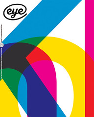
Summer 2012
Devil in the detail
Careful, even-tempered typographer by day – wild art director by night? For John Morgan, both the typographic detailing and the grand gestures are essential to each project’s unique ‘atmosphere’. By John L. Walters.
John Morgan has branded a city and typeset the words of God. He has set poetry in granite and written a brand book (for David Chipperfield Architects) that begins: ‘The first guideline is to work with a good designer.’ He designs books that are beautiful and desirable objects, good to hold and own and use, yet most of his time is spent thinking about the meaning of words and of characters and the spaces in between. He once took a graphic design vow of chastity (‘The designer must not be credited’), yet his work is wide-ranging and polymorphous, adding dignity to books and business cards, bringing gravitas to criticism in academic journals and fine art captions.
Drawing the Curtain: The Cold War in Cartoons by Fontanka, 2012.
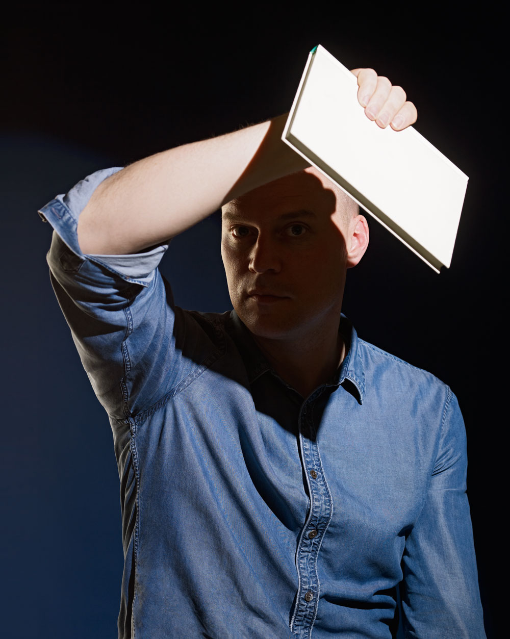
Top: portrait of John Morgan by Blommers & Schumm
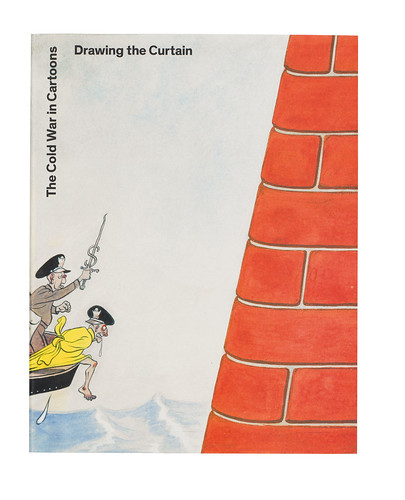
For those of us immersed in a world of unsubtle, overwrought design, Morgan’s work can be so subtle and understated that it catches you out. Look at his design for Drawing the Curtain: The Cold War in Cartoons. It’s not just the typography that makes this big book so inviting, it’s the way the images have been paced and ordered to support the authors’ ideas and intentions. Also, it’s the way the book feels in your hands, the way the pages turn and lie flat while you are reading text or examining the pictures. Morgan’s design is there at your side while you read the book, helping you to enjoy every aspect of its contents, but performing this role so skilfully that you almost forget he’s there.
Look, too, at 6a.co.uk, his minimal website for 6a architects (a vertically scrolling selection of images whose seriffed captions appear when the user mouses over the frame), or the simplicity of his design for Things 19-20, whose monastic greyness, wrapped in a yellow cover, stands out in a jungle of text heavy journals as both serious and readable.
For Morgan, the devil is in the detail, typographic or otherwise: ‘There’s rarely an archetypal design solution,’ he says. ‘I do think I could redesign something for ever, and often do.’ Every choice, he explains with a long sigh, is so loaded: ‘I want a typeface which is of my time, which is relevant now, but I want to design for the long term. And even an ephemeral thing can stay around for the long term!’
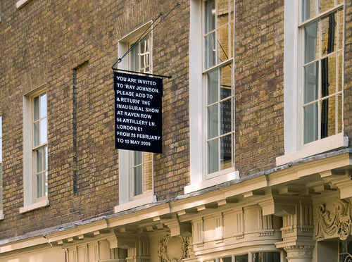
But there’s a wilder side to Morgan you see in his work for Raven Row gallery and Ambit magazine – the deliberate artlessness of his vernacular signs, the translucent pink plastic cover for The Jet Age Compendium: Paolozzi at Ambit, and the way he cheerfully plonks smudgy scans of book and magazine pages alongside his own typography in AA Files and the eccentric Four Corners Books edition of The Picture of Dorian Gray.
Could there be an almost gothic, Dr Jekyll / Mr Hyde element to Morgan’s design practice: serious Reading-trained book typographer by day / wild art director by night?
Morgan sees the two sides as completely complementary, both in his work as a graphic designer, and in his approach to teaching.
‘There was a period when I taught at Central Saint Martins (CSM) and the University of Reading at the same time, and I saw my role and position as opposites. But you respond to the environment and see what’s needed. The CSM students were well looked after in grand gestures, so I taught detailed telephone directory layout. At Reading, there wasn’t much (dare I say it?) “atmosphere”, so I pointed the students in that direction. Horses for courses.
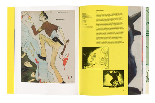
Spread from Drawing the Curtain: The Cold War in Cartoons by Fontanka, 2012.
‘I like students to be able to produce the detail of Jan Tschichold or Hans Schmoller [Tschichold’s successor at Penguin] combined with the overview of books or posters by [German artists] Martin Kippenberger or Hans-Peter Feldmann.’
Morgan says he has learnt much from working with architects, particularly Chipperfield, and the scale at which they operate: ‘For large-scale projects such as signage or identities where you are working with many people, you have to accept a degree of what David Chipperfield would call “critical compliance”. You cannot control every detail, so you become a consultant – sometimes even to your own studio.’
Chipperfield, by contrast, values the fact that Morgan’s team is small. ‘In my business … to put a building together I need fifteen people,’ he says during a phone interview. ‘But there are “surgical” moments, when someone has to give direction, to clarify the proposition. When you work with John you’re working with John – there is no substitute. What he does is very precise.’
Morgan frets about the content, the validity of producing many of the projects he is asked to do. Does anyone need large photobooks any more? What is the relevance of large art catalogues when it is easier to search online? Morgan’s designs for Phillips de Pury answer this question well; his subtle catalogue design gives the auction house a critical edge in a difficult marketplace.
In our first conversation for this article, in a café near his London studio, the matter most pressing on Morgan’s mind is the correct word to describe the totality of a piece of typographic work. Could that word really be ‘atmosphere’? He can’t help returning to that troublesome term throughout our conversation. Morgan works with artists, architects and curators all the time, people who work with expansive, expensive-sounding phrases.
‘[Swiss architect] Peter Zumthor doesn’t hesitate to use a word like “atmosphere”,’ he says. ‘Atmosphere is a problematic and woolly word, but it’s the best description of what I aim for in my work. It’s the sensation you find when you walk into a building or space and it changes the way you feel.
‘It’s hard to define what gives a book atmosphere, because it can be found in unexpected places, and many books by caring, attentive designers lack it, but you know it when you see it or feel it.’
Whatever it is called, Morgan first learnt to appreciate this elusive element while working for Derek Birdsall’s Omnific studio: ‘It’s the difference between something being good and really great. You need a certain sensibility to achieve that. At Omnific we’d work on a job forever, get all the details right, and then Derek would do one little beautiful thing. As long as the rest is done well, it’s that thing that makes it special.’
Morgan (born 1973) grew up in a small Lancashire village. His father was an academic, a biochemist with an enthusiasm for stationery. While there were few art or design books around (apart from John Berger’s Ways of Seeing), he remembers home life as ‘open and critical’.
‘My father’s way of thinking was extremely lateral. When I was a student my he sent me a letter every week addressed in a different typeface (with full type history credit line)’ says Morgan.
Looking back, he feels fortunate to have stumbled upon the Typography & Graphic Communication course at Reading. This was very academic, with an extensive reading list and a defined syllabus of history and theory. In this it was quite different, he says, from other UK graphic design courses, especially the ones that kept strong ties to the art schools that spawned them.
‘In the formation of the department [in the 1980s], Michael Twyman made a conscious decision to split graphic design and communication away from art. All of us had girlfriends in the art department, but otherwise there was no crossover. We’d be so envious. I’d go over to the art department to see Claire [Morgan’s girlfriend, now wife] and the students would be sitting, smoking, painting, while we’d be working like crazy to a deadline …
‘All those contrasts were quite extreme. We learnt about micro typography and history, the things that could actually be taught.’
His teachers included Twyman, who gave lectures on theory; former St Bride librarian James Mosley, who taught the history of letterforms every Saturday morning; and, most importantly, the late Paul Stiff, whom he calls ‘a great mind’.
‘You’d get really severe, useful criticism from Paul,’ Morgan recalls. ‘He described one of my student projects as looking “like an in-flight meal”.
‘It was partly through Paul that I was invited back to teach,’ says Morgan, who has taught part-time (at Reading and CSM) for the past decade.
The other central figure in Morgan’s early education was Birdsall (see Eye no. 9 vol. 3), who took him on after he graduated in 1995. After visiting other studios full of computers and carpet tiles, Birdsall’s scaled-down Omnific in Islington was ‘a student’s idea of what a studio was’, with a PMT [photomechanical transfer] machine and a giant lightbox. ‘It felt like an atelier,’ says Morgan, ‘which for me at the time was an important thing.’
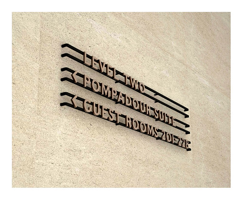
Integrated architectural signage for the Cafe Royal hotel, London.
At Omnific, he was introduced to ‘all the things that Derek does well’, including long lunches with clients, and grappa. ‘We still all worked incredibly hard,’ he says. ‘Derek might have an afternoon nap and would wake up ready to go again at six o’clock!
‘We’d work late and eat late and drink late but the balance was good … I remember laying out the Lucian Freud catalogue raisonné with Frank Auerbach, Bruce Bernard, Freud, Derek and me (saying nothing, wisely), just laying out the book. There was a good culture there, one that was much broader than anything I’d encountered at Reading.’
When Morgan left Omnific in 2000 to set up John Morgan Studio, a third influence loomed large in his life: that of Hyphen Press publisher, Robin Kinross. Along with architects Dan Monck and Duncan Kramer of Material, they were co-founders of Workplace Co-operative 115, the multiple-occupancy building in Kentish Town. Over time this address has been shared by many different designers, including Peter Brawne and Dot Dot Dot co-founder Stuart Bailey.
Two of Morgan’s early clients came directly (with Birdsall’s blessing) from Omnific: Ambit and the Church of England. With regard to Common Worship, the Anglican prayer book, Morgan explains that when he and Birdsall presented their sample layouts to Church House Publishing in the Jerusalem Chamber of Westminster Abbey in 1999, an important part of their proposal was the combination of ‘an experienced designer in his sixties and an assistant in his twenties who could develop the series’. By 1 January 2001, when the first edition was published, Morgan was well versed in the way the prayer books were put together and the mechanics of managing a production process with several editors and fourteen proofreaders.
His early work included a couple of books for Booth-Clibborn Editions, exhibition graphics (‘Saul Bass’ at the Design Museum) and catalogues. His first assistant was Sven Herzog, and Michael Evidon, who had been a student of his at St Martins, joined in 2004. Morgan left 115 for Hackney the same year, and in November 2006 moved to his present office, a multiple-use building in Paddington station with its entrance opening on to platform one. By this time Morgan and his wife Claire had moved their young family (Rudy, Francis and Iris) to Oxfordshire. The Paddington location, he says, is a design solution: ‘My train arrives there directly.’
Other clients came along gradually, in publishing, literature, art, architecture. His 2004 poetry pavement for the BBC’s ‘media village’ in White City required him to set Andrew Motion’s words in granite, a subtle piece of typography that is easier to read when it rains. (Motion had to write to fit Morgan’s typographic design: fourteen characters.)
One of Morgan’s first independent book designs was Petersburg Perspectives (Fontanka), a literary guide to the city, with photographs by Yuri Molodkovets. For this, he and publishers Frank Althaus and Mark Sutcliffe set themselves up in a spacious St Petersburg apartment, laying out flatplans on the floor overlooking the Fontanka canal. ‘We were all still learning on the job,’ he says. ‘I hadn’t art-directed Russian photographers before, or attempted to document a city.’ Spending weeks living and working together and ‘drinking vodka from the freezer’ created a bond that is rare in designer-publisher relationships.
Raven Row gallery
‘It enabled more recent books, like Drawing the Curtain, to happen,’ Morgan says, ‘where the design is integral to how the book is structured, and where good design is a branch of editing.’
Morgan attracted a student following with some of his writing in the journal Dot Dot Dot, including ‘The Vow of Chastity’, which he had set (in 2001) as a design brief for graphic design students at CSM. ‘Each first-year student had to sign up and swear to submit to the rules for the duration of the project,’ he wrote, when it was published in Looking Closer Four (Allworth, 2002). ‘They were produced with tongue in cheek, and in direct reference to the Dogme95 “Vow of Chastity” for film-making by Lars von Trier and Thomas Vinterberg.’
Morgan elaborates further: ‘Robin Kinross suggested there could be a design or typography equivalent to the Dogme vow. Paul Stiff wrote a version off the cuff and I wrote mine, which included Paul’s first point: “Content matters: design nothing that is not worth reading.”’ Despite the humorous but critical tone of the vow – ‘a teaching exercise in constraints’ – Morgan says he stands by many of its core principles. For example: ‘The design takes place here and now. No pastiche.’
Though he has written articles about design and typography (including an interview with Sally Potter about her father Norman Potter for AA Files), Morgan worries about the role of the designer-writer: ‘The question I pose at talks is: “Name me one graphic designer who has something interesting to say about a subject other than graphic design.” Many graphic designers have an overwhelming desire to publish merely because they have the means to do so.’
This conjures another cinematic analogy: ‘When Linda van Deursen invited me to be an external examiner at the Rietveld Academy, she compared the graphic designer’s role to that of a cinematographer, who has a relationship with a director beyond that credited. They can influence the whole tone of a film.’
Morgan’s typographic eye can be seen in projects that have unfolded over time: the identities for Chipperfield and for the Raven Row gallery and in his sure-footed art direction of AA Files, the journal of the Architectural Association School of Architecture. When he took over the quarterly, it was matt laminated with a four-colour cover, ‘like an annual report’. His response was to make something quieter, more literary, that would have a longer shelf life and demand more from its readers.
The journal’s typographic quietness can be deceptive, though. While Morgan uses Fred Smeijers’ Arnhem Blond for the body text, he has had fun with a series of display typefaces, including some very noisy drop capitals designed by Paul Barnes (see Eye 82), based on what James Mosley terms the English Vernacular. The lessons of those Saturday morning type lectures in Reading were not forgotten.
Collaborations with type designers have been an important part of Morgan’s design armoury for some time. After designing the identity for the Slovenian capital Ljubljana – a logotype made from a letter ‘L’ turned through 45 degrees – he worked with Henrik Kubel (A2 / SW / HK) to produce Ljubljana bold, a typeface for the city.
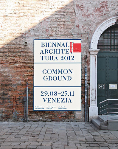
As the studio expanded he was able to add a typeface designer (Adrien Vasquez, a graduate of the Reading MA typeface design course) to his team, which means he can create typefaces for new projects such as the 2012 Venice Architectural Biennale, directed by David Chipperfield, for which the studio has devised a stencil alphabet. This summer John and assistant Mathias Clottu will set up a temporary studio in Venice for the Biennale.
‘John earns your trust,’ says Chipperfield, ‘and that gives him a certain freedom. He’s not having to pitch and perform all the time – he’s just John.’
Another client, Richard Embray, of publisher Four Corners, recalls first encountering Morgan’s work through Common Worship. When Embray and partner Elinor Jansz devised the Four Corners Familiars series of novels interpreted by artists, they saw a similar challenge: ‘We wanted these classic texts to be thought of afresh.’
Though each artist has as much control as they wish, Morgan’s design maintains a consistent thread. ‘Each relationship in that series has been unique,’ says Morgan. ‘It ranges from ones in which the artist is effectively providing self-contained plates, to more closely integrated books, where we discuss the whole together.’
The forthcoming Four Corners edition of Madame Bovary in collaboration with artist Marc Camille Chaimowicz has given Morgan an opportunity to pursue his longstanding search for the ‘generic French paperback typeface’, and his enthusiasm for ‘the typography and romance’ of Livres de Poche – and French design in general.
Poster for ‘Common Ground’, the 2012 Architecture Biennale, Venice.
Embray describes Morgan’s design for the new Four Corners website, fourcornersbooks.co.uk, as ‘slightly perverse’. He explains: ‘we wanted a website that privileges physical objects, that makes you want to handle the books.’ The site encourages users to view and sort the publisher’s books by their size, colour, weight, spine and back, in what Embray describes as ‘a very elegant solution’.
Though Morgan’s client list is quite varied, the work best known to his fellow designers is the more arcane (‘Mr Hyde’) work for Ravens Row and Four Corners. Does he ever yearn to work for a more ‘mainstream’ client? Or a big brand?
Morgan points immediately to his work in the fashion sector. He’s been working with fashion / costume curator Judith Clark on an exhibition inspired by 1950s Vogue pattern books and on a show that marks 60 years of Chloé. This is not a recent move – he designed an enormous, elegant book of Horst fashion plates (Platinum) for publisher Jefferies Cowan for Hamiltons in 2006.
‘I’ve been a subscriber to Vogue for many years,’ he says ‘and I hold a secret desire to redesign it.’ How would he approach such a commission?
‘I would want to strip away all cover copy except for the masthead (which in turn could be more playful and responsive like earlier issues), take the celebrity away, and create a more artful publication, which the content mostly deserves.’ As for big brands, while noting that large organisations tend to work with the larger design consultancies, he sees ‘no reason why a large scale organisation shouldn’t work with individual designers.’
Page 1: Great Expectations (GraphicDesign&, 2012), the recently published book in which 70 typographers and designers set the first page of Dickens’ novel and explain their choices, provides a further insight into Morgan’s typography. Morgan, who chose to set Dickens’ words in Bram de Does’s Trinité, is both competitive and modest in his contribution: ‘My aim is to design for readers.’
He describes his practice as ‘design-led’ rather than ‘strategy-led’. For him, the ideal situation would be to direct a publishing house or gallery (as Willem Sandberg did at the Stedelijk in the 1950s).
For the moment he regards himself fortunate in his clients: ‘From what I’ve seen of design education recently, engagement or dialogue with a commissioner or client is seen as a weakness, as if it were an inauthentic activity. The result, apart from a few exceptional moments, is a model of design practice that can only be supported by teaching – which in turn perpetuates a skewed view of what the role of a graphic designer is.’
Though Morgan’s brow furrows when asked about the way he specifies type for any project, it is also his favourite subject. He quotes Nietzsche’s rhetorical question: ‘What clothes should modern man wear?’ And while his conversation is peppered with similarly unanswered questions, he is the most decisive and assured of designers when it comes to getting the job done.
David Chipperfield says: ‘There’s a certain resolute quality in the way John works. He doesn’t mess around.’ Chipperfield remarks that the self-analysis required to decide on a company’s identity – ‘who do you think you are?’ – can be quite terrifying. ‘With John, it was quite pleasant. It’s more about getting closer to what you are. If everyone shouts it’s a good idea to whisper. And John is a very good whisperer.’
John L. Walters, Eye editor, London
First published in Eye no. 83 vol. 21.
Eye is the world’s most beautiful and collectable graphic design journal, published for professional designers, students and anyone interested in critical, informed writing about graphic design and visual culture. It is available from all good design bookshops and online at the Eye shop, where you can buy subscriptions, back issues and single copies of the latest issue. You can also browse visual samples of recent issues at Eye before You Buy.