
Spring 2025
Eye type reviews

Ferdinand P. Ulrich
Toshiya Izumo
Mark Thomson
Yara Khoury Nammour
Damien Gautier
Bureau 205
Chiachi Chao
Lineto
Khajag Apelian
Wael Morcos
David Jonathan Ross
Peter Biľak
Typotheque
Four contemporary type reviews by Silvia Sfligiotti, Ferdinand P. Ulrich & Toshiya Izumo, Yara Khoury Nammour and Mark Thomson
Naancy by Damien Gautier (2025) 205.tf
Reviewed by Silvia Sfligiotti
Even if the name and description of this typeface immediately connect with the French city of Nancy and its Art Nouveau design legacy, Damien Gautier’s Naancy is not a revival nor a simple contemporary take on that style: it draws upon a wider range of historical references, incorporating them in a multilayered, coherent project …

Kleisch by Chiachi Chao (2024) lineto.com
Reviewed by Ferdinand P. Ulrich and Toshiya Izumo
Even before reading Chiachi Chao’s concept paper (lineto.com/pages/articles/kleisch), his typeface Kleisch will strike users as an exciting contemporary transitional-style Latin typeface in the tradition of seventeenth- and eighteenth-century punchcutters in Amsterdam. Released by Lineto last year, Kleisch began as a student project at ECAL …
Forma Arabic Banner
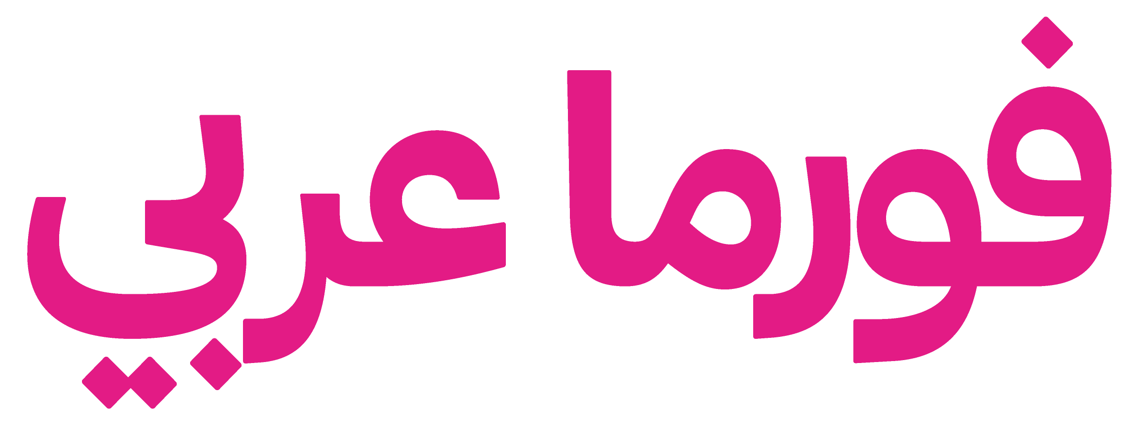
Forma DJR Arabic by Khajag Apelian and Wael Morcos (2024) djr.com
Reviewed by Yara Khoury Nammour
I have always looked for an Arabic typeface suitable for newspaper headlines – one that does not resort to excessively thickening its baseline, or manually compressing its proportions, that can lead to heart-wrenching distortions. Although Forma Arabic (a companion to the Latin version by David Jonathan Ross) was not designed with this in mind, its approach to tight spacing and structural integrity makes it a plausible candidate.
Over the past decade, neo-grotesque Arabic typefaces have become dominant. Forma Arabic balances tight spacing with a functional aesthetic that responds to the Latin counterpart it was meant to accompany …
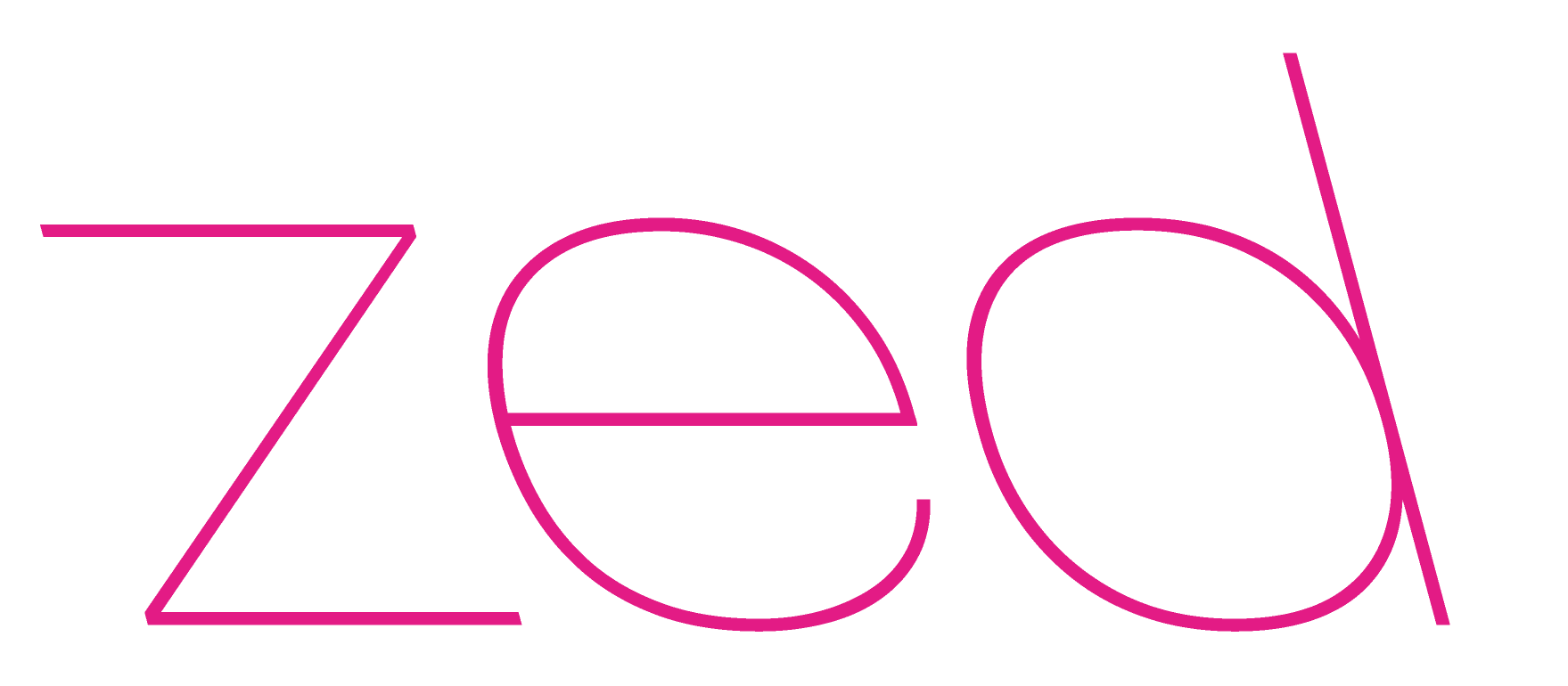
Zed by Peter Biľak (2024) typotheque.com
Reviewed by Mark Thomson
When Peter Biľak started out, his idea was to name his fonts sequentially through the alphabet; by the time of his Reputations interview in Eye 75 he was up to ‘H’ with History, having already achieved success with the sans / serif family Fedra. His new type family is called Zed – not because it is the end of the line, but because it is so comprehensive that he estimates it will only be completed some time in the late 2030s …
Silvia Sfligiotti, graphic designer, writer, Milan
Ferdinand P. Ulrich, typographer, type historian, lecturer, Berlin
Toshiya Izumo, graphic designer, typographer, Berlin
Yara Khoury Nammour, designer and assistant professor at American University of Beirut
Mark Thomson, designer, London
Read the full version in Eye no. 108 vol. 27, 2025
Eye is the world’s most beautiful and collectable graphic design journal, published for professional designers, students and anyone interested in critical, informed writing about graphic design and visual culture. It is available from all good design bookshops and online at the Eye shop, where you can buy subscriptions and single issues.