
Spring 2007
Like they do give a damn
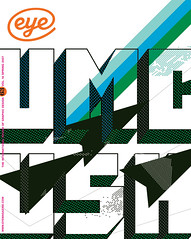
Strong design, right-on ‘Projects’ and lashings of information porn make Good a title that aims high
Good caught my attention while I waited at the checkout in a college bookstore, where its textual fill-in-the-blank cover shared a shelf with Rolling Stone, Vibe, Men’s Journal, Elle and Sports Illustrated. Not since Herb Lubalin’s all-typographic covers for Fact has anything stood out from its competition so aggressively. And the contents delivered as much cerebral as visual stimulation, a far cry from its glossy neighbours.
Good is not specifically produced for a design-hungry audience, but the publication will appeal to those appetites. The ‘Graphic Statements’ opening spreads are reminiscent of the days when John Plunkett (see Eye no. 28 vol. 7) art-directed Wired and teased readers with illustrative introductions that established the issue’s themes. In the first issue, which has articles focused around an ‘I (Heart) America’ theme, W+K12 (the Wieden+Kennedy ad school in Portland, Oregon) uses large wooden type smothered in red, white and blue to state ‘America love it or fix it’. W+K12’s work also appears later in the issue, in the form of merit badges that champion all things [United States] American, such as roller-coasters, curing polio and breaking the sound barrier, and challenges its citizens to do more – or do better.
Wired and business magazines such as Fast Company and Fortune have had their own versions of ‘information porn’, but Good devotes an entire section to it. Casey Caplowe, its creative director and founding partner, invited designers 2x4 (see Eye no. 28 vol. 7) to contribute a twelve-page graphic exploration for issue one. This reveals mysteries beneath everything from high-fructose corn syrup to the high cost of marriage / divorce. For Good no. 2, designers Number 17 (see Eye, no. 39 vol. 10) investigated journalists, nuclear weapons, advertising and bestsellers.
Many pieces of Good’s puzzle come from somewhere other than the magazine’s West Hollywood offices. Area 17’s Arnaud Mercier (Brooklyn) designed the website plus the brand identity that became the masthead. Good’s editorial design is by Open (See Eye no. 53 vol. 14) in New York City.
‘There are a lot of magazines out there, but not many like this,’ says Open’s Scott Stowell. ‘Good is different because it has high ideals but absolutely does not preach to the converted. Their (and our) intention is to make a magazine that will appeal to a very wide audience, and all our decisions support that.’
The first issue sold out on many newsstands, with its strongest distribution in New York and Los Angeles, and Caplowe has heard good reports from distribution channels: ‘The vice-president of Barnes and Noble has told us that we are the only socially conscious magazine that sells. The Whole Foods distribution person said we were their favourite launch of the year, and we are increasing our distribution there significantly.’
A philanthropic impulse
Because the title is editorially and financially independent, it can afford to demonstrate its philanthropic mission with a ‘Choose Good’ campaign that donates the first 50,000 subscribers’ fees (worth USD1 million) to any of the magazine’s twelve non-profit partners. By January 2007, Good had enlisted more than 11,000 subscribers, raising USD220,000 towards its goals.
The magazine is the first step towards building a ‘community of people that give a damn.’ Caplowe says, ‘We see the magazine as a crucial component and, for the time being, our most significant public face, but we are hard at work to figure out the ways to serve this community through other platforms – namely our website, events, video and even feature films produced by our sister company, Reason Pictures.’
Good’s media kit acknowledges that it ‘stole ideas’ from ‘the confidence and forward-looking perspective of Wired, the gravity and credibility of The Economist, the writing prowess of The New Yorker, the clear and worldly design of Colors, the wit and humour of The Daily Show, and the gritty texture of Rolling Stone and Vice’. Companies such as Timberland and Ralph Lauren share ad space with not-for-profits such as Universal Giving and the Rampage Relief Fund, to confront what Good’s founder Ben Goldhirsh describes as ‘educated, media-savvy, engaged, creative, worldly, critical trend-setters’, who are ‘young movers and shakers shaping the future of our planet’.
Born out of a desire to deliver what Goldhirsh and his team call ‘content that matters’, the magazine has succeeded in merging timely ideas with gung-ho design. Under the direction of publisher and founding editor Max Schorr, Good entertains and informs readers without bashing them over the head. The magazine feels light in your hands, thanks to its airy typography and low advertising volume, but its economical design also breeds confidence. Thanks to these clean visual attributes, Good’s content directly relates to its appearance. In contrast to Adbusters’ guerrilla vernacular, Good looks more like a svelte superhero who is calm under pressure and good-natured.
The ‘Portraits’ section – ‘a collection of people doing things that matter’ – reinforces the magazine’s human spirit without leaving any saccharine aftertaste. Novelist Kurt Vonnegut offers an ‘original napkin sketch’ for a provocation on page 101.
Sitting right at the end, ‘Projects’ invites readers to take action in what sounds like a toned-down Fight Club assignment. The inaugural mission is to create a bumper sticker about voting. Alongside Stowell’s written brief, James Victore serves up an example that is not as visually aggressive as his customary work (see Eye no. 30 vol. 8) – though he did manage to work in a rifle. The second Project asks readers to tell Good ‘what needs to change’; the responses are displayed on the website, and each proposal can receive comments, too. The Project’s creative constraints remain loose, and all work can be submitted – and, in turn, downloaded or viewed – from Good’s website.
Endearing functionality
Both the website and the print title share a highly functional typographic approach, and the website chops information into small, digestible bites. Perhaps Good should take a lesson from other magazines such as Fast Company and Newsweek, which deliver privileged online content to readers through URLS buried within the magazine.
If the magazine’s contents feel subversive, then the publishers have done their job. Good possesses an economy of means, as functional as it is endearing. Caplowe and Stowell have engineered something different from the offerings of Condé Nast, Time Inc. and Rodale. Good presents a worthwhile alternative to the regular people reaching for something in the checkout line, without neglecting good design.
Jason A. Tselentis, designer, writer, educator, University of North Carolina-Charlotte
First published in Eye no. 63 vol. 16 2007
Eye is the world’s most beautiful and collectable graphic design journal, published quarterly for professional designers, students and anyone interested in critical, informed writing about graphic design and visual culture. It is available from all good design bookshops and online at the Eye shop, where you can buy subscriptions and single issues.