Summer 2010
Make music visible
Gerard Saint’s Big Active is on a mission to turn music into something tangible through art direction and design.
Since the turn of the century, Gerard Saint’s Big Active has defied conventional business wisdom about music design, as much of the music industry went into a downward spiral of denial, panic and hasty downsizing in the face of the digital revolution. While some practices have cut down their music work in favour of other sectors, and others regard it as a point of entry, a loss-leader or a labour of love, Big Active has moved in the opposite direction, with impressive success. ‘We are employed to give music visibility,’ declared Saint at the St Bride ‘Design 4 music’ conference on 29 January. In his view, the state of contemporary music design poses interesting problems: ‘How do you devise a definable image that at one point is the size of a postage stamp, and next is the size of a fucking house?’
Saint founded Big Active in 1990 with two friends from college, Paul Hetherington (who later worked with Peter Saville and ShowStudio) and Mark Watkins, who left the practice in 2001 to move out of London with his family. One of their first pieces of self-promotional work was a card that said ‘Hello’ on one side and ‘Fuck Off’ on the other, so they would have something to give to both to potential clients and to photocopier salesmen who came calling.
Big Active’s 1990s clients included the Crafts Council, fashion labels, small art galleries (though they would often get sacked from such jobs) and publishers. Their editorial work included early work on AnOther, a spin-off from Dazed & Confused, and FHM. Later, there was style title Scene, and the high-profile but short-lived revamp of legendary women’s magazine Nova for IPC (‘bunch of c***s and you can quote me on that,’ says Saint). But by the late 1990s, after the arrival of Saint’s friend Mat Maitland, formerly an in-house designer at Warner UK, the practice began to devote much more of its time to music.
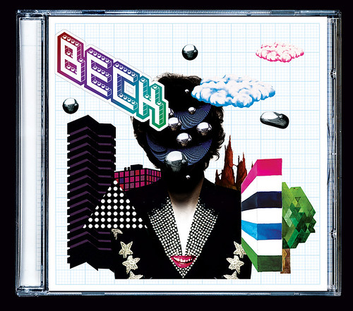
Illustration and representation
In parallel to their work as a design studio, Big Active started representing illustrators that they had encountered while working on Scene. Saint claims there wasn’t any kind of business plan originally, but that it was something that grew logically from their editorial work.
‘There were a lot of people I was commissioning – young, really interesting people coming out of the art college system who didn’t have an agent, didn’t want to have an agent, and didn’t feel there was an agency who made any sense to them,’ recalls Saint.
‘I was getting them to do stuff – just as the Face was getting them to do stuff at that time – people like Jasper Goodall, Kate Gibb, Dave Foldvari, so we thought why don’t we join forces with them, and that’s how the Big Active family started to grow. It wasn’t a plan – it all happened quite organically.’
Their ‘creative management’ department, now run by Greg Burne, represents a roster of illustrators that includes: Letman, Mimi Leung, Kristian Russell, Will Sweeney, Kam Tang, Vania Zouravliov, Sanna Annukka, Jody Barton, Jesse Auersalo, Siggi Eggertsson, Matt Furie, Klaus Haapaniemi, Filipe Jardim, Adrian Johnson, Parra, Genevieve Gauckler and now Jim Stoten.
Saint has the relaxed manner of a music business veteran who started out for the love of it – like many designers, he played guitar in bands at college and as a young man. Originally inspired by music designers of the 1970s and 80s such as Malcolm Garrett and Barney Bubbles (see Eye 6 and 70), he cites the latter’s cover for Music for Pleasure, by the Damned, as a major influence.
But he is disparaging about the malign influence of the CD boom, with its nasty jewel cases and flimsy booklets, and the dreary aspects of music design that followed: ‘There was a time in the 1990s where every sleeve was a photograph with a bit of Helvetica stuck in the corner and they all looked the same.’
Music design, for Saint, is the process of ‘creating something with a bit more love or care. Giving the sense of added value for money.’ He says: ‘If you want to download it – fine – but, if you buy it let’s make you something that invites you into the world of the recording artist.’
Saint describes what Big Active does as ‘creative management’, by which he means overseeing everything from album covers and promotion, to merchandise and the live experience. In the case of Beck’s The Information, Big Active actually took over some of the merchandising manufacture, making limited-edition vinyl posters and other products.
‘When we start to think about projects we’re trying to think about the larger picture,’ says Saint. ‘Albums are experienced through lots of different touchpoints in media. The sleeve or packaging is only one of them … it’s about the way the whole experience goes together. Everything we do needs to lock in.’
Big Active’s editorial background is clearly a plus when dealing with the wide variety of artists and visual styles encompassed by their client list. ‘I like to think that we could still be doing stuff in ten years time and it would still be interesting,’ says Saint. ‘It’s not about having a fixed style – that would be really boring.’
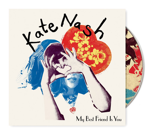
But do the visual elements reflect or represent the sound of the artists Big Active works with, if indeed they should? Saint replies that he wants to make the artwork reflect ‘the spirit in which the music was made.’ There’s a recognisable flair in the confident way the agency matches image-makers with bands and individual performers: Jasper Goodall with The Freelance Hellraiser; Siggi Eggertsson (see Eye 74) with The Delays; photographer Dan Tobin Smith with Athlete; Will Sweeney with Architecture In Helsinki; and most recently Kate Gibb with Kate Nash.
Yet Saint points out that very often it is the artist’s identity that predominates. ‘With Alison Goldfrapp it’s just as much about her back story and image as anything.’ Saint compares her to 1970s artists such as David Bowie whose images ‘totally came from themselves’, and where each musical development – such as a new image – is matched by a new palette of visual references: everything from eye make-up to typefaces. Such changes were always about much more than the square album cover.
Making music visible
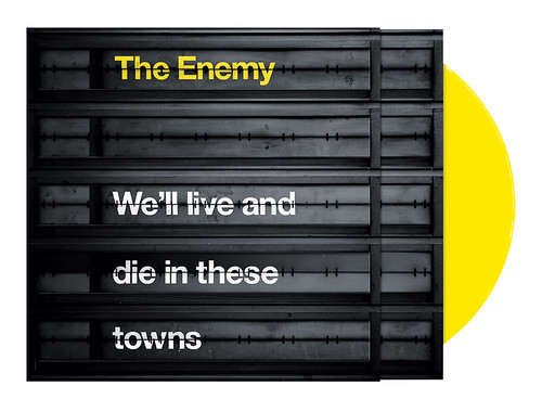
Many of Big Active’s most visually compelling campaigns stem from the ideas behind the songs. The campaign for Coventry trio The Enemy stems from a rock’n’roll staple – the urge to flee the nest, take a train to a new place, escape provincial life to make it in the big city. Their use of mainline station departure boards worked as a literal signifier of travel and escape, and as a visual metaphor for the young band’s retro sound.
A campaign for Kate Nash’s new album is also rooted in the singer’s tastes and enthusiasms, a mash-up of eclectic visual references for illustrator and screen-printer Gibb to work on with art director Maitland. Their do-it-yourself art direction campaign for Beck’s The Information, for which fans could assemble their own cover using a sheet of stickers, chimed with Beck’s own musings about the dematerialisation of music, bringing relational aesthetics to the pop charts, and providing another opportunity for Big Active’s ‘family’ to shine in public: the sticker sheet features twenty different illustrators.
Big Active has an affinity with music design that works both aesthetically and commercially, whether collaborating with million-selling superstars or small labels and emerging artists. ‘What I’ve always liked about being a designer is the art director part of it,’ says Saint, ‘being able to work with all the best people that you know and love – like a record producer, pulling people in where it’s appropriate.’
But why music design? Like many designers, the Big Active team values music as one of the few forms of design where they can add a new element that in Saint’s words, ‘makes the music visible’.
‘If we were making a book we’d be very respectful to the content and the author in the sense that’s it’s the author’s book. Say it’s a photography book, it’s about the photography, not our design. The function of our design would be to present the work in the best possible way. Music is an intangible thing we can make more tangible.’
First published in Eye no. 76 vol. 19.