Summer 2010
One man brand?

Manfred Eicher’s uncompromising artistic vision has always defined the look and feel of ECM.
Long before we get to the music, or the covers, or the legendary sonic detail, we encounter the ECM mythos. You might be tempted to call it the ECM ‘brand’, but that would be to equate Manfred Eicher’s Munich-based label with drain-cleaning products or toothpaste. Of course, you could argue that the ECM record label is a textbook example of branding: its public-facing persona is consistent; it is always recognisable; and its many admirers hold it in awe. But to think like that is to miss the point of branding – or more accurately, to take the view that branding is something that can be applied rather than forged.
The benefits of silence
I’ve sat in design meetings with music industry people – intelligent, well intentioned people – who’ve told me that they’d like to have a label identity ‘just like ECM’. But when I’ve pointed out the factors that make the ECM ‘brand’ so compelling – wintry monochrome imagery, miniscule typography, hardly any artist’s pictures, not to mention the uncompromising music and the singular recording ethos – they all decided that they didn’t really want it after all. Labels who think they might like to be ‘just like’ Eicher’s company are making a mistake that most branding people make – they are assuming that you can apply a few squirts from the ‘Instant Branding’ aerosol and, hey presto, you have a brand.
If an ECM brand exists, it is because it has been constructed by the artistic (and commercial) vision of the label’s founder and creative impresario Manfred Eicher. This vision is deeply personal, and rooted in unflagging artistic conviction. ECM covers look the way they do for a reason: they have emerged from Eicher’s theories of the deleterious effects of excess information; his well chronicled views on the benefits of silence; and his espousal of the enigmatic in a world where meaning must always be spelt out with deadening simplicity. Eicher’s vision is uncompromising and extends to every aspect of the label’s existence. This is the auteur theory of branding.
As a long-time ECM watcher and listener, my interest in the label waxes and wanes. There have been times when I’ve drifted away from Eicher’s monumental project; yet its lunar pull always drags me back and I invariably find something that makes me fall in love all over again. But I am not an uncritical lover. Windfall Light: The Visual Language of ECM (Lars Müller, 2010) is a second collection of ECM cover art. In it we find the covers that have emerged since the first collection, Sleeves of Desire: A Cover Story (Lars Müller, 1996), was published. And while it’s clear that ECM remains a beacon of visual integrity in what the music writer Ian Penman calls the world of ‘hi-sheen graphix, ... hi-budget campaigns [and] CD hygiene’, this new generation of ECM cover art lacks the inventive flair and creative sensitivity of the work done by the label’s most accomplished designer, the great Barbara Wojirsch.
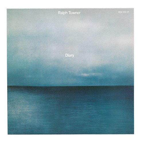
She’s a hard act to follow. She began designing ECM sleeves with her husband Burkhart in 1970, the year after the label’s first release. They worked together, signing their covers B. & B. Wojirsch, until Burkhart’s death in the early 1970s. Barbara continued to design for Eicher until her retirement in the mid-90s. Her legacy hangs over ECM like a benevolent angel.
Diary, Ralph Towner (1974). Design: B. & B. Wojirsch.
Top: Music for Large & Small Ensembles, Kenny Wheeler. Design: Barbara Wojirsch.
Slender lines of typography
Dieter Rehm joined in 1978, and was responsible for the label’s move towards photography, a trend that has escalated now that both Wojirsch and Rehm are no longer involved. When I interviewed them in 1995 for an article for this magazine (Eye 16, ‘Think of your ears as eyes’), they both praised Eicher for the freedom he gave them, yet acknowledged his omnipresent influence in their visualisation of the ECM ethos.
Today, it is rumoured that Eicher takes a more active role in the design of the label’s covers. This has led to the near universal use of photography as the key component of ECM sleeves over the past decade or so. The slender lines of typography imparting only the barest amount of information remain. The sense of unhurried quiet also remains. A Tarkovsky-like motionlessness still hangs around most of the images.
Yet I can’t help feeling that Eicher could do with a designer with Barbara Wojirsch’s sense of adventure to stop ECM’s drift towards the anodyne. As in cinema, the auteur theory works best when the director’s vision is supported by brilliant accomplices: Welles needed his cinematographer Gregg Toland to make Citizen Kane burn so incandescently in the cinematic firmament. Looking at the current generation of ECM sleeves, good though many of them are, Eicher needs to find another Toland to follow Wojirsch and Rehm.
First published in Eye no. 76 vol. 19.