
Summer 2017
Pleasure in the process
Paul McNeil and Hamish Muir are graphic designers who construct typefaces through mathematics, systems and experimentation, pushing hard at the boundaries of alphabetic form
Paul McNeil and Hamish Muir are on a mission. They are designers who – as MuirMcNeil – make typefaces that work in mysterious but mathematical ways. Using methods that are entirely contemporary, though they can seem arcane, they explore ‘parametric design systems’. And there is something about their commitment to a punchy, practical, systems-based approach that communicates far and wide. Though they eschew ‘style’, their fonts and posters – including identities for the London College of Communication (LCC) and TypeCon – are recognisable within seconds. They also have robust theories about the experimental, almost scientific methods they apply to design and design education. One might be tempted to describe these two articulate and opinionated designers as ‘bursting with ideas’, except for their highly public rejection of ‘ideas’ as unnecessary and problematic – for emerging designers and students in particular.

They point out that they are not type designers, but graphic designers who design type; this can place them in an intriguing critical limbo. McNeil says that, because of developments in type design software, their form of ‘constructed’ type is often looked down upon by professional type designers ‘as something that anybody could do – as if there’s no real quality to it’. Muir adds: ‘So when you do anything modular or geometric people go “Ugh, bitmap!”’
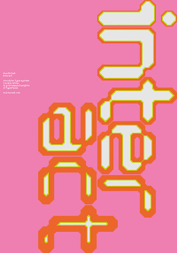
Silk-screened poster (2010) for the Interact type system using the colours PMS 926 and 809, in of an edition of 100 printed on 160gsm Naturalis Absolute Smooth. Dimensions: 100×70cm.
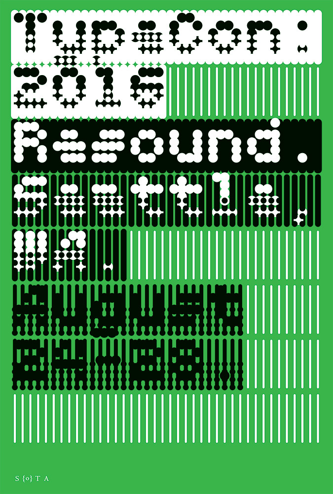
Top: MuirMcNeil’s identity design for TypeCon, the annual convention of the Society of Typographic Aficionados (Sota) held in Seattle in the United States, 24-28 August 2016.
Not that McNeil or Muir lose much sleep worrying about the opinions of their peers. They revel in the simplicity and beauty of type derived from maths, where the placing in a grid of marks that can be read as letters is determined by numerical variables within a set of strict rules. ‘These number sequences have incredibly different qualities,’ says Muir. ‘The visual outcomes to sequences in multiples of eight are very different to those in multiples of seven; they govern the form in an interesting way … allowing accidents to be part of it.’
McNeil applies another metaphor: ‘We’re following pheromone trails, the way ants do. We are trying to establish sets of conditions and then to play them out.’
However Muir are McNeil are not content to leave their work in a typographic Petri dish. Aesthetic judgement, plus their sense of what works, quickly enters their mode of production. Their typefaces have a robustness that belies their experimental origins.
The pair began working together almost a decade ago. Both teach design at the LCC – Muir part-time. Muir says: ‘We discovered a shared set of interests which 8vo [Muir’s earlier practice, see Eye 37] had touched upon but hadn’t really got hold of in a big way. And we developed it.’ McNeil adds that the two things they talked about most were a) the notion of using systems to make design; and b) the concept that ideas are less important than ‘processes of enquiry or discovery.’
Muir frequently (indeed notoriously) disdains suggestions that design is ‘creative’ or ‘about ideas’ – what he calls the ‘look at clever little me’ stuff. He worries that such notions seriously inhibit young designers.
‘One sees students struggling with the tyranny of ideas and the belief that to be a graphic designer they have to … have an idea! So as they sit around, some tutors will give them methodologies for generating ideas, like spider diagrams and Post-it note workshops.’
‘When you unpick it,’ says McNeil, ‘it’s not about “idea-lessness” as in being a cow in a field chewing the cud, it’s about restricting your ideas to some very defined parameters that are more associated with form-giving than they are with trying to be “creative” ... in the manner of Bob Gill, for instance.’
MuirMcNeil’s work has always sought to be about content and context, through discovery more than preconception. Muir likes to quote the late Ian Noble’s notion of ‘standing still and digging deep’. The pair’s embrace of process and systems echoes many forms of culture, including the Systems Group of the 1960s; artists and designers such as Frieder Nake, Hansjörg Mayer and Paul Brown; composers such as Steve Reich and Michael Nyman; and film-makers Peter Greenaway and Godfrey Reggio. They cite the long history of what they call ‘constructed’ typefaces, whose appearance is determined by the technologies used to make them. Their long list of examples spans five centuries, including the Romain du Roi, the Plaque Découpée Universelle, commercial stencil types and DIN 1451, plus alphabets by Renner, Bayer, Albers, Koch, Cassandre, Frutiger, Knuth, Norm and Lineto.
The uncompromising mathematical thrust of their typefaces can seem diametrically opposed to the warmth and legibility of current ‘golden age’ type designers, and the humanistic approaches taught at KABK (the Dutch Royal Academy of Art) in The Hague and at the University of Reading. True, with their typeface ThreeSix, which began as a research project in 2010, they attempted to reconcile these divergent approaches – constructed type and humanistic type – through optical interventions in the forms at different sizes. But the solitary furrow they have ploughed since then can make them seem like type design world outsiders. McNeil holds forth: ‘The idea that letterform [design] is not necessarily the product of the hand, the body, the arm, the proprioceptive* senses, that it can be about a system of visual differentiation, has quite an extensive history and a fascinating one, yet it is frowned upon nowadays.’
Could this be merely the working of the pendulum of fashion? ‘Partly that,’ answers McNeil, ‘but it is mainly to do with the fact that the technology – FontLab, Glyphs, DTL FontMaster – is very much about making extremely sophisticated structures. And the people who make them push that as far as they can – the people who spend all of their time being type designers.’ He worries that the institutions who encourage this ‘are entrenched in a pre-Modernist approach’, whose work, despite its sophistication, cleverness and elegance, ‘has an attitude that is somewhat shackled by tradition.’
Muir says: ‘We’re attempting to work at the boundaries of language and alphabetic form. Notions of legibility are over-emphasised. You can push type almost to destruction and it can still be read – it depends on the context.’
As rebellious ‘outsiders’ go, McNeil and Muir are remarkably well accepted and acclaimed by the design establishment. Both men combine design practice with teaching, and they are long-standing members of prestigious design organisations – Muir in Alliance Graphique Internationale (AGI) and McNeil in the International Society of Typographic Designers (ISTD). Muir is well known as a founder of UK practice 8vo (1985-2001) and their legendary, eight-issue design magazine Octavo (see Eye 9), which Unit Editions is publishing as a big, Kickstarter-funded book later this year.
Yet they proudly relish their ‘outsider’ status, a sense that the way they work – through experimental processes closer to chemistry and biology – goes against the grain of current design fashions and obsessions.
They make typefaces first of all for themselves, and then for other graphic designers; their work has a small but substantial fan base. Despite their enthusiastic immersion in the pleasures of process, deep down they understand that a typeface has little value until it is used.
And they strive to make typeface families that work. Some of the letterforms in which they find inspiration – such as those devised by Wim Crouwel for his Stedelijk museum posters – were made in very limited character sets, sometimes no more than the handful of letters needed for each poster’s text. MuirMcNeil, however, habitually take on the responsibility of creating a full ‘Latin 1’ standard character set, including ligatures. The lighter, simpler weights of ThreeSix, for example, are reassuringly legible as 10pt text printed on newsprint in U:R/D 03, the Unit Editions tabloid about the project, and there is enough craft and care in the multiple iterations of the typeface to meet the needs of designers with very different agendas.
For certain practitioners, MuirMcNeil’s type systems strike powerful chords. In New Zealand, Auckland-based designer and typographer Catherine Griffiths admires what she calls their ‘Sol LeWitt obsessiveness’, saying ‘it sort of sucks you into a void, where the “dirty” of design occurs, where such deep drilling defies all that might be in vogue.’
Griffiths has used MuirMcNeil’s typefaces in magazine covers for Desktop (Australia) and Brain (Japan), and in posters for her workshop series ‘typ gr ph c’ and contemporary dance by Oliver Connew. When Griffiths took part in ‘The Alphabet’, a 26-day art project with the US regional newspaper Sentinel & Enterprise (in Fitchburg, MA) in which 26 different typographers set a different front page character each day, she used TwoPoint for her letter ‘U’.
Griffiths’ dazzling ‘Collidescape’ (2015-17), a seven-metre high grid of glazed panels at the entrance of Te Kei, the new building designed by Athfield Architects at the Ara Institute of Canterbury in Christchurch, New Zealand, makes use of TwoPoint and Panopticon.
Pentagram’s Eddie Opara specified ThreeSix in his identity design for Makr Shakr, the ‘robotic cocktail bar’ made for the Google I/O conference in 2015, playing on the typeface’s associations with ‘retro futurism’ for this jokey installation / experiment.
Designer and teacher Nick Kapica used ThreeSix for the concrete entrance panel for a university building in New Zealand. Kapica has known Muir and admired his work since the former was a student nearly three decades ago, and had seen the typeface in its early research phase in 2008. He also used ThreeSix for the limited edition ‘1974 Clock’ (2011, with product designer Chris Jackson) and Panopticon for the 2015 ‘A L’Arme!’ music festival in Berlin.
Both McNeil and Muir are old enough to remember a time when graphic design practice required the careful drawing and specification of artwork for printing, the struggle of trying to control a Rotring pen, compasses or a scalpel blade. Yet they are young enough to have been involved in the first flush of digital culture. They experienced the computer’s impact upon the design industry in the late 1980s, 90s and 2000s; Muir’s work with Octavo has had a profound influence on more than one generation of graphic designers.
Muir: ‘Because of our ages, we started our design careers pre-desktop computers, and we had to make things by hand. It’s a different way of thinking … especially the notion of specifying things for others to do, such as typesetting and printing. I can’t imagine what it must be like to learn to be a graphic designer without having had those experiences.’
And though they sometimes claim that their constructed typefaces could have been worked out on graph paper, the multiple variations they explore benefit from the iterative power of computer software, while their use of the computer is informed by their earlier experiences in artworking.
Muir notes that the computer – as a tool – is a more clean, quick and precise way of doing what he used to do on paper. ‘While you’re actually making the stuff you are also generating the final form, the artwork,’ he says. ‘You can do everything at once now.’
However, because the designers vividly remember how things used to be, the older, more time-consuming, physical processes are still embedded in the way they work and think. McNeil talks about the ‘resistance of media’ as something that channels and gives conditions for the production of work. ‘The computer is very lacking in any resistance,’ he says, ‘it’s a fluid environment.’ They replicate their knowledge of constraints from earlier modes of production. Muir cites the ‘snap to grid’ software option as a way ‘you can push the computer’ to work the way they think.
Now they have made the ‘bricks’ (in Muir’s word), the interesting part is constructing the building. Both McNeil and Muir take pride in the unfeasibly large quantity of printed material they have produced to display their typefaces – whether for clients or for themselves. The unselfconscious ease with which their work straddles the digital and the physical reaches its apotheosis in their exquisitely screenprinted posters. Their plan chests are bursting with such specimens, often using foils and special colours, such as neons; they both love the sensual pleasures of print, the deep blacks made possible by the screenprint process. Given the vast number of options available to them with any weight of any typeface, one might wonder how they ever agree what makes an acceptable final print. They explain that this is a time-consuming process, but one that they greatly enjoy.
Muir typically tiles out posters from A4 print-outs. McNeil says they can happily talk about them all day, focusing purely on their visual responses to what they have made. ‘I’m very bad at making decisions about something unless I can see it printed out full size,’ says Muir. McNeil cites David Hockney’s view that being an artist is about the pleasure of looking, about paying attention. ‘That’s what we’re doing, using our eyes.’ Muir returns to the subject of education, lamenting the decline of life drawing lessons. ‘You’re not really teaching people to be draughtsmen,’ says Muir. ‘You are teaching them to use hand, eye and brain at the same time, and make judgements about the marks and how they all fit together.’
Nevertheless, the designers agonise over their choices. ‘There is a fight going on all the time, internally,’ says Muir. ‘That’s the interesting thing about the systems approach, which is how strict you are about your intervention with it. Whether you make any rules, or whether you just trust your instinct.’
‘That’s the friction,’ declares McNeil, ‘the grit in the oyster. Aesthetics are usually seen as purely visual, as either beautiful or not, but for both of us, systems are aesthetically beautiful. I understand that this is largely to do with human pattern-making requirement – because of the way the brain works – but it is not often acknowledged as just a perfect place to be!’
John L. Walters, editor of Eye, London
First published in Eye no. 94 vol. 24, 2017
Eye is the world’s most beautiful and collectable graphic design journal, published quarterly for professional designers, students and anyone interested in critical, informed writing about graphic design and visual culture. It is available from all good design bookshops and online at the Eye shop, where you can buy subscriptions, back issues and single copies of the latest issue. You can see what Eye 94 looks like at Eye before You Buy on Vimeo.