
Summer 2010
Reputations: Alex Steinweiss
‘I got this idea that the way they were selling these albums was ridiculous. The covers were just brown, tan or green paper. I said, “Who the hell’s going to buy this stuff? There’s no push to it. There’s no attractiveness. There’s no sales appeal.” So I told them I’d like to start designing covers.’
The first illustrated album cover was designed around 1940 for a 78rpm record, by Alex Steinweiss, art director at Columbia Records. And it was he, in the early 1950s, after designing hundreds of packages, posters and catalogues for Columbia, who created the paperboard LP cover to protect and market the latest revolution in music delivery, and in the process defined the visual identity of recorded music for decades to come.
The 93-year-old Steinweiss does not receive the recognition given to Paul Rand or Lester Beall, widely considered to be among the form-givers of American Modernism, but he was just as much a pioneer of corporate branding insofar as he gave a major recording company a distinctive identity.
The son of a Polish shoe designer and a Latvian seamstress, Steinweiss was born in 1917 in Brooklyn, New York. On the strength of his high school portfolio – he had been taught by Leon Friend, the co-author of Graphic Design, America’s first comprehensive book on modern visual communication – he won a scholarship to Parsons School of Design in New York. After graduating in 1937, he got a job with the Viennese émigré Joseph Binder but later quit to start his own studio. Then he heard CBS had bought the American Gramophone Co., renamed it Columbia Records, and had an art director’s position available. The rest is design history.
Cover for Cesar Franck’s Symphony in D Minor. Released by Columbia Records. Design: Alex Steinweiss.
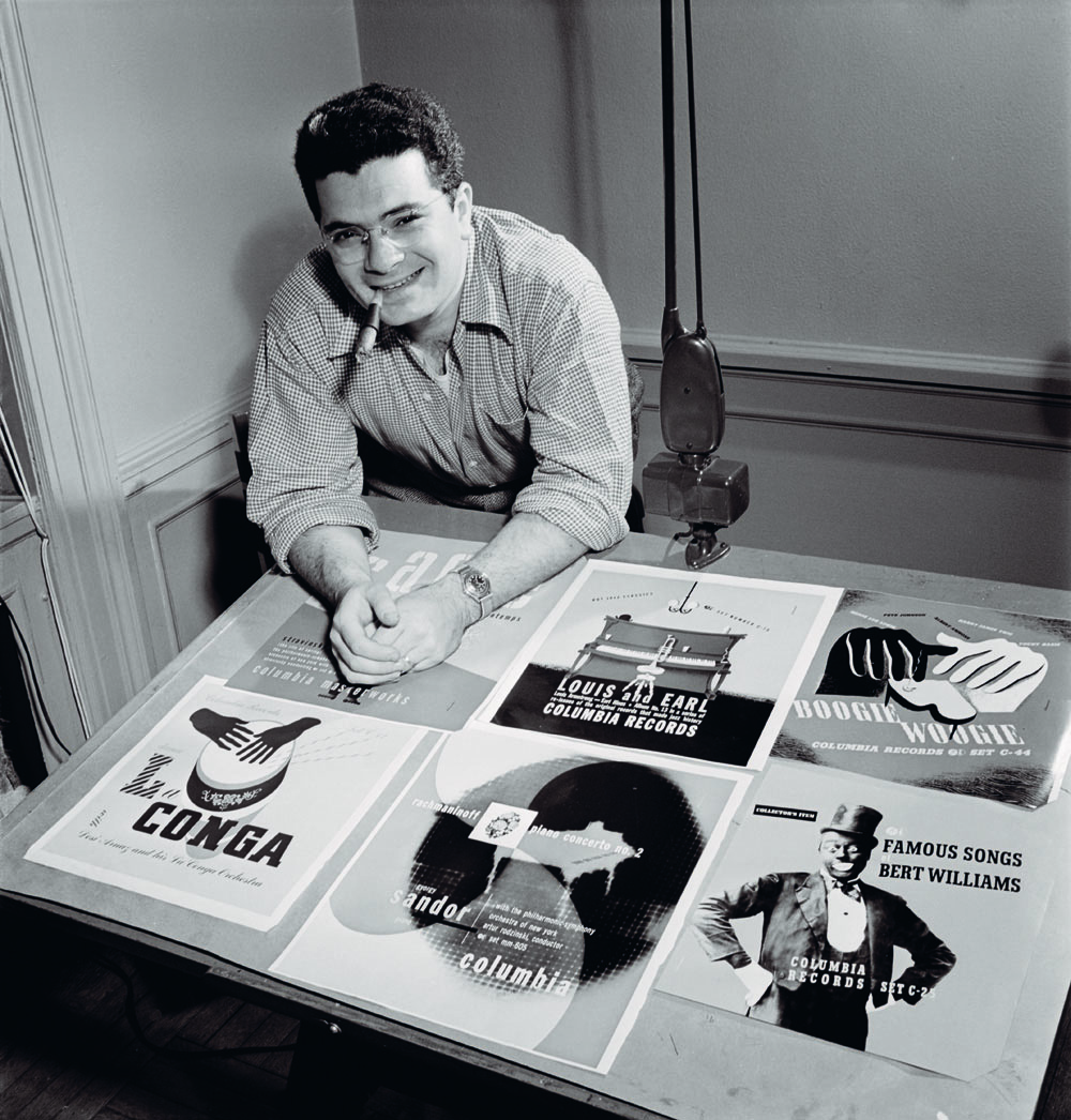
Above. Alex Steinweiss in his studio, 1947. Portrait by William P. Gottlieb.

Steinweiss’s covers were designed as mini-posters. Yet they did not mimic his heroes Lucian Bernhard or A.M. Cassandre; his graphic style was unique – and even today entirely identifiable as his own. His strategy was simple: rather than show a portrait of the recording artist, he believed musical and cultural symbols would more effectively stimulate the audience’s interest. His most striking covers always had strong central images, eye-catching lettering and distinctive colour combinations.
Constraint influenced his design as much as any formal considerations. With no type shops in Bridgeport, Connecticut (where Columbia was headquartered), he had to hand-letter the titles, eventually developing his trademark spaghetti-like ‘Steinweiss Scrawl’. And the lack of process colour engraving forced his flat colour palette.
Steinweiss was a prodigious cover designer for Columbia, Everest and other labels until the early 1960s, when changes in the industry damaged his practice and business. At the age of 55 he ‘bowed out’ of graphic design, and moved to Sarasota, Florida, to pursue first ceramics, then painting.
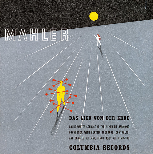
Cover for Bruno Walter conducting the Vienna Philharmonic Orchestra – Mahler: Das Lied von der Erde, 1943. Released by Columbia Records. Design: Alex Steinweiss.
Then the design history movement started resurrecting its forgotten pioneers. A monograph, For the Record: The Life and Work of Alex Steinweiss co-written with Jennifer McKnight-Trontz, was published in 2000. Kevin Reagan teamed up with Taschen in 2009 to produce Alex Steinweiss: The Inventor of the Modern Album Cover, an exhaustive survey of his covers and other graphic design. At 422 pages, measuring 39.6cm 3 33cm, it is possibly the largest design monograph published.
Today Steinweiss is happy to receive the recognition, but he is not as spry as he was a few years ago when I conducted the following interview, which served as background for a few essays I have written about him, including forewords for both the books mentioned above. This is the first time the transcript, which provides an oral history of music packaging, has been published.
Steven Heller: Why did you choose to study design in the first place?
Alex Steinweiss: Leon Friend was the reason. At that time he was very strong on graphic design. He was training the kids to get involved in it. He inspired us by showing all the real masters of graphic design, mostly Europeans – Bernhard, Jean Carlu and Cassandre, and so forth. That hyped us all up. There were also activities in school connected with graphic design, including posters for school events, and designing the arts and literature magazines, notably one called Cargoes.
Originally, I got involved with marionettes when I was in the first year of high school. Leon Friend was involved in that, too – he was involved in everything. So when I went over to the art room to discuss marionettes, I saw all of these guys, like Gene Federico and Billy [William] Taubin [later the art director of the “You don’t have to be Jewish to love Levy’s real Jewish rye” ad campaign] bending over boards on which they were doing hand-lettering. They were doing signs for the school. I was a kid of fourteen, and I said to myself “Jesus, this is like a miracle. They take a brush, dip it in some paint, and they make letters!” So I got into that. I said to myself, “If some day I can become a good sign painter, that would be it.”
SH: This was Depression-era America. How did your parents like your career path?
AS: We were living in Brighton Beach [Brooklyn] and were very poor at the time. My father, a ladies’ shoe designer, came from Warsaw, Poland. My mother, a great seamstress, who came from Riga, Latvia, was very strict, yet all she said was: “No paint on the floor!” I made myself a table from plans in Popular Mechanics magazine. I bought myself a board that was used to roll out dough and made a base; I set it up at an angle and got goose quills from the butcher and cut my own nibs. Then I started to letter like an old monk. I practised and practised and practised all the scripts, and finally got my hand to do what I wanted it to do. That was the beginning.
SH: So you perfected a style?
AS: Well, I took every kind of art class that was available, and ended up as a major in graphic design – the course given by Mr Friend. He got everybody worked up; for me to be able to do a piece of artistic communication for the public was a very important thing. I didn’t even know that I could draw at the time. But apparently, it was lurking in the background, and it came out.
SH: It’s one thing to have talent, and another to get work. How did that happen?
AS: I was in the right place at the right time. I had met Dr Robert L. Leslie [famed proprietor of New York’s Composing Room and publisher of PM – later A-D – magazine] when I was a student. He was always looking for new talent and recommending people to the agencies and designers around town. It was a different era then, you know. The desire to create good things, beautiful things, was so strong.
SH: What made that time so special?
AS: It was a whole new thing for people to discover the beauty of putting type together with illustration in the form of posters, books, booklets, packages and so forth. And everyone involved in it that I knew was very much like an idealist, trying to do the very best regardless of remuneration.
SH: In addition to design, you were a gymnast?
AS: I was very good at academic work. But yes, I was involved with gymnastics and performed in and out of school. I was a health nut. On Saturdays I’d go to the gym at City College of New York and then go to Macfadden’s Penny Restaurant and have a dish of soaked prunes for two cents and cracked wheat for another couple of cents. But gymnastics was never going to be my career. I applied for a scholarship and was awarded one year tuition at Parsons School of Design.
SH: I understand that you were not the most co-operative student at Parsons, is that true?
AS: I made a nuisance of myself and was called into the president’s office. He told me to straighten out and fly right, or else I’d get kicked out on my ass! I said I didn’t mind that, because I’d be able to get a job. At that age I could afford to be brave.
SH: So that’s when you sought out Boris Artzybasheff, the fantastical and satirical illustrator of books and Time magazine covers?
AS: Yes. I wrote him a letter offering my services as a paintbrush cleaner and sweeper. He invited me to his apartment and I can still remember being there. It was 45 Christopher Street in Greenwich Village. He had a sunken living room, and all his beautiful originals were around. He only used the apartment for work – he was married to a very rich woman uptown. So he sat me down, we talked, and finally he gave me a little advice. He told me to get along with people in this field, even though you don’t like them – which was apropos at my stage in the game. Then he showed me some tricks: he showed me how to make a transfer sheet with silk and crayon.
SH: When I came out of that meeting, I went back to Parsons a different person (fortunately, I hadn’t planned to quit Parsons until I secured a job). Incidentally, I also took a teaching course at NYU because my momma said that the only people who made money during the Depression were teachers.
AS: Your design career really started when you met Lucian Bernhard, isn’t that right?
SH: I showed up unannounced at his studio on East 86th Street. His son, Carl, came to the door and asked, “What can I do for you?” I told him I was graduating school. He said: “Don’t you know you’re supposed to call for an appointment?” I apologised and he looked in the portfolio anyway, and apparently liked what he saw. He said,“Sit down, and I’ll get the master to look at it.” For about a half hour I was sitting there in a pool of sweat. Then Lucian comes out, and he said [puts on a thick German accent] “Mishta Shteinweiss, I have looked at your work and I like it very much, and I have already called my friend Joseph Binder, who just came from Vienna, and is looking for an assistant.” So I took the bus down to Binder’s apartment on 59th Street, and he hired me and another guy.
SH: Is this how you learned to work with an airbrush?
AS: He asked whether I knew how and I said yes. Truth is, I had never even held one in my hand. He worked in a little bedroom, doing his typical Binder posters for Ballantine’s beer and other things. I learned how to use the airbrush.
A month and a half later, Mr and Mrs [Carla] Binder called me in, gave me my cheque, and said: “I’m sorry, but business is getting very slow, we no longer need either of you.” I didn’t mind; it was great just to work with him for seven weeks. I learned a lot…
SH: I met Mrs Binder when she was 90 years old, still living in the very same apartment you worked in. I could tell she ran things very well.
AS: Yes, she did. And the next morning, Mrs Binder called me and said: “Mr Steinweiss, Mr Binder really likes the way you work better than the other man. We’d like you to come back on Monday. The only reason we did it this way was not to hurt the other man’s feelings.” I came back and worked there for three and a half years.
SH: Then it was time to make it on your own?
AS: I was getting fed up with doing another guy’s finished paintings and drawings. I was dying to get some creative work under my belt. I had an architect friend by the name of Morris Sanders, and I made a deal to use some of his empty space. My wife, Blanche, was representing me, trying to get some freelance work, but nothing concrete. It was the end of 1939. Then Dr Leslie called to tell me that CBS bought a record company in Bridgeport, Connecticut and would I be interested in becoming the art director? Who wouldn’t? So I had an interview with Pat Dolan, who was the advertising manager. He said, “Well, you’re a little young for the job, but let’s give it a shot.”
SH: You’ve mentioned that your office was a big barn-like room with only you at a drawing board…
Me and a tank of air and an airbrush. I started doing all kinds of promotion. Columbia was going to knock RCA [the market leader] off the scene. We reduced the cost of the albums from to and produced promotions, booklets, posters, catalogues for all the classical, pop, and international records [which kept Steinweiss working for 24 hours a day]. I didn’t even have a paste-up person then. After everything was finished, I literally collapsed. I was in bed for a week. The doctor said he never saw such a case of complete fatigue in his whole career. After that, they let me hire some help.
SH: How did the first covers come about?
AS: I got this idea that the way they were selling these albums was ridiculous. These were shellac records and they were in four- or five-pocket albums to make one symphony. The covers were just brown, tan or green paper. I said: “Who the hell’s going to buy this stuff? There’s no push to it. There’s no attractiveness. There’s no sales appeal.” So I told them I’d like to start designing covers. Dolan’s response was: “Then we’ve got to buy plates and start printing, and it adds cost.”
SH: But you must have had allies, or you wouldn’t have been able to make such a revolutionary change…
AS: I made very good friends with the vice president in charge of sales. He saw the value in what I was doing. He got all the dealers hopped-up about it.
SH: Yet they balked at the extra production expenses?
AS: They had to balk. Bridgeport was a desert. The city was known for making guns, bullets, nuts and bolts. There were no typographers. There was no such thing as a photostat. There was an engraver, but he only worked in black and white – he did not know what the hell to do with colour (and process colour didn’t exist). So I had to teach the engraver what to do – it was really quite an effort.
Sure, Columbia balked, but they saw the light. There was one album with a Brahms Symphony where sales shot up 800 per cent when I put a cover on it. That was enough of a convincer.
SH: What guided you in the kind of concept and style you used to make those early covers? Since there were no conventions, you had to invent them.
AS: I was very much involved with music as a kid. I had some musical talent, although I never played an instrument. My father took me for a singing audition, and they said I had perfect pitch. I’d go to the Metropolitan Museum when the Mannes Orchestra played there. I’d sit in galleries and look at paintings and listen to music. So when I joined Columbia, I was really open to music. I knew a lot about Mozart, Beethoven and Brahms. Then I got involved with jazz and folk music. Columbia had great artists: Benny Goodman, Harry James and all those guys. I’d come to New York City once or twice a week to watch the artists record in the studio.
SH: But where did your style come from?
AS: Because I felt that, promotion-wise, the interest of consumer wouldn’t stimulated by looking at a picture of Mozart, I tried to get into the music, either through the music or through the life and times of the artist or composer.
For example, if it were a Bartók piano concerto, I’d want to make it seem more contemporary.
So the look that I wanted to put on the cover was not a picture of Bartók – what the hell does that mean to anybody? Nothing! So I got into the instrument, into the piano. I took elements, let’s say, of the piano – the hammers, the keys, the strings. I composed that in as contemporary
a setting as I could, with colour, etc.
If you talk about Bartók, you talk about Hungary. And you talk about the fact that he spent all his life recording folk tunes of Romania and Hungary. So I would use a little suggestion of a peasant figure. That’s the way my mind worked.
SH: You did hundreds of covers. But eventually there were too many to do all by yourself. Did you hire Jim Flora to do jazz albums?
AS: As the albums became more successful we needed more creative people. One of the guys hired was Jimmy Flora. He came from a little town in Ohio. I didn’t find him, Pat Dolan did. He took over a lot of the jazz covers because his style lent itself to it.
SH: You set the standard for 78rpm album design. But also for 33 1/3 rpm LPs. How did this happen?
AS: Right after the war I was on retainer to Columbia. In 1947, I think, at one of my lunches with Ted Wallerstein, president of Columbia, he took something out of his drawer and went over to the record player and put it on. We started listening to music as we talked. You got into the habit in those days of waiting for the record to drop after four-and-a-half minutes (the normal running time of a 78). It played for ten, twelve, fifteen minutes. So I said: “What the hell is this?” He said: “You’re listening to the first pressing of an LP record.”
SH: Wow! That’s historic.
AS: “But,” he continued, “we’ve got a packaging problem. We tried these Kraft [paper] envelopes, and they are leaving marks all across.” He said when the records were stacked up in boxes and left in the box car, they got marks from the thickness of the paper. He needed a solution, “otherwise we’re up the creek”. So I took on the assignment, and designed the LP jacket you have today. I found a manufacturer and all the rest. The guy had to invest, at that time, about a quarter-million dollars in equipment.
SH: Wasn’t your brother-in-law involved with this?
AS: Yes, he found the guy who produced the material. Actually, we were making some money on the deal, independent of Columbia. But later on, he bought out my share and he ran it. I didn’t want to have anything to do with being a salesman of packaging. Maybe that was stupid. But I remained a designer – that’s what I wanted to be. (The original patent was in my name, but I had to sign a waiver that everything belonged to Columbia.)
SH: As far as design went, there was a stylistic difference between the LPs and the 78s you did early on. Why?
AS: It depended on the client. London Records was imbued with the idea of photography. So there was a period, in order to eat, that I had to design shots and supervise the shooting of models and artists in the studio. At Decca, I could do whatever I wanted in classical because the A&R director had a certain respect for my talent. But the pop guys wanted to go a different way – photography. So that was a lousy period in my life.
SH: So why did you leave Columbia after all you contributed to their success?
AS: I forget what year it was but Ted Wallerstein got into a fight with William Paley [chairman of CBS] about company policy, and Ted quit. He was the guy in my corner. We’d had a relationship since the company was formed.
There was a guy who used to be the head of A&R for Classical Music, named Goddard Lieberson – a great front office guy, very handsome and well-spoken [he was also a composer]. I used to have lunch with him quite often and he’d play me test pressings. He became the president of Columbia Records. I won’t go into any detail – it was a sordid story – but he hired other art directors. He never called me to tell me they were changing their whole policy and were designing things in-house. He never told me.
SH: That’s tough.
AS It did dislocate me a bit. It took me some time to get back on my feet, because that was a major account. But it worked out fine [Steinweiss went on to freelance for other clients, including companies outside of the music industry].
SH: Did the musicians and composers have any control as to how you designed their albums?
AS: In those days they had no control. But there was a guy by the name of Andre Kostelanetz, who sort of had some control. But he exercised it in a gentlemanly way. I would go to New York, and we’d sit down over food and we’d talk about it. He’d give me his ideas, and I would try my best to bring out his idea without sacrificing mine. And he was happy. Leopold Stokowski wouldn’t have anybody else do his things but me. And I used to get letters from the artists, thanking me for the covers I did for them. So there was no outside control. But that was the reason, many years later, I left the business.
SH: What do you mean? Did you lose control?
AS: After I left Columbia in 1943 [to work for the US Navy’s war effort], I was freelancing for Decca, London and other independents. In the 1960s I would come into an office in my regular business suit and the guys would be sitting around in boots, Levi’s, long hair, fringed leather jackets, and look at me as if I was from Mars. “Who the hell is this guy? He wants to sell work to the record business? No way.”
Rock people, who were controlling the record labels, were only interested in sales. They were not interested in anything that you would say was connected with beauty or idealism. These guys were mostly Seventh Avenue salesman who came over to the record business because the kids were getting involved in all this rock stuff. The rock people had their own artists and designers who thought the way they did. It was foreign to me.
SH: So that was the end of that chapter?
AS: I was 55 years old and at the urging of my wife, I sort of bowed out. Unless you were Paul Rand or Will Burtin, it was too much of a race. It was too demanding of me at that particular time in my life. So I got involved in ceramics. I learned the rudiments, and then I went on my own and set up a studio. The idea of being a craftsman was very, very strong. Finally, I developed a style of my own and made about 300 pieces.
When I moved down to Florida, I brought my whole shop down here, but I never did any more because I got involved in painting. So, that’s what I have been doing, I’ve just been painting.
First published in Eye no. 76 vol. 19.
Eye is the world’s most beautiful and collectable graphic design journal, published quarterly for professional designers, students and anyone interested in critical, informed writing about graphic design and visual culture. It is available from all good design bookshops and online at the Eye shop, where you can buy subscriptions and single issues.