
Winter 2017
Reputations: Atlas, Astrid Stavro and Pablo Martín
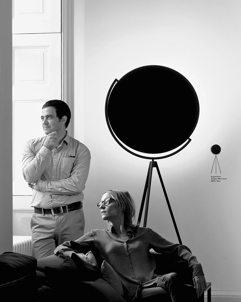
‘You have to be the orchestra conductor, taking control of all these elements and making them magically come together’
Since Astrid Stavro and Pablo Martín merged their design studios in 2013 to form Atlas, their combined practice’s rise to international renown has been rapid. The couple had each already established robust professional reputations in their own right, and have seen continued success with their joint venture; since Atlas’s foundation they have won a raft of design awards, appointed two senior associates, and opened an Atlas office in New York. In September 2017 they moved their family to London, adding another outpost to Atlas’s increasingly global enterprise. Atlas’s work has cemented the standing of both Stavro and Martín as formidable, accomplished and generous-spirited figures within the international design community.
Born in Trieste in 1972, Stavro had an early introduction to the editorial arts through her father’s printing and publishing company. She studied literature and philosophy at Boston University before graphic design beckoned. After cutting her teeth in several Spanish consultancies, she moved to London to study at Central Saint Martins (2000) and the Royal College of Art (2004). After graduating, Stavro returned to Barcelona and established Astrid Stavro Studio, building a portfolio that demonstrated a flair for editorial design, with clients including the Art Directors Club of Europe, ICA London and Disseny Hub Barcelona (DHUB).
Martín (b. 1964), a Barcelona native, studied graphic design at EINA, Centre Universitari de Disseny i Art (1985). After stints at Mario Eskenazi Studio in Barcelona and Vignelli Associates in New York, he founded Grafíca with Fernando Gutiérrez (see Eye 36) in Barcelona in 1993, establishing their reputation with work for Camper, Metalarte, Phaidon and Canal Sur, plus newspapers and magazines including La Vanguardia and El País de las Tentaciones. After Gutiérrez’s departure for Pentagram in 2000, Martín ran Grafíca for thirteen more years. His work was recognised in 2013 with Spain’s highest design accolade, the National Design Award.
La Resistencia, a newspaper that unfolds into a protest poster for the Barcelona photography festival Tràfic ’08, 2008. Designed by Grafíca, Pablo Martín’s company before he and Astrid Stavro established Atlas in 2013. Top: Portrait by Philip Sayer.

Stavro and Martín left Barcelona for Mallorca in 2009, re-establishing their practices in a shared office in Palma. Although working together had not been part of the plan, their proximity resulted in a blurring of boundaries, and Atlas was formed in 2013, with highly visible commissions such as their identity for Barcelona’s Museu del Disseny (see Eye 91) and their redesign of Elephant magazine. Other notable Atlas projects have included identities for Huguet and Jijibaba, plus editorial design for Phaidon, Laurence King and others.
Stavro and Martín are enthusiastic participants within the international design community, with memberships including AIGA New York (Design Leaders), D&AD, ISTD and The Typographic Circle, and frequent teaching and speaking engagements worldwide. Both are also active within Alliance Graphique Internationale (AGI), with Martín currently President of AGI Spain and Stavro a member of the AGI International Executive Committee. That the pair balance such extra-curricular activities with client work – not to mention maintaining a marriage and raising a young son – is testament to a modern, nomadic and engaged approach both to graphic design practice and to the integration of work and life.
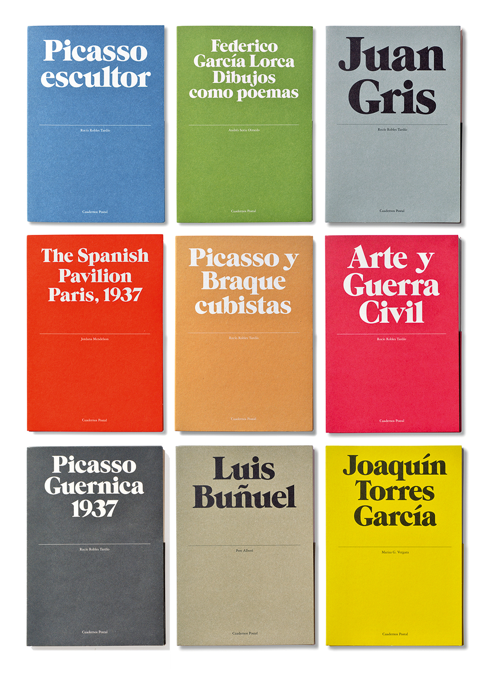
‘Cuadernos Postal’, a collection of postcard-sized art and architecture monographs designed for Ediciones La Central, 2005. Design: Astrid Stavro Studio. The design of these folder covers, which use ITC Grouch for the artists’ names, makes reference to the dividing central line present on the reverse side of a standard postcard; each folder contains a book, postcards and a folded poster.
The following conversation took place via Skype just before their departure from Mallorca, and in person shortly thereafter at Electric House in London.
Anna Lisa Reynolds: After eight years in Mallorca, the two of you have just moved to London. How much of Atlas is coming with you?
Astrid Stavro: Just Pablo and me. Our design teams and associates are still based in Palma. We have always had a very international way of working, and a nomadic spirit at heart, so for us the notion that a team has to all work under the same roof is obsolete. That’s actually one of the reasons why we named the studio Atlas, it was all part of the plan! For work, where we live is not really important, but for life, yes.
Pablo Martín: Mallorca was never meant to be forever. We knew the time would come when we needed to be in a big city.
What made you decide on London?
AS: I love London, but Pablo prefers New York, so we’ve been having that debate for a couple of years. In the end, we decided on London because it is great as a hub between Palma and New York and everywhere else,and for the cultural input, more for our son perhaps than for us. But we work wherever there’s a wi-fi connection.
Identity design for Universidade de Vigo, Spain, 2006. Design by Pablo Martín’s Grafíca. A bespoke inline typeface, Campus, was created for the project, to contrast with the more classic serif used elsewhere within the identity and logotype.

How does it work with your New York office at the moment – is someone based there all the time?
PM: It’s more of a pied-a-terre right now, but in the next couple of months, once the visas come through, we plan to have someone there on a more permanent basis.
AS: We work a lot with Skype and conference calls with different countries, different time zones, both with clients and with designers. But for New York clients you have to be there – they want that face-to-face.
PM: We still feel that meeting with a client is important, so if a new client is in New York then I’ll fly to New York. Astrid was already travelling to London a lot for the same reason. When we moved to Mallorca people were surprised, but when we told clients about the move to London they just took it in their stride.
AS: And with the designers, you art-direct and manage the process – it’s not that you have to be there next to them.
Editorial design for Elephant magazine no. 30, Spring 2017. Astrid Stavro: ‘With Elephant, we were working within a different set of parameters every time to keep ourselves on our toes … You want things to change in the time that passes between each issue, and for the design to make sense with the content and to not overshadow the art.’

The move to London happened around the same time that your work on Elephant magazine came to an end – was it your decision to stop, or theirs?
AS: It was theirs. There wasn’t a fall-out or anything; we’re still on really good terms. We had a great three years doing Elephant [eleven issues, 2014-17]. We made it really hard for ourselves because we almost had to redesign it every time – otherwise, it became boring very fast. I think it’s slightly over-designed at times, but then you do want to draw the reader in through those poster-like spreads…
PM: Elephant brought a lot of people to us, and our designers put the extra hours in because they really engaged with it.
At the same time as working on your final issues of Elephant, you’d also started working as brand art director for Jaime Hayon and Jasper Morrison’s new clothing venture, Jijibaba …
AS: Yes – that project came about through Richard Schlagman, who we knew through Phaidon. He called to ask if I would be interested in working with him on a new brand with two very important designers, but he wouldn’t tell me who they were. The entire thing was very cloak-and-dagger, but once he told me it was a British industrial designer and a Spanish product designer, I put the pieces of the puzzle together pretty quickly. The brief for Jijibaba was to design the identity and to consult on everything – not just the logo and stationery but also the clothing labels, the lookbook, the communication strategy, the exhibition at Somerset House, the displays in Dover Street Market … I have never worked in fashion before, and I was excited by the creative opportunities the project could offer. Jaime and Jasper are not from the fashion world, so they think in a different way.
Identity design and printed matter for Teatre Principal, Palma, Mallorca, 2016-17.


Conducting an orchestra
Did you draw upon your experience in editorial design for the project at all, bringing so many different things together within one project?
AS: You have to be the orchestra conductor, taking control of all these different elements and making them magically come together in time for the launch. It’s an ongoing process, so we have really only just started, and because neither the clients nor I have worked in fashion before, we are all learning.
Do you still have the same enthusiasm for editorial design, and are you keen to do more?
PM: I would love to do another newspaper. I actually worked on my first online newspaper recently with Mark Porter, for El Nacional.cat. The ex-director of La Vanguardia approached me, and I didn’t have any experience in editorial design for online so I suggested to Mark that we work on it together.
Posters for Barcelona’s Museu del Disseny, part of the dual identity designed by Atlas for the museum and Disseny Hub Barcelona (DHUB), 2015-16. The diagonal line device used on these posters, which appears throughout the identity, is derived from an aerial view of the intersection of three of Barcelona’s main thoroughfares at the Plaça de les Glòries Catalanes, the location of the building that houses both institutions.

How is that process different from working on a print newspaper?
PM: It’s a very fast process. It’s funny because when a project is for print, people understand that you need time, but for the web they think it can happen instantly. I do quite like the online world, even though we have always been very inclined towards print.
It’s like the first time you do a newspaper – you learn so much, and then you know the next one is going to be better. I do like the complexity of a newspaper, but at the same time I like a packaging project, or a logo, or a brand … I’m the opposite of specialised.
AS: When editorial design projects have a lot of visibility, people start to associate you more with one kind of design. And that’s not true, because we do everything.
Astrid, does your affinity for editorial design stem in some way from your earlier studies in literature and philosophy?
AS: My philosophy career ended rather abruptly when I discovered Interview magazine. It changed my life – love at first sight. I was an avid reader, of course, but Interview was an entirely different visual language, in which words and images danced together. It coincided with moving out of my mum’s house and realising that I needed to make a living.
My first design job was as a bike courier and everything else for Alfonso Sostres, who I met by coincidence on the day he was leaving his role as art director of the magazine El Gran Musical – one of the closest things to The Face or i-D in Spain at the time. He was surrounded by cardboard boxes, literally moving out of the door. He hired me on the spot. I knew nothing about design; I really liked it but didn’t really know why. After Sostres, I worked for several other design studios, including two years at La Tinta China. I would go to the photocopy store to enlarge percentages of beer bubbles – one of the studio’s main clients was a drinks manufacturer – and then paste bubble after bubble into the mechanicals, with their multiple layers of transparencies and marked-up notes. At night, I dreamt of yellow bubbles for two long years.
‘Special edition’ wine label for 1856, designed for Mallorcan winemaker Macià Batle to celebrate its 160th anniversary in 2016. The centrally placed ‘1856’ on the black, white and gold silkscreen printed and foil blocked label are based on a letterpress-printed poster – given to the winemaker’s clients and wine cellars – using wood type and a press dating from 1913 at the Imprenta Nueva Balear in Mallorca. Photograph by José Hevia.

Pablo, how does that compare with your own introduction to design?
PM: My first encounter with graphic design was probably when I started to buy LPs in the mid-1970s, but what really attracted me to those album covers was the photography. At school I was taught how to use a darkroom, so I set up a small lab at home and began taking photos; that’s where my eye began its training. I considered going into architecture, but ended up studying design at EINA because Yves Zimmermann, whose daughter was in my class, recommended it. EINA gave me two basic skills: typography, which became an obsession, and visual thinking, thanks to Mario Eskenazi, who introduced us to the work of Alan Fletcher, Bob Gill, Robert Brownjohn and Derek Birdsall, to name a few.
Mario is the designer that has most influenced me, and I ended up working for him after graduation; also Michael Bierut, my boss at Vignelli Associates. I came back to Spain a different and better designer because of him.
How did you end up working with Vignelli?
PM: After five years, Mario suggested I should try working abroad, so when the chance to go to Vignelli Associates arrived I took it. While there, I worked on the layout of the monograph Design: Vignelli. When the book was almost finished, Vignelli asked me if I thought it would be improved by adding a rule on the top of each page. The book was produced the classical way with a mechanical for each spread, so adding a rule meant pasting a piece of repro paper using wax on to each of the pages: a lot of work. So I told Massimo no, I think it’s fine as it is. He agreed, but nobody at the studio could believe that I had just said no to Massimo Vignelli!
Identity design, packaging and exterior graphics at the factory for Huguet, a cement tile and terrazzo object manufacturer based in Campos, Mallorca, 2016-17. Photography by Gori Salvà.


Island life
What prompted the two of you to move to Mallorca eight years ago?
AS: We decided to move from where we were living in central Barcelona because that part of the city had become very touristy and crowded. It was almost like Venice …
PM: It wasn’t easy, and it wasn’t a good place for our son to grow up.
AS: We initially looked at property in Mallorca just for fun, because we both knew the island very well, but then we found a house there that we both instantly fell in love with. We moved in a month later, without thinking too much about it. Pablo and I are slightly naïve when it comes to decisions like that – we think a lot when it comes to work, but for personal stuff we have a kind of adventurous Tintin-like spirit. You need that element of chaos, because otherwise you would become like robots.
How did your clients react?
AS: There wasn’t any shock, though Pablo did lose a client – someone who liked to sit by the computer and look over his shoulder. But when we told other designers in Barcelona about the move, they thought we had lost it.
PM: ‘They’re retiring! They’re just going to go buy a boat, spend all their time fishing …’
AS: We thought the move might work against us, but it became a really good thing because we went against the current. Mallorca was a testing ground, in the sense that if we could make it work from there, then we could do it from anywhere …
PM: You should only move to islands, that’s what we’ve learned. Manhattan, Great Britain, or Mallorca …
AS: Surrounded by water, to keep the clients far away!
Do you each have your own design team within Atlas?
AS: Yes – in Palma I work on one side of the office and Pablo works on the other, and we try to keep it as healthy and independent as we can. People think we sit next to each other every day, holding hands, and it’s not like that!
PM: Sometimes at the beginning of a bigger project we will brainstorm together. We’re very good at playing ‘ping-pong’ with each other in that respect – we’re used to it.
Were there any challenges in bringing your two practices together?
PM: No, it was completely natural. In a way, we had already tested our compatibility in that regard through our discussions about design. We are in the same ‘club’ – we believe in the same kind of design, and want to do the same sort of work. We do have our differences aesthetically, but our references are similar, despite coming from different backgrounds and educations.
Editorial design (in collaboration with Mark Porter Associates) for online newspaper El Nacional.cat, Grup les Notícies de Catalunya, 2016.


Has it resulted in a lot of arguments?
AS: We do have big fights!
PM: Yes, but something good comes out of them.
AS: If something is shit, I will come and tell him. We can lose sleep over our work, we can lose kilos. We do have different personalities at work, and problems sometimes happen when we join our teams for a project and tread on each other’s toes, but even then, it’s fun.
Does Atlas’s profile in the design world mean that you can help the work of your Mallorcan clients reach a wider audience, in that respect?
AS: It can be really interesting. For example, we have been working with Biel Huguet, whose family business makes tiles and ceramic pieces. His clients in turn are Herzog & De Meuron, David Chipperfield, and so on – and this is a guy based in Campos, a town in the middle of nowhere in Mallorca. If Huguet were in London, he would be astronomically successful and famous.
PM: He runs his company with an international vision because he knows how important that is. The local aspect of his work is still important, but he has this international mentality.
AS: It took us a while to find local clients that think exactly like us, but now some of them have become real friends.
PM: If you establish that kind of relationship, then the projects feel more like a joint venture. We can help them, both with work on the project itself and through the other interesting stuff that we do.
AS: Local museums and institutions have also started commissioning us to organise events and initiatives, which is great. Es Baluard, a contemporary art museum in Palma, contacted me in 2016, for example, to organise some design events for a more general audience. That’s something we are very interested in, because graphic design is such a small world.
Identity design and promotional newsprint publication design for Made in Mallorca.

Have any of your projects directly addressed that concern, of design becoming too introverted?
AS: There was EnsaimadArt, which was a pro-bono project to raise money for the Amadip Esment Foundation that we did together just before we formed Atlas. That was fun and it went down really well; we are very proud that it reached the general public. Every Spanish newspaper picked it up: El País, La Vanguardia …
PM: It was on the radio in Spain as well – we were interviewed for a prime-time show, so millions of people heard about it.
AS: A project like that gives you the opportunity to make some money for a good cause, but you’re also helping the general public understand what design is about, and what it’s for. We have had debates about this before, at times when I didn’t feel that the work I was doing was useful enough. People might say, for example, that a book cover is useful, but it’s just one more book cover!
PM: Well, if it’s well designed, and it becomes a book you want to keep …
AS: But how useful is it, really? GraphicDesign& [Lucienne Roberts and Rebecca Wright, see pp.102-03] is a really good example of how you can address that question, because design publishing can be very celebratory rather than questioning. I admire those more critical and inquisitive ventures, because I really think that design can change the world. Design is a very powerful tool, and we should be using it to spark change and to question the role of design. We need to ask how that role has changed in the last decade, with all this crazy political stuff going on, even if we don’t have the answers.
Made in Mallorca – a showcase of the work of five craft-focused Balearic design companies that launched at the London Design Fair, September 2017.

Sophisticated mis-communication
Do you think that this responsibility that you mention extends to the way that designers present themselves online? [There was a lot of conversation on Twitter earlier this year about this, in response to Stavro’s tweet about Jessica Walsh’s lifestyle Instagram account.]
AS: Responsibility is standing up for everything we say and do with integrity, authenticity and intelligence, whether online or not, and I think that moral or ethical responsibility is very important – by which I mean being aware of the impact of our actions and the messages we are sending out to the world. It might be something that comes with age. Young designers eagerly display their work or send lifestyle images into the world without considering the responses to, or consequences of, their actions.
In most cases, social networks are highly edited online extensions of ourselves, and mobile phones are incredibly invasive. In any big city today, it’s sad to see hundreds of people numbly staring at their phones, and I have actually become one of them!
But I find this excess of communication distracting, and in a sense it can actually be a highly sophisticated way of mis-communicating. The boundaries between what is public and private have blurred to such an extent that it’s hard to detect what is self-parading, self-branding, simple posturing or proselytising. Then again, there is a democratic beauty in open-source thinking, and who is to say what’s right or wrong? How designers project themselves online is a matter of personal choice, and sharing stories is a wonderful thing. When the boundaries between personal and professional are blurred and consciously used as branding or marketing tools, well – a picture speaks more than a thousand words.
One of the things I love about going to the cinema is the ‘switch off your mobile phones’ message; I like long-haul flights for the same reason. I know I can always just switch my phone off, but I never do. I’m too worried about missing out on the next big thing.
How do you think we can foster a more critical and responsible attitude, both within and outside the design community?
AS: First, by getting together. Graphic design is a very small world, and we all know each other. I gave a talk at Pentagram in London recently, and the only question at the end that nobody could answer was what our plan wAS: how do we intend to move things forward and bring about change through design? I don’t have the answer yet, but it’s important that whatever we do is not just aimed at other designers. The problem is that we speak only to our clans. The people that we need to be speaking to are outside of those circles.
How does that tie in with your involvement with professional associations such as AGI?
AS: Those are places where we can discuss these issues and voice those concerns with like-minded designers – you can start small revolutions there, because you need to start somewhere.
PM: I think it’s important to feel like you belong to a community. At AGI there is a mutual respect with the other members. They have the same problems that we have. I always come back from those gatherings with a lot of energy.
Identity design, labels and packaging for apparel brand Jijibaba, 2017. Stavro says: ‘Jaime Hayon and Jasper Morrison have designed the first garments for the brand, but the idea is that Jijibaba will be like the Vitra of fashion, with different product designers and industrial designers doing garments.’


Your client base at Atlas is quite diverse – do you ever turn down work?
AS: We do, sometimes because of the timing or budgets, or if I don’t see an opportunity to create anything exciting or new. I wouldn’t take on a project just for the money.
PM: We try to give clients a chance, but sometimes they might have an unrealistic deadline, or they don’t understand the amount of work involved, so they don’t respect the design process.
You do have to be realistic about money, but if something comes along that we really believe in, with the chance to do something interesting, we will always try to help.
AS: You have to strike a hard balance to allow for that sort of project. There’s a fine line – we sometimes call it the prostitution line – when you sell your soul to the devil and do work that is ‘sketchy’ because you know the client doesn’t understand that good design is good business. We really try to keep all our work on the right side of that line.
So you hold yourselves to account, in terms of the work that you take on, to make sure everything that you do is something you can feel proud of?
AS: Yes. Sometimes projects don’t look particularly exciting in the beginning, but we can make them exciting for ourselves.
PM: Every project has potential, but the client needs to believe in you and trust you. We always try to do something good, even if the client might happen to be a multinational manufacturer or something like that. You know at the beginning of that kind of project that they will probably want something more generic, so you always try to push them in the first presentation. Then, if they reject it, at least you can say that you tried; they just didn’t get it. When I worked in Spain before Atlas, the market would aim for something safer, but I always wanted to aim higher than that. It’s the same with what we do at Atlas.
Anna Lisa Reynolds, design writer, Brighton
First published in Eye no. 95 vol. 24, 2018
Eye is the world’s most beautiful and collectable graphic design journal, published quarterly for professional designers, students and anyone interested in critical, informed writing about graphic design and visual culture. It is available from all good design bookshops and online at the Eye shop, where you can buy subscriptions and single issues. You can see what Eye 95 looks like at Eye Before You Buy on Vimeo.