
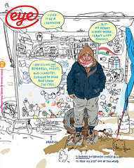
Winter 2016
Reputations: Fuel
‘We love collecting vernacular … it’s functional, not following a preconceived idea of what is correct. This can give it an unexpected quality … in “real” design all those elements are lost. Everything is too considered.’ By Rick Poynor
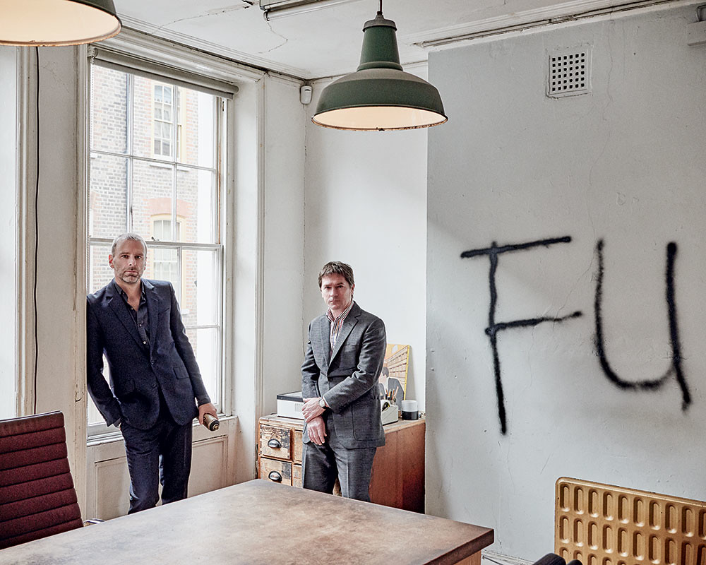
Last year was Fuel’s 25th anniversary. I met them when they were students at the Royal College of Art, already attracting attention for their self-published magazine, also named Fuel – an early short profile appears in Eye no. 11 vol. 3. After graduating, they found a floor in Fournier Street, where the City of London meets the East End, opposite the house of Gilbert & George, and they have worked in Spitalfields ever since in a bare, atelier-like space. Their book Fuel Three Thousand, published in 2000, shows two photos of the studio’s entire contents piled high on a table and it gives a lasting impression of their un-designery attitude and set-up.
They began as a foursome, but Nick Oates soon departed, leaving Peter Miles, Damon Murray and Stephen Sorrell. I visited them at intervals, usually to write something, and these encounters were always a little uneasy. Certain lines of enquiry, concerning for instance their influences, could be relied upon to draw a frosty response. They cultivated an air of distance from other designers and seemed not to want to be part of the design scene. They avoided competitions and design organisations, rarely gave lectures and preferred not to employ anyone else. Their work was sharp-edged, sinister and provocative and about as far from sprawling 1990s typography as it was possible to get. The trio showed a natural affinity with editing from the start. The sequence of magazines devoted to four-letter themes – ‘Girl’, ‘Hype’, ‘Cash’ and ‘Grey’ – led to the book Pure Fuel (1996), in which they commissioned images and texts to address themes such as leisure, chaos, aspiration and society.
In 2004, the continuity of the studio – still only the three of them – was rocked by Miles’ sudden decision to leave. Recovering swiftly, Murray and Sorrell began a new phase as instigators and owners of Fuel Publishing, while continuing to operate as a design team for Penguin, Rizzoli, Granta and Film 4, and artists such as Tracey Emin, Jake & Dinos Chapman, and Tim Noble & Sue Webster.
While it is not unusual for graphic designers to publish books about graphic design, the pair built on their formative experiences in self-publishing to commission and craft a list of original and successful titles, often with Russian themes, that investigate subjects such as criminal tattoos, cookery, bus stops, space dogs, and the nightmare of forced labour camps. The books have a graphic style that is as honed, quirky and recognisable as Fuel’s early work, but the designers’ manner is much warmer than it used to be when they were a trio.
The interview, conducted at their studio, focuses on Murray and Sorrell’s evolution and aims as publishers.
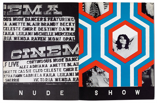
Fuel no. 1, ‘Girl’, spring 1991. Cover and spread from the self-initiated, large-format magazine published at the Royal College of Art by Damon Murray, Stephen Sorrell, Peter Miles and Nick Oates. From the outset, each issue had a provocative four-letter rubric.
Rick Poynor: With Fuel there was always a sense of ‘apartness’ and doing it your own way. Finding this place and remaining here was part of that and you always seemed like a very uncompromising trio. How were you positioning yourselves in relation to the design scene?
Stephen Sorrell: That is how we saw ourselves. Everybody was in the West End and we liked the fact we were out here on the edge of the City’s financial district in a Georgian house, next to Brick Lane and the Bangladeshi community. To us this mix was a more interesting environment.
Damon Murray: I remember going to a meeting at a big advertising agency and they asked us, ‘Where’s your studio?’ We said, ‘Spitalfields’, and they’d never heard of it. This place was tumbleweed. Being in this studio, one Mac, a couple of radiators and a cold tap, it was our fortress. We had always been on the outside when we were at the Royal College because we had gelled so quickly and started to work together almost immediately. It comes down to attitude. You need attitude to give you impetus to survive. We were never going to be employed by a traditional graphic design company and we didn’t want to be. There was nothing there for us. In order to make that kind of leap you have to define yourself.
SS: Our understanding of the power of an image – we shaved our heads and got pinstripe suits – made a strong statement as a group. I’m sure it put off more clients than it attracted, but it was quite good fun for us. We weren’t doing it as a confrontational thing, necessarily. It was pretty tongue-in-cheek and maybe a lot of people misread that. We wanted to have an image that somehow reflected our work and our attitude.
RP: Peter Miles left suddenly in 2004 after thirteen years in practice together. What happened and what impact did it have on you?
SS: We had been doing a lot of work with [the fashion designer] Marc Jacobs, which paid well but wasn’t particularly rewarding creatively. Peter was doing more of that work because he was a close friend of [the photographer] Juergen Teller. For whatever reason, he decided he wanted to leave and go to New York and do his own thing. He did it without any warning and it was a pretty big shock.
DM: I think he handled it badly. Anyone can change their mind, anyone can leave at any time, but there is a civilised way to do it.
SS: He literally came in one morning, said I’m going and left five minutes later. That was it.
RP: Had you all been good friends up to that point?
DM: We thought so.
SS: There was no row. It was very odd.
RP: And no more contact afterwards?
DM: Not from our side.
SS: Maybe he thought we would be all right about it.
DM: I think he probably did what was easiest for him.
RP: Did you wonder whether the studio could continue?
SS: For a few hours we were: ‘What are we going to do now?’ We had just finished the first Russian Criminal Tattoo book with Steidl and Peter had said, ‘Steidl won’t want to carry on publishing with you.’ After he’d gone we said, ‘OK, why don’t we just publish as Fuel, then?’
DM: We knew fashion didn’t really interest us because, like Steve said, there is not a lot of room to be creative. The designer or art director is always ancillary. It’s a monotonous, superficial cycle, which has never interested us that much. We wanted to work on projects where we were making the decisions and had ultimate control. This was something we had done from the outset, and perhaps we had been distracted from it. So we had a chat about what did interest us and, having just done the tattoo book, we knew that was the kind of project we could push a bit further. We set up a meeting with Thames & Hudson, who said, ‘We knew this was a Fuel book anyway. It’s very different from what Steidl normally produces. We’ll definitely distribute you. Let us know how many books you can produce a year.’
SS: Around that time Jonny Trunk turned up with all his library records. We decided that had to be one of our first books. It was a natural progression and nice timing. It went on from there. The tattoo book was always our project. We had edited it, commissioned the texts and translators, and made the picture choices. All Steidl did was print it.
RP: How did the tattoo book come about?
DM: A friend of ours, Anna Benn, who was working for a Russian publisher, had shown us some of Danzig Baldaev’s drawings and said that he was looking for a publishing deal in English. They had such a visceral quality – you couldn’t look away. As soon as we saw them, we thought they were perfectly wrong. In a strange way it connected with our earlier work. We went to Russia in 1992 for one of our magazines, ‘USSR’. So we felt a connection with the end of the Soviet period and an interest, which was reignited by this. We got the whole collection sent over and started looking for more photographs. That’s when we contacted [Russian photographer] Sergei Vasiliev and got more of his images to use in the book.
SS: We knew there was a lot more material and because the first one had done so well it made sense to do another volume or two.
DM: From that point on, because of the success of this book, we knew we needed to work around this subject, so we started making contacts in Russia.
RP: How did you arrive at that very distinctive format for the tattoo books – small, dense and like a handbook?
DM: We first saw the tattoo drawings as a group. When we got them up on screen and looked at them one by one they had a lot more impact. The large size was something that didn’t seem to suit the tattoo. It demands more intimacy. Also, because the majority of the tattoos were from the 1950s and 60s, we wanted it to feel like a historical book that had been rediscovered. The content was perfect for this as it described a complete world, roughly coinciding with the beginning and end of the Soviet regime. The design of the books sits outside anything contemporary, making them feel unfamiliar.
SS: The sugary colours weren’t planned ahead because initially we thought we were only going to do one volume, but we quite like that contradiction with the sweet covers. Having done the first one as a pink, the others had to be blue and yellow.
DM: Buildings in St Petersburg are painted in these colours and that’s where Danzig is from, so we thought that makes sense as well. You have this saccharine cover, then you open it and you’re in hell.
RP: The books had a big, cultish impact far beyond the graphic design scene.
SS: The tattoo phenomenon took off around that time as well, though it was a fairly slow start. It took a while for people to discover the book, then it gained its own momentum.
DM: In some respects it’s disappointing how Russian tattoos have since become a largely fictionalised cliché, but our books maintain their integrity. They are a first-person testimony, reproduced directly from the primary source. There is nothing else like it. This is where it all originates.
RP: You cut your teeth as editors in the 1990s with Fuel, your self-published magazine, and the books Pure Fuel and Fuel Three Thousand. Were you always interested in magazines as a medium and in the editorial process?
SS: We were, actually. I did work experience at The Face over the summer between Saint Martin’s and the RCA, and Peter had worked at Harpers & Queen the previous year.
DM: I’d done work with i-D so we all had that background. We knew that Fuel wasn’t going to be like a mainstream magazine. It was going to be something different, a space for us to fill, which at that time was just brilliant. We had something we felt we wanted to say.
RP: Can you say more about what you wanted to say?
SS: I think it was also about getting a reaction from people. I don’t know that our messages were always that obvious and we weren’t concerned about making very clear statements. But I think we did enjoy making statements. If you can do that with an image, I think that’s quite powerful. The graphic design of that time, the late 1980s and early 1990s, was quite bland and slick and not very interesting.
DM: A lot of the work we were making was ambiguous and made you question the purpose of graphic design. We didn’t have to communicate a literal message. Our work could be as opaque or transparent as we liked. Post-rationalising it, it was about making an image that people would be interested in, whether it was for a good or bad reason. The result needed to be striking and that’s what graphic design wasn’t doing at the time. It wasn’t questioning anything. That was the catalyst for us because we knew that if we reacted to images, then other people might react to them too.
RP: The Fuel aesthetic was very striking because apart from being against all the bland mainstream work you have mentioned, it was also completely different from the complicated digital typography that was happening then. It had a chisel-like sharpness and punch to it. Where did that come from?
SS: I don’t ever remember discussing a visual approach, but I think that happened because of the speed at which we worked and the immediacy of putting the magazine together. Also, not feeling too precious about the work. It was considered, but when you are on a similar wavelength you tend to come up with a result fairly quickly.
DM: It’s also about trying to make the work do something, so it has a direction to it. With all our work we discuss an idea before putting anything down on paper. Once this is defined, you can decide the best way to say it and how obvious you want to make the communication. We start with the bare minimum of items, then shape it into a direction.
RP: There is a strong link in your work with the tradition coming out of New York in the 1950s, or British design in the 1960s – a spirit of clear, clean communication. But the difference is that the earlier generation wasn’t trying to provoke or disturb. They maintained a cheerful tone and jollied the viewer along with a little graphic joke, whereas your messages were potentially more troubling.
DM: Yes, I think it was more sinister because that was the world we were in. Maybe the 1950s and 1960s were more positive eras whereas we are from the Thatcher era, so our viewpoint is not necessarily so bright. That’s something that isn’t commonly found in graphic design. We love collecting vernacular for this reason, too – it’s functional, not following a preconceived idea of what is correct. This can give it an unexpected quality, whereas in ‘real’ design all those elements are lost. Everything is too considered.
RP: In the period you have been a publisher, there has been a shift from authoring material and expressing Fuel’s vision in your own publications to editing books with often quite sophisticated content coming from elsewhere. How do you view this editorial evolution?
DM: Every book is a kind of lie in a weird way. Every book is someone’s vision of how that information should be presented. With our authored magazines and books, we chose themes that caught our attention, and the content we publish ourselves now is selected for the same reason. The main difference has been the freedom to expand on a particular subject. The books are still our complete vision, but focused on a single topic. That’s why we can choose such apparently diverse and obscure subjects. We are not interested in producing what we call ‘cock’ books – the biggest books that you can stick on your coffee table. We are interested in producing books that harness our critical talents in language and design and making an object that is a perfect vessel for that information.
SS: I think it’s quite a natural progression from the way we produced our Fuel magazines. We are just as ruthless in our editing and use of images. Everything earns its place. The design and impact the content has is considered and concise. There is no fleshing out. Our approach is refined to our vision.
RP: What are you looking for as publishers and how do you decide what to publish?
SS: We look for subjects that we think our approach can make a difference to. So the design is an integral feature, but it’s not just about design. It’s also practice. You develop an understanding for what will work. We also get approached with proposals, but I don’t think we have ever taken one up, have we?
DM: Maybe one or two. People’s ideas of what we might publish are usually very different to what we are interested in. Also a book takes so long to put together – some take four years – you really have to want to know what it is going to be, the idea and the narrative, how it will finally appear. So generally, now, we are working on more of our own ideas than anything else.
SS: The cookbook is a good example. All publishers publish cookbooks. We thought it would be nice to do our own take and the Russian/Soviet era was an obvious choice for us. We liked the fact that it’s not known for its high cuisine – already you have an interesting starting point. It’s almost an anti-cookbook because the images are from old Soviet cookbooks that don’t necessarily look delicious, but they all have a really interesting story behind them. It’s not about the eye-candy that is typical of this genre. It’s approaching the idea from a different angle.
DM: Soviet Space Dogs was one of the first books we did that was entirely our idea. We saw these images, started collecting them and over a period of a year or so we had accumulated about 150 items. We knew then that our concept would work, that we would be able to tell the complete story of the space dogs solely through ephemera from the time. I was bidding for something in an online auction and a woman kept outbidding me. I lost again and she contacted me and said she had a shittier version if I wanted to buy it. I said, ‘I don’t want to buy it, I just want a good scan of it because I’m doing a book on space dogs.’ It turned out she had a massive, really good collection and she was happy to scan all her stuff for us. And then she introduced us to other collectors as well.
RP: Mainstream publishers seem increasingly less inclined to take a chance on their own instincts about what is interesting and might find an audience.
SS: All our books are a calculated risk, even with the new Russian Alphabet Colouring Book. That could completely miss the mark and no one will buy it, but it’s been fun to do it in our own way. With all our books we are never sure if they are going to find their right audience because they often don’t sit comfortably in one genre.
DM: It always seems like we are taking a chance. We are conscious of our list, but the theme of our list is our approach, which allows us a lot of freedom. It would be harder for us to follow the path of mainstream publishing, because it’s not how we’ve ever worked. It’s the only thing we can do. We don’t know another way.
RP: You have some very well established relationships with artists – seventeen projects to date with the Chapman Brothers and fourteen with Tracey Emin. How did these collaborations come about?
DM: We first met Jake [Chapman] when we did a weird fashion catwalk show for Comme des Garçons in the mid-1990s – we were picked with a load of YBAs and Pete Townsend. We got on with Jake and regularly bumped into him and Dinos because they used to live in Fashion Street. Then White Cube suggested we work on a catalogue with them. The Chapmans let us get on with it and don’t really interfere.
SS: They have a very relaxed attitude and they are quite into the experimental side of the graphics. They are confident enough in their own work to allow us to do an interpretation on the covers, for example. The Fucking Hell books that were burned – they loved that idea. Other artists might feel that was too strong an input from a graphic designer.
RP: What about Tracey Emin?
SS: We met her similarly because she lives in the street and her studio is on the other side of Spitalfields. The first thing we did for her in 2002 she liked and we’ve been working together ever since. We also put together and published a book of her personal photographs, from childhood through to the present day, called My Photo Album, a kind of extension of her work in a way. Our approach for Tracey is very different to our approach for Jake and Dinos. We don’t do things that are quite as mad for her.
RP: Are you looking for this kind of continuity with clients?
DM: I think it just finds you. People see work we’ve done that they like. It’s about chemistry, there is an automatic acceptance there that you could well be the right person to do the job. We don’t get work by going out with a portfolio. We’ve not done that for fifteen years or longer. We don’t pitch either. Occasionally we are asked, but it means the person isn’t confident that you are right for the project, so the starting point is skewed.
RP: In organisational and business terms, how does the balance between being a graphic design studio and being a publisher play out?
SS: It’s now about fifty-fifty. I suppose previously it had been slightly more commercial work, but as the publishing side has grown it has naturally taken up more time.
DM: Next year it might be more like 70-30 – just because we have six books pencilled to come out and normally we bring out two or three a year. It’s just the way these projects have bubbled up to the surface.
RP: Which books have reprinted so far?
SS: All three Russian tattoo books numerous times, Soviet Space Dogs, the CCCP Cook Book, Soviet Bus Stops, Drawings from the Gulag – that probably did better than we expected. Soviets [a 2014 collection of Baldaev’s cartoons and Sergei Vasiliev’s photographs] struggled a bit, because it was slightly harder to pinpoint what that book is about.
RP: How do you get away with just having two of you doing everything with the scale of the operation now?
DM: There is always stuff to be done so we are always thinking, ‘OK, what’s the next thing?’ Right now it’s very full-on but hopefully that will ease up.
SS: We have had to delay volume two of our Russian Criminal Tattoo Police Files, because we have run out of time. But it’s not the end of the world. The work is still there.
DM: If we are commissioned to do a design job, then our own work gets sidelined for a little while. Between the two of us, it’s a lot of work, but our system works for us. When we have tried to get other people involved, we have found it harder. Everything has our stamp. Although we are not quite sure what that stamp is, I can tell you what it isn’t.
RP: What is your view of the independent publishing scene, which shows every sign
of flourishing now?
DM: I’m slightly worried that it’s talking to the converted. There is a tendency of narrow repetition in a lot of the books that are being produced, particularly in the areas of graphic design, photography and art. There are not many people working outside these limits and that’s disappointing. Those disciplines can speak to people outside their own territories and I think that’s still not really happening.
RP: But you have attempted to address a broader audience, as opposed to a niche audience.
DM: You could say this happens inadvertently, because of the titles we publish, but that would ignore the route our list has taken. It’s more conceivable to say we shape obscure content so it engages us. When we publish a book, initially we are talking about something that appeals to the two people in this room. That is a niche market beyond a niche market, but then hopefully it becomes a broader market.
RP: Will Russian and Soviet subjects continue to be central to your list?
DM: It depends how many interesting things we find. Are we reaching an end? I don’t know. It’s strange how modern Russia is perceived outside Russia. There are still gaps where interesting stories present themselves.
SS: Most of our next books have Russian themes. But The Music Library, which we just reissued, doesn’t and that’s done really well. More people are interested in vinyl records again and in sleeve design. It’s encouraging to see that it’s not all about digital downloads.
RP: How much interest do you have in producing design books, such as the Sainsbury’s book Own Label (2011)?
SS: We like discovering collections and archives. With the Sainsbury’s Own Label material [see review in Eye no. 82 vol. 21], a few things were familiar to people but that archive was so amazing and it wasn’t that well known. We are not interested in producing monographs as such, particularly in graphic design. It feels like a well worn path and we are not big enough fans. Generally, I don’t think there is enough critical rigour applied to books on design. Perhaps that has something to do with modern culture, where everyone loves to look back.
DM: We have never really been interested in design names. The Sainsbury’s packaging touched a chord with us because we grew up with it, as well as it being classic design. So it worked for us and that’s a good enough reason to publish the book. The sleeves reproduced in The Music Library are as close to the vernacular as you can get on an album cover. Those are our criteria, though our criteria change all the time. Even Thames & Hudson said to us: ‘You are the last people we expected to do a colouring book.’ We don’t want to be snobby or hierarchical. We don’t rule anything out if we think it will work as a Fuel publication.
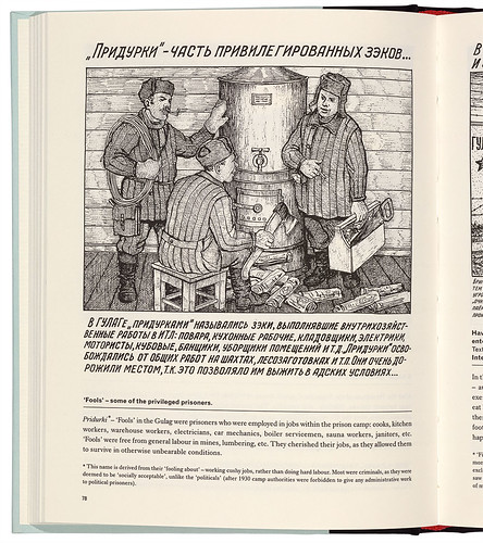
Page from Drawings from the Gulag, Fuel Publishing, 2010. Designed by Fuel. The drawing by Danzig Baldaev of ‘privileged prisoners’ with a cushy job (usually ordinary criminals) is one of the lighter images in a collection showing scenes of the intolerable cruelty meted out to political prisoners in the Soviet labour camps.
Rick Poynor, writer, Eye founder, London
First published in Eye no. 93 vol. 24, 2017
Eye is the world’s most beautiful and collectable graphic design journal, published quarterly for professional designers, students and anyone interested in critical, informed writing about graphic design and visual culture. It is available from all good design bookshops and online at the Eye shop, where you can buy subscriptions, back issues and single copies of the latest issue. You can see what Eye 93 looks like at Eye before You Buy on Vimeo.