
Spring 2014
Reputations: Louise Fili
‘Most restaurants are not used to dealing with designers, so I ask lots of questions. It’s being able to talk about colour, texture or architectural details. All I need is one element to latch on to that can make the logo work.’
Louise Fili (b. 1951) grew up in an Italian-American household in New Jersey – her mother was from Calabria and her father from Sicily. When she was sixteen Fili taught herself calligraphy with an Osmiroid pen and a book of type samples. She went to Saratoga Springs, where she studied studio art, or ‘commercial art’ at Skidmore College. Her senior project was a hand-lettered Italian cookbook. In 1973 Fili left to go to New York City, where she did an internship at the Museum of Modern Art, and completed her degree with a final semester at the School of Visual Arts [SVA].
She first worked in a small ad agency, then for B. Martin Pedersen, now owner, publisher and creative director of Graphis, who at the time had a small studio. Fili later became a freelancer at Knopf working on picturebooks, where she discovered that she loved book design.
On her 25th birthday Fili went to work for Herb Lubalin in his celebrated studio. Lubalin used type as an expressive tool. Fili found that working in an environment in which type was paramount would had a big impact on what would later become her voice and style.
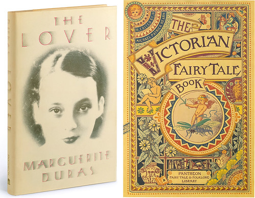
Book jackets for Pantheon Books, art direction and design by Louise Fili: The Lover, 1985, with lettering by Craig DeCamps and The Victorian Fairy Tale Book, 1988, with illustration by John Craig. The Lover was a runaway bestseller – Pantheon’s first since Dr Zhivago in 1958.
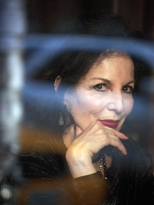
Top: portrait by David Eustace.
In 1978, Fili joined Random House as art director for the Pantheon list. After the critical and commercial success of her cover design for Marguerite Duras’s The Lover she was given the opportunity to develop her own voice across more than 2000 book jackets for the publisher. In the mid-1980s, Philip Meggs described Fili (in a Print article about the state of graphic design) as one of ‘the women who saved New York’.
In 1989, Fili opened her own New York studio, focused on food-related logos, restaurant identity and packaging. She has designed identities for New York eateries including La Vara, Mermaid Inn, Artisanal and, most recently, the Pearl Oyster Bar. Much of her work tends to be local New York establishments because her process requires her to be a sort of embedded designer. ‘I keep my eyes and ears open for any and all visual cues that can inspire a graphic direction for the logo. It can be something as simple as an architectural detail, a colour, or a texture.’ As deeply as her work is inspired by history, it reveals itself as new and contemporary.
Fili also designs labels and packaging for food clients such as Late July, Bella Cucina, Tate’s (cookies) and Irving Farm (farm-roasted coffee).
For three decades Fili has been documenting and organising the forgotten signs of Italy on storefronts and buildings, preserving these disappearing arts for her own personal archive, and these regular pilgrimages to Italy continue to shape her taste, her aesthetic, her manners and etiquette.
Fili has written or co-written more than a dozen books, including the limited-edition Logos A to Z (printed letterpress on Fabriano paper stock) and Elegantissima, a portfolio of her work from 1979-2012. Other recent books include Scripts (see Eye 80) and Shadow Type, both collaborations with her husband, design writer and historian Steven Heller.
Whenever she gives a talk in New York, she has it catered by her client, L’Arte del Gelato, which is a ‘great way to warm up a crowd’, she says. It’s also a way of ‘designing’ the experience, giving the audience an understanding through several senses.
The following interview took place early in 2013, shortly after Fili’s trip to Italy, where she documented signs for her upcoming book Grafica della Strada: The Signs of Italy (to be published by Princeton Architectural Press). Fili’s next book will be about Parisian signs.
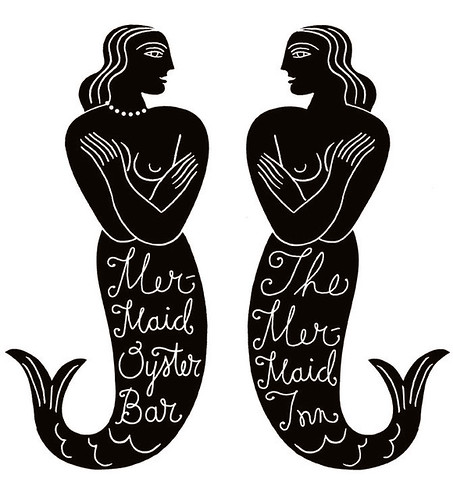
Identity design for the Mermaid Oyster Bar (2010) and Mermaid Inn (2003). Design: Louise Fili and Chad Roberts. Illustrations: Anthony Russo. When the Oyster Bar sibling opened seven years after the Mermaid Inn, the mermaid image was flipped and a pearl choker added around her neck.
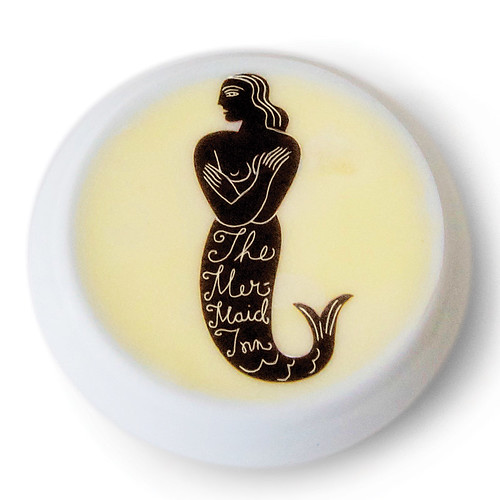
Identity design for the Mermaid Inn (2003) on butter. Design: Louise Fili and Chad Roberts. Illustrations: Anthony Russo.
Liz Danzico interviewed Louise Fili in the latter’s New York studio.
Liz Danzico: When you were little you carved letters above your bed. Was that the beginning of your life as a designer?
Louise Fili: That was my earliest creative memory, carving those letters. I couldn’t even put words together at the time. I just thought letters were really cool. When I was sixteen I sent away for the Osmiroid pen that was advertised in the back of the New Yorker. I used to see it there every week and I thought … I want to try this. I taught myself calligraphy from a Dover book that I had bought for $2.50 that featured different examples of illuminated initials. I must have used every single page of that book. I keep it here in the studio and I still refer to it. Before long, I started creating illuminated manuscripts of Bob Dylan lyrics that I would sell to classmates.
LD: Did you know what you were doing?
LF: I didn’t know it was graphic design, no. Nobody, even in high school, none of my art teachers ever told me that there was something called graphic design I might be interested in.
At that time, I was interested in books. I thought I wanted to be a librarian. There were very few books in our house – they were a luxury my parents didn’t entertain (even though they were both schoolteachers). It was all about food. So I would spend all day Saturday in the library looking at books.
LD: And today, do you have a house full of books?
LF: What do you think?! Yes, it’s a constant problem just to keep the books off the floor.
LD: How did you make the transition from New Jersey to New York City?
LF: When I was in college and found out what graphic design was, I really wanted to come to New York and get a job as a designer. And I always wanted to work for Herb Lubalin.
There were a number of times when I really considered moving to Italy, but I knew there was nothing happening in graphic design at that time and for women it was not an enlightened era. There were very few design studios then and the only place to find a job was in Milan, which I didn’t care for.
Today there are design studios all over Italy. You don’t even have to be in a big city to find them. And in Rome there are many, many design studios, and a number of them are solely owned by women, which is remarkable in this span of 35 years – it’s changed that much. Going from Saratoga Springs, New York to New York City was a little bumpy, but there was no question that that’s what I had to do.
I came up with a scheme to leave school early to do an internship at the Museum of Modern Art and then attend the School of Visual Arts for my final semester. When I graduated I got a Bachelor of Science! I started taking it off my résumé because people would look at it and say, ‘Oh, so you were a science major and you decided to get into graphic design.’
I came to New York and worked first in a very small ad agency and then for B. Martin Pederson. Then I started freelancing at Knopf, and that’s when I realised how much I loved designing books. This made sense, since I was always attracted to both books and typography, and doing picture books was a great experience. The first project I worked on was with British feminist, Midge MacKenzie. She was a film-maker who had just released an acclaimed documentary for Masterpiece Theatre about the women’s suffrage movement in England, which was to be turned into a book. She had never done a book before – nor had I. But they threw us into an office together and miraculously it worked out really well.
But I needed a full time job – once the book was over, I was out on the street again. So that’s when I went to work for Herb [Lubalin], which was an incredible experience, being in an atmosphere where type was so important. He used type as an expressive tool instead of illustration or photography. I had the great luxury of having my office in very close proximity to Herb’s, which no one else did. So I really got to see how his thought process worked, and that was invaluable.
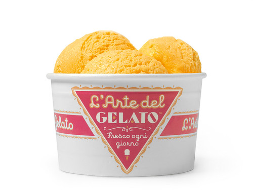
Identity for L’Arte del Gelato, 2009. Design: Louise Fili and Jessica Hische. The logotype was inspired by a collection of wrapping papers for Italian pasticcerias from the 1930s, and appears on everything: take-out packaging; delivery carts; a classic Fiat Cinquecento.
LD: In what way?
LF: Lubalin loved working on U&lc, the magazine he started. What made him so happy about working on it is that he wrote most of it – headlines and text – so he really had control over the whole look of it, which is great when you’re a typographer who’s so specific about things fitting so well. So the auteur kind of approach was something I was exposed to early.
LD: You left after a couple of years. To gain a different kind of experience?
LF: I just sort of walked into the job at Pantheon, which had a very impressive roster of authors, all European, but you couldn’t appreciate that because the covers were so dull. So I had carte blanche. After the first book list that I did, the editors were so happy that they finally had somebody who was trying to make the books look good. That gave me more creative control. It was a great opportunity for me to develop my design voice there because I got to experiment with a different period of type history on a daily basis, which was wonderful.
LD: It seems to me that with each new area of work you do, you think, ‘Well, how can I shake things up?’.
LF: Yes! While I was with Pantheon I did my first wine label. It was just a fluke: an upstate winery needed an identity and labels for wine and champagne. I looked at what was going on and thought: ‘Why does it have to look like this? Why can’t I take the elements that are used for this very tired formula that everybody thinks they have to follow for champagne labels, which is using gold or silver metallic and script type, but no white space. So I thought, well, I can use metallic colours but they don’t have to be traditional gold and silver. I can use a script but it can be a graceful upright script. And how about a little white space for a change? So that’s where it started.
LD: What was it like to set up your studio in 1989?
LF: In those days, because there was no Google, people had to find you. So you couldn’t get too creative with the name of your studio. I knew I had to name it after myself, although that might be a liability. I could have called myself like ‘Fili Associates’ to make it look like I was bigger and more important. Or I could’ve come up with a cute name. But people were going to have to try to find me in the phone book. And so I just named it after myself, which I knew would be a problem for some people.
I really wanted to send a message, which was this: if you have a problem with my being female, then I don’t want you as a client! I think there were lots of people who haven’t called because of that. It’s less of an issue now, but some people do come here and say, ‘Oh, you’re so small’.
LD: Isn’t that the point.
LF: Yes, I like it that way. And then you’ll have a personal contact with me and I won’t just pass you over to a junior designer.
LD: Do you have some idea of how many people you have inspired to do the same thing?
LF: That’s the other thing. When I was in college and I was first starting out in business, there were no female role models. Paula Scher was about the first one but she’s only a couple of years older than me. You really had to look hard. There was Cipe Pineles – actually she was very good friends with the people who owned that first small ad agency I worked at and William Golden had done their logo.
LD: There’s Cipe, but where are all these other women? What happened?
LF: I’d love to hear about your process (if there is even such a thing), because you often seem to put yourself in the context of the work.
Well, the first thing I do when a client contacts me is play ‘Twenty Questions’. Especially if it’s a restaurant. Most of them are not used to dealing with designers or having to articulate what the restaurant is about. So I ask them lots and lots of questions – whatever they can tell me to help me get a handle on who they are.
It’s in the walkthrough and being able to talk about colour, texture or architectural details, because really all I need to make the logo work is one tiny little element to latch on to. That’s why I tend to not do any restaurants out of town – I really have to be there.
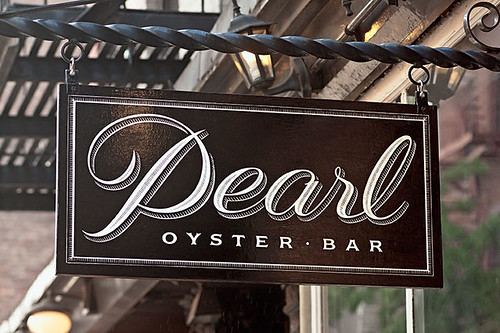
Pearl Oyster Bar, 2012, Greenwich Village. Silver leaf hanging sign using letterforms inspired by sign painting samples from the 1930s. Design: Louise Fili and Spencer Charles.
LD: Tell me about your recent work with the restaurant Pearl.
LF: I did the Pearl Oyster Bar after my book Elegantissima was finished, and I regret that it didn’t get into the book because Rebecca Charles, the chef / owner, is really wonderful. I’ve worked in restaurants for so long but I’ve rarely had an opportunity to work with female chefs. There were precious few when I first started in this business, but it is encouraging to see how the demographics have changed over time. Rebecca has been doing this for a long time and she’s well respected by her staff (which is not always the case). I’ve seen some very abusive chefs. I’ve heard them talking to their staff, and I’ve learned the obvious – that it’s a trickle-down effect. So if you have an abusive chef / owner, the manager is going to be abusive to his staff, and so on.
Dinner at Pearl means arriving at 6pm to wait in line, as it is a tiny restaurant. Rebecca was the first to start this whole concept, which now everybody is doing. It’s a very authentic, simple oyster bar. And the menu is very limited. Her staff are amazingly cheerful. I mentioned something to her about one of them who was particularly nice to us, and she said, ‘Oh, he’s a newbie. He’s only been there for four years’. To have a staff that stays that long, you know that she treats them very well.
So when Rebecca first contacted me about her logo, she had been in business for fifteen years and she said that she had always wanted to call me. And I thought, ‘I always wanted to do this restaurant.’
However when we met, what was funny is that she mentioned where she lived. And I said, ‘Oh, I live a block away’. And we realised that the backs of our apartments face each other. So she wrote me an email that night and she said, ‘You know, I can’t believe that I’ve been sitting here for years in my study looking at your website, wishing that you had done my logo and you were only 50 feet away.’
LD: How is it to walk around New York City neighbourhoods, between the Upper East Side and Soho, and see your work? You’re creating these New York experiences...
LF: It does feel great. My favourite area is in the West Village because there is Pearl, then there’s Mermaid Oyster Bar, and there’s a new place called Oatmeals, which is an oatmeal-themed restaurant.
A couple more jobs did not make it into the book, like Ambessa (a range of imported teas).
Marcus Samuelsson, a very high profile New York chef, originally contacted me about doing the Ambessa line for imported teas as well as coffees. I developed a design that could work for both packages. At the time, the tea was going to be in a paper box. They were struggling with the whole concept, so I recommended a food consultant who I frequently work with who moved the project along. The coffee was put aside and the tea ended up in a tin, which is much more distinctive and collectable. The project ended up taking two years, but at least the end result was very satisfying.
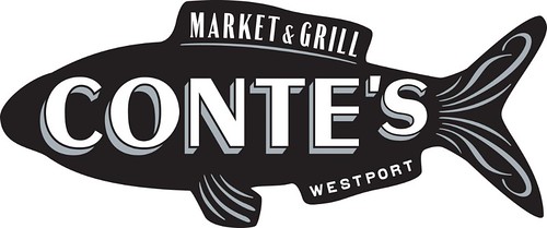
Die-cut, foil-stamped business card on duplexed black paper for Conte’s 2002 Seafood restaurant, Westport, Connecticut. Design: Louise Fili and Chad Roberts.
LD: What kind of timeline do your projects typically have?
LF: Normally, for a food package like this where I have to design the logo and the package, usually once we meet and really have a definitive discussion about it, I’ll ask for three to four weeks. It’s not a lot of time but it’s enough time to get it done right. If I can’t do it in three to four weeks, then I’m not going to be able to do it at all.
LD: What was it like working with the Good Housekeeping Institute?
LF: The first question I ask when I work with a new company is: ‘Who are the decision-makers?’
Because in a lot of cases, they’ll say, ‘The CEO, and he doesn’t have time to meet with you’. And I‘ll say, ‘Well, I can’t do the job.’
So when I asked Good Housekeeping, they said it was just eight of them – eight women, which was really interesting. I was not their first choice, they had previously given it to a big design branding firm that had taken it too far. But when they saw it, they realised it was too different. That paved the way for me, since it was apparent, like in most makeovers, to keep one or two elements from the original logo – in this case, the oval and the star.
LD: You mentioned there will be a new edition of the Love stamp for the US Postal Service …
LF: Yes, we proposed designs for both Love stamps and Wedding stamps. For the Wedding stamp, I had what I thought was a great idea for same-sex couples using an illustration of a couple on a cake, it would split down the middle, so one could mix and match: two women, two men, or a man and a woman. I thought it had great potential, but the USPS didn’t see it that way.
In any case, three love stamps were accepted, and so far two have been issued, with one more to be introduced in the near future.
LD: We talked about language a little bit and I wanted to check the names of your books. Are they real words?
LF: Yes. That’s funny that you ask if they’re real. They are real words, but you wouldn’t find them in the dictionary because they’re just superlatives, so they can’t list every superlative because Italianissimo really means ‘very, very, very Italian’ and Elegantissima ‘very, very, very elegant’. For the title of this book, I was originally thinking of ‘Squisita’, because that means both delicious and exquisite, which I think is a beautiful word. But it’s even more difficult to pronounce than Elegantissima.
LD: Tell me about your trip to Rome …
LF: I was a visiting artist at the American Academy for a month to work on a book called Grafica della Strada: The Signs of Italy. I’ve been obsessively photographing signs in Italy for over 35 years, starting with 35mm slides, then point-and-shoot snapshots and finally digital images. Thanks to technology, I can now take better photos, yet it is as a result of this same technology that beautiful hand-painted signs have begun to disappear and are being replaced by clumsily crafted computer type.
I spent the last year returning to as many cities as possible – Rome, Bologna, Florence, Venice, Padova, Turin, Lucca, Viareggio – to rephotograph whatever is still remaining. For all the rest, there’s Photoshop!
LD: Do you do your research in English or Italian?
LF: Sometimes, it’s half in English and half in Italian, but when I’m in Italy – and this is why I like to travel by myself in Italy – I never have to speak English. Which really heightens the experience. That’s just why I went out for the day every day at the American Academy with my camera and then I could just speak Italian to my heart’s content.
LD: When did you learn Italian?
LF: I did not learn to speak Italian from my parents because, like many immigrants of that era, they only wanted to speak English. Especially because I grew up in New Jersey. Had I been closer to New York City, I would have been more exposed to the language (and its incoherent dialects!)
Now when I look back to when I was in elementary school, everyone’s parents were from somewhere else, but no one talked about it. My parents Americanised their names – they went from Ferdinand and Filomena Fili to Fred and Phyllis.
LD: They were such beautiful names!
LF: I know, with all the Fs, right? And they only spoke Italian at the dinner table to tell secrets in front of us when necessary.
So I had to make a real point of learning it on my own, which I started when I first came to New York and took classes. For years I’ve studied with a tutor who comes to the studio. I still do that when I have time, because the thing I’ve learned about fluency is that just when you think you’re fluent, you realise how much further away you really are.
The only real way to learn is to live there. It’s about vocabulary and nuances and accents – and real-life situations. But I managed to talk my way through a water-heater problem in a rented house in Tuscany!
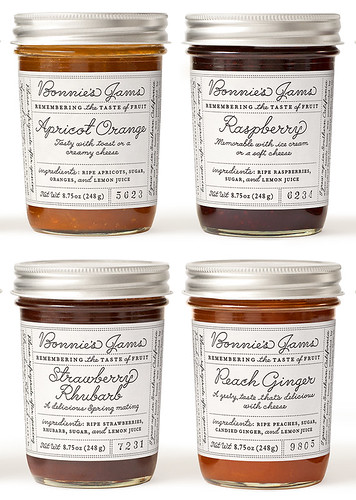
Identity and label design for Bonnie’s Jams, Cambridge, Massachusetts, 2011. Made in small batches, Bonnie’s artisan jam was originally designed by Bonnie herself. The new label uses a custom font developed from handwriting samples from the 1940s. Design: Louise Fili and John Passafiume.
Liz Danzico designer, editor, educator at the School of Visual Arts, New York
First published in Eye no. 87 vol. 22 2014
Eye is the world’s most beautiful and collectable graphic design journal, published quarterly for professional designers, students and anyone interested in critical, informed writing about graphic design and visual culture. It is available from all good design bookshops and online at the Eye shop, where you can buy subscriptions, back issues and single copies of the latest issue. You can see what Eye 87 looks like at Eye before You Buy on Vimeo.