
Autumn 2013
Reputations: Tony Brook
‘What other profession do you end up in where you learn so much about other people’s businesses than in graphic design? It’s remarkable. Clients will tell you everything. It’s like being a therapist. That’s really exciting. You never know what’s going to happen from one week to the next.’

Tony Brook grew up in Halifax in the north of England where most of his male relatives were miners (on his father’s side) and steelworkers and firemen (on his mother’s). He showed early promise in art, and left home in 1980 to study illustration at Somerset College of Arts and Technology in Taunton, switching to graphic design in his third year.
After a year of unemployment he joined the design agency Shoot That Tiger! in 1984, followed by stints at Icon (later Sonicon) in 1989 and Crimson in 1991, before setting up Spin with his wife Patricia Finegan in 1992.
Since that time Spin has expanded and contracted in size, influence and prosperity throughout a turbulent time for graphic design. Initially dependent upon the declining music industry, Spin moved on to big-client branding in the mid-00s, acquiring a reputation for an austere, neo-Modernist approach to identity design for a variety of blue-chip clients. These have included auctioneers Christie’s, galleries (Whitechapel, Haunch of Venison, The Photographers’ Gallery, Proa in Argentina) and TV stations such as Channel 4, Five and More4.
Spin has always produced self-initiated projects as promotional items, from expensive interactive and motion-based initiatives to its newsprint reading lists, and Brook has also been a prolific collector of books and posters with a wide range of enthusiasms. He was the guiding spirit behind the Design Museum’s 2011 exhibition ‘Wim Crouwel: A graphic odyssey’ (curated by Brook and Margaret Cubbage), which went on to the Stedelijk museum, Amsterdam later the same year.
In 2009, Brook teamed up with art director-writer Adrian Shaughnessy to found Unit Editions. This autumn sees the publication of Unit’s thirteenth book, FHK Henrion: the Complete Designer.
Brook has also become increasingly active in AGI, the Alliance Graphique Internationale, which he was invited to join in 2006. He is a tireless organiser and proselytiser of AGI Open, the ‘world cup of graphic design’ at London’s Barbican in September 2013. He was president of the UK chapter, 2008-13.
In contrast to Brook’s multitasking responsibilities and eclectic tastes, the work for which his studio is best known is a spare, reductive approach to identity design. Spin’s systems frame content – art, TV programmes, artefacts – in a way that combines practicality with a refined typographic sensibility. The conversation below took place in Spin’s studio and the Eye offices in the summer of 2013.
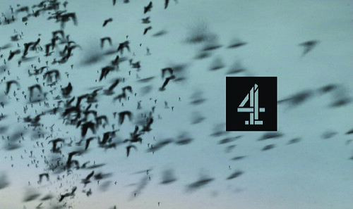
Frames from moving image identity for Channel 4, 2001. Design: Tony Brook.
Top: portrait by Phil Sayer.
John L. Walters: How did you first become aware of art and design?
Tony Brook: My dad was a miner. And his brother was a miner, too, and he drew birds on scraper-board. There were all these pictures of birds on the walls, just sheer black and white and really contrasty, and I asked my dad, ‘Who did these?’ and he said ‘Your Uncle Brian’. I couldn’t believe that I knew someone who could create something like that. And that started me drawing. Right from the start, it was black and white and harsh.
When I was in junior school, my teacher said, ‘You’re not going to be a mathematician’, and he used to send me out to the playground in maths to draw because he thought I was quite gifted technically. He explained the rules of composition. It made a huge impact on me. He told me that if you’re drawing hills that are surrounded with things, if you put the hills toward the top of the picture, it’s going to feel more monumental, and if you put them at the bottom, then you’ve got the sky. So just the notion of where you could put the line to make an impact was really exciting.
JLW: How old were you then?
TB: Only about seven or eight. My first commission was to do the Christmas decorations for the school, and I got a team of kids to help me do it. Basically, it was a perfect square with a diagonal line across it. One part was red, and the other part was yellow, and we clipped them to strings.
JLW:At college, you originally studied illustration. Is that because you didn’t know there was such a thing as graphic design?
TB: Yeah. A lot of people couldn’t really draw. I could draw reasonably well. There seemed to be a lot of kudos in that.
I went to Somerset because I wanted to do illustration (and that was the only course I could find that did it) and I wanted to get a long, long way from home. Not because I didn’t like home, but because I wanted to go somewhere else for a different experience. Taunton was ‘off the map’ – a seven-hour car journey from Halifax.
In the third year, I discovered photography. And then I bumped into a piece of work by Gert Dumbar, which made me think ‘No, I really want to do type. Type is a wonderful thing.’ It was a black and white book cover, with tiny, spaced-out type, in Dutch, and it seemed to come from a different world. At Somerset College, it seemed like they hated type because you were only allowed to use two fonts: Futura and Garamond. Type was something to put on your illustration.
JLW: Of course in the 1980s, illustration was dominant – and a good way to make a living.
TB: It really was. I remember Chloe Cheese came to talk to us once, and all the girls in the class were ‘doing Chloe Cheese’. They were very good at it as well. Russell Mills did some fantastic work around that time, and he was taking illustration into a completely different dimension.
I loved Grapus as well, and they were a mixture of mad type and illustration. Illustration was tempting, but … I just wanted to be a designer!
When I saw the Dumbar cover, and made the backwards leap to things I’d been enjoying, like Malcolm Garrett’s Buzzcocks sleeves (the early graphic ones) I realised that Dumbar’s work was refined and had a lovely feel to it, very poetic.
That was in my third year. I thought that if I was a designer, then I could still illustrate. And I could still take photographs. They threatened to kick me out, but I insisted on graphic design.
JLW: What was life like as a designer after leaving college? Did you work as a staffer or freelancer?
TB: I was a staff member at Shoot That Tiger!. I was very lucky to get that job, and stayed there five years because I’d been on the dole for a year, and I walked in as somebody walked out. I was grateful for that job, but I stayed too long. My natural preference is for a reductive kind of approach, more conceptual, and this wasn’t it.
JLW: Were you doing everything? Illustration, type, art direction?
TB: Yep, everything. I then moved to a place called Icon (later Sonicon) which did record sleeves as well. And that was a little bit closer to where I wanted to be, with a more cultured approach to typography.
It was only when I went somewhere that wasn’t right that I realised I was making bad decisions. I ended up at Crimson, which then changed its name to something else (as they all do). When I handed in my letter of resignation, my boss told me that I was absolutely clinically insane to start up at that time. That was a point in 1992 in the middle of a major recession.
JLW: So how did you manage to break free?
TB: I thought that if I had my two-bedroom flat, one bedroom as my studio and the other as my bedroom, that my overheads could never be any lower than that. I had a couple of clients like Telstar, and I just jumped ship.
When we set up Spin, my only desire was to make sure it survived. I’d read an article that said most businesses go bust in eighteen months. And I thought ‘Well this is it, my eighteen months’. We were doing horrible stuff, but I didn’t care – I just wanted to survive.
We tried to get a loan from the bank. The bank said: ‘We can’t give you a loan to start a business, but we can lend you money to buy a car!’
JLW: Was it just the two of you? You and Patricia Finegan, your wife?
TB: Yes, although I was on my own at first. Trish had studied fashion management – transferable skills! – and was involved in PR and hated it. She joined me one month later.
JLW: So you survived the eighteen-month period, the classic point at which a business’s cash flow can go badly wrong. Did you have an idea of which clients you wanted to deal with?
TB: Yeah, we had a wishlist of clients, and we worked for most of them over the next seven or eight years after we started.
I was working completely insanely. It wasn’t about designing, it was just about survival. In the first three years, I took just one weekend off.
JLW: Were you the sole designer?
TB: Yes. After six months we hired our first employee. I’ve always wanted to employ people, make a commitment to them. That’s when we were in Streatham in a two-bedroom flat. Then we moved to a bigger place as we started to make some money. But my brain was turning to fudge – it wasn’t how I’d imagined Spin when we started. Then we moved to an even bigger place in Clapham and worked from there.
JLW: What was the work like?
TB: I had worked on record sleeves for ten years. And that was long enough for me – I started disliking music. One day I was walking through the offices of AVL (Associated Virgin Labels) and Iggy Pop – who is a complete hero of mine – was walking the other way. My first reaction was, ‘Iggy Pop!’ … my second thought was: ‘We’re both too old for this!’
But as far as the mix of art and commerce goes, I wanted different challenges, to do anything but album covers. Music has always been important to me, and I hated the idea that I would become cynical about it, knowing the industry, and seeing lots of people being chewed up by it.
When I said I wanted to do everything, I really meant it. I was massively intrigued by technology. I’m not really technologically minded, but I really wanted to know about it and know what was going on with it and surround myself with people who did know.
What other profession do you end up in where you learn so much about other people’s businesses and what they do than in graphic design? It’s remarkable. Clients will tell you everything. It’s like being a therapist or something. That’s really exciting. You never know what’s going to happen from one week to the next. Whereas when I was doing record sleeves, I knew exactly what was going to happen. You get faxed through the label details and the title, and a note saying, ‘we think this is a dance track’, and off you go and make something for it.
JLW: How did you make the break with your old music business clients?
TB: We moved from Clapham into a huge studio in Kennington. The space was really cheap – it used to be for horse taxis, and all the floors were sloping. Our chairs would just start rolling back.
Then we did this thing that still scares me to think about to this day. We resigned all the accounts I hated.
JLW: Where do you think Spin stood within the 1990s design scene?
TB: I’m very secure about what my design position is now, but it wasn’t always that way. I spent the 1990s searching for a voice. I’m not sure that we were one of the leading lights at that point. We were exploring the more organic, painterly approaches, a style I still enjoy but not what I prefer to make.
JLW: That was a dominant strand then, wasn’t it?
TB: Well, there were two things going on. I was really into photography, and I enjoyed the Polaroids of Andy Warhol and how formal yet loose they were. I also enjoyed Edward Weston’s work, incredibly pared back and reductive. There was Grapus. I was really attracted to the activist ‘Fuck you’ kind of attitude that they had – really irreverent – because it kind of related to punk I guess.
But I didn’t like the torn paper punk, I liked the more constructed work, like the cover of The Buzzcocks’ ‘Orgasm Addict’ – particularly the back cover. The way the type was used, seemed more intelligent and thoughtful, and therefore more engaging than just sort of tearing something up and throwing it on a page. It was structured but affecting as well.
When I was working in record sleeves, I was still trying to work out those two aspects. One was illustrative and expressive, and the other was reductive.
There was a period in the 1990s when we were working for clients like Talking Loud and various other things we did at the time that were very organic. But if there was this battle between the two, I realised which side of the divide I wanted to be on, and it was conceptual.
The driving force was: ‘What’s the best way of explaining my idea? What’s the clearest way of explaining my idea?’ There was an art history lesson that we had in Halifax where my teacher explained that an upright line was not passive or active, but was in a position where it could be either. A horizontal line was passive and a diagonal line was active. That had an incredible effect on me. That lesson stuck with me.
So in 1996 I made a decision about where I wanted to go. I just wanted to head in a different direction – it was an epiphany. And from that point, Spin started to change. The impact of these changes was that we had to let some people go. It was a painful thing to do because there was nothing wrong with them – they were very capable and nice people.
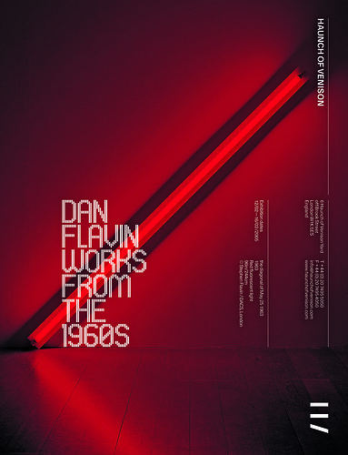
Full page magazine adverts for the Haunch of Venison gallery in London. Design: Joseph Burrin, Patrick Eley, 2005. Brook: ‘The type for the Flavin ad was a simple abstraction of Flavin’s use of neon. The orientation and repetition of what we saw as the corporate or functional elements, allowed us the licence to play with the exhibition identity.’
Self-initiated projects
We’ve always been interested in creating some space for personal projects, and they haven’t necessarily been done or created to make business. You get down time in a studio, and you like to use it productively.
We did a series of self-initiated projects. One was a CD-Rom on the word ‘spin’, which we wanted to do to play around with interactivity. That ended up being seen by Diesel, who gave us a large commission. So we bought a little PC and started making a short film, and that was seen by Mother, who recommended us to Channel 4, and then we ended up doing the channel’s identity design.
Then we did this ridiculously expensive, self-indulgent piece, a short film on table footballers. It cost a fortune, and had no other purpose than our entertainment really.
JLW: Were those first self-initiated projects part of a plan to get more moving image work?
TB: Well, it was more to do with having down time and wondering what best to do with it. We weren’t doing the kind of work I really wanted to do, and it’s taken me a long time – ten or fifteen years – to get into the right place. If you start in the wrong direction, it’s really difficult to get back in the right one. So I saw these as opportunities to show where I wanted to go.
JLW: Bad clients don’t get you good clients …
TB: That’s absolutely true, and we had some stinkers. It was a case of either accepting your lot or trying to change it.
The way we used the self-initiated work in the portfolio was to say: ‘We can deliver the job for you. And then we could do it like this, so there’s more of a creative edge to it, more of an experimental kind of edge to it.’ But it took a while to get it going.
JLW: Was the table football film expensive because it ate up lots of studio time? Or did it cost you hard cash?
TB: Both. I don’t know what we were thinking of. This was a time when we were working for big corporate clients. The film was beautifully made, shot on 16mm, which is expensive. Four senior designers were involved in it, it was insane. There was a monetary cost and we didn’t even count the studio cost, or the salary cost. Just stupid.
But it wouldn’t have been stupid had we put some effort into following it up, and become more motivated to become directors. But we didn’t, so it became this white elephant.
Between 2003-06 we had a staff of more than 30. We had started to attract large
corporations such as Nike, Diesel and Levi’s, and they required a lot of project management. I used to go to work feeling like the Queen just walking around, asking people, ‘And what do you do?’
Before then, I’d only ever worked in small studios of maybe three, four or five people. So it was absolutely mystifying to me how it got so big. We were starting to work for major clients and there was a lot of money sloshing about … it just got out of hand. It didn’t ever seem like a good idea to say no.
Reading Lists, Spin’s newsprint publication, 2006. Design: Tony Brook, David McFarline.
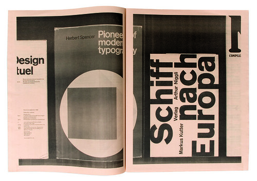
Reading lists
We sat down as a group and said: ‘What can we do that would be less self-indulgent and more outward-looking?’ We thought that the newspaper format would be affordable. So we decided to stop entering design competitions and do that instead. The first paper was about selected works of Spin.
JLW: A kind of portfolio?
TB: Yes. The idea was that it would introduce us to clients and what have you. But people bought it – they ordered it straightaway. People from Argentina and Sweden and Belfast! It wasn’t at all what we expected. And it sold out.
JLW: The next publication was a reading list.
TB: Yes. My experience at college was a little odd, but not unique, in that we didn’t get a design reading list – we got an art and architecture reading list. We weren’t introduced to any of the major figures in graphic design. I talked to some designers, contemporaries of mine, and they’d had similar experiences.
So I contacted Wim Crouwel, who I already knew because I’d invited him to speak at an event with Mark Holt of 8vo. I thought that if I could get Wim to do a reading list, then maybe others would follow suit. So I sent out a letter to 100 designers, with Wim’s list to inspire them, and we got 50 replies, and that made the second publication.
JLW: Most of what you do now appears to be what you want to do, with a very strong Spin aesthetic. Yet you’ve always been aware of – and interested in – designers who have completely different approaches.
TB: Yes. I’ve always had broad tastes in art, music, design. I’m just one of those obsessive people who spends hours browsing and just finding enjoyment in something that I think is beautiful. I’m a collector, so whether I’m buying something or just looking at it for pleasure,
I think there’s an engagement that you can have with design and type and all different types of colours and shades. That kind of conversation you can have with those pieces that’s exciting and compelling. At home, my walls are covered in Modernist posters. But that’s only because I haven’t had the cash to frame the stuff that’s not Modernist. I could easily have Jan van Toorn all over my walls. His work is thrilling and challenging. I’m not dogmatic.
Spin is becoming more experimental, and we’re getting more opportunities to challenge ourselves. The way we have developed creatively has been influenced by the designers whose work I enjoy.
My aim is to have an interesting dialogue with the person who’s going to be viewing the work. I’d hate anybody to think what I’ve done was boring, or didn’t communicate in some way.
There’s always got to be an extra dimension to the conversation with the client, where you’re bringing them to a place where they wouldn’t necessarily expect to turn up. I never have a problem talking with clients. But I don’t like the idea of just going off and doing something and coming back and saying ‘There you go, and that’s what I’ve done.’
The challenges are pragmatic: I want it to work for me; I want it to work for them; and I want it to work for the audience. We’ve had a couple of clients that lasted quite a long time that have had that.
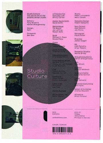
Studio Culture, 2009. Editors: Tony Brook, Adrian Shaughnessy. Design: Ian Macfarlane.
JLW: Was there ever a model for Spin – another design practice that’s been exactly what you want?
TB: Well, I was obsessed with Total Design and the way that they ran themselves. But we couldn’t really be that strategic, I suppose.
What surprised me about Studio Culture (Unit Editions, 2009) was how businesslike some of the people were that I thought would be quite flaky. And how flaky some of the people were that I thought would be quite businesslike!
If we’re going to lose money …
JLW: Unit Editions started from you and Adrian Shaughnessy meeting on his Resonance FM radio show, Graphic Design on the Radio …
TB: At that time, we were working with two major publishing companies and having a bad experience with them. Incredibly frustrating. And so all of that was boiling up in me thinking, ‘We should think about self-publishing. If we’re going to lose money doing books, we might as well do something we love.’ So it was all going through my mind when I met Adrian.
We just went out for a pint after the broadcast, and I was telling him how I was feeling and he was feeling very much the same way. We were both planning to do something, so we thought, ‘why not do it together?’
JLW: How would you describe your editorial policy?
TB: There are some great figures in the history of design that deserve serious consideration. I’d say Ken Garland and F. H. K. Henrion would definitely be among those. There’s no doubt. And then there’s another string of publications we do which are shining light on more obscure subjects. I suppose Jurriaan Schrofer fits into that category. The newsprint publication about Ronald Clyne’s design for Smithsonian Folkways is another example. Things that we think are interesting and deserve to be explored.
The problem is that there isn’t necessarily an existing demand for certain books. You have to hope that people will be interested and engage with them. Even Total Design. People might know about Wim Crouwel, but not the other designers associated with the studio, such as Benno Wissing – an absolutely incredible figure.
JLW: The world is full of amazing design archives. Some will be less well known than others. Is there a particular aesthetic sensibility, a certain look that strikes a chord?
TB: When I look at the stamps I collected when I was five years old, I can see that they’re strong and vibrant and graphic. I like experimentation – things that challenge me, things that surprise me. And I’ve also got pretty catholic tastes, so we’re fairly open. There’s room in my world for Jan van Toorn and Wim Crouwel.
We’re making a very specific point of looking at these figures now, and seeing them in a contemporary light. We’ve got to feel that there’s a connection, a resonance with what’s going on today.
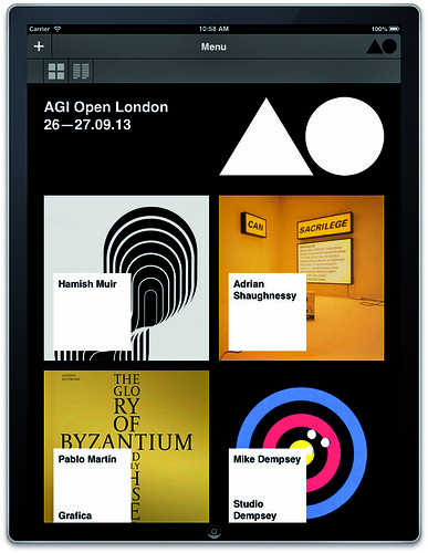
Websites designed by Spin. AGI Open, 2013. Design: Dan Flynn. Tumblr populated by Callin Mackintosh.
Joining AGI
When I was invited to join AGI, I turned up to the first congress with the idea that it was going to be one of the most excruciatingly painful things, even though I saw it as a great honour to be part of it.
But when it came to the reality of getting on the plane and going to Amsterdam, I thought it was going to be a cold, hard experience – that I was going to be sitting on my own for most of the time.
I had very low expectations, but it was exactly the opposite. People just kept coming up and talking to me. Famous people – people that I’d admired. It was an incredible thing to be involved in. Because they’re designers, they’re all slightly bonkers. The vast majority of them are open and friendly. It’s like a room full of the most interesting, stimulating people you’re ever going to meet all in one place.
JLW: Why did you become so involved in AGI?
TB: I was in the IEC [International Executive Committee] for four years. I’ve never been a joiner-in, so it was an absolute shock to me that I liked it so much. You’re just asked to do things that you’d have an opinion on.
I saw there was incredible potential to do much more with the organisation – and I became enthused with the idea of contributing to it – AGI Open, the three websites, a whole raft of new members. We’ve been more proactive in getting involved with new members, who themselves bring in new blood. Last year there were more than twenty new members.
JLW: How would you describe Spin today?
TB: The culture at Spin is what I hoped it would be when we started, a positive, supportive and collective studio working across a range of disciplines. Our clients are from all quarters, which is rewarding, as that was one of the main objectives when we set up. We have a young, energetic and committed team. They are technically savvy, socially engaged and from all over Europe. I look forward to coming in to work every day, especially on ‘Thursday Fry-day’ – a terrible pun but always a great breakfast!
JLW: Have you evolved a philosophy of design, a view of what you want to do now that survival isn’t the biggest priority?
TB: I’m not sure if I have a philosophy so much as an intention. I want to make a genuine connection, to communicate. I believe I should make the best work that I can. My pet hates are lazy thinking and irrelevant solutions. What we produce as a studio has to engage its intended audience. There is nothing worse than a boring or predictable conversation. It’s a designer’s responsibility to create a stimulating visual dialogue. Personally, I rely on boiling down a rational thought to a point where it becomes, in my eyes, full of visual impact and conceptually interesting. It is worth saying that I don’t imagine for a moment that someone looking at our work will get all the thinking behind it, but I do allow myself to believe that they will pick up on a sense of purpose.
The design we make doesn’t go out with an explanation. I tend to under-explain. Because you worry people are going to be bored or something. I remember when Rick Poynor did the ‘Communicate’ exhibition (Barbican, 2004). He asked me what my thing was, and I said ‘Swiss Design’ because I didn’t want to say anything. For a long time I had this notion that people who raise their heads above the parapet get shot down. AGI has opened my mind.
You have to keep yourself slightly uncomfortable, to be not sure. If you feel edgy and uncomfortable, then that’s a good thing. With design, I want to make some kind of connection. If there’s not a connection, it’s a pointless exercise. I am a deeply restless person at core and I’m never really satisfied.
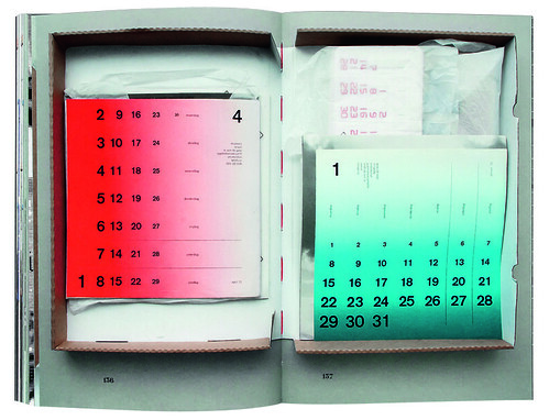
Spreads showing items in cardboard archive boxes from the catalogue for Wim Crouwel exhibition, Design Museum, London, 2011.
John L. Walters, editor of Eye, London
First published in Eye no. 86 vol. 22 2013

Eye is the world’s most beautiful and collectable graphic design journal, published quarterly for professional designers, students and anyone interested in critical, informed writing about graphic design and visual culture. It is available from all good design bookshops and online at the Eye shop, where you can buy subscriptions, back issues and single copies of the latest issue. You can see what Eye 86 looks like at Eye before You Buy on Vimeo.