Summer 2020
Spassky Fischer: Concrete moves

The work of this prolific young French studio is founded on practicality and systems, while transcending such prosaic methods
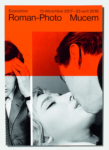
Multi-part poster displays for Mucem. This poster series showcases the studio’s concrete typography – key elements of the visual identity are stacked and chopped to fit the available physical space.

French studio Spassky Fischer aptly describes its systematically conceived output as ‘concrete’ graphic design. Spassky Fischer (named after the 1972 chess championship finalists) works with type as if it were as much building material as language, or in such a way as to render explicit the literally constructive potential of typographic form – as a material that can be piled up and stacked, arranged word by word, like bricks in endlessly reconfigurable walls. Founded in 2014 by Thomas Petitjean, Hugo Anglade and Antoine Stevenot, the studio now comprises five with Manon Bruet and Julia Andréone, who joined a year later. The studio is currently based in the outskirts of northern Paris, working exclusively in the cultural sector for key clients such as the contemporary art museum Mac Val in Val-de-Marne near Paris, and Mucem (Museum of the Civilisations of Europe and the Mediterranean) in Marseille.
The identity and publicity for Mucem exemplifies Spassky Fischer’s ‘concrete’ approach – type is restricted to Christian Schwartz’s Neue Haas Grotesk (used for the majority of projects) and is deployed frequently at scale and in idiosyncratic configurations, with a flexible display of the word Mucem preventing the need for a logo. Intuitively organised panels of bright colour provide a secondary construction material, while Andréone’s cool photography – created to replace the institution’s own archive imagery with a more consistent aesthetic – provides the final building block. This trio of elements is combined and ordered, recombined and reordered, perpetually highlighting the plasticity of the text and image content.
Infographic spread analysing the museum’s visitors from Rapport Activité (Activity Report), 2017, also for Mucem.

In public lectures, Petitjean has spoken of the influence of Swiss concrete art on Spassky Fischer’s work, in particular the studio’s distrust of symbolism. Yellow means yellow, not ‘summer’ or ‘sunshine’. These are familiar positions, clichés even,
for designers schooled in the so-called neutrality of Modernism. Yet for all the highly systematic nature of the studio’s productions and their emphasis on ‘practicality’, such talk distracts from what could be interpreted as a more critical agenda. In an age where cultural institutions fight for recognition amidst the indistinguishable morass of their homogenous identities, perhaps the real distrust is whether the messages emitted by them are really capable of conveying anything, beyond the basic identification of a point of origin. Could it be that Spassky Fischer recognises the emptiness at the heart of the modern cultural branding project and are attempting to invigorate it somehow via fantastically fabricated feats of visual abstraction?
Poster at Mucem (the Marseille-based museum dedicated to the Mediterranean), for ‘Roman-Photo’ an exhibition about the commercially successful (if critically dismissed) genre of the Italian postwar photo-novel.

John-Patrick Hartnett, designer, writer, lecturer, London
First published in Eye no. 100 vol. 25, 2020
Eye is the world’s most beautiful and collectable graphic design journal, published for professional designers, students and anyone interested in critical, informed writing about graphic design and visual culture. It is available from all good design bookshops and online at the Eye shop, where you can buy subscriptions and single issues.

