Summer 2008
Talking pictures (Isotype)
By representing data in simple graphic form, Isotype anticipated modern information design.
Isotype (International System of Typographic Picture Education) deserves to be brought in from the margins of graphic design history and reassessed in its context, and for its methodology. It was developed as a system of pictorial statistics at the pioneering Museum of Society and Economy in Vienna between 1925 and 1934 (and was first known as the ‘Vienna method’). Under the direction of Otto Neurath, a social scientist and prominent member of the Vienna Circle of (anti-)philosophers, a coherent set of rules emerged for transforming complex, statistical information into self-explanatory charts using elemental pictograms.
The influence of these pictograms (designed from 1928 by Gerd Arntz) on today’s information graphics is immediately apparent, although perhaps not yet fully recognised. ‘Visual education’ was always the prime motive behind Isotype, which was worked out for exhibitions designed to inform ordinary citizens (including schoolchildren) about their place in the world. It was never intended to replace verbal language; it was a ‘helping language’ always accompanied by verbal elements. In later years Isotype was applied more to publications, encompassing diagrammatic explanations of scientific subjects for young readers and civic information for developing countries in Africa.
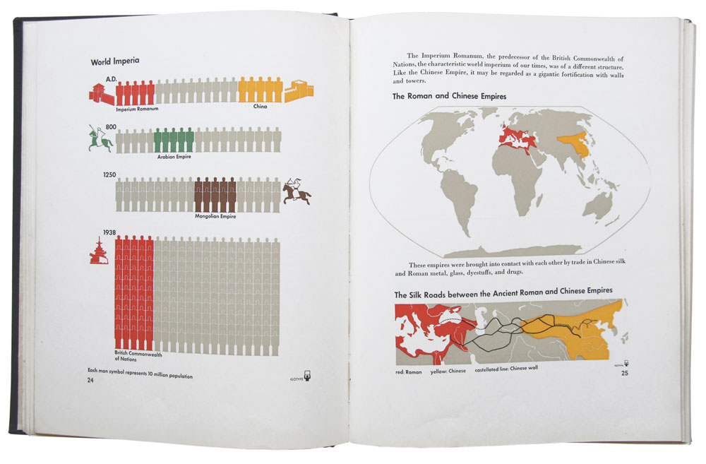
Modern Man In The Making (1939) is the high point of the Isotype team’s core concern with social statistics. It resulted from a generous commission by the publisher Alfred Knopf, which gave Neurath great freedom as author of the book. His principal collaborator (and later wife) Marie Reidemeister persuaded him to try something new: a book in what she called ‘picture-text’ style. A chart inserted into the text constituted a ‘paragraph’ that had to be ‘read’ in order to follow the argument.
Reidemeister assumed the role of ‘transformer’, a name coined for the interpreter of statistical data into simplified graphic form – a role that anticipated the modern information designer. She worked closely with Neurath and Arntz to achieve the tight unity of the book. Seven colours in total were used for printing the graphics.
Published on the eve of the Second World War, Modern Man In The Making addresses many issues still of great relevance today: globalisation, emigration and the relationship of war to economy. Neurath deliberately avoided words that he deemed almost undefinable and therefore unhelpful (progress, justice, normal), a circumspection that gives a timeless quality to his text. Similarly, Isotype was partly characterised by knowing which details to leave out in order to communicate information memorably.
Of the pictograms used in the system Neurath said: ‘The symbol may not denote more than is necessary to the statement of facts for which it is chosen.’ This reflects primarily a philosophical and linguistic position, and only secondarily the graphic minimalism of inter-war Modernism.
Neurath explained the intention of Isotype thus: ‘At the first look you see the most important points; at the second, the less important points; at the third, the details; at the fourth, nothing more – if you see more, the teaching-picture is bad.’
Top: Isotype pictograms in a spread from Otto Neurath’s Modern Man In The Making (Knopf, 1939). Design: Marie Reidemeister and Gerd Arntz.
First published in Eye no. 68 vol. 17 2008
Eye is the world’s most beautiful and collectable graphic design journal, published for professional designers, students and anyone interested in critical, informed writing about graphic design and visual culture. It is available from all good design bookshops and online at the Eye shop, where you can buy subscriptions and single issues.