
Summer 1992
Telling and selling
Cooper Black is one of the emblematic typefaces of the twentieth century. Who was the man behind the face?
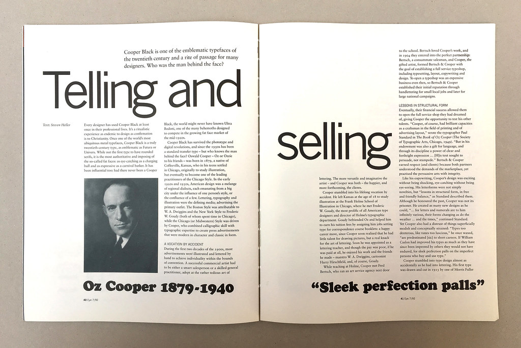
Every designer has used Cooper Black at least once in their professional lives. It’s a ritualistic experience as endemic to design as confirmation is to Christianity. Once one of the world’s most ubiquitous metal typefaces, Cooper Black is a truly twentieth-century type, as emblematic as Futura or Univers. While not the first type to have rounded serifs, It is the most authoritative and imposing of the so-called fat faces: as eye-catching as a charging bull and as expressive as carnival barker. It has been influential too: had there never been a Cooper Black, the world might never have known Ultra Bodoni, one of the many behemoths designed to compete in the growing fat face market of the mid-1920s.
Cooper Black has survived the phototype and digital revolutions, and since the 1950s has been a standard transfer type – but who knows the man behind the face? Oswald Cooper – Oz or Ozzie to his friends – was born in 1879, a native of Coffeeville, Kansas, who in his teens settled in Chicago, originally to study illustration, but eventually to become one of the leading practitioners of the Chicago Style. In the early 1920s and 1930s, American design was a melange of regional dialects, each emanating from a big city under the influence of one person’s style, or the confluence of a few. Lettering, typography and illustration were the defining media; advertising the primary outlet. The Boston Style was attributable to W. A. Dwiggins and the New York Style to Frederic W. Goudy (both of whom spent time in Chicago), while the Chicago (or Midwestern) Style was driven by Cooper, who combined calligraphic skill with typographic expertise to create press advertisements that were modern in character and classic in form.
A Vocation by Accident
During the first two decades of the 1900s, most advertisements were illustrated and lettered by hand to achieve individuality within the bounds of convention. A successful commercial artist had to be either a smart salesperson or a skilled general practitioner, adept at the rather tedious art of lettering. The more versatile and imaginative the artist – and Cooper was both – the happier, and more forthcoming, the clients.
Cooper stumbled into his lifelong vocation by accident. He left Kansas at the age of 18 to study illustration at the Frank Holme School of Illustration in Chicago, where he met Frederic W. Goudy, the most prolific of all American type designers and director of Holme’s typographic department. Goudy befriended Oz and helped him to earn his tuition fees by assigning him jobs setting type for correspondence course booklets: a happy career move, since Cooper soon realised that he had little talent for drawing pictures, but a real knack for the art of lettering. Soon he was appointed as a lettering teacher, and though the pay was poor, if he was paid at all, he enjoyed his work and the friends he made – maestro W. A. Dwiggins, cartoonist Harry Hirschfield, and, of course, Goudy.
While teaching at Holme, Cooper met Fred Bertsch, who ran an art service agency next door to the school. Bertsch loved Cooper’s work, and in 1904 they entered into the perfect partnership: Bertsch, a consummate salesman, and Cooper, the gifted artist, formed Bertsch & Cooper with the goal of establishing a full service typeshop, including typesetting, layout, copywriting and design. To open a typeshop was an expensive business even then, so Bertsch & Cooper established their initial reputation through handlettering for small local jobs and later for large national campaigns.
Lessons in Structural Form
Eventually, their financial success allowed them to open the full service shop they had dreamed of, giving Cooper the opportunity to test his other talents. ‘Cooper, of course, had brilliant capacities as a craftsman in the field of printing and of advertising layout,’ wrote the typographer Paul Standard in The Book of Oz Cooper (The Society of Typographic Arts, Chicago, 1949). ‘But in his endowment was also a gift for language, and through its discipline a power of clear and forthright expression … [H]is text sought to persuade, not stampede.’ Bertsch & Cooper earned respect (and clients) because both partners understood the demands of the marketplace, yet practised the persuasive arts with integrity.
Like his copywriting, Cooper’s design was exciting without being shocking, eye-catching without being eye-soring. His letterforms were not simply novelties, but ‘lessons in structural form, in free and friendly balance,’ as Standard described them. Although he honoured the past, Cooper was not its prisoner. He created as many new designs as he could, ‘… for letters and numerals are to him infinitely various, their forms changing as do the weather … and the times,’ continued Standard. Yet Cooper also had a distrust of things superficially modish and conceptually strained: ‘Types too dexterous, like tunes too luscious,’ he once waxed, ‘are predestinated [sic] to short careers. If William Caslon had improved his types as much as they have since been improved by others they would not have endured, for sleek perfection palls on the imperfect persons who buy and use type.’
Cooper stumbled into type design almost as accidentally as he had into lettering. His first type was drawn and cut in 1913 by one of Morris Fuller Benton’s staff artists at American Type Founders (ATF), unbeknownst to Cooper and without his permission. Cooper had routinely crated customised lettering in advertisements for one Bertsch & Cooper’s largest clients, the Packard Motor car Company, and the lettering caught Benton’s eye. As the ads were not signed or attributed to any artist – and type piracy was a fact of life at the beginning of the century – Benton innocently ordered the face to be redrawn, founded in metal and named Packard. But Benton was also a man of integrity; when he eventually learned that the original was designed by Cooper, he paid him a fee and attributed the design to him.
The Black Blitz
Cooper’s first typeface over which he had total control was not released until 1918. The first of his faces with a rounded serif, it was named Cooper and later renamed Cooper Old Style. Soon afterwards, Barnhard Brothers & Spindler Foundry (BB&S), America’s second largest specialist, approached Cooper to design a complete family. Cooper did not immediately accept the offer, reasoning he was first a lettering artist, and in any case was too busy with his own business. Bertsch, however, was not only Cooper’s partner, but his biggest promoter. He had billed Cooper as the ‘Michelangelo of lettering’, and now urged him to accept BB&S’s offer. Cooper was in many respects the perfect choice, since he was not rooted in classicism as were other period type designers, and BB&S had already publicised the idea that, in the words of sales manager Richard N. McArthur, they would not ‘revive the letter styles of the old masters, but … encourage our own modern artists, and try to add some contribution in our time ….’
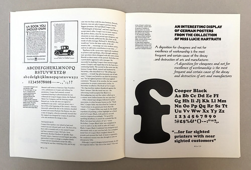
Typefaces in the 1910s were vigorously marketed to printers and typeshops, often through ambitious type specimen sheets designed with the same artistic flourish as sheet music of the period. McArthur was a particularly aggressive sales manager. He succeeded in pushing Cooper’s first normal weight roman (Cooper) and urged that it be the basis for a continuing family. The second in the series was the famous Cooper Black, named and marketed by McArthur, who described it as ‘the selling type supreme … it made big advertisements out of little ones.’ Cooper was heard to say that his invention was ‘for far-sighted printers with near-sighted customers.’ Because of its novelty, the face caused commotion in certain conservative circles. As McArthur recalled in The Book of Oz Cooper: ‘the slug-machine makers thundered against the black “menace”. But the trend was on – the advertising world accepted the Black in a thoroughgoing way and the orders rolled up in a volume never before known for any type face.’
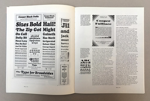
Other related type designs followed in quick succession, in what became known as the ‘black blitz’. Cooper Italic was described by Cooper as ‘much closer to its parent pen form than the roman …’; Cooper Hilite was made by the simple expedient of painting a white highlight on a black proof of Cooper Black, with patterns cut and matrices engraved accordingly. ‘It’s good for sparkling headlines; it cannot be crowded like the Black, but must have plenty of “air”,’ wrote McArthur. Cooper Black Italic was completed in 1926 to cash in on the swell in sales of Cooper Black; Cooper Black Condensed was designed soon afterwards with 20 per cent less heft. As a complete metal font of Cooper Black weighed almost 83 pounds and strained the back of many a typesetter, the condensed version was also thought to save on chiropractor bills.
Although Cooper’s designs initiated trends, he did not respond well to ‘the itch of the times’. Nor was he a fan of what in 1928 he called the extreme left, ‘the balmy wing of modernism’. Yet his last face, designed in 1929 for BB&S and originally called Cooper Fullface, later changed in ATF catalogues to Cooper Modern, was in fact consistent with dominant styles and a precursor of Goudy Stout. Of his own face, Cooper wrote in his notes for BB&S salesmen’s ‘talking points’: ‘This style, lately revived by the practitioners of the “modernistic” typography, had created a demand for display letters that comport well with it – letters that reflect the sparkling contrasts of Bodoni, and that carry weight to meet the needs of advertisers. Cooper Fullface is such a letter.’
Cooper’s layouts were unfettered by decoration’ he was skilled at the art of arranging type for maximum effect without the ‘flowers’, ‘dingbats’ and borders that junked up many contemporary press advertisements. But he did design a series of decorative material for BB&S, including a variety of ‘screamers’, or exclamation points for ‘adding punch to headlines’. In the late 1920s, Cooper was virtually kidnapped away from his drawing table at Bertsch & Cooper by the owner of BB&S to spend five days a week designing faces and decorations, often at a pace that allowed for little introspection. As he believed that, ‘A type design has to be run around the track a few times before it is permitted to start out in the world,’ he was not always happy with his hastily conceived endeavours, which did not always succeed in the marketplace. By the late 1920s, largely due to bad management, BB&S was struggling to survive, and desperately trying to anticipate public taste. Cooper complained: ‘We lose hundreds of years of taking seriously every inane suggestion from anybody anywhere.’
How to become a master
BB&S was eventually merged into ATF, and Cooper was commissioned to draw two trendy faces. McArthur, who joined ATF, recalled: ‘[t]his being the period of “Modernistic” typography, somebody sent in a clipped bit of hand-lettering and Cooper was asked to make rough sketches to complete an alphabet of capitals, figures, and points. Result: the typeface which we named ‘Boul Mich’, this name being the advertising man’s idea for a tie-in with the fashion advertising of Chicago’s Michigan Boulevard, the avenue of the smart shops.’ Cooper was also asked to make the pattern drawings for Dietz Text, a horsey gothic script designed by August Dietz. Cooper did not enjoy working on other people’s designs and vowed to return to Bertsch & Cooper as soon as his obligation was fulfilled. After a year with ATF, he lamented: ‘I have practically nothing to show for [a] year’s work to my own credit except a few Christmas ornaments.’
Although he had left ATF by the end of the 1920s, Cooper did not entirely forsake type design. He continued to design letterforms, though not with the intention of making full alphabets. He turned his attention instead to protecting what he did create. Seeing his work pirated in Europe and at home inspired him to fight for copyright protections for all designers and to try (unsuccessfully) to convince Washington that patents should be awarded for typefaces. He chided his colleagues about copying, too, arguing that: ‘To work in the style of current trends or past periods is all right, but do it in your own way. Study the work of the leaders, but never have another’s work before you when you are trying to create. There was never a great imitator – not even in vaudeville. The way to become a master is cultivating your own talent.’
Cooper died in 1940 at the age of 61. Although not as well known as his colleagues Dwiggins and Goudy, as one of the so-called ‘Great Three of Lettering in America’, he did change the type preferences for a generation. A man of his times, he created type for the ages to come.
Steven Heller, author of Borrowed Design: The Use and Abuse of Historical Form
First published in Eye no. 7 vol. 2 1992
Eye is the world’s most beautiful and collectable graphic design journal, published for professional designers, students and anyone interested in critical, informed writing about graphic design and visual culture. It is available from all good design bookshops and online at the Eye shop, where you can buy subscriptions and single issues.