
Winter 2017
The anti-Rockwell
Blechman pioneered a less-is-more aesthetic. His scratchy shorthand expresses ideas with a punchy surprise
During the 1940s and 50s, Norman Rockwell and the members of the ‘Famous Artists School’ of realistic, romantic and often saccharine editorial illustration ruled the roost. Before R. O. Blechman produced his earliest work, the typical narrative style of rigorously painted tableaux dominated American magazines and advertising from the late nineteenth century through to the 1960s. True, some of it was of high quality and many of its adherents’ work won the lion’s share of awards, lined the walls of New York’s musty Society of Illustrators and filled the pages of its competition annuals, but it was doomed to extinctionLiteral representation was de rigueur and art directors were required to circle the text passages they wanted to have illustrated. Form dominated content, and conformity was its death knell.
Gradually venerated realism lost its popularity. It became turgidly obvious, imaginatively bankrupt and was eclipsed in the postwar 1950s — first by more baffling impressionistic, and later by expressionistic, approaches. Clever concepts were soon valued over photorealistic obsessiveness. A new, modern illustration was influenced by certain Europeans, such as George Grosz in the 1920s and Saul Steinberg in the 1940s, among many, whose approaches, as a rule, were drawn more sketchily and relied on ideas that were expressed through gesture, as well as allegory and metaphor. This work proffered absurdity and surreal juxtapositions; simple, embolden lines added to the allure.
Blechman was one of the pioneers of a less-is-more, comedic aesthetic that was an intentionally more scratchy graphic shorthand than laboured representation that expressed an idea with a punchy surprise. His work, along with others of his ilk, was also often untethered to text, more autonomous than the slavish conventional illustration, and therefore more entertaining and memorable. Blechman’s method, especially his minimalism, however, not only distinguished itself from the preceding generation. His approach was unique within his own generation, which was awash with individualists that typified an exciting era of change in this artform.
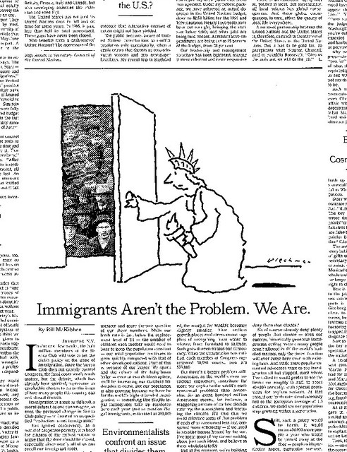
The New York Times Op-Ed illustration, Monday 9 March, 1998. Art Director: Nicholas Blechman. With his distinctive squiggle, Blechman makes an icon or cliché – like the Statue of Liberty in this drawing – appear fresh and engaging.
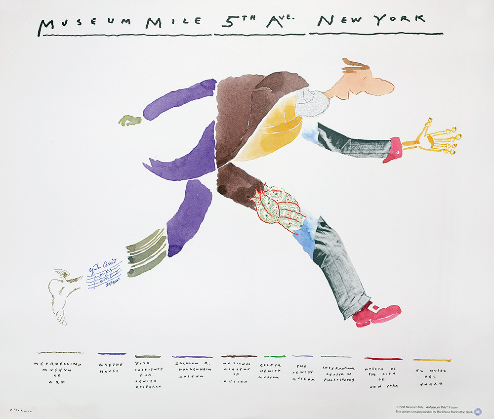
Top: A Museum Mile, poster, 1981. Blechman packs all the highlights of New York’s famous museum mile into one single image.
The wave of cartoonists, illustrators and graphic commentators that emerged at the time were known for idiosyncratic conceptual styles and unorthodox content. At first they found outlets in large and small magazines that leaned politically left, or at least in the libertine ways they flaunted taboos.
And Blechman was not alone. The other iconoclasts of Blechman’s era include Robert Osborn (who was a bit older), Jules Feiffer, Tomi Ungerer, Edward Sorel, David Levine, Lou Myers, Seymour Chwast, Milton Glaser, Randall Enos and Robert Grossman, who created stingingly satirical work for magazines such as Second Coming, Monocle, Evergreen, Ramparts and The Realist. The men’s magazines Playboy, Esquire and Cavalier were fertile ground, as well.
Although stylistically these artists were all very different, what tied them together was an interest in addressing intimately personal themes using expressively sophisticated techniques that employed taboo-busting humour to attack a host of emerging social and political issues. To a large extent they reshaped the role of illustration that evolved into the illustrator-as-author ethos that is so vital today.
‘Op-Ed’ illustration for The New York Times, Monday 11 February, 2013. Art director: Aviva Michaelov. Blechman was one of several illustrators used to offset the social critiques with subtle yet sharp graphic commentaries.
Steven Heller, design writer, New York
First published in Eye no. 95 vol. 24, 2018
Eye is the world’s most beautiful and collectable graphic design journal, published quarterly for professional designers, students and anyone interested in critical, informed writing about graphic design and visual culture. It is available from all good design bookshops and online at the Eye shop, where you can buy subscriptions and single issues. You can see what Eye 95 looks like at Eye Before You Buy on Vimeo.