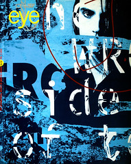
Spring 1994
The game of art
Graphic design was just one of the tools Karel Teige used to advance his vision of a new Czech society
In 1922 the first Czech Constructivist book design appeared in the shops of Prague. In the same year the first jazz orchestra – another kind of Modernism – was formed in one of the city’s nightclubs. The young republic, independent since 1918, was eager to play its part in linking the two lands of promise to the east and west: the Soviet Union and America.
This was the cultural backdrop for the avant-garde alliance Devetsil (meaning “nine forces”), founded in 1920 in the Prague Cafe Union. Its members were artists born around the turn of the century who shared a communist outlook and a commitment to artistic experimentation. Over the next ten years, they would meet day and night for discussions in the artificial light and public spaces of coffee houses, beer cellars and nightclubs. The group’s leader, Karel Teige (1900-51), a one-time painter who had renounced art in favour of exploring “mechanical reproducibility”, was an eloquent public champion of the new Modernist ideas.
After 1918, backed by a booming economy, Czechoslovakia embraced international Modernism. It is only since the velvet revolution of 1989, however, after decades of communist neglect and denial, that the scale of this ambition has been revealed. In the field of architecture, Baba, a small district of functionalist villas, was created in Prague, while the city Brno celebrated the republic’s tenth anniversary with an exhibition of trade fair pavilions by the best international Modernist architects. Mies van der Rohe, then director of Dessau Bauhaus, built the Villa Tugendhat for one of the country’s leading industrialists, while in the Moravian town of Zlin, centre of the shoe-manufacturing industry, Modernism reached its ultimate capitalist form. Here Thomas Bata, inspired by Taylorist principles of manufacturing industry, Modernism reached its ultimate capitalist form. Here Thomas Bata, inspired by Taylorist principles of management, had his office placed in a glass lift from which he could observe the activities of his staff on every floor of his futuristic factory. Meanwhile, Jiri Kroha, a leftist Devetsil architect, was imprisoned for sprinkling his architectural lectures with agitprop.
More than 80 artists from all branches of the arts joined Devetsil in the course of its existence. Among them were Miroslav Ponc, composer of twelve-tone music, kinetic artist Zdenek Pesanek, who created the first neon sculptures as well as organs that produced colour instead of sound, and the dancer Milca Mayerova, who performed the characters of the Latin alphabet on the stage of Prague’s Liberated Theatre. Apart from Teige – an energetic critic, agitator and inspiration for artists of all disciplines – the most prominent member of the group was the robust Vitezslav Nezval (1900-58), a poet who made poetry the starting point of the new art.
Teige focused his attention on two related areas which he considered to be the most appropriate agents of propaganda for an international socialist order: architecture and book design. Son of Prague’s city archivist and prolific writer, he was described by Moholy-Nagy as “the most well-informed man in Europe”. A born leader, he saw his personal vocation as being to open Czechoslovakia’s windows to the world, both east and west, following the stifling rule of the Austrian Empire. He was soon to become the ideologist and spokesman of the Czech avant-garde.
THE NEW TYPOGRAPHY
In its prosperous early years, the Czechoslovak Republic radiated optimism and confidence. The new order was expressed within Devetsil through the rise of Poetism, described by Nezval as “a way out of the disharmony of clashing world views that are mummified, poisoned and oppressive”. Teige wrote a manifesto of Poetism in 1924, a jubilant clarion call for the avant-garde to shake off the past and enter new associations: “Poetism is the pinnacle of like, of which Constructivism is the basis.” Fusing Marxism and Dada, Moscow and Paris, engineering and poetry, Poetism represented a “modus vivendi…the art of living and enjoying life”.
Teige did not complete his art history degree, and one of the tenets of his vision of art was that major innovations would come from amateurs. “The professional artist is a deviation, even an anomaly. In 1924 no professional athletes were allowed to compete in the Paris Olympics. So why can’t we reject the professional cliques of painting, writing, sculpting and chiselling businessman? The work of art should not be the subject of commercial speculation nor of academic discussion. In essence it is a gift or a game, without obligations and without consequences.” Poetism, with its emphasis on freedom from commitment and its craving for public life, was to be the pivot of Teige’s philosophy.
As the designer of around 100 books and magazines between 1922 and 1938 and a major influence and inspiration for avant-garde artists, Teige succeeded in steering book design in a new direction. In Prague alone at least four of the leading publishers – Frantisek Borovy, Odeon, Aventinum and Vaclav Petr – switched to Devetsil artists. Their names parade in the extensive book colophons that Teige once called “the passport of the book”: painters such as Toyen, Jindrich Styrsky, Josef Sima and Otakar Mrkvicka; architects such as Vit Obrtel and Zdenek Rossmann; critics such as Teige himself. Publishing flourished during these years, and new book design was regarded by the general public as a recommendation rather than a drawback. But outside Czechoslovakia this innovative work was hardly noticed, especially since the defenders of traditional typography tended to close ranks at international exhibitions. In 1925 Arthur Novak, defender of the book beautiful, mocked Teige’s design for Na vlnach TSF (On the waves of the telegraph), a book of poetry by Jaroslav Seifret (1901-86): “I wish Teige would have seen how the book was produced. The printing plant was like a circus. The typesetter had to rush from one case to the other to execute the typography according to the sketch. Such a variety of type was used that few printers in the republic could have set the book at all.”
But the new typography – authentic design as well as he inevitable imitations – was a commercial success, inside and outside Czechoslovakia. The phenomenon of senseless Modernist book design, shamelessly flirting from behind shop windows, infuriated serious Modernists such as Theo van Doesburg, who contemptuously spoke of a “marketing plague”. Teige managed to guard his integrity. At international exhibitions of commercial design, such as that organised by Kurt Schwitters at Amsterdam’s Stedelijk Museum in 1931, his designs for the ideological sector were surrounded by advertisements for ladies’ underwear (Jan Tschichold), cars (Herbert Bayer), electric cable (Piet Zwart) and raspberry cookies (Dick Elffers).
A UNIVERSAL LANGUAGE
Looking with hindsight at Teige’s book designs, one gets the impression that what makes them so eye-catching is not a matter of aesthetics, but their “universalism” – the consequence of his ambition to address both east and west. Teige seized every opportunity to speak universally. During the course of his lifetime the means he employed changed, but he maintained his belief that stylistic motifs from all over the world were there for anybody’s use. His designs bear traces of his admiration for El Lissitzky and Rodchenko, Tschichold, Bayer and the Bauhaus, Max Ernst and Hans Arp.
Teige’s early work uses primarily colours and abstract geometrical forms of Constructivism – the square, circle and line. After the appearance of his manifesto on Poetism, his universal language began to draw on cinema, especially silent movies, which he preferred to talkies for their attempt to overcome language barriers. This is the period of expressive typography – preferably using a different typeface for every page – that Novak condemned. The book covers of the period play out a sentimental movie, with their sequences of archetypal imagery suggesting mobility, freedom and exciting international connections through the use of foreign expressions such as “bon vent!”, and pictures of embraces, aeroplanes, letter, showgirls and movie stars.
In the late 1920s a more rigid approach crept into Teige’s work. His typographic manifesto of 1927 proposed a formal basis for universalism: standardisation, economy, rationalisation. Universality in book design now meant first and foremost that readers should be able to find their way easily through the text, with an emphasis on structure and function. The book should be as accessible as “a timetable, a filing system, a keyboard”. He dismissed decoration and advised designers to use colour sparingly, as a cue or contrast. In his own apartment the curtains and pictures were removed and the heating ducts painted red to stress their function.
Teige’s obsession with a universal language led him to explore the concept of a universal alphabet, along the lines of experiments at the Bauhaus, and some of his designs use an adapted version of Bayer’s Universalschrift. With its monochrome cover, standard A5 format and mixture of upper- and lowercase lettering, his design for Nezval’s Chtela okrast lorda Blamingtona (She wanted to steal from Lord Blamingtona), published in 1930 – the year that Teige lectured at the Bauhaus – is typical of this functionalist approach. Interesting enough in itself, it lacks poetic agility. Teige justified curtailing the designer’s freedom – so contrary to his ideal of poetic freedom – with the argument that the “laws” he proposed were not chains but regulators that would help safeguard the designer from aberrations.
THE SOVIET DREAM
The change in Teige’s typography did not occur by itself and his architectural writings also became more radical. In that area too he had started as a complete amateur. In 1922, on the recommendation of the leftist architect Karel Honzik, Teige was appointed editor of the prominent architectural review Stavba (Building). With considerable flair and enthusiasm and a fashionable admiration for engineers’ architecture such as the Dnjepr power station and Canadian silos, Teige zealously advanced the case for international Modernism, such as the Bata shops and headquarters.
But as professionalism increased and the economy slumped, Teige’s views sharpened. Architectural criticism became his prime instrument for attacking society. For instance, in reviewing the housing problems of the poor, he criticised “bourgeois privileges” such as privacy, spacious accommodation, the family structure and the marital bedroom, that “stage set of Strindbergian drama”. Here Teige lost contact with the reality of Czech society, where collective housing was restricted to sanatoria and student accommodation. At a time when the Soviet model was beginning to arouse the suspicion of its most ardent sympathisers, Teige pledged himself fully to it.
“In 1929 I signed a manifesto by seven authors,” recalled Jaroslav Seifret. “Of those seven I was dismissed from Devetsil on the instigation of Julius Fucik.” This episode cost Teige the goodwill of many of his friends. The pretext was an official purge of the Soviet communist party, whose victims included Devetsil authors of publications designed by Teige. Teige and Nezval saved their communist reputations and banished the outcasts from Devetsil. The group was dissolved two years later.
In other areas, too, Teige exhibited immoderate loyalism. In 1932, while discussing the merits of photomontage – “Raphaels without hands can make them” – he called the medium a “trumpet for the Five-Year Plan”. On the other hand, he publicly decried the Soviet denouncement of Constructivism and rejected the dogma of Socialist Realism. From 1934 onwards, driven by an unswerving poetic preference for unlikely oppositions, he even embraced French Surrealism. Its glorifying of free association no doubt appealed to him.
TOO CLEVER TO BE SANE
Teige’s poetic world functioned as long as he could choose the best from both communism and capitalism. But his “world that laughs” ceased to be viable when in 1936 the Soviet show trials divided communist sympathisers into opponents and proponents. The French Surrealists, led by Andre Breton, put some pressure on their Czech allies to detach themselves from official Soviet party politics. Teige consented and for the rest of his life clung to Surrealism.
For a while his book designs once more used images, often photomontages. But with the death of his poetic dream of “a way out of the disharmony of clashing world views”, Teige’s graphic output began to dwindle. The German invasion, war and the communist putsch of 1948 destroyed the cultural climate. In book design traditional typography was revived, and Teige, who had always denounced the “Privatmann” in his fellow citizens, made hundreds of personal photomontages. Most of them are images of more or less undressed women cut out from magazines and set on a cruel stage. Meanwhile his publications, such as the 1947 Das moderne Lichtbild in der Cechoslovakei, show a tendency towards regionalism rather than universalism.
After the putsch, Czechoslovakia became a mere satellite of the USSR. At the pack of Stalinism, the communist authorities started a campaign against Teige. He was condemned for his “cosmopolitanism” – the equivalent of treason – and called a “pornographer”. In 1950 it was announced that Teige was someone “with an inability for that sincere, innocent, human gaiety that we call humour”, and faithful comrade Nezval, elevated to the rank of state artist, called him too clever to be sane. The campaign put an end to Teige’s public life and to any design or writing commissions. He died in isolation the following year.
CRITICISM AND HUMOUR
Teige’s book designs show talent, boundless energy and a sharp eye for the right models, including El Lissitzky and Jan Tschichold, who in turn approved of this eager Czech universalist whom they invited to international exhibitions and to whom they referred in their publications. Whatever his designs may lack in consistency and balance, Teige has added some outstanding works to the international corpus of Modernist design, including the 1926 Abeceda, the 1928 S lodi jez dovazi caj a kavu, the Devetsil journal ReD (1927-31), the 1930 Alamanach kmene and the 1933 Prace Jaromira Krejcara. In evaluating Teige’s graphic work one should allow for his numerous essays, books and articles, the magazines he edited (Disk, ReD, Stavba, Zeme Sovetu) and the numerous public speeches he gave. Karel Honzik vividly described Teige the public speaker: “I saw immediately how Teige was excited by his inner emotions, how he nearly crushed his pipe in his fist, how his gaze wandered about restlessly, how he started to stammer. He was sturdily built, with dark hair and stubby dark hairs sprouting from his cheeks. He could stab you with his piercing black eyes, constantly agitated with a mixture of criticism and humour. He was always dressed in a black suit, his intellectual uniform, probably seldom or never ironed. One had to admire his courage on the platform, when he participated in discussion before a large audience. While tensely trying to formulate a thought he often stood on the tips of his toes and when sitting down in a circle of debaters, he curled his legs or his hands around that chair with the same vehemence with which he pushed his pipe from one corner of his mouth to the other.”
Teige was never a “designer” in the present meaning of the word. He abstained from a professional career or a safe position. For him this was a way to double the outlets for his propaganda for a better world – as both the author who presents intellectual propaganda and the designer who delivers visual propaganda. In the context of his extensive verbal output, it is hard to suppress the idea that for Teige, graphic design was merely a clumsy metaphor for the circulation of ideas.
After Teige’s death the communists eliminated almost all trace of him. Even today, in spite of some exhibitions in Prague, his designs in the rural National Museum of the Book (Zdar), though listed in the catalogue, have been removed for an indefinite period, “undergoing restoration”, in the words of that well-worn communist phrase. But studies on Teige have recently been published, other are in preparation, and his work can be seen in several countries. This unshaven nightclubber, 40 years after his death, still inspires admiration as a designer, a writer and a daring believer.
First published in Eye no. 12 vol. 3 1994
Eye is the world’s most beautiful and collectable graphic design journal, published quarterly for professional designers, students and anyone interested in critical, informed writing about graphic design and visual culture. It is available from all good design bookshops and online at the Eye shop, where you can buy subscriptions and single issues.