
Spring 2018
The information graphics
Good data visualisation is vital to effective news publishing, says Simon Rogers
Information graphics, in their truest form, are as necessary and as crucial to news publishing as they have ever been. At a time when there has never been more data – or more tools to visualise it with – there is also a problem with old-fashioned notions such as ‘truth’ and ‘facts’, which have become debating points rather than starting points.
This requires new skill sets for journalists and designers in the news industry. Data journalism is as much about being open source and collaborative as it is about clicks and editorial. That is not a space we are used to occupying.
But magazines are particularly well suited to a time when thoughtful analysis is so desperately needed. National Geographic, for instance, has turned carefully considered visualisations into an award-winning artform. Time’s Datalab is an open-source compendium of data-based analyses that reflect the magazine’s journalism in print and online.
That is why I have written information graphics books for children. We learn to understand the world visually long before we learn to read. Information graphics can help us make sense of a world that is nuanced and confusing, despite the push to make it appear black and white.
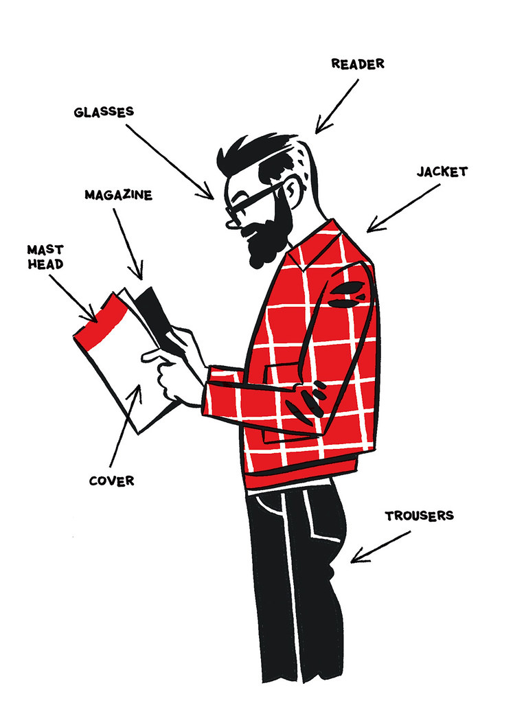
Top: Illustration by Jason Ford.
Simon Rogers is data editor at the Google News Lab and director of the Data Journalism Awards
First published in Eye no. 96 vol. 24, 2018
Eye is the world’s most beautiful and collectable graphic design journal, published quarterly for professional designers, students and anyone interested in critical, informed writing about graphic design and visual culture. It is available from all good design bookshops and online at the Eye shop, where you can buy subscriptions and single issues. You can see what Eye 96 looks like at Eye Before You Buy on Vimeo.