
Autumn 2023
The power of physical books

Sonya Dyakova has a way with words, ideas, space and type. By Mark Sinclair
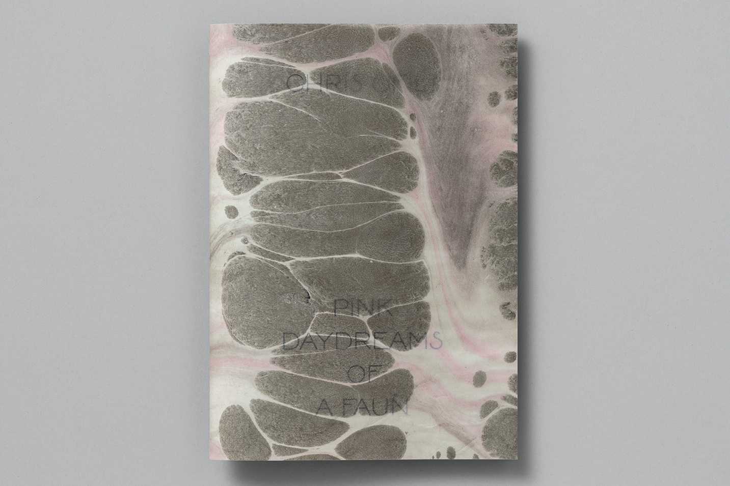
Over the past ten years, Atelier Dyakova has been steadily branching out from publishing and editorial design. However the physical printed book remains a key object both in its practice and in the life of the studio’s founder, Sonya Dyakova. A new publication designed by the studio for artist Chris Ofili, for example, has a direct link to a gift given to Dyakova by her father – a book about Léon Bakst, artist and costume designer for the Ballets Russes in Paris, whose designs for L’Après-midi d’un faune in 1912 in part influenced Ofili’s own Pink Daydreams of a Faun print series. ‘I remember even the way this book smelled. I kept it for all this time,’ says Dyakova. ‘It’s so useful, you never know when you might need it. Never throw away your books. They have a lot of power.’
The impetus behind the establishment of her own studio in 2014 can be traced back to her formative years in Russia, the US West Coast and, perhaps most significantly, London. Following positions at various studios in the city, and roles at publishers Phaidon and Frieze magazine, Dyakova now runs her Deptford-based visual communication studio with a team of three other designers, Gabriella Voyias, Tom Baber and Ben Greehy, and studio manager Marta Fernandez Canut.
Chris Ofili’s Pink Daydreams of a Faun (2023) is a series of prints inspired by Stéphane Mallarmé’s Symbolist poem L’Après-midi d’un faune and made using the Japanese suminagashi paper marbling technique. Top. Portrait by Orlando Gili, 2023.

Working directly with Ofili and the Victoria Miro Gallery, Atelier Dyakova designed a publication to accompany the prints which features unique chine collé backgrounds for ten etchings and a jacket hand-painted by the artist in an edition of 30.
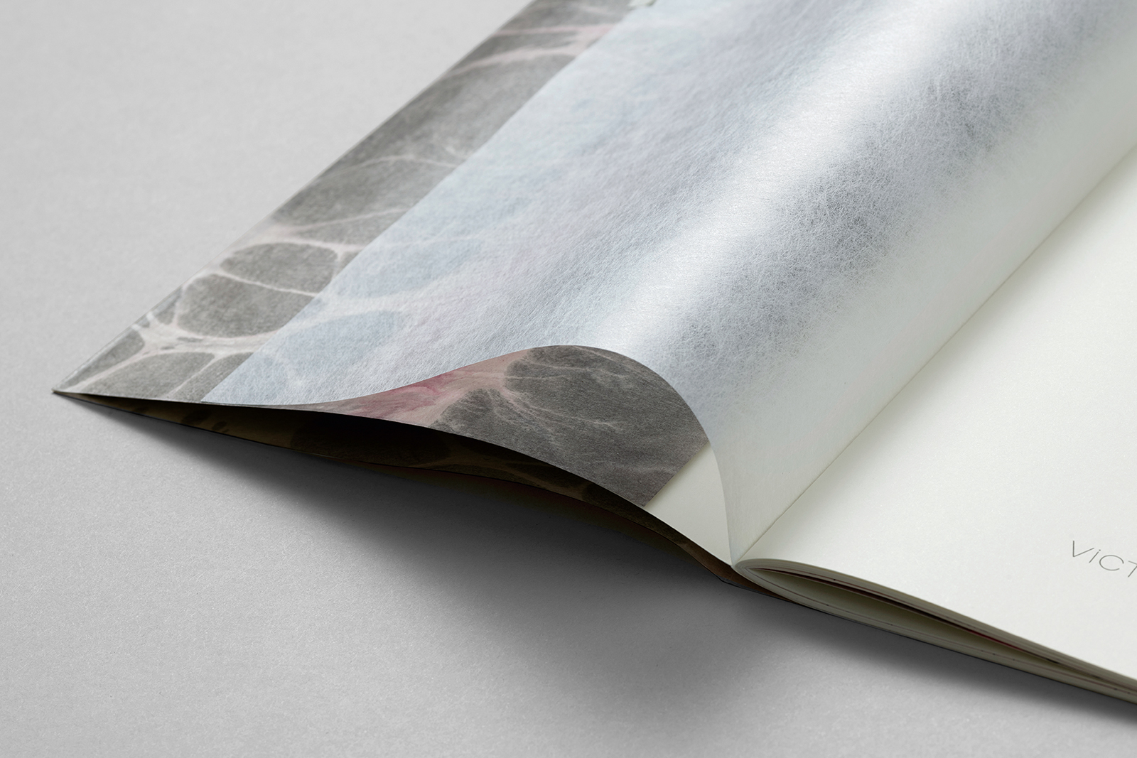
The studio also created a bespoke display typeface for Pink Daydreams of a Faun, inspired by the world of the Ballets Russes and artists associated with it, such as Léon Bakst and Adolph de Meyer. Photography: Ed Park.
Dyakova’s parents were both architects who met while studying architecture in Novosibirsk. Growing up in Siberia’s largest city, Dyakova noticed differences between her own family and those of her friends. Her grandparents’ generation was also creative, and included a photographer, a sculptor and a tailor. ‘I knew our family were different. A Soviet block is like a beehive, you’re all close together, all in each other’s business. I noticed from [the] things friends’ families had, from their interiors– everything in the shops was the same – the choice of books, objects, they were different.’
Dyakova left Russia with her mother and brother in 1989, in her early teens, travelling first to Vienna before spending three months in Rome. The three then went to San Francisco where Dyakova’s mother had friends; she attended high school and then the University of San Francisco (USF), a Catholic institution which had links with the Academy of Art College where she took art and design classes, partly inspired by her brother’s architecture studies and his magazines on American illustration. USF was, she says, ‘very Californian’ and alongside ‘Tai Chi and dream interpretation’, Dyakova was exposed to a wider curriculum which included history and philosophy.
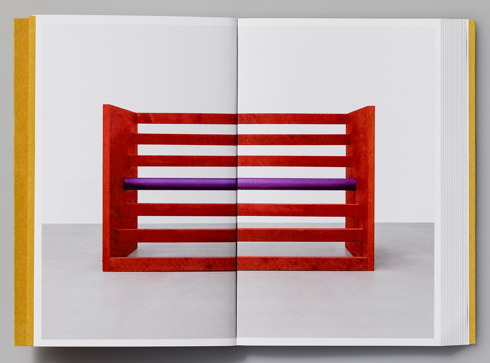
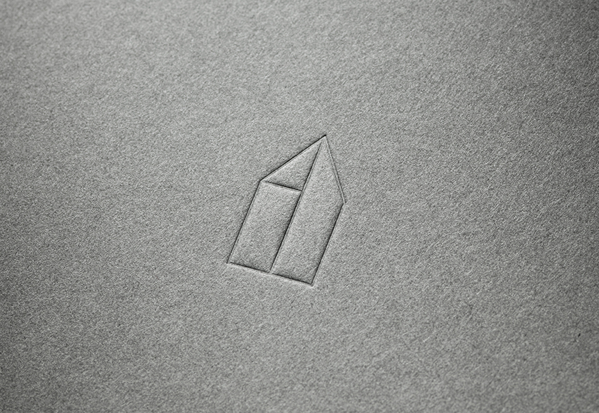
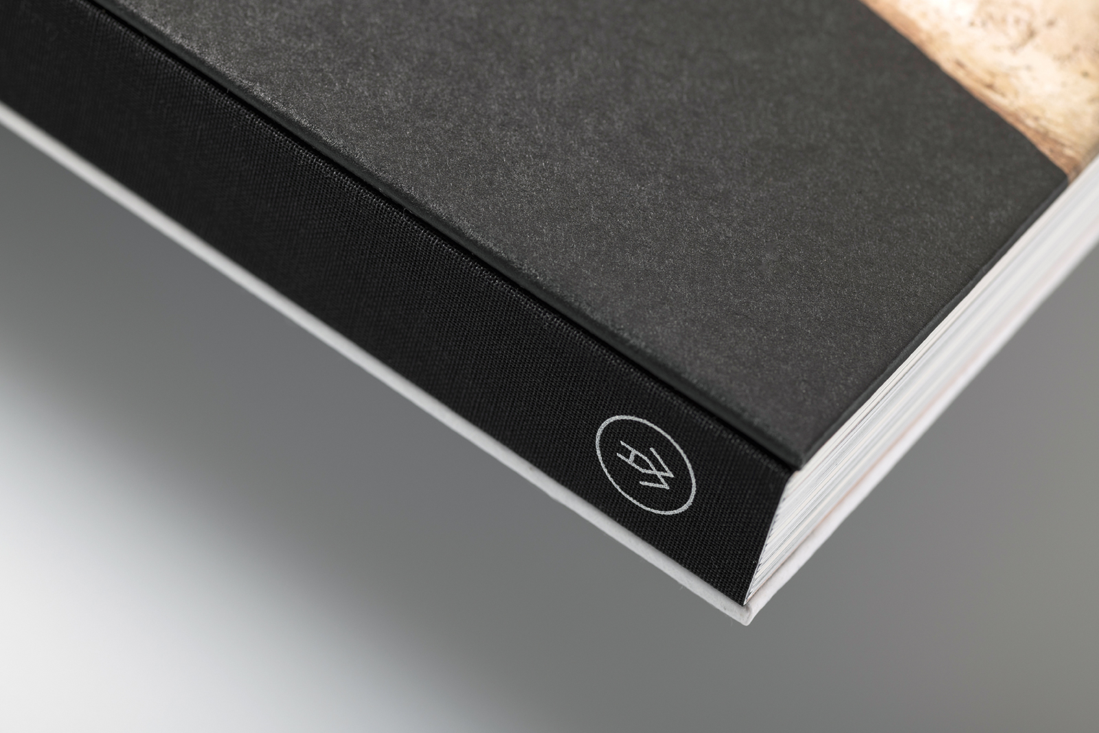
The Donald Judd book (2019) was made for the first solo exhibition of Judd’s three-dimensional work in France in eighteen years. Published by Galerie Thaddaeus Ropac in Paris, it contains texts by Judd, Flavin Judd and Catherine Millet. Atelier Dyakova worked closely with Flavin Judd to create an ‘experimental object’ with a slanted book edge that references the geometry of prints featured in the show.
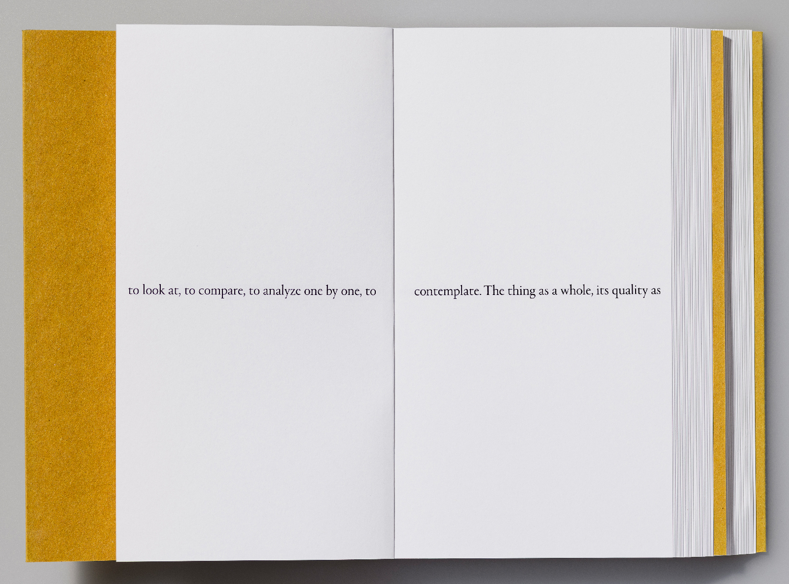
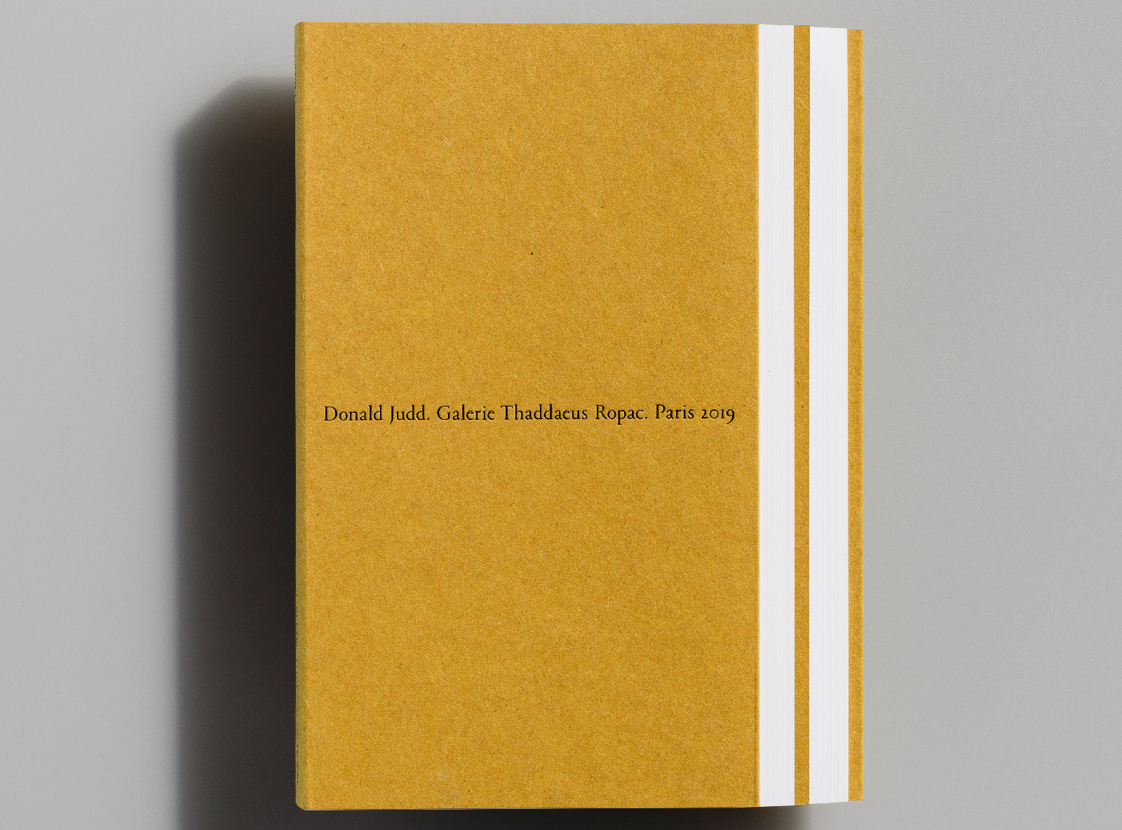
The text layout of Donald Judd refers to the artist’s interest in the exploration and use of space. ‘In terms of material, layout and type choices, we were thinking about [Judd’s] abandonment of the New York life and going to Marfa [in the Trans-Pecos desert region of west Texas] and that environment,’ says Dyakova. ‘We used a very rough material for the cover that resonates with that place.’ Regarding the slanted edge, she says: ‘It is more about how it is connected to the work, to make it work somehow, make it into an object that can be made and produced.’ Photography: Ed Park.
It was during college that, at a friend’s suggestion, Dyakova embarked upon a trip to London that would kickstart her design career. ‘Sometimes if you want to change something you do whatever it takes. London was immediately appealing,’ she recalls. Prior to leaving the US, Dyakova had done some research in San Francisco’s Rizzoli bookstore, which carried a good selection of European design books (Tomato’s Process; A Tomato Project proved irresistible and she was later invited to meet with the collective). She recalls poring over D&AD annuals in the design section of Borders, copying out the names and addresses of studios whose work she liked.
Dyakova methodically approached the studios that appealed to her. To help get her work in front of people she sent them hand-made books ahead of phoning: ‘Another powerful thing about books: once you give someone a book that is nicely made, you know, “I dare you to put it in the garbage!” You can’t! I hand-made these leporello books [as] a way to show my work. I collected some leaves [and] pressed them. I would send it ahead so [that] I had a reason to call and say who I was – the one who sent you that thing.’
One of the names on Dyakova’s list was Vince Frost. ‘With Vince, it was a bit of luck and he liked what I showed him,’ she says. ‘When I got that internship in that studio, I just thought it wasn’t real. I had a massive shock. It was not a good thing – almost to a point where you’re doing things, but you feel so scared that you’re not doing them right.’ This early experience, while hugely valuable, gave her a sense of ‘imposter syndrome’, she says. ‘When you’re a student, you look at other things and you learn by copying and trying. When you’re on the spot, trying to solve a problem – it was difficult for me to have people around with expectations. [It was] a period of teething, finding my place.’
After leaving Frost’s studio, Dyakova briefly worked at Daniel Eatock’s Foundation 33 before again finding some kindred spirits within the pages of Idea magazine. An article on Kerr|Noble, the studio founded by Frith Kerr and Amelia Noble, led Dyakova to approach the studio. They worked differently to Frost, she recalls, exposing her to a range of non-design interests and activities. ‘They were using references that were not design references, it was all about art … but also really free, somehow … very conceptual, but also very feminist in a way. Not about rights and so on, but “we are women, and we like Beyoncé and cute shoes!” This was so cool.’
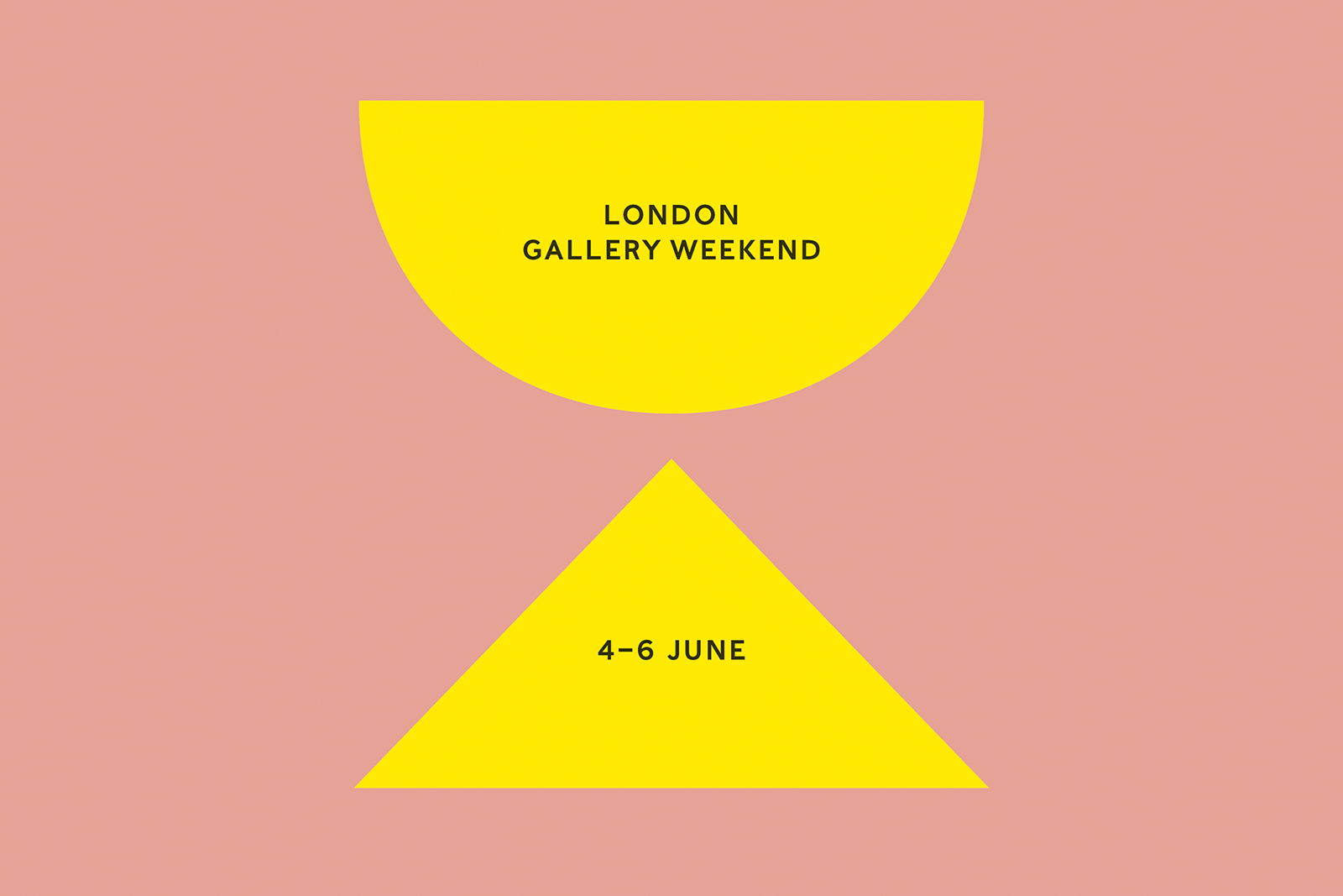
Atelier Dyakova’s identity for the annual three-day London Gallery Weekend was inspired by the London brick and the indentations on its surface, known as ‘frogs’. Patrick Fry’s Brick Index (see Eye 101) served as a source, says Dyakova.
Kerr|Noble also designed their own type. Dyakova remembers being stunned by this: ‘[It was] completely daring, I never thought you could do that. My education never talked about that, so it was a real eye-opener. Working with these two young women [was] very nurturing … I learned you could use illustrators and that the typography doesn’t have to be loud, but could be quiet and quirky. In their work they had a lot of quirks and humanity. They didn’t have to [make] this macho “design”, you know?’
Dyakova cites one experience in particular that changed the way she saw the design process – a method for collecting visual ideas that transformed the way a design direction could be explained to a client.
‘The main thing I learned from them that was the most valuable, was how they compiled a project together, because they used these Muji books to put references in that they collected,’ she explains. ‘We would photocopy a bunch of stuff and put these in – making a book. Each thing was a page so you could collate your own ideas together. We like how this painting does this, or we’re going to take the colours from that. I had never done that before – how do ideas appear? How do you think of them? This was a physical way of putting an idea together, to keep it for reference, and also to present it to your client. And when you present it in this way, it became clear that it was much more difficult to knock down because it was so well put together – you had rationale for your thinking.’
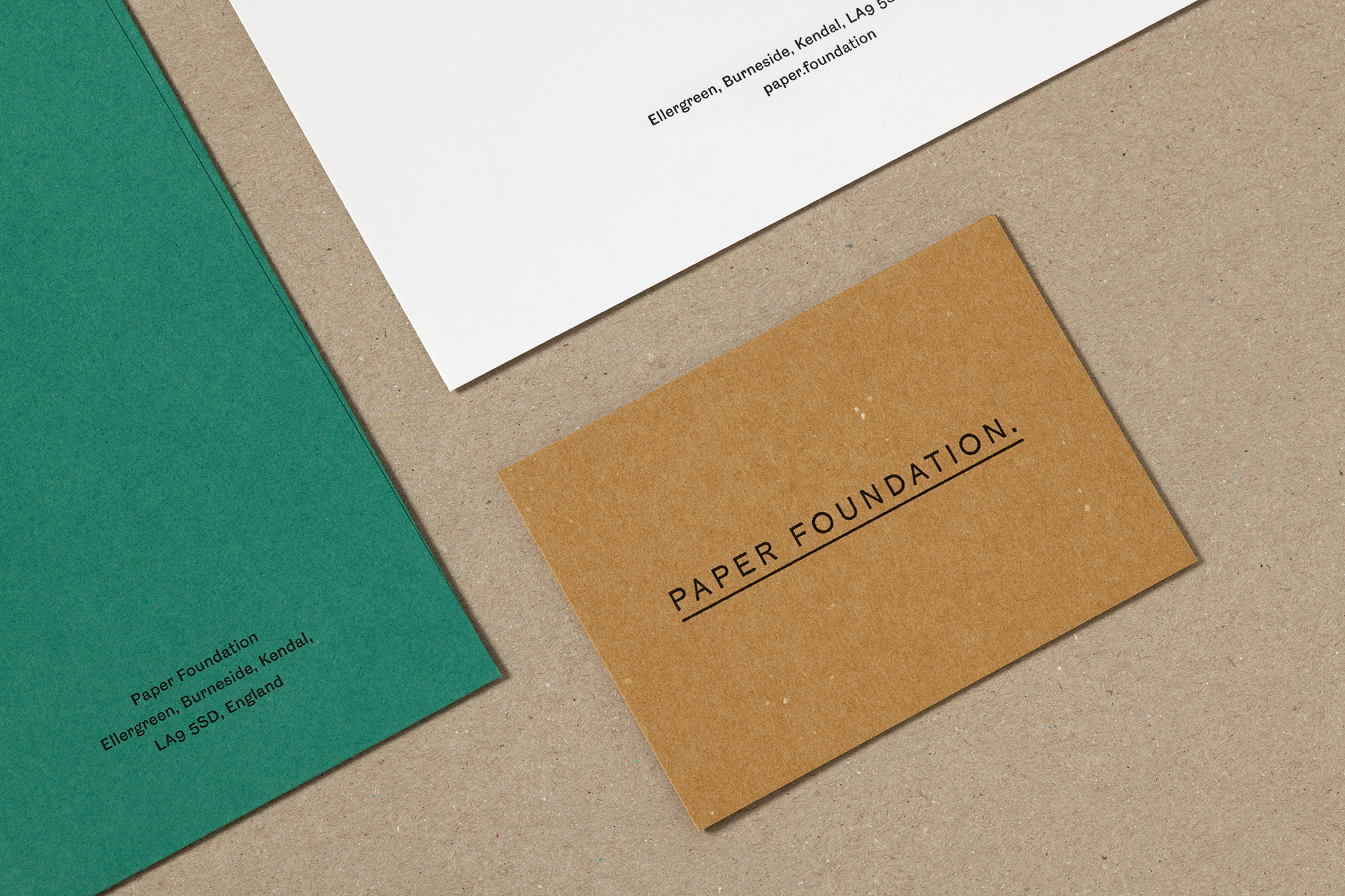
Identity design (2020) for the Paper Foundation, an arts and heritage charitable organisation created to celebrate paper, founded by Mark Cropper (of the James Cropper paper mill). Atelier Dyakova’s identity for the Foundation, based in Burneside in England’s Lake District, lets the paper play a pivotal role: the logo is based on historical watermarks used by paper-makers to certify their production, while the all caps and underlined wordmark is based on a telegram envelope from the 1800s that Dyakova came across in the Foundation’s archive. Photography: Ed Park.
At the suggestion of Pentagram’s Angus Hyland, Dyakova then went for a job as design manager at Phaidon Press. Alan Fletcher was there as design director and, she believes, hired the young designer for her sensibility rather than her people managing skills. The change of work culture was considerable but gave Dyakova an insight into the machinations of art and design book publishing. Her role required her to find designers to design new books, but invariably she would put herself forward for some of the more interesting ones.
In an early meeting, the team were discussing who was going to work on the 720-page-monograph of prolific Japanese photographer, Araki [Nobuyoshi Araki: Self, Life, Death]. Dyakova was a huge fan of the work. She put herself forward. ‘There wasn’t a lot of questioning,’ she says. ‘“Have a go, if it’s horrible we’ll find somebody else”.’ Inspired by the approach of M/M (Paris) and Graphic Thought Facility, Dyakova’s design was elaborate – so much so that Fletcher suggested publishing a special edition of the book alongside a regular trade volume. The wider process was also an education, Dyakova adds, courtesy of Fletcher who would routinely list out names of his contemporaries that she should look up. Fletcher was kind and nurturing, she recalls; at private views and parties he would introduce her to people as the ‘art director’, both of them knowing that was not really her role.
In 2018 Atelier Dyakova developed a flexible identity for books published by the gallery Hauser & Wirth. The studio’s logo is built on a vertical and diagonal grid with an underlying structure that enables it to work well at different sizes, ranging from the spine of a book to signage on the gallery’s own bookshop.
When Dyakova left Phaidon in 2010 to have her first child, she began to think about establishing her own practice, a solution that would match both her ambitions to work for herself and her family setup. Almost as if to bridge the gap, a perfect job emerged, which would provide a good amount of flexibility. Frieze magazine was looking for an art director. Dyakova undertook a complete redesign of the magazine, locking herself away over the Christmas period. She had never designed a magazine before and was apprehensive, but she realises now that this spurred her into work. ‘It’s almost like to get rid of this anxiety, you have to do something, you have to act,’ she says. ‘That was a good way to work through it … It was a good step forward for me to have something of my own to contribute. From then it was much more enjoyable as it was my system and not someone else’s.’
Further encouraged by an unexpected Grand Prix from the Tokyo Type Directors Club for her work on Creamier, a Phaidon publication, Dyakova says another key moment in her development was acquiring an assistant as she systematically approached new clients. Finally, one responded.
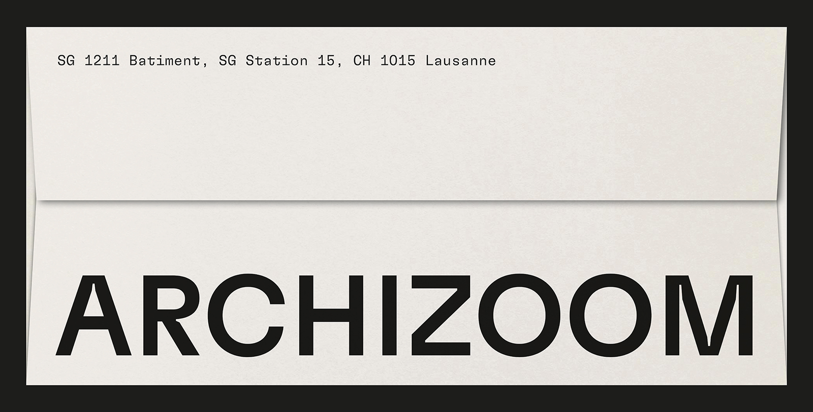
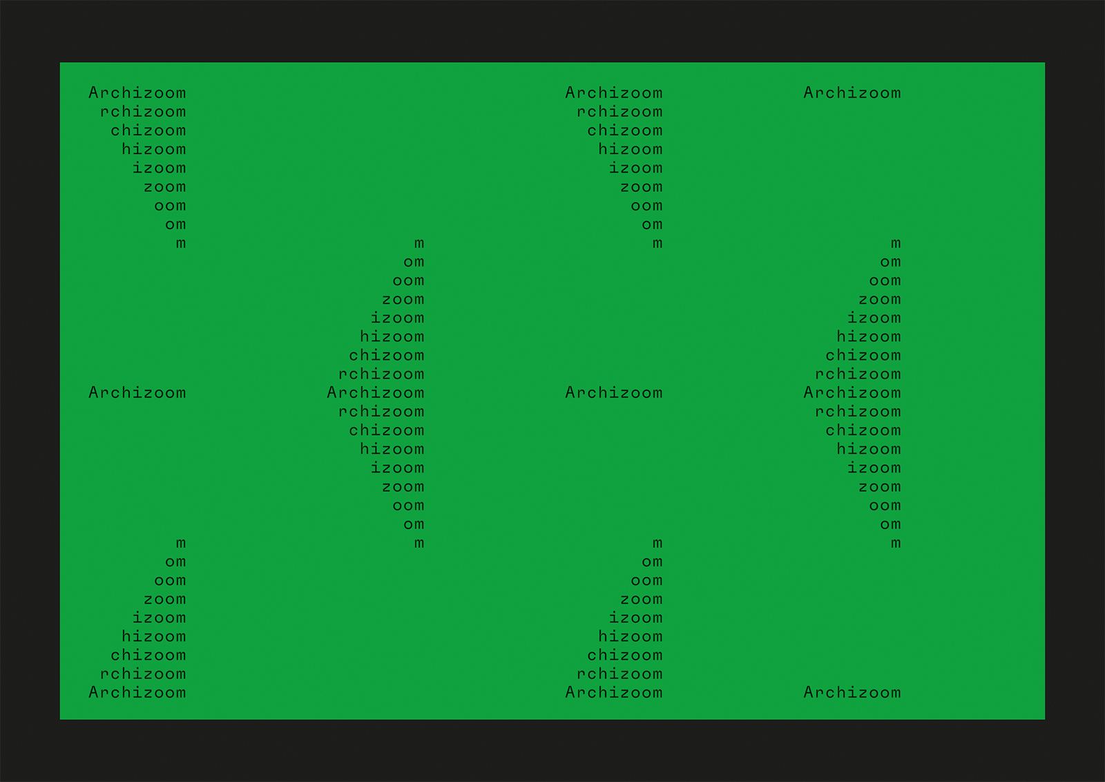
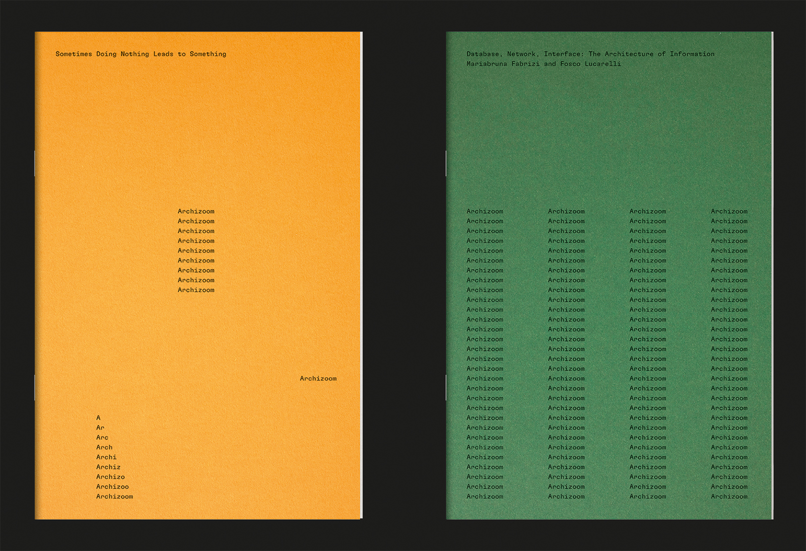
Identity design for Archizoom, a cultural platform for exhibitions, conferences and debates on architecture, 2021 and ongoing. Located on the EPFL campus in Lausanne, Switzerland and named after the 1960s radical group Archizoom Associati, the gallery reflects the notion that design, in its broadest sense, is inseparable from research and political engagement.
The publishing team at the Fondation Cartier, who were working on a Ron Mueck book, became her first client. The fashion brand Lemaire also discovered Dyakova early on, through her book design, and asked her to take on their brand redesign. She had never worked on an identity before but said yes: ‘Work is work,’ she says. ‘I think the incessant emailing had an effect, somehow. You know when you just manifest something? You think: “I want to work with Hauser & Wirth, I heard that they just opened their Somerset restaurant” – and then it happens.’
Dyakova met the publisher of Hauser & Wirth and ended up designing the logo for the new venue alongside a book, which led to many more projects with them. ‘I rely on these simple methods,’ she admits. ‘Some people are more clever and rely on connections that they make, which I also learned to do. But you shouldn’t underestimate the simple act of reaching out.’ More work followed and the range of projects she was asked to take on expanded across the cultural and commercial sectors, into brand identity, packaging, spatial design, digital and print. Publishing naturally remains a key area for the studio, but it doesn’t define what it is now capable of.
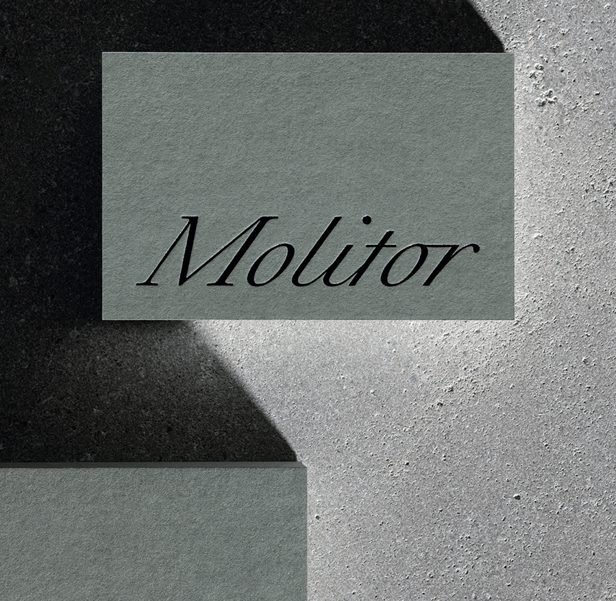
Identity design for Molitor, 2022. This art gallery was founded in that year by Marie-Christine Molitor in a residential development near Berlin’s Potsdamer Straße. Atelier Dyakova aimed to create a ‘warm and personable’ identity, using handwriting as a starting point. The wordmark was made in a typeface by Raphaël Verona. The stationery range uses colours that reflect the building’s steel and concrete finishes. Photography: Ed Park.
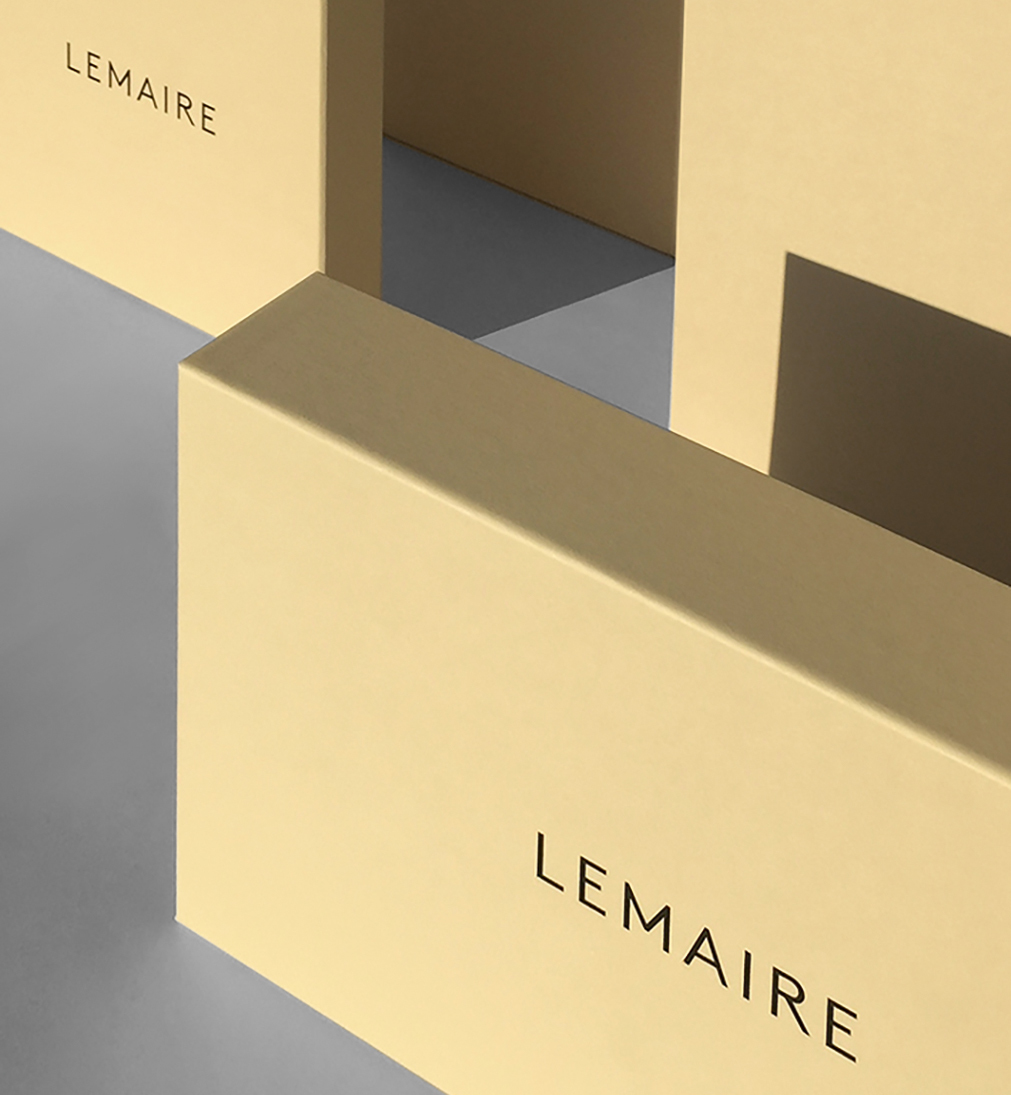
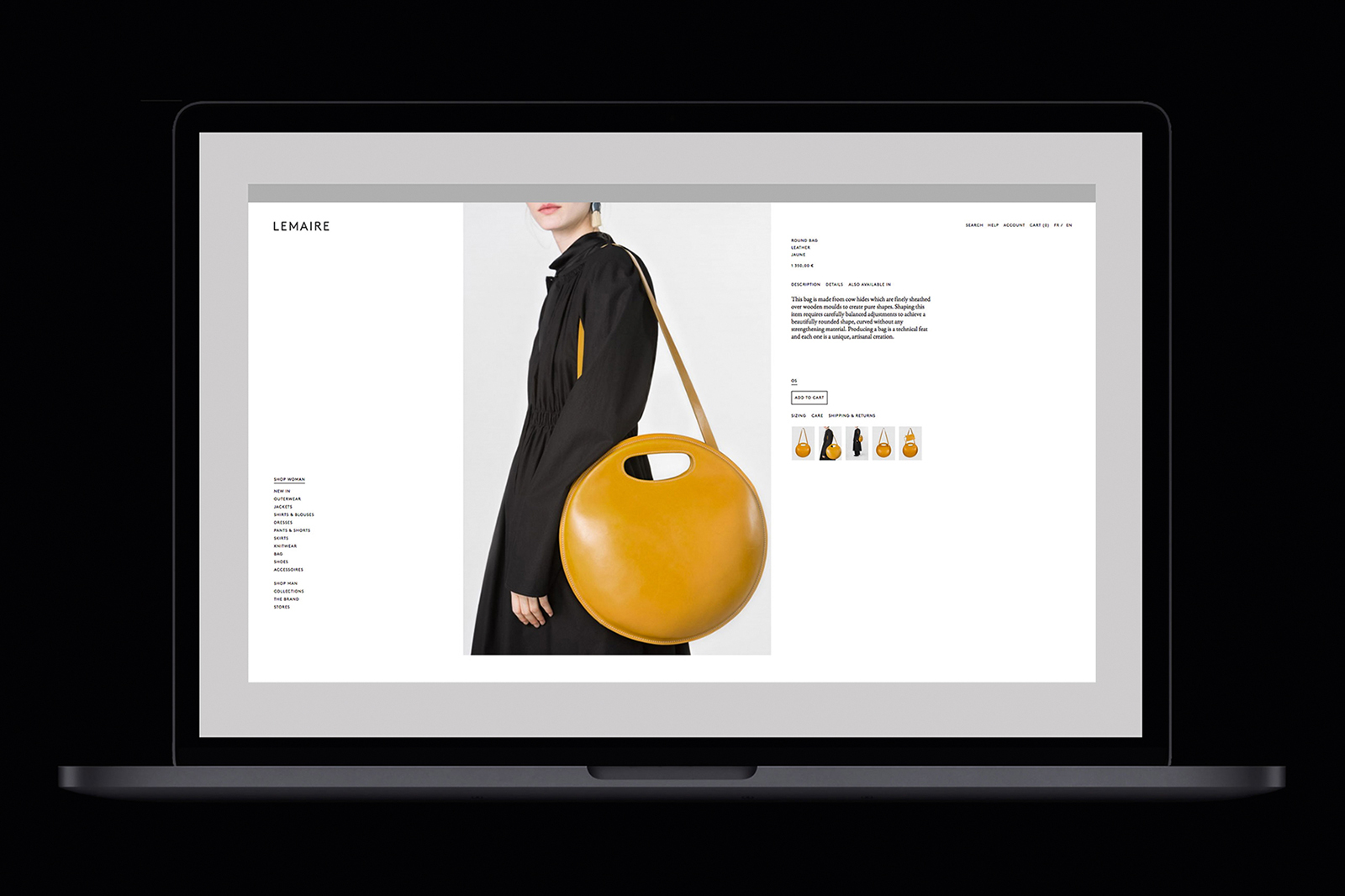
Identity for fashion brand Lemaire, 2021 and ongoing. Founded by Christophe Lemaire in 1990, the quality clothing brand has undergone several iterations and in 2014 Atelier Dyakova was commissioned to rebrand the company. The work began with the logo and brand identity guidelines and extended to the website, labelling, packaging, stationery, look-books and digital communications. Photography: Polina Hohonova.
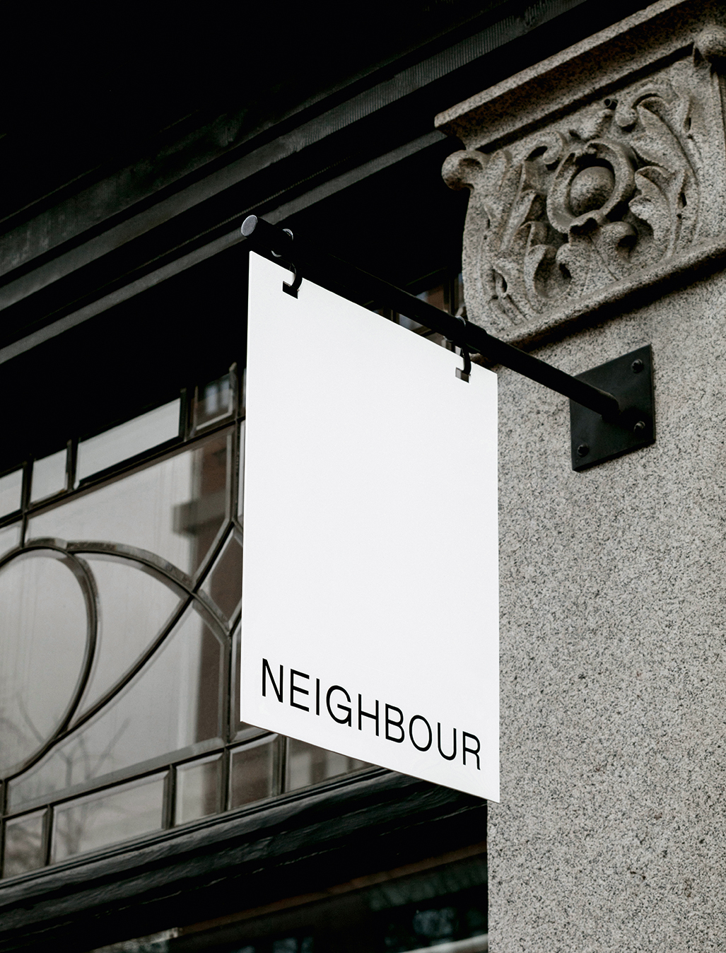
Identity design for Neighbour, a clothing and object store in Gastown, Vancouver, which opened in 2022. Owners Karyna Schultz and Saager Dilawri carefully select every brand they sell and, says Dyakova, ‘one of the concepts was thinking about the shop as a friendly neighbour.’ Photography: Ian Lanterman.
If anything, Dyakova’s foundational work in books has influenced the studio’s work in identity design; she suggests that the two areas overlap considerably: ‘Aren’t books like an identity in themselves?’ As the studio’s website states, its approach to work is ‘firmly rooted in conceptual and typographic experimentation’, and it is this, coupled with in-depth research and a fascination with materials and tactility, that enables them to cover a wide ground and ensure that a variety of approaches and aesthetic considerations are visible in their portfolio.
With this variety, one aspect that connects the many projects the atelier has worked on over the past decade is that each one begins with language, a notion Dyakova mentions in an interview with publishers David Zwirner Books, whose Donald Judd, Artworks: 1970-1994 was designed by the studio. ‘We use language in our work as a starting point,’ she explains, expanding on this idea of talking before visualising.
On any given job the studio aims to ‘formulate an idea with words’ and the first act is to ‘type out all the qualities of the subject matter you’re dealing with, and what you’re trying to achieve, but only using words,’ she says. ‘[Get to] solutions through writing – then use InDesign, colours, type. It’s more direct and pure. We do this systematically now … after research, our first [presentation] slide is keywords. These then guide you and you can check in with the list.’ It comes back to collecting ideas with Kerr|Noble, page by page, and a simple maxim that the pair once invoked to Dyakova: ‘Think a lot, do little’.
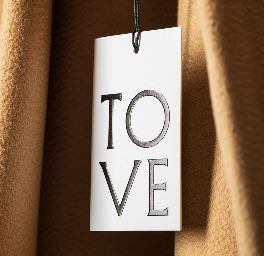
Identity for fashion label TOVE, founded by Camille Perry and Holly Wright in 2019. The silhouettes are ‘architectural’, says Dyakova, evoking a feminine ideal with the ethos of creating refined garments. Some of the clothes reminded Dyakova of Greek statues: the studio developed custom letterforms evoking the chiselled lettering of classical statuary. Photography: Ed Park.
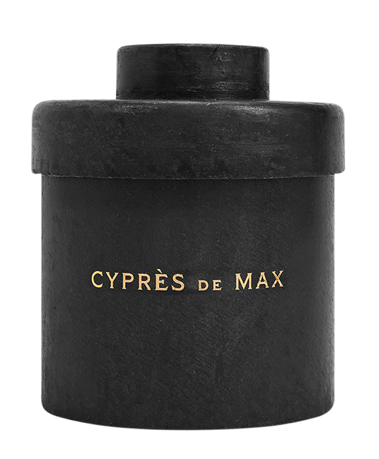
Identity for Mad et Len, the artisanal perfumer based in the southern French Alps, 2022. Atelier Dyakova’s identity aims to evoke the atmosphere of the traditional apothecary … or an alchemist’s lair. The custom typeface reveals sharp and sculptural letterforms that take inspiration in equal parts from local hand-painted signage and the black iron vessels that house Mad et Len’s products. Photography: Guillaume Roujas.
It also comes back to books. Something of their versatility, their variety of structure and of form – their sheer willingness as objects to communicate in any number of different ways at the hands of a great designer – means they remain a strong foundation for Dyakova’s ever-evolving studio practice. And books can act as a catalyst for change. In April 2022, in response to Russia’s war on Ukraine, the studio held a month-long book sale of many rare and out-of-print titles, raising more than £17,000 for Médecins Sans Frontières. As this Books for Ukraine initiative proved, even when people feel powerless, books really can have a lot of power.
Mark Sinclair, freelance writer, editor, Stroud
First published in Eye no. 105 vol. 27, 2023

Eye is the world’s most beautiful and collectable graphic design journal, published for professional designers, students and anyone interested in critical, informed writing about graphic design and visual culture. It is available from all good design bookshops and online at the Eye shop, where you can buy subscriptions and single issues.