
Spring 2018
The reviews

Evaluations by ‘trusted third parties’ are a mag staple, says John L. Walters
For certain magazines, the reviews section is its heart and soul, possibly the economic reason for its existence. The subject matter might be cars, domestic appliances, music, literature, games, holidays or gadgets; on a very basic level, the reviews provide a service to the readers as consumers – whether it is a star rating out of ten or an in-depth critique. Titles such as How To Spend It, Stuff, What Car and Which? make this clear.
A cultural magazine’s mood, intellectual positioning and visual style (or lack thereof) is often determined by the critics it employs more than anything else. At a time when a multiplicity of exhibitions, books and movies jostle for attention, reviews in titles such as Sight & Sound, The New York Review of Books, The Paris Review, Artforum and The Wire aim to perform a vital service to their readers. Music titles, such as Vibe, Gramophone, Straight No Chaser and Rolling Stones, accompany reviews with album sleeves, which establish an instant look and feel appropriate to the readership.
For the editorial designer, however, the sheer quantity of material is a challenge usually solved by either shoehorning pictures and text into fixed boxes, or running on within a more flexible grid. Though editorial designers rarely show off such layouts at a conference, or enter them for awards, well designed reviews pages are testament to the art director’s ingenuity and resourcefulness.
The New Yorker’s ‘Briefly Noted’ book reviews show thumbnail-sized book covers; its more substantial reviews (for movies, TV and music, too) tend to use commissioned illustrations. Its capsule reviews – restaurants, art galleries, nightlife – at the front of the magazine are masterpieces of compression, running elegantly across a three-column grid that has barely changed in 93 years.
Once a pattern is established, a magazine’s readers will expect the reviews to look much the same, in the same section of each issue. Design innovation may be limited to nuances: colour, typographic details and spot illustrations.
Indie film magazine Little White Lies, whose feature section is dominated by commissioned illustration, sobers up for its extensive reviews section with a spread or a page for each film accompanied by a single still. Shorter reviews are two to the page, and each movie scored out of five for ‘Anticipation’, ‘Enjoyment’ and ‘In retrospect’, which provides scope for a mini infographic.
For titles such as Stereophile and Digital Photographer (still a print magazine), product reviews are their bread and butter; doubts about the honesty of online reviews mean there is still a place for the evaluations of trusted third parties on the printed page. The designers of such pages, though, may take a ‘Zen’ approach to endless renderings of matt objects, perhaps concentrating on the choice of type that wraps around each cut-out.
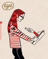
Top: Illustration by Jason Ford.
John L. Walters is editor of Eye
First published in Eye no. 96 vol. 24, 2018
Eye is the world’s most beautiful and collectable graphic design journal, published quarterly for professional designers, students and anyone interested in critical, informed writing about graphic design and visual culture. It is available from all good design bookshops and online at the Eye shop, where you can buy subscriptions and single issues. You can see what Eye 96 looks like at Eye Before You Buy on Vimeo.