
Winter 1993
The rules of typography according to crackpots / experts
The director of graphic design at California Institute of the Arts challenges received wisdom and offers some ‘rules’ of his own
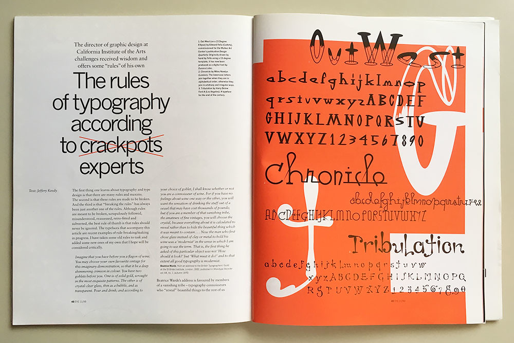
The first thing one learns about typography and type design is that there are many and maxims. The second is that these rules are made to be broken. And the third is that ‘breaking the rules’ has always been just another one of the rules. Although rules are meant to be broken, scrupulously followed, misunderstood, reassessed, retro-fitted and subverted, the best rule of thumb is that rules should never be ignored. The typefaces that accompany this article are recent examples of rule-breaking/making in progress. I have taken some old rules to task and added some new ones of my own that I hope will be considered critically.
Imagine that you have before you a flagon of wine. You may choose your own favourite vintage for this imaginary demonstration, so that it be a deep shimmering crimson in colour. You have two goblets before you. One is of solid gold, wrought in the most exquisite patterns. The other is of crystal-clear glass, thing a a bubble, and as transparent. Pour and drink; and according to your choice of goblet, I shall know whether or not you are a connoisseur of wine. For if you have no feelings about wine one way or the other, you will want the sensation of drinking the stuff out of a vessel that may have cost thousands of pounds; but if you are a member of that vanishing tribe, the amateurs of fine vintages, you will choose the crystal, because everything about it is calculated to reveal rather than to hide the beautiful thing which it was meant to contain…now the man who first chose glass instead of clay or metal to hold his wine was a ‘modernist’ in the sense in which I am going to use the term. That is, the first thing he asked of this particular object was not ‘How should it look?’ but ‘What must it do?’ and to that extent all good typography is modernist.
Beatrice Warde, from an address to the British Typographers’ Guild at the St Bride institute, London, 1932, published in Monotype Recorder vol.44 no. 1, autumn 1970.
Beatrice Warde’s address is favoured by members of a vanishing tribe – typography connoisseurs who ‘reveal’ beautiful things to the rest of us (Modernists). Such connoisseurs are opposed to typographic sensationalists who have no feelings about the material they contain with their extravagance (post-modernist hacks). In short, the typographers with ‘taste’ must rise about the crass fashion-mongers of the day. Connoisseurship will always have its place in a capitalist, class-conscious society and there is nothing like Modernism for the creation of high and low consumer markets. The Modernist typophile-connoisseur should rejoice in the typefaces shown here because they reaffirm his or her status as being above fleeting concerns. After all, if there was no innovation to evolve through refinement to tradition, then where would the connoisseur be?
Beatrice Warde did not imagine her crystal goblet would contain Pepsi-Cola, but some vessel has to do it. Of course, she was talking in terms of ideals, but what is the ideal typoface to say: ‘Uh-Huh, Uh-Huh, You got the right one baby’? There is no reason why all typefaces should be designed to last forever, and in any case, how would we know if they did?
The art of lettering has all but disappeared today, surviving at best through sign painters and logotype specialists. Lettering is being incorporated into type design and the distinction between the two is no longer clear. Today, special or custom letterforms designed in earlier times by a letterer are developed into whole typefaces. Calligraphy will also be added to the mix as more calligraphic tools are incorporated into type-design software. Marshall McLuhan said that all new technologies incorporate the previous ones, and this certainly seems to be the case with type. The technological integration of calligraphy, lettering and type has expanded the conceptual and aesthetic possibilities of letterforms.
The rigid categories applied to type design in the past do not make much sense in the digital era. Previous distinctions such as serif and sans serif are challenged by the new ‘semi serif’ and ‘pseudo serif’. The designation of type as text or display is also too simplistic. Whereas type used to exist only in books (texts faces) or occasionally on a building or sign (display), today’s typographer is most frequently working with in-between amounts of type – more than a word or two but much less than 100 pages. The categories of text and display should not be taken too literally in a multimedia and interactive environment where type is also read on television, computers, clothing, even tattoos.
Good taste and perfect typography are suprapersonal. Today, good taste is often erroneously rejected as old-fashioned because the ordinary man, seeking approval of his so-called personality, prefers to follow the dictates of his own peculiar style rather than submit to any objective criterion of taste.
Jan Tschichold, 1948, published in Ausgewählte Aufsatze über Fragen der Gestalt des Buches und der Typographie, 1975.
‘Criteria of taste’ are anything but objective. Theories of typography are mostly a matter of proclaiming one’s own ‘tastes’ as universal truths. The typographic tradition is one of constant change due to technological, functional and cultural advancement (I use the word advancement as I am unfashionably optimistic about the future).
In typographic circles it is common to refer to traditional values as though they were permanently fixed and definitely not open to interpretation. This is the source of the misguided fear of new developments in type design. The fear is that new technology, with its democratisation of design, is the beginning of the end of traditional typographic standards. In fact, just the opposite is true, for though typographic standards are being challenged by more designers and applications than ever before, this challenge can only reaffirm what works and modify what is outdated.
The desktop computer and related software have empowered designers and non-specialists to design and use their own typefaces. And with more type designers and consumers, there will obviously be more amateurish and ill-conceived letterforms. But there will also be an abundance of new ideas that will add to the richness of the tradition. Too much as been made of the proliferation of ‘bad’ typefaces, as if a few poorly drawn letterforms could bring western civilisation to its knees. Major creative breakthroughs often come from outside a discipline, because the ‘experts’ all approach the discipline with a similar obedient point of view. The most important contribution of computer technology, like the printing press before it, lies in its democratisation of information. This is why the digital era will be the most innovative in the history of type design.
The more uninteresting the letter, the more useful it is to the typographer.
Piet Zwart, A History of Lettering, Creative Experiment and Letter identity, 1986.
Back in Piet Zwart’s day most typographers relied on ‘fancy type’ to be expressive. I don’t think Zwart was against expression in type design as much as he was for expression (an architectonic one) in composition. Zwart’s statement epitomises the typographic fundamentalists’ credo. The irony is that the essentially radical and liberal manifestos of the early Modernists are with us today as fundamentalist conservative dogma.
I suspect that what is most appealing about this rhetoric is the way they typographer’s ego supersedes that of the type designer. By using uninteresting ‘neutral’ typefaces (created by anonymous or dead designers), typographers are assured that they alone will be credited for their creations. I have often heard designers say they would never use so-and-so’s typefaces, because that would make their work look like so-and-so’s, although they are apparently unafraid of looking like Eric Gill or Giovanni Battista Bodoni. Wolfgang Weingart told me after a lecture at CalArts in which he included my typeface Keedy Sans as an example of ‘what we do not do at Basel’ that he likes the typeface, but believes it should be used only by me. Missing from this statement is an explanation of how Weingart can use a typeface such as Akzidenz Grotesk so innovatively and expertly.
New typefaces designed by living designers should not be perceived as incompatible with the typographer’s ego. Rudy VanderLans’ use of Keedy Sans for Emigre and B.W. Honeycutt’s use of Hard Times and Skelter in Details magazine (see this issue, page 56) are better treatments of my typefaces than I could conceive. Much of the pleasure in designing a typeface is seeing what people do with it. If you are lucky, the uses of your typeface will transcend your expectations; if you are not so fortunate, your type will sink into oblivion. Typefaces have a life of their own and only time will determine their fate.
In the new computer age, the proliferation of typefaces and type manipulations represents a new level of visual pollution threatening our culture. Out of thousands of typefaces, all we need are a few basic ones, and trash the rest.
Massimo Vignelli, from a poster announcing the exhibition ‘The Masters Series: Massimo Vignelli’, February / March 1991.
In an age of hundreds of television channels, thousands of magazines, books, newspapers and inconceivable amounts of information via telecommunications, could just a few basic typefaces keep the information net moving? Given the value placed on expressing one’s individual point of view, there would have to be only a handful of people on the planet for this to work.
Everything should be permitted, as long as context is rigorously and critically scrutinised. Diversity and excellence are not mutually exclusive; if everything is allowed it does not necessarily follow that everything is of equal value. Variety is much more than just the ‘spice of life’. At a time when cultural diversity and empowering other voices are critical issues in society, the last thing designers should be doing is retrenching into a mythical canon of ‘good taste’.
There is no such thing as a bad typeface…just bad typography.
Jeffery Keedy
Typographers are always quick to criticise, but it is rare to hear them admit that it is a typeface that makes their typography look good. Good typographers can make good use of almost anything. The typeface is a point of departure, not a destination. In using new typefaces the essential ingredient is imagination, because unlike with old faces, the possibilities have not been exhausted.
Typographers need to lighten up, to recognise that change is good (and inevitable), to jump into the multicultural, post-structural, post-modern, electronic flow. Rejection or ignorance of the rich and varied history and traditions of typography are inexcusable; however, adherence to traditional concepts without regard to concepts without regard to contemporary context is intellectually lazy and a threat to typography today.
You cannot do new typography with old typefaces. This statement riles typographers, probably because they equate ‘new’ with ‘good’, which I do not. My statement is simply a statement of fact, not a value judgement. The recent proliferation of new typeface should have anyone interested in advancing the tradition of typography in a state of ecstasy. It is always possible to do good typography with old typefaces. But why are so many typographers insistent on trying to do the impossible – new typography with old faces?
Inherent in the new typefaces shown here are possibilities for the (imaginative) typographer that were unavailable ten years ago. So besides merely titillating typophiles with fresh new faces, it is my intention to encourage typographers and type designers to look optimistically forward. You may find some of the typefaces formally and functionally repugnant, but you must admit that type design is becoming very interesting again.
Jeffery Keedy, type designer and director of graphic design at CalArts, Los Angeles
First published in Eye no. 11 vol. 3, 1993
Eye is the world’s most beautiful and collectable graphic design journal, published for professional designers, students and anyone interested in critical, informed writing about graphic design and visual culture. It is available from all good design bookshops and online at the Eye shop, where you can buy subscriptions and single issues.