
Summer 2016
Tune out, dive deep, read on
Riposte magazine’s innovative format, diverse contents and clean design challenge the formulaic mainstream. Meg Carter interviews its founders, Danielle Pender and Shaz Madani
Plummeting print readership has made the past decade a tough time to be a traditional magazine publisher. Yet for a next generation of young, ambitious independent publishers, future success lies not in online publishing, tablet editions or paywall strategies, but in rejuvenating print.
‘There’s definitely a changing role for print in people’s lives as part of a reaction against always being online and connected,’ says Danielle Pender, co-founder and editor of independent women’s magazine Riposte. ‘People want to tune out. That’s where print comes into its own. As being away from screens becomes more important, so, too, will the value of print.’
Riposte, a UK-produced biannual title that mixes intelligent editorial and stylish presentation in a beautifully designed format intended to inspire and impress, embodies the next generation of print publishing in several ways. One is the diversity of subjects it covers – a balance unmatched by most mainstream women’s titles. Another is its approach to navigation, and the philosophy behind – and execution of – its innovative visual design.
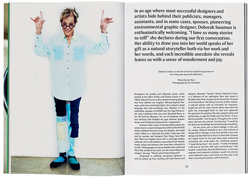
Spread from a feature about US graphic designer Deborah Sussman in Riposte no. 2, 2014. Sussman, the co-founder of Sussman / Prejza & Co., died shortly after publication.
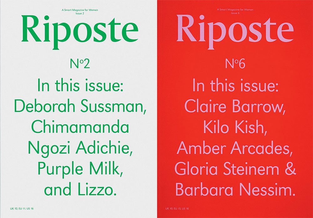
Top: Covers of Riposte no. 2, 2014, and Riposte no. 6, 2016.
Launched in 2013, Riposte was born of a desire to create an antidote to mass-market women’s magazines obsessed with airbrushed celebrity cover stars and bikini-body headlines. Today, the magazine has an articulate, opinionated and loyal audience attracted by its in-depth exploration of subjects.
No. 6 includes a feature about human rights lawyer Amber Arcades, an article about the apartment shared by Gloria Steinem and Barbara Nessim in the 1960s and ‘Hip-Hop’s Mom’, a profile of the late Sylvia Robinson, founder of Sugar Hill Records.
No. 5 (2015) featured image-maker Isamaya Ffrench; writer Karley Sciortino; and a showcase of 1980s Jamaican photography. There was also an extensive feature on Nova, in which original copies of the British woman’s magazine (published 1965-75) were shown in a series of period scenarios staged and shot by Catherine Losing and Sarah Parker.
Pender, who has an MA in creative writing and a degree in the history of modern art, film and design, first worked as a festival and events manager. It was while working as curator at agency and gallery KK Outlet in East London that she had the idea for a different kind of women’s magazine.
The aim was to create ‘a smart magazine’ for a core audience of women aged 25-40, she explains. She wanted to focus on women’s creative and intellectual merits, their ideas and opinions, an agenda encapsulated by the dictionary meaning of the word ‘riposte’ – a quick, clever reply.
From the outset, though, Pender knew that its visual presentation would be critical to bringing this vision to life – and to demonstrate its difference. Which is where co-founder and creative director Shaz Madani came in.
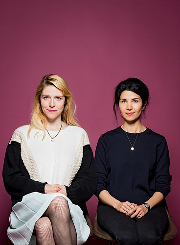
Danielle Pender (left) and Shaz Madani, respectively editor and art director of Riposte. Photograph by David Levene.
Madani has run an independent practice for the past five-and-a-half years, and her career includes staff roles on high-street retailer Top Shop’s design team and at London design agency MadeThought. Her client list includes Thames & Hudson, Laurence King, MoMA, the Wellcome Trust and London’s University of the Arts.
Madani says: ‘My background is in print, and we shared the belief you can’t replace the feeling of holding a printed magazine in your hands. A magazine is a more timeless and collectable object that, in turn, equates to better written and long-form articles,’ she says. ‘Print forces you to think more carefully about commissions and content. Every inch and page of a printed magazine is precious: you just can’t be frivolous or careless with it!’
Realising the vision for Riposte began with creating the right logo and front cover. ‘This was the first step from which everything else sprang,’ says Pender. ‘We experimented with different options, images and sizes. Having a text-only cover, which came up halfway through the process, was scary but it was also the most distinctive and exciting, which is why we eventually went with it.’
The pair deliberated at length, Madani recalls. ‘That’s the joy of being independent – you can take more time and risks, and you can experiment without upsetting stakeholders. So we chose to go with a typographic cover that simply headlines the names of the women featured inside, while an image of the cover star sits happily on the back cover.’
The decision was a powerful signal of intent, and from then on the pair applied an equally left-field approach to pagination and visual style. Initially Riposte followed a ‘54321’ format: opening with five ideas, then four meetings, three features, and two essays, before culminating with one piece about an ‘icon’ (for example, Metronomy’s Anna Prior on musician Sheila E, photographer Ewen Spencer on Elaine Constantine, and writer / singer Mish Way on Fleetwood Mac’s Stevie Nicks). The aim was to be orderly without being prescriptive – an editorial agenda reflected by Madani’s clean, uncluttered design.
Pender and Madani drew up a wish-list of women and topics they’d like to address, identified writers they’d like to work with, and bookmarked the portfolios of a diverse array of photographers, illustrators and set designers whose commissions would provide visual resonance and depth.
‘When content demands it, illustrations can achieve wonderful simplicity and communication… [but] I believe it is most effective when handled as a visual treat,’ Madani says. ‘Much of what I do is pared-back design, and I always try to place the focus on the content. Good design should be invisible rather than overpowering … but always confident and bold with a clear view and a strong voice.’ The idea was to create bespoke visuals that would bring each article to life on the printed page, working with established and upcoming female artists and illustrators, such as Laura Breiling (on arousal), in Riposte no. 4, and Martina Paukova (on staying creative under pressure), in no. 5.
‘We want to deliver the reader a full story with photography and illustration and set design working together to really add something,’ says Pender. ‘The piece on Nova has visuals that are period-inspired 1960s and 70s-style set pieces that bring the feature alive.’
Another way Riposte challenges expectations is in its use of A5, bound-in inserts on different paper stocks. This was to break things up by including items that did not necessarily relate to content elsewhere in the issue. These have included the mini-zine of collected short stories in no. 4, made in collaboration with The Anonymous Sex Journal, and the visual essay Anónimo by US artists Jeremy Floto and Cassandra Warner in no. 6.
So far, so good. But when no. 6 hit the streets in June 2016, the question preoccupying both co-founders was Riposte’s future development. At its launch, the title was a hand-to-mouth affair: half the costs of the first issue were covered by pre-orders, with the balance of print costs covered by a loan. Advertising was scant, and keeping down costs was a priority. The balance of income came from cover sales at £10 per copy.
Three years on, while financial pressures remain, a loyal audience has helped the magazine grow advertising sales and brand partnerships. The latter saw Riposte collaborating with Nike on two occasions, and a collaboration with Fred Perry. Pender explains: ‘We found four girls around the world who were staunch Fred Perry fans. We spoke to them about their lives, what they were into and shot their portraits.
‘These collaborations are really important for us. I like working with brands we wear ourselves or respect. They “get it” and it isn’t a compromise, they never ask us to do things we’re not comfortable with. They help make the magazine happen and we help them tell their stories in interesting ways.’
Talk now is of building circulation and diversifying distribution, both at home and abroad. No. 5 featured an evolution of the ‘54321’ format to allow for a greater variety of article lengths, along with a cover on coloured paper for the first time.
The latest issue (no. 6) has two alternative covers. One is in Riposte’s familiar typographical format. The other, which Pender describes as ‘opening up the magazine to new readers who might have been put off by the text-only cover’, has a headshot of fashion designer Claire Barrow.
‘When you’re building something, there comes a point when you can start thinking of expanding,’ says Pender. Her wish-list includes a spin-off book, products, developing live talks and social events and upgrading the Riposte website beyond its current ‘shop window’ function.
Since Riposte’s inception, some interesting women’s platforms have emerged, including online channels The Pool and Broadly. But while Pender welcomes sites like these, she says most women’s magazines in the marketplace ‘remain embarrassing and lame’.
While this may be bad news for some readers, it clears a path for Riposte to grow a readership that values a fresh approach to content and design, enjoying the printed magazine as an object of desire.
Meg Carter, novelist, Bath
First published in Eye no. 92 vol. 23, 2016
Eye is the world’s most beautiful and collectable graphic design journal, published quarterly for professional designers, students and anyone interested in critical, informed writing about graphic design and visual culture. It is available from all good design bookshops and online at the Eye shop, where you can buy subscriptions and single issues. You can see what Eye 92 looks like at Eye before You Buy on Vimeo.