Winter 2010
Undergrowth
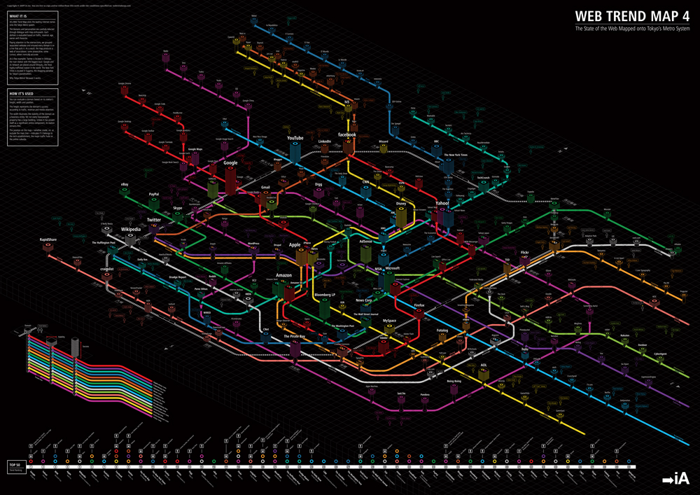
Untangling the internet with IA’s metro ‘snapshot’
Metro maps occupy a vital place in the history of information graphics. Harry Beck’s octolinear design for the London Underground showed that the most logical feature of standard maps – geographical accuracy – was largely irrelevant to the Underground passenger. London’s complex, knotty tunnels and variable distances were far better represented with simplified, functional geometry. So what better metaphor to unravel the tangled interconnections of the Web?
The Web Trend Map, by Zurich / Tokyo-based Information Architects (IA), plotted the biggest names and domains on the internet on to the Tokyo Metro map. The graphic takes the system’s stations, lines and crossings, and turns them into domains, thematic lines (news, publishing, sharing, etc.) and meaningful interconnections.
But can a static bit of information design work for something as fluid as the internet? ‘The Web is such a complicated matter that you must ultimately fail,’ IA founder Oliver Reichenstein explained to me in an email, ‘[but] it works as a snapshot.’
It is interesting to see how IA’s Web snapshots have changed since he put together the first version in 2006, as a Christmas gift for clients.
At the time, IA described the scaled-down design, available in postcard format, as ‘totally unscientific and almost useless, but definitely fun to look at’ (see IA’s site, informationarchitects.jp/en).
It went viral, and six months later a full-size version, Web Trend Map 2 (2007), was released, featuring more domains / stops and a new Chinese line – ‘the second internet’.
Even for those unfamiliar with Tokyo, the connections, chance intersections and proximities are by turns obvious, humorous and enlightening. In version 2, Google moved from Shibuya, ‘a humming place for young people’, to Shinjuku: ‘a suspicious, messy, yakuza-controlled, but still pretty cool place to hang out.’ In the map’s third incarnation (2008), Facebook was put in Nippori, a hub for Tokyo’s international airport, because, as IA explained, ‘from a broader perspective, Nippori is boring. But it’s still an important station’.
The first two versions were based on the official Tokyo map design, a flat layout on a white background; the third added perspective. Web Trend Map 4 (2009, pictured) took things into three dimensions, with a black background and neon lines. The height of a station represents the domain’s success (in terms of traffic, revenue and trend) and its width the stability of the company behind the domain.
Twitter was put in Shibuya, ‘because that’s where the biggest buzz is’, and by 2010 and the Cosmic 140 map, IA had left Tokyo behind, to locate the top 140 Twitter users on an expanding universe. But as a snapshot of the Web at a crucial moment, the Tokyo-based 2009 map may be IA’s most enduring.
Top: Information Architects’ fourth Web Trend Map (2009) plots the biggest domains of the internet on the lines of the Tokyo Metro.
John Ridpath, writer, developer at El Mysterioso, London
First published in Eye no. 78 vol. 20 2010
Eye is the world’s most beautiful and collectable graphic design journal, published quarterly for professional designers, students and anyone interested in critical, informed writing about graphic design and visual culture. It is available from all good design bookshops and online at the Eye shop, where you can buy subscriptions and single issues.