
Summer 2010
Vaughan Oliver’s Minotaur
This Pixies box set was a chance to make brand new artwork with a student team from UCA
‘The Pixies were one of the most inspirational bands I’d worked with,’ says Vaughan Oliver. ‘Close to my themes, the dark sense of humour, the surrealism, the sex and lust and lust and sex and all of that … and full of images, even though we didn’t try to illustrate those images. We just worked on the themes to build an atmosphere, to create a mood.
‘The dialogue I had with Charles [aka Black Francis, aka Frank Black] on the artwork was always very productive. Start with the lyrics, listen to the music, what’s this about, and then talking around the subject, what sort of films does he like (he’s a big David Lynch fan …)
‘I went to Simon Larbalestier, who had been in Bangkok for years. And he was fearful. Some of this stuff is iconic. People have been buying those Surfer Rosa prints with the topless Spanish dancer for years.’
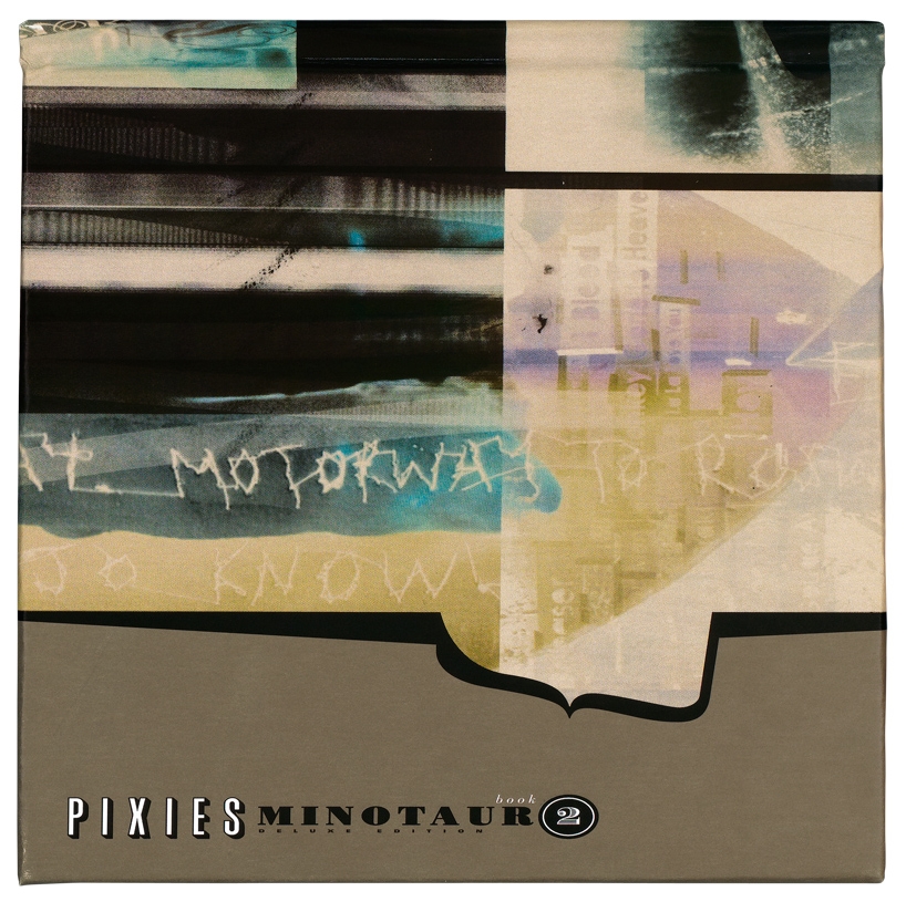
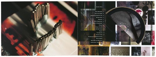
Spread from board book for CDs, DVDs and Blu-Ray disc. Michael Speed’s drawing of original Surfer Rosa image in thumbhole. Pixies, Minotaur (Artist in Residence, 2009). Creative director: Jeff Anderson, AIR. Art direction and design: Vaughan Oliver. Photography: Simon Larbalestier. Design assistance and artwork: Brian Whitehead. Printing and sculptural design: DV8-Now. UCA students: Ben Ewing, Aaron Kitney, Phoebe Richardson, Michael Speed, Rose Thomas, Paul Tumber, Rosie Upright.
Top: Board book cover.
‘With the ever-diminishing canvas [of music formats], I wanted to go way out again. I wanted to make a large-format book.
‘I chose some University for the Creative Arts [UCA] students in Epsom that I was working with on some book covers, and the college gave me another three students from the first year. I briefed them on the music and one of the lads said, “I love this music, but I’ve never seen the sleeves.” He’d just downloaded it.
‘So I said to the students, we’ll make some graphics to go with this imagery and we’ll use these words – it was as open as that. Half the battle was to get them [the students] to relax and not worry about it.
‘It started off with the idea as doing all the graphics as real and as one shot, no layering or Photoshop. It’s just there. And there’s something quite vital about that, that would sit well with Simon’s imagery. I knew I was gonna use just one image per page: graphic response, photograph, photograph, graphic response.’
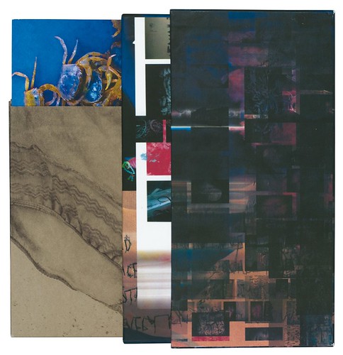
Box for five vinyl discs, in their glossy inner sleeves and matt, sawn-off outers.
‘[UCA tutor] Brian Whitehead couldn’t handle working without a grid. I said, “It’s just a bloody picture book, man, what do you need a grid for?” He calls the way I use typography “flying type”! It’s what font works on the page with that imagery, what colour, what size, and if it’s not working there I’ll slide it about a bit. Is that what an illustrative approach is? It’s just marks on a page isn’t it, texture … That’s why I’ve never grown a “proper studio”, I like doing things myself, I like being the person that puts the catalogue number on.
‘There’s no need for Pixies logos or anything on the outside, you know what you’re getting by now. The idea was to do these truncated sleeves … textural images on the outside and these brighter glossy inner sleeves.
‘I like it when something fascinating visually comes from a banal source. There’s inspiration everywhere and I think that’s what Terry Dowling taught me. You don’t have to go very far, you have to look closely. The challenge here was not to do too much, try to stick everything in there, keep cool.
‘I liked the idea of using information as illustration, working with a team, creating more work than I would have done on my own, and also working with a young team who had not done anything like this before and had no fear. They hadn’t been tainted by the business, by working in a studio for ten years or whatever. I wanted it raw – a bit of raw and a bit of polish!’
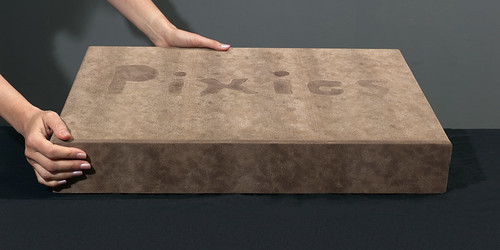
Box is covered in soft vinyl faux skin [naugahyde] with ‘Pixies’ debossed on the lid. Differently lettered versions of the band’s name, sewn, hammered, cut, etc., can be seen throughout.
‘The more experienced I’ve become, I can control things in a relaxed way. When you look at that book, some of it looks like student work, and I like that! It’s not too polished and sophisticated.
‘It’s funny how we talk about LP sleeves and print and ink on paper being a tactile experience – even down to smelling the ink and feeling the texture – I wanted to take that a bit further, but not be over the top! I hope it’s not over the top.
‘I was delighted when I put Minotaur as a working title to the band and Charles said yes – he loved the little rocket on the front, and he said just get on with it.
‘The band were surprised … they have no visual reference point for this. I might be able to show them a Joel-Peter Witkin portfolio, or a Surrealist book covered in fur, but they had no idea of what it could look like. They generally describe it in terms of size: “It’s yay high”.’
Vaughan Oliver was talking to Eye editor John L. Walters
First published in Eye no. 76 vol. 19.
Eye is the world’s most beautiful and collectable graphic design journal, published for professional designers, students and anyone interested in critical, informed writing about graphic design and visual culture. It is available from all good design bookshops and online at the Eye shop, where you can buy subscriptions and single issues.