Summer 2010
Yin and yang
Matthew Carter, co-founder of the first major digital foundry, explains how he came to design his first wood type

The positive / negative aspect of type is always in a type designer’s mind. This may be particularly true for a designer who has been trained, as I was, in punchcutting, a technique that works on the space – the letter is what is left over at the end. When I spent time at the Deberny Peignot foundry in the early 1960s, Adrian Frutiger showed me that he sometimes began a design by drawing with white paint on black paper: drawing the space, in other words, not the letter.
I followed Adrian’s example and enjoyed the obvious affinity with punchcutting. From those days I also remember buying Willem Sandberg’s experimenta typographica 11 (see Eye 25) and loving the page of ‘the inner LIFE principle’, in which the word LIFE is turned inside out to show its inner forms. ‘Glyph space,’ as Cyrus Highsmith says, ‘is the mechanism that makes movable type possible.’
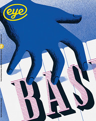
I’m not a printer, least of all a letterpress printer, but I have tried to think like one. So when the Hamilton Wood Type & Printing Museum in Wisconsin commissioned me to design a new wood face earlier this decade, I could imagine that the interaction of dual forms might provide interesting effects at the poster sizes typical of wood type.
First I made a titling font of Latin capitals and figures (no lowercase) in PostScript, then duplicated it and reversed all the characters to make a pair of fonts, positive and negative, night and day, yin and yang. The set-widths are exactly the same in both fonts. I had no specific models for my Latin letters, except for the ampersand, which occurs on gravestones around Boston.
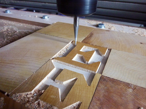
I sent my digital fonts and proofs to the Hamilton museum, which cut a few trial characters by the traditional method: Norb Brylski used a fretsaw to cut enlarged plywood pattern letters to guide a pantographic router that cut the face in type-high maplewood blanks.
Norb then hand-finished them, using a knife to sharpen corners rounded by the router bit. We took them to TypeCon in Minneapolis in 2003, where Richard Zauft and I gave a talk about the project that got an encouraging response from letterpress printers in the audience
Despite this promising beginning, the project languished until 2009, when Jim Moran and his brother Bill joined the museum. They found a local sign-manufacturer with a CNC router that could work directly from my digital data, and produce razor-sharp corners.
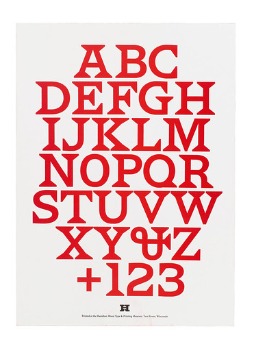
By November 2009, when the Morans organised their Weekend Wayzgoose at the Hamilton museum, we had wooden fonts of both the positive and negative versions of the type at 12-line (2in) size. When the printers arrived, we had alphabets of both versions set up on Vandercook presses, with the positive letters inked in red and the negative in black, for them to try printing from.
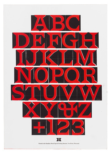
I was quite unprepared for the inventiveness of the first results with this two-faced type (which was then provisionally named Carter Latin). All manner of pages emerged from the presses: one-colour, two-colour, multiple impressions, in register, out of register, right way up, sideways and upside down …
The new typeface has now been named after Jim Van Lanen, the driving force behind the museum for a long time. Both wood fonts, Van Lanen and Van Lanen Streamer (the reversed version), can be bought from the museum, which also licenses digital versions to help plan work to be printed from the wood type. At 144pt, the digital letterforms should exactly match their wooden counterparts.
It was a pleasure and privilege to see my design come to fruition under the same roof as the astonishing collection of historical wood types that Hamilton possesses. On the day I arrived at Hamilton I picked up a piece of maplewood type and realised that it was exactly 50 years since a type of my design had been in a physical form that I could hold in my hand.
First published in Eye no. 76 vol. 19.