
Feature: Graphic design

Art and ambiguity
The identity for Venice Biennale Arte 2019, designed by Melanie Mues, distorts type across a colourful three-dimensional grid
News cycle
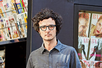
Italian designer Francesco Franchi brings magazine finesse to the world of daily newspapers
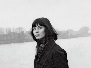
The enigma of Thérèse Moll
This young designer is credited with introducing Swiss typography to MIT

Strategy of excess
Like a human algorithm, Hansje van Halem explores a huge number of variables until she finds the right ‘recipe’ for each project
Two cheers for publishing
A two-volume book packed with graphic design history is a visual blockbuster, but does little for scholarship. By Rick Poynor
Tales from the West Coast
With its origins in ‘live journalism’ shows, The California Sunday Magazine achieves its narrative power through a cinematic approach to photography and type
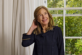
This woman’s work
Kate Hepburn’s design career, embracing pioneering magazines such as Spare Rib and Vole as well as comedy and rock’n’roll, is rooted in rigorous typography
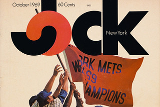
Lovable loser
A daring approach to sports journalism earned the short-lived Jock magazine a place in design history
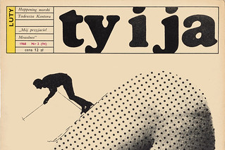
Pulling back the curtain
Published by the Communist Women’s League, Ty i Ja [You and I] was an ambitious 1960s title that brought the outside world to its Polish readers
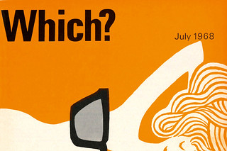
Two-colour haikus
Banks & Miles art directed Which? magazine, the Consumers’ Association’s flagship title and its covers. John Miles talks to Paul Harpin