
Feature
Publish and be damned
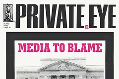
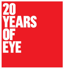
As Private Eye celebrates its best sales figures for 25 years, lifelong subscriber Andrew Billen describes its winning mix of gossip, serious exposés, parodies, cartoons and attention-grabbing covers

David Pearson: inside out
The man who made series design fashionable (and profitable) at Penguin is also a publisher who relishes the ‘big puzzle’ of books.
The show must go on
Buy a pension or a huge collection of theatrical type? For Celia Stothard and Alan Kitching, the choice was clear.
From object to observer
Exhibitions blend the complexities of architectural space with the narrative concerns of book design
They work with words
Fraser Muggeridge, Modern Toss and OK-RM have devised a series of typographic spreads exclusively for Eye. More information here.
Through thick and thin: fashion and type
Fashion’s obsessions are mirrored in its typography, from Vogue’s femme serifs to butch Chanel and the hybrid YSL logo
Nameless thing
Tokyo’s TDC rewards work that transcends means, intention, content, context – and just ‘is’

Trust in Modernism
The John Lewis Partnership’s co-operative ethos has informed 50 years of corporate identity.
Tools of the trade
David Barringer on the one sure thing he has grasped in two decades of graphic design life