
Autumn 2018
Cinematic view
A2 / SW / HK
Scott Williams
Henrik Kubel
Alex Prager
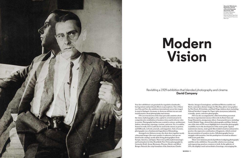
Alexander Rodchenko
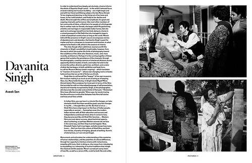
Dayanita Singh
Critique / Photography
A recent edition of Aperture examines the enduring affinity between two art forms. Photo Critique by Rick Poynor
Photo Critique by Rick Poynor, written exclusively for Eye magazine.
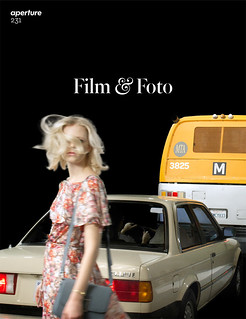
The Summer 2018 issue of Aperture magazine, ‘Film & Foto’, is dedicated to the relationship between photography and film-making.
It is a theme of enduring relevance – an article spotlights the landmark ‘Film und Foto’ exhibition held in Stuttgart in 1929 – and the issue provides a good moment to revisit a title, founded in 1952, that has strong claims to being the world’s finest photography magazine. Issue 210, Spring 2013, introduced a redesign by Scott Williams and Henrik Kubel of A2 / SW / HK (see ‘Moscow by type’ in Eye 90) that reflected the editors’ conviction that the next phase in photography’s development – at a time when photographs were burgeoning online – demanded an imaginative new approach to print.
Unusually, the page size increased and that had the effect, at a stroke, of making Aperture, already a serious publication, look even weightier and more firmly established than before. In the preceding phase, Aperture’s typographic grain and flow of pictures maintained a fairly even pace from article to article. Some pictures might be shown larger than others, but the resources of page design were not fully used to boost the pictorial drama, or to significantly modulate the pacing of stories, and white space was deployed only sparingly. Visited again now, those still comparatively recent issues look surprisingly subdued and even a little old-fashioned.
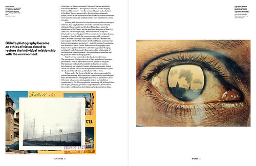
Photographs by Franco Vaccari (1974), left, and Luigi Ghirri (1971), right, from an article about Antonioni’s film The Red Desert.
Top: An article about the 1929 ‘Film und Foto’ exhibition. Photograph by Alexander Rodchenko (1924).
Spreads of Aperture 231, Summer 2018. Design by A2 / SW / HK.
In issue 210, the editors describe how A2 / SW / HK re-envisioned Aperture ‘to capitalize on how this print publication can continue to assert itself as an object, through its tactile presence, dynamic typography, and high-quality reproductions – all housed in an elegant design geared toward both reading and viewing.’
In the five years since then, Kubel and Williams’ art direction has lived up to this clear-sighted statement of intent. Editorially, Aperture is divided into two styles of article signposted on the contents pages as ‘Words’ and ‘Pictures’. The difference is principally a matter of emphasis and they are blended together on the flat plan. The wordier articles are set in Aperture Serif, the pictorially led pieces in Aperture Sans, both designed by A2 / SW / HK. Everything looks invitingly readable yet the picture content also feels exceptionally generous. Both elements benefit from open white pages that feel structurally necessary to the storytelling, rather than acting as tasteful signifiers of ‘luxury’ for the cultured reader, white space’s traditional coding.
These virtues are all to the fore in ‘Film & Foto’ (issue 231). The cover shows a detail from Hawkins Street (2017), a picture by Alex Prager (see Eye’s online Photo Critique, 18 July, 2018) and the out-of-focus foreground figure – a new departure for Prager – is subtly filmic in mood.
The issue, devoted to the idea that film and photo ‘continue to exert pressure on each other’, features an introduction to Prager and interviews with American directors Sofia Coppola and Gus van Sant about the inspirations they draw from photography. An article considers the lasting implications for Italian photographers of The Red Desert (1964), Michelangelo Antonioni’s first colour film. Dayanita Singh’s photobooks and installations, subject of another feature, make references to the film studios of Bombay and the Cinecittà studio in Rome.
Feature illustrated by images from Dayanita Singh’s photobook Museum of Chance, 2014.
It is axiomatic now to speak of the flow of spreads in a magazine or book in cinematic terms. The arrival of film as an advanced contemporary medium gave modernist designers a new way of conceiving editorial design as a kind of film editing, each turn of the page performing a ‘cut’. The precision, energy and excitement of a publication comes from the variations that designers can work in the visual editing. The design by A2 / SW / HK offers a masterclass in how to sustain the temperature of invention and forge interest and surprise value from spread to spread. The layouts move back and forth between colour and black and white. Full page images are followed by more intricate layouts of multiple pictures. Photos are matched with sensitivity; they always have room to breathe. Shifts from coated to uncoated paper add tactile variation. The entire publication is held in a state of astutely judged equilibrium. It feels organic, effortless and inevitable, yet across the wide field of magazines devoted to visual subjects – architecture, art, film, photography – it is rare to find journals as mindful of the internal tensions and resonance of images that are their reason for being.
The outcome is a publication that projects a sense of authority from first sight of its quietly confident logo. Its size and heft feel almost monumental, like a magazine from half a century ago. The writing inside is informative, assured and accessible, as outward-looking visual journalism should be, and this idealism and self-belief glows from the designers’ pages.
Cover showing a detail of Hawkins Street by Alex Prager, 2017.
Rick Poynor, writer, Eye founder, Professor of Design and Visual Culture, University of Reading
Eye is the world’s most beautiful and collectable graphic design journal, published quarterly for professional designers, students and anyone interested in critical, informed writing about graphic design and visual culture. It is available from all good design bookshops and online at the Eye shop, where you can buy subscriptions and single issues. You can see what Eye 97 looks like at Eye Before You Buy on Vimeo.