
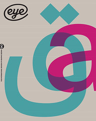
Summer 2015
Moscow by type
For the underground railway of Russia’s capital, wayfinding experts City ID commissioned A2-Type to make the Metro’s first typeface and pictogram system
Each day, around nine million people are shuttled across Moscow on the state-owned underground railway, the second biggest transport system outside Asia, with the world’s busiest daily ridership. The Metro first opened in 1935 with just one 12km line and thirteen stations. Now it has 328km of track, spread over twelve lines and 196 stations. It boasts some of the most architecturally impressive stations in the world, with more than twenty new ones planned for the next few years.
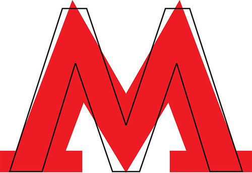
Despite the network’s scale, the only official ‘branding’ on the system is the red splayed capital ‘M’ at station entrances, which exists in several different versions, often paired with the word METPO [Metro]. There is no clear identity and no coherent signage system to guide its commuters. And for non-Russian readers there is another obstacle: all the signs are in Cyrillic.
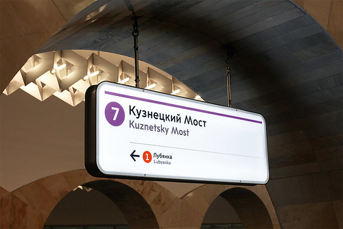
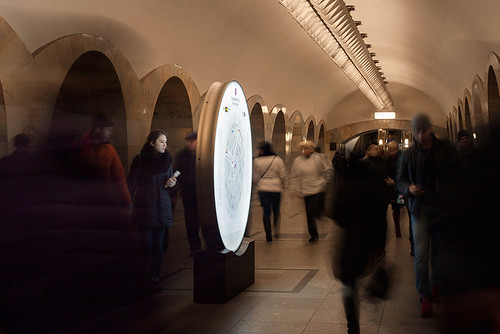
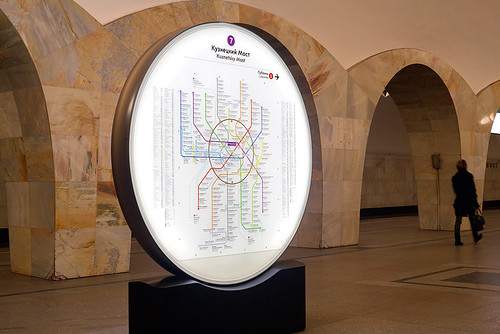
Suspended Metro lightbox, Kuznetsky Most station, Moscow. The Cyrillic setting of the station names is in a larger size and heavier ‘grade’ of A2’s Moscow Sans typeface.
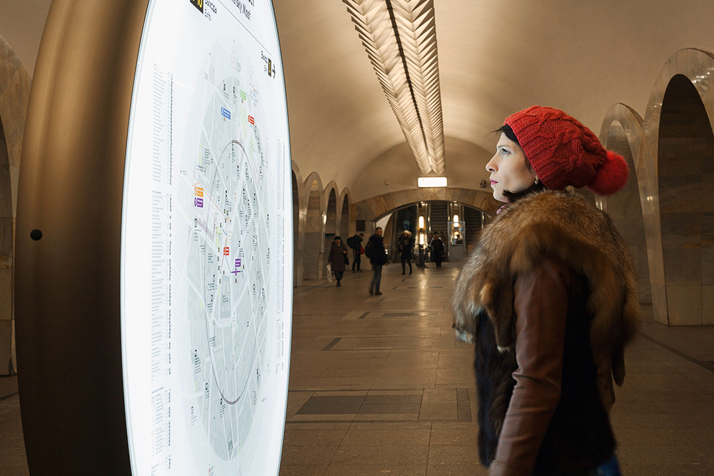
Top: Freestanding circular totem with pedestrian orientation map. Photographs: Ivan Anisimov.
Several attempts have been made to address this problem, but none has come to fruition until now. In October 2013, City ID was appointed by Moscow Department of Transport to create a visual identity and wayfinding system for the Metro to improve the flow of human traffic through the stations. There is a pleasing historical resonance in the choice of a British firm: consultants and engineers from London Transport played an important part in building the Metro in its early stages. The Metro is just the first part of City ID’s commission to create a wayfinding system for the entire city.
Based in Bristol, City ID specialises in design, information and wayfinding solutions for cities. Their most celebrated project to date has been WalkNYC, a city-wide wayfinding system and ‘information brand’ that helps people navigate the streets and transit systems of New York.
The practice commissioned A2-Type – the London studio founded by Henrik Kubel and Scott Williams (see Eye 67 and 71) – to design at least 40 pictograms and a bespoke typeface that included both Cyrillic and Latin characters. Kubel says: ‘It was important to us that we weren’t a team that just came in and rolled out something modern and European. We wanted to design something that was rooted in the heritage of Moscow, yet was contemporary.’
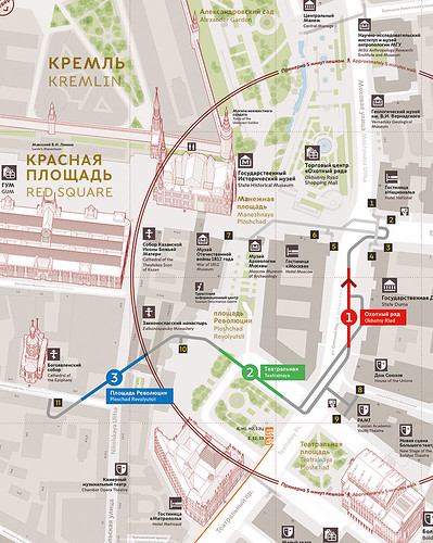
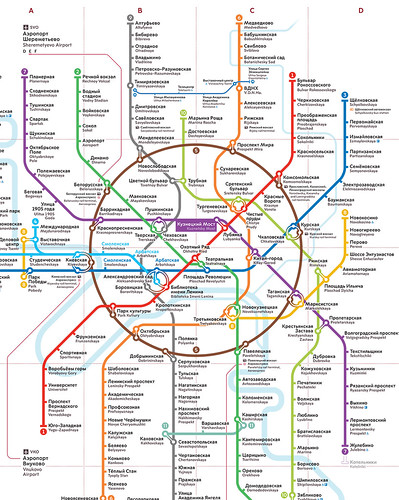
Detail of Moscow Metro map.
After Kubel and Williams were commissioned in January 2014, endless hours of research ensued, followed by a five-day ‘field trip’ to Moscow where the designers visited museums, key historical landmarks and many stations on the Metro, designed from the 1930s to the present day, which they used as sources of inspiration. ‘The stations are like architectural pearls. There are marbles, bronzes and golds, chandeliers and mosaics. It’s extraordinary, they’re so beautiful,’ says Kubel.
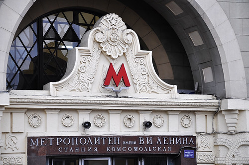
One of several different versions of the splayed letter ‘M’, as used on a Metro station in Moscow. Research snapshot by City ID.
Built at Stalin’s bidding, the Moscow Metro was one of the Soviet Union’s most extravagant architectural projects, with stations constructed as luxurious ‘palaces for the people’. The Metro’s architects and artists were ordered to design a structure that embodied radiance and represented a bright future.
‘There’s a charm in that each station is unique. They were beautifully designed, particularly during the 1930s when no expense was spared,’ says Williams. ‘There’s no advertising and no signage. It’s almost like a museum.’
Redrawn Metro ‘M’ logo overlapped by outline ‘M’ from Moscow Sans typeface.
‘Does it say Moscow?’
For City ID, it was important that the bespoke typeface appeared neutral against the grandeur of the stations. ‘We wanted the typeface to have enough personality to suggest that it was “Moscow”,’ says Mike Rawlinson, design planner and founding director of City ID. ‘It had to work across all those different time periods.’
Kubel and Williams were asked to consider redesigning the Metro’s ‘M’, but they quickly decided against it. ‘It’s a key design element that is already in place which signifies Moscow and the Metro. As a design ingredient, it’s one of the most powerful elements they have,’ says Williams.
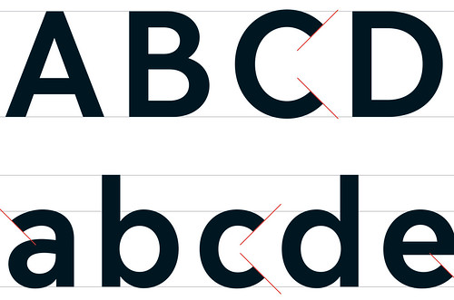
Instead, A2 infused the form into their own typeface, Moscow Sans, using the geometry of the original ‘M’ as a building block for the design. Along with the cultural and historical influences on the typeface design, there were also practical considerations: ‘Some of the names of the stations are very long and almost illegible if the sign is 20ft in the air and is seen from a particular viewpoint,’ says Williams. It is sometimes assumed that typefaces for signage need to be condensed, to take up less space. To some extent that is true, Kubel says, but a more condensed face is harder to read from an angle. ‘Our font is slightly wider,’ he continues, ‘so that at an angle it’s legible.’
Kubel adds: ‘We wanted to put some roundness / softness into the Cyrillic, and some straightness / hardness into the Latin, so that they would both complement each other and come together as a unit.’ Across the wayfinding system, the idea is for the Cyrillic and Latin scripts to be used together, in two different weights and two different sizes. ‘They knock the Latin back a little bit in colour, just to say that Cyrillic is the one which takes priority […] If you used the same font size or colour for both, it would just look confusing.’
A2-Type recruited two consultants to help them with the commission: Moscow-based designer Ilya Ruderman, who helped with the Cyrillic forms, and the celebrated South African-born, London-based designer Margaret Calvert.
Calvert has a close relationship with A2 (Kubel studied with her at the Royal College of Art), and the foundry collaborated with her on the typefaces New Rail Alphabet (see Eye 71) and New Transport. The British road signs Calvert designed with Jock Kinneir in the 1950s are widely imitated (see Eye 34). ‘Her knowledge is amazing,’ says Kubel. ‘She is critical, but a lot of her feedback is practical … what reads well, what colourways, what tones, what point size, what spacing,’ Williams adds. ‘She will ask: “Does it work? Does it say Moscow?”’
Calvert herself is modest: ‘Although there may be some small differences of opinion regarding details, it was a joy to work with A2 on such a prestigious project, if only in a minor capacity.’
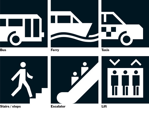
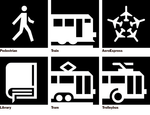
The project also involved developing more than 40 pictograms, indicating everything from cashpoints [ATMs] to escalators, based on a geometry similar to that of the typeface. With City ID, Kubel and Williams were keen to use elements that made the pictograms unique to the city.
Twelve of the 41 pictograms for the Moscow Metro system, commissioned by City ID and designed by A2-Type with Margaret Calvert as a consultant.
‘We tried to keep some “oddness” in the pictogram design,’ says Scott Williams of A2-Type, talking about replacing the old ‘walking man’ sign. The new pictogram, he says, is ‘infused with properties and angles from the Moscow Sans typeface.’
The designers had the challenge of making complementary icons for several distinct means of public transport (other than the Metro itself): suburban trains, trolleybuses, trams, buses and ferries.
Part of the city’s DNA
Kubel recalls travelling to Russia to present their final drafts to the team at Moscow’s Department of Transport: ‘After I spoke for twenty-odd minutes there was complete silence. And then Alexey Mitaev, who led the client team in Russia, said three words: “It feels Moscow.” It was a great moment.’
The result was Moscow Sans, a sans serif typeface with 431 glyphs covering Latin and Cyrillic. It is based on a grid of core shapes and angles and a repetition of shapes. It exists in four weights (though Kubel prefers the term ‘grades’, because of their subtle weight differences), with ink traps to aid legibility in smaller sizes.
As Russia’s major political and economic centre, Moscow is the hub that connects Russia to the rest of the world. It sees itself increasingly as a business and tourism destination: a dual-language signage system is necessary if Moscow is serious about this new international role. As City ID’s Rawlinson explains, ‘The Metro is an opportunity to introduce dual language throughout. They’ve got things like the World Cup coming up in 2020. They see themselves as a world city.’
Moscow also has a problem with congestion and air pollution, of which motor traffic is the main source. There is an urgent need to persuade people to leave their cars behind and use public transport.
Freestanding circular totem with pedestrian orientation map at Kuznetsky Most Metro station.
The new system is a pilot, designed and planned by City ID with industrial design firm Billings Jackson Design. One of City ID’s innovations is a circular map, its form echoing the rounded arches in many of the stations. Dale Newton, architect and industrial design specialist at Billings Jackson, explains: ‘We felt the products had to have a richness in form and materiality. We evolved a product language with more forgiving details, rounded edges – akin to some of the existing signs – and softer, more organic profiles.’
When it comes to evaluating the project’s success, Rawlinson explains that it’s not just about the design but also about ‘the ability to deliver the design over a period of time. The legacy, how you make it endure.’ The overall design phase will last five years, with immediate plans to roll the system out across the entire Metro. Rawlinson says there are also longer-term plans to implement the new system across all modes of public transport, including trams, trolleybuses, buses and ferries.
For City ID, the typography, and A2’s type design, is an essential ingredient of the design process. ‘It has to feel as if it fits the purpose of the city; that it is part of the spirit and DNA,’ says Rawlinson. ‘The overriding image of London Underground is its typographic language. In Moscow, we’re trying to do what has been done over generations in a very short period of time.’
Kat Phan, writer, London
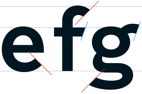
Detail of specimen showing terminals on some of the Latin characters of Moscow Sans, a custom font with four grades, designed by A2-Type.
Freestanding circular totem with new Metro network diagram at Kuznetsky Most Metro station. Metro diagram artwork designed by City ID and Misha Kvrivishvili.
Detail of Moscow Metro map.
First published in Eye no. 90 vol. 23, 2015
Eye is the world’s most beautiful and collectable graphic design journal, published quarterly for professional designers, students and anyone interested in critical, informed writing about graphic design and visual culture. It is available from all good design bookshops and online at the Eye shop, where you can buy subscriptions, back issues and single copies of the latest issue. You can see what Eye 90 looks like at Eye before You Buy on Vimeo.