
Autumn 2009
The artful charm of the public notice

various designers
Lawrence Weiner
Christopher Wool
Mevis & Van Deursen
Kay Rosen
Eva Weinmayr
Jop van Bennekom
Critical path
Typography
Visual culture
Monitor
Big, bad, bold and subverted by artists and designers, the public notice returns power to the people
Susan Sontag, in her 1970 essay on posters (first published in The Art of Revolution: 96 Posters from Cuba), makes a distinction between the public notice – one of the earliest forms of graphic design – and the poster.
‘Both posters and public notices address the person … as an unidentified member of the body politic,’ she writes. ‘But the poster, as distinct from the public notice, presupposes the modern concept of the public – in which the members of a society are defined primarily as spectators or consumers. A public notice aims to inform or command. A poster aims to seduce, to exhort, to sell, to educate, to convince, to appeal.’ Implicit in Sontag’s argument is a claim about the way information is shaped. The form of the public notice is neutral, while the poster’s is inflected.
Originally developed as ‘an extension of the power of the ruler’ (as Maurice Rickards noted in the 1970s), the public notice, this grandfather to the poster, still retains a sense of authority. Until the spread of mass literacy, such notices had to be read aloud – often to the sound of trumpets – before they were posted. Rickards notes that through such fanfare ‘the document came to be seen as a tangible contact with the very will and person of the ruler himself’. Some of the earliest printed notices even camouflaged the fact of their mass production, to make it seem as if the ruler himself had written the document. Thus the notice’s arrival and posting was tantamount to the ruler’s own arrival; its words created seemingly by his own hand. The King was the Law, and now the Law was the Word. In time, the people came to understand and accept this.
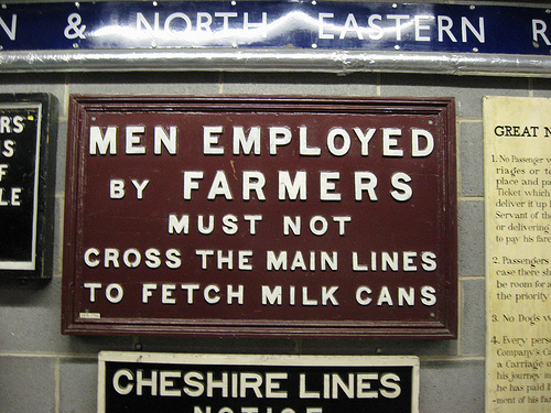
Public sign, York Railway Museum.
Top: Christopher Wool’s Apocalypse Now, 1988. Alkyd and Flashe on aluminium & steel, 84 x 72 in (213.4 x 182.9 cm). Courtesy of the artist and Luhring Augustine, New York.
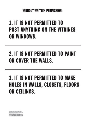
It’s not surprising that, having consented to the power of the Word, the people would eventually want that power back. Flipping through the ‘Forms of Inquiry’ catalogue a while ago, I stopped to reflect on Mevis and van Deursen’s contribution, which appropriates rules sent out to teachers and students at the Gerrit Rietveld Academy each year for proper treatment of their historic building.
Essentially, this is a notice that forbids its own posting. The act is not a futile one; it is surely a comment on the condition of having to work within a living monument and the creative struggles created as a result. But, aside from the language, Armand Mevis and Linda van Deursen have appropriated something else: artist Lawrence Weiner’s trademark use of Franklin Gothic Extra Condensed (see ‘The work must be read’, Eye no. 29 vol. 8). They have also dropped a fourth rule from the original text, to better echo Weiner’s statements, which so often come in threes.
When Weiner’s 1969 work A Series of Stakes Set in the Ground… was damaged, he decided that the work’s essence rested in its verbal formulation, not its physical implementation. He began to see that his medium for sculpture could be language itself; that language alone was sufficient for communicating his ideas. In the same year, artist Joseph Kosuth published his essay ‘Art After Philosophy’. Kosuth explains that ‘artness’ is a criteria and that Duchamp’s strategy, employed with his Readymades, of simply declaring: ‘This is a work of art’, was enough to activate that criteria. Art could exist as a simple declaration or assignation, a public notice. The King’s Word. With this power, however, came responsibility: ‘Being an artist now,’ Kosuth asserted, ‘means to question the nature of art.’ So while artists were appropriating the power of the King’s Word, it was also their job to somehow investigate or undermine that power.
Mevis and van Deursen’s contribution to ‘Forms of Inquiry: The Architecture of Critical Graphic Design’, curated by Zak Keyes, Architectural Association, London, 2007.
Weiner’s work began to do this via a verbal form of Readymades, which curator Nancy Spector lists as ‘Readymade structures, such as idioms, clichés, and proverbs, which underscore the contingent nature of meaning when encountered in different contexts.’ This is language that is reused so frequently we often fail to even hear it, and it becomes, ineffect, ‘dumb’ in both the simple and silent senses of the word.
Weiner’s uninflected, workmanlike typography flattens out these phrases even further, leaving us with an ambiguous object: are we reading it or seeing it? Where does one act stop and the other one start? Weiner’s work makes these questions new, large, and physically real.
Many artists using language as a medium after Weiner start with these magically pervasive and authorless phrases. Christopher Wool is one, with lists such as Sell The House. Sell The Car. Sell The Kids. (1988), running in all caps with awkward breaks. Wool’s painting jolts us into reading a phrase we’ve heard many times before (it comes from the film Apocalypse Now) in a new way. We struggle with it and are disturbed by it. Its logic is as coarse as its rough grid of letters. Its tone is as suffocating as its lack of white space. Its execution is not careful and considered, but hasty.
The use of irregular breaks and spacing to disjoint or disorient us and make us ‘see’ language is also common in the work of artist Kay Rosen. The Krugeresque lowercase Futura Bold Oblique in a Rosen painting from 1987 shouts at us in red on black:
assass
in in
the the
ater
But for all the doubling letters and breaking of words we cannot hear the warning until we look for the piece’s title: John Wilkes Booth.
Kay Rosen’s John Wilkes Booth, 1987. Courtesy of the artist.

Rosen’s phrase is drawn from the news, which, in 2008, is probably the public notice’s most common content provider. In 2005, artist Eva Weinmayr collected handbills for London’s Evening Standard newspaper for her book Suitcase Body Is Missing Woman. The Evening Standard handbills reunify the public notice with the spoken language that originated it, though in a much less formal dialect. I can’t help be reminded of Weiner’s work again, and also of Jop van Bennekom’s wonderful standfirsts for his Butt magazine (see Eye 61), which blend graphic bluntness with chatty description. A sample:
stephen galloway
hysterical ballet
dancer and artist
and choreographer
and style consult-
ant and r&b singer
in germany loves
poppers
It’s all there: the run-on list, the bad break, the prepositional cement, the dumb syntax. This language comes from the street and from IM chat rooms, it comes from conceptual art and vernacular signage, from punk flyers and concrete poems.
It’s bad (English) but it’s bold. Writ large, set tight, almost always capped, and in the most boring typeface available, these graphic descendants of the public notice use banality to be seen and boldness to be read, reclaiming the Word for the people.
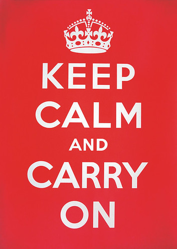
Ministry of Information poster, made but not distributed in 1939, later rediscovered by Stuart Manley of Barter Books.
First published in Eye no. 73 vol. 19 2009
Eye is the world’s most beautiful and collectable graphic design journal, published for professional designers, students and anyone interested in critical, informed writing about graphic design and visual culture. It is available from all good design bookshops and online at the Eye shop, where you can buy subscriptions and single issues.