
Tuesday, 8:00am
13 January 2015
Beer signs in the grain belt
uncredited designers
anonymous designers
Food design
Graphic design
Type Tuesday
Typography
Visual culture
Water, grain and time converge at the source of the Mississippi in Minnesota. Steven McCarthy tastes the typefaces and signs that brand his local beers
Minnesota has abundant quantities of beer’s two main ingredients: water and grain, writes Steven McCarthy.
It has another aspect, too: architecturally scaled signage that promotes this alchemical marriage as both preserved history and future-oriented pursuit. Known for its more than 10,000 lakes and as the source of the Mississippi River, Minnesota also borders Lake Superior, which holds ten per cent of the world’s fresh water. The bountiful crops of the state’s farms – including corn, soybeans, wheat and barley – flow into the twin cities of Minneapolis and St Paul for processing into internationally distributed goods. General Mills’ Wheaties and Cheerios cereals, Pillsbury’s baked products and Cargill’s many agricultural goods, such as brewer’s malts, are a few examples from the ‘grain belt’.
Hennepin Avenue bridge, Minneapolis, Minnesota.
Top: Grain Belt Beer sign repositioned to the bank of the Mississippi River in 1950.
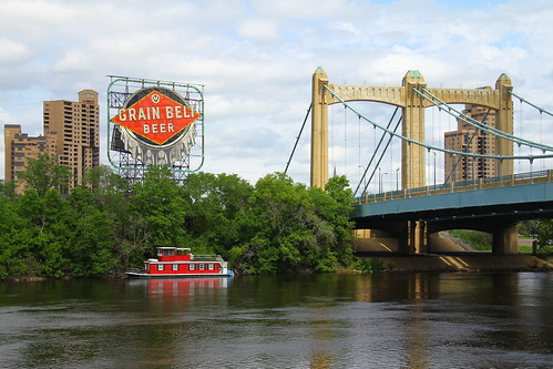
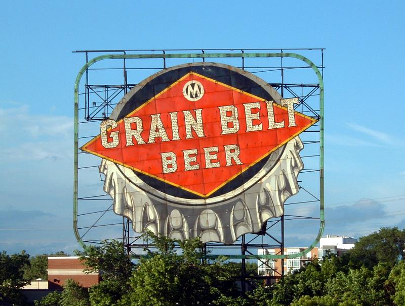
A massive sign advertising Grain Belt Beer, originally erected over a nightclub in 1941 in downtown Minneapolis, was repositioned across the Mississippi River in 1950 and stands there today. Its neon no longer lights up, its surface badly needs repair and graffiti artists have tagged the back of the decaying sign.
Still, without visual competition in its place adjacent to the Hennepin Bridge, the bottle cap, red diamond shape and no-nonsense type design is a significant feature of the landscape. With the river at its feet and ageing grain elevators nearby, the Grain Belt Beer brand name joins place to product. But in an era of entrepreneurship and real estate development, its future was uncertain.
Fortunately, the sign was recently purchased by Schell’s Brewery of New Ulm, Minnesota, which acquired the Grain Belt brand in 2002. The company is working with The Preservation Alliance of Minnesota to restore it. They are also proposing LED lights to better control the lighting and save energy. Of interest to the area’s many designers, the restoration is as much about saving mid-century graphic design as it is about preserving Minnesota’s beer heritage.
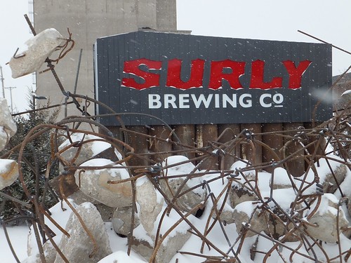
Surly Brewing Company, Minnesota.
All Surly photographs by Steven McCarthy.

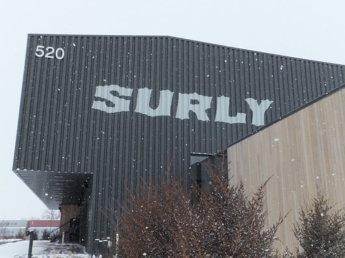
Tethering the past to future, a new beer sign went up this year – on Surly Brewing Company’s ‘destination brewery’ complex in Minneapolis’ Prospect Park neighborhood. The purpose-built industrial facility houses a fully functioning brewery, canning and packaging capacity, and two restaurants. It has been greeted with plenty of enthusiastic customers.
Surly’s sign – simply its logotype – adorns the building’s corrugated metal façade and a smaller sculptural display at ground level. Like Grain Belt Beer’s type it is set in all caps, but is more muscular. Figuratively speaking, it bulges in a tight T-shirt while sitting on the hood of a new, retro-looking Dodge Challenger. Historically, however, Surly’s logotype resembles a nineteenth-century Antique Tuscan Expanded, with its slight mid-stroke spurs. (Perhaps it sits on a Belgian draft horse.)
Surly Beer Hall opened 19 December 2014.

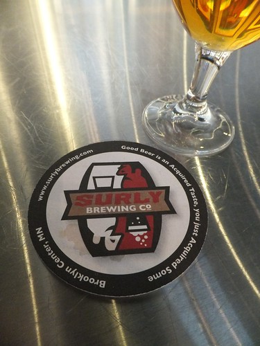
A glass of Cynic ale and a Surly branded coaster reading ‘Good Beer is an Acquired Taste, you just Acquired Some.’
Grain Belt Beer’s letters hark back to the vernacular of American commercial signage, exemplified by typographer John Downer’s Brothers, a revivalist typeface released by Emigre in 1999. Modest triangular serifs anchor thick, mono-width strokes in the Grain Belt Beer letterforms, which are solely constructed of lines and angles, not curves.
Beyond the physical characteristics of each sign’s typeface, it is worth considering the relationship between type (and brand) personality and the lagers and ales they represent.
Screenshot of Grain Belt ‘Premium’ label from the Grain Belt website.
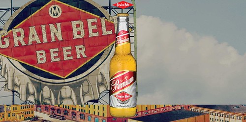
Grain Belt’s ‘Premium’ label describes itself as ‘Light to medium straw color. Light malt flavour and detectable sweetness. Unique Premium hop aroma and flavor with a low hop bitterness.’ It has 4.6 per cent alcohol by volume (abv.).
Surly’s ‘Furious’, its most popular beer, counters with: ‘An amber-colored ale with citrusy hoppy aromas and flavours, balanced out by a chewy caramel malt backbone (sweetness), with a refreshing bitter finish.’ It steps up with 6.2 per cent abv. – clearly the muscle car in this race.
Time will tell which brew’s attributes – flavour, market following and graphic identity – will continue to prosper. The Grain Belt brand has been produced since the 1890s, while Surly was founded in 2005. Thankfully, historical preservation and new trends are both welcome in the Twin Cities’ vibrant urban landscape. As time is a key element in the fermentation of the right blends of water and grain, and thirst is with us on a daily basis, it should be well worth the wait.
Surly Brewing Co. in Prospect Park, Minneapolis, Minnesota. The brewery fought to change Minnesota law to permit breweries that produce less than 250,000 barrels per annum to sell beers on site.
Steven McCarthy, Professor, University of Minnesota
Eye is the world’s most beautiful and collectable graphic design journal, published quarterly for professional designers, students and anyone interested in critical, informed writing about graphic design and visual culture. It is available from all good design bookshops and online at the Eye shop, where you can buy subscriptions and single issues.