
Friday, 10:00am
27 February 2015
Books received #13
Sarah Hyndman
Tony Seddon
Paula Scher
Alexander Rodchenko
Henry Wolf
Alan Kitching
TwoSheds Design
George Lois
Tom Wolsey
Paul Doan
Élodie Boyer
Atelier Patrick Doan
Design history
Graphic design
Illustration
Photography
Reviews
Typography
Ligne B, Editorial Design, T: A Typology of T-Shirts, Greetings from Retro Design and The Type Taster
Here’s another round-up of some of the design-related titles piling up at Eye’s Shoreditch office.
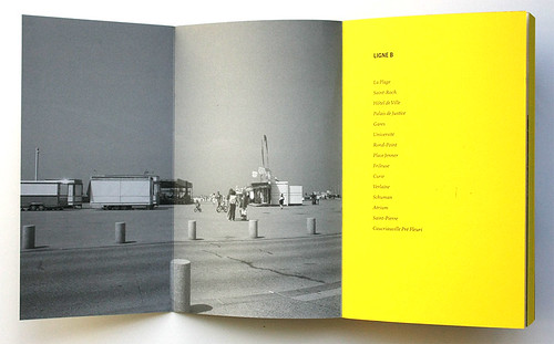
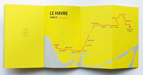
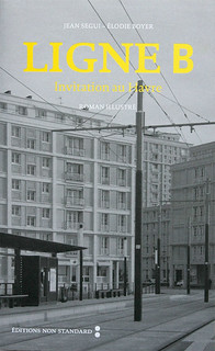
Ligne B: Invitation au Havre by Jean Segui and Élodie Boyer (Éditions Non Standard, €25) is a beautifully illustrated novel filled with full bleed photographs of the city of Le Havre, France. The book’s visual narrative traces the fifteen Ligne B tram stops between the Porte Océane home of Paul and Colette (the book’s central characters) to the Caucriauville quarter, culminating in a brilliant yellow fold-out back cover that shows a map of the route.
Each chapter begins with a sequence of photographs. The French text is dotted with pictograms to emphasise the metaphors used in the plot. (See also ‘Letters on location’ in Eye 85, a review of Élodie Boyer’s Lettres du Havre, also published by Editions Non Standard.)
Inside front cover of Ligne B: Invitation au Havre, written by Jean Segui, showing photography by Élodie Boyer.
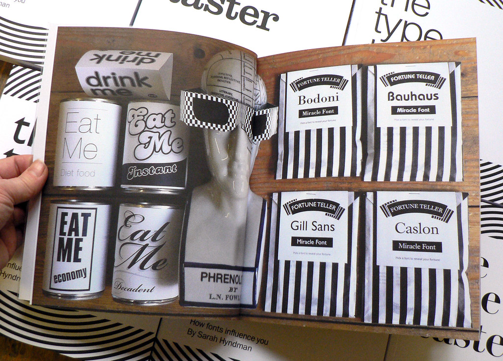
Top: Spread from Sarah Hyndman’s The Type Taster.
Fold-out inside back cover showing the fifteen stops on the Ligne B tramway in Le Havre.
Ligne B, written by Jean Seguin. Concept, photography and creative direction by Élodie Boyer. Designed by Paul Doan with assistance from Marco Juan Lavandier.
Editorial Design: Digital and Print by Cath Caldwell and Yolanda Zappaterra. Designed by TwoSheds Design.
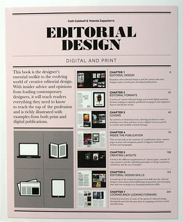
Editorial Design: Digital and Print by Cath Caldwell and Yolanda Zappaterra (Laurence King, £19.95) is a practical guide book to the fast-paced editorial design industry.
‘The debate about print versus digital is over’, writes Caldwell, ‘We are now part of a new golden age of magazine design, an eco-system of print media integrated with social media, events, campaigns and mobile media products.’ The book combines exemplary historical examples – 1950s Esquire covers, Interview from 1972 and Blitz from 1989, among others – with contemporary titles (Eye is one among many).
A series of five ‘briefs’ interspersed throughout the boot feature projects by Caldwell’s Central Saint Martins graphic design students.
Spread showing the cover of Esquire, 1958, designed by George Lois and the cover of Harper’s Bazaar, March 1959.

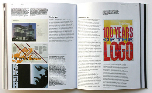
Editorial Design, 2015. Spreads from Inside magazine, Inner Loop and FT The Business (which features a letterpress print by Alan Kitching).
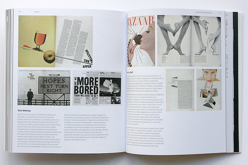
Editorial Design. Spreads from Man About Town designed by Tom Wolsey (left) and Harper’s Bazaar designed by Henry Wolf.
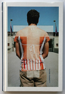
T: A Typology of T-Shirts by Susan Barnett (Dewi Lewis Publishing, £25) is the product of a photographic project started in 2009 that captures the slogans, logos and artwork people willfully display on their bodies. Barnett sees the nuanced T-shirt graphics as a reflection of people’s identities. Marvin Heiferman’s introduction states: ‘As if through some uncanny sort of ventriloquism, the garments mouth off on a range of hot-button topics: sexuality, race, spirituality, consumerism, violence, pleasure, history, narcissism, and nihilism.’
Susan Barnett’s T: A Typology of T-Shirts shows the subjects’ ‘vulnerabilities and hopes as much as their affiliations and opinions.’
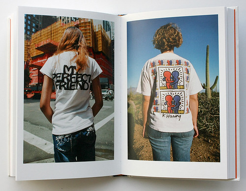
T: A Typology of T-Shirts by Susan Barnett with texts by Marvin Heiferman and Harold Koda.
Greetings from Retro Design: Vintage Graphics Decade by Decade by Tony Seddon (Thames & Hudson, £18.95) is a reference book for the sweeping, indefinite term ‘retro’. It begins with a simplified timeline of the artistic movments of the past century before plunging into the finer details of each decade. Three designers are profiled per decade, such as Lester Beall (1940s), Milton Glaser (1960s) and Paula Scher (1990s), with supporting graphic design that exemplified popular aesthetics, showing how ‘extraordinarily influential the graphic design styles of the last century were and of course still are today’.
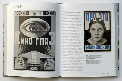
Spread showing work by Alexander Rodchenko including a poster design for the 1924 film Kino Glaz (left) and a book cover designed in collaboration with Vladimir Mayakovsky for Pro Eto: Ei i Mne, 1923 (right).
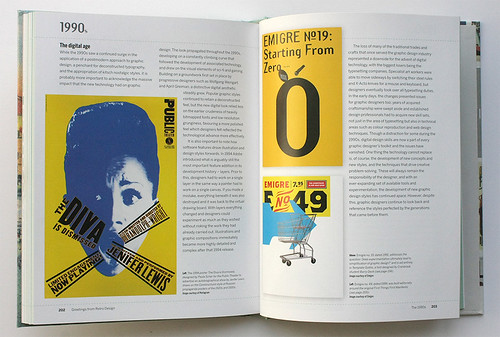
The 1990s illustrated with Pentagram partner Paula Scher’s The Diva is Dismissed, 1994 (left), and covers of Emigre no. 19, 1991, and no. 49, 1999.
Greetings from Retro Design: Vintage Graphics Decade by Decade, written and designed by Tony Seddon.

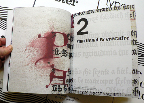
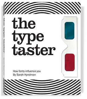
The Type Taster, a self-published book by Sarah Hyndman (With Relish, £18) is the fruit of more than two years of type workshops, ‘type safari’ guided tours, talks and type-related experiments with food. Hyndman is interested in interrogating the feelings – the ‘psychology of typography’, associated with everyday letters and reading. This playful book addresses the everyday type consumer, aiming to take the discussion beyond the immediate audience of graphic designers and type specialists. Chapters ask conversation-starting questions such as ‘Typefaces, they don’t really matter?’, ‘Functional vs evocative’ and ‘Type is a time machine’. The book also includes the results of Eye’s tasting panel – see ‘Type on the tongue’ on the Eye blog.
Spread showing a detail of ‘His Consolation of Philosophy’ printed by William Caxton in 1478.
The Type Taster, written and designed by Sarah Hyndman.
Eye is the world’s most beautiful and collectable graphic design journal, published quarterly for professional designers, students and anyone interested in critical, informed writing about graphic design and visual culture. It is available from all good design bookshops and online at the Eye shop, where you can buy subscriptions and single issues.