
Monday, 8:59am
27 October 2014
Five strategies tabled in Eindhoven
Van Abbemuseum throws new light on Jan van Toorn’s critical design practice
Homage exhibitions are inherently celebratory, writes Francisco Laranjo. However ‘Staging the Message: The Open Work of Jan van Toorn’, now at the Van Abbemuseum in Eindhoven, the Netherlands until 18 Jan 2015, offers a critical challenge to that tradition.
With a seemingly informal but bold approach, work by the Dutch designer is framed within a wider historical and contemporary graphic design practice, allowing ‘Staging the Message’ to become an exercise in self-reflexivity while proposing a succinct yet provocative case for design theory.
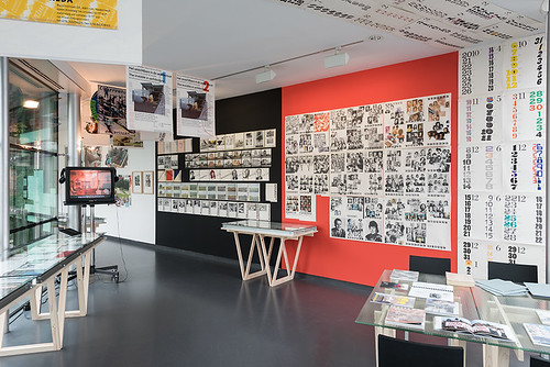
Installation photo by Peter Cox.
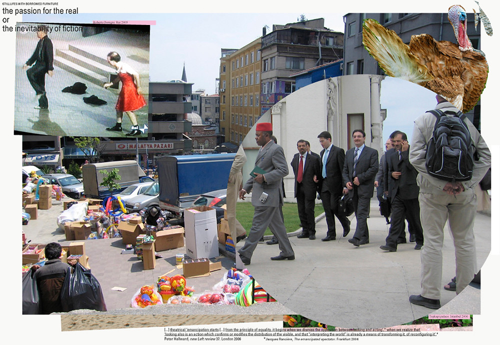
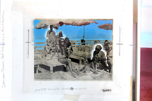
Top: Jan van Toorn, The passion for the real, from the series ‘Still Lifes with Borrowed Furniture’, 2011.
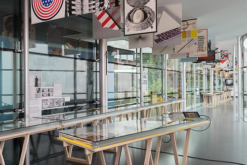
One corridor of the museum is lined with wooden tables designed by Van Toorn, filled with a vast quantity of books and other printed matter. Tablets and a TV screen provide extended access to publications and references used in his work, ranging from film to literature and theatre. The exhibits have been carefully selected, giving attention to Van Toorn’s strong relationship with the Van Abbemuseum and its former director, Jean Leering, who shared and encouraged Van Toorn’s intentions in openly challenging the role of the museum and art in the public sphere.
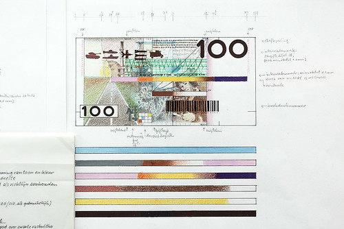
Though the show includes recent work (‘10 Still Lifes with Borrowed Furniture’, 2011), it presents an opportunity to see lesser-known works, such as his proposal for bank notes for De Nederlandsche Bank (1986). Here Van Toorn made visible the politics of money, and his proposal was rejected. Catalogues, books and posters show a shift away from grid-based functional works from the early 1960s, to a journalistic and dialogic approach in the early 1970s and later. The exhibition provides an understanding of that progression, and Van Toorn’s struggle to free himself from his Modernist education.
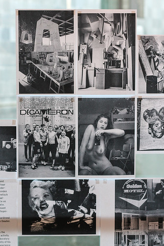
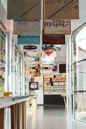
Black-and-white prints – Staging, Design Strategies, Editing, Image + Research, De-Schooling – are taped to the museum’s windows, structuring and commenting on the exhibition, each with a quote from a thinker (Umberto Eco, Hans Magnus Enzensberger, Ivan Illich) that emphasises the relationship between media, manipulation, politics, method and design.
Jan van Toorn, prints taped to a window of the Van Abbemuseum. Photo taken by the author, 2014.
Under the heading ‘Editing’ come other sub-headings
that summarise Van Toorn’s practice and the contributions he has made to graphic design through books such as And Justice for All … (1996), Design Beyond Design (1998), Design’s Delight (2003) and Critical Practice (2005). Themes include Data-Journalism, Pictorial Statistics + Isotype, Typography and Image, Image Editing and The Commission.
Ontwerpstrategieén / Design Strategies co-authored with historian and curator Els Kuijpers. Installation photo taken by the author, 2014.
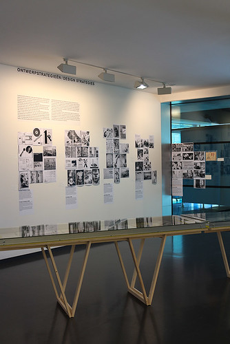
But it is the five ‘Design Strategies’, co-authored with historian and curator Els Kuijpers, that provide the exhibition’s most provocative theorisation. The first strategy is Functionalism: designers in this category (including Jan Tschichold, Wim Crouwel, Bruce Mau, Mevis and Van Deursen and Experimental Jetset) think ‘technology and form can be deployed in a value-free way’. The ‘socio-political dimension of the design process is reduced by the conceptual orientation of this model of communication and the abstract, uniform visual language in which it addresses us.’
Formalism groups Herbert Bayer, Alexander Rodchenko, Irma Boom, Gert Dumbar, Stefan Sagmeister, Wolfgang Weingart and Anthon Beeke. This strategy ‘celebrates the aesthetic form as liberation from the Modernist dogma forms follows function and the uniform functionalist style it paradoxically leads to.’ Instead, form becomes ‘detached from content […] at the expense of meaning’. Informalism, by contrast, employs socially driven, radically open language, opposing ‘the aestheticisation of everyday life by art and design’, breaking with professional design that ‘deploys communication to control and discipline’. Examples include Hannah Höch, Kurt Schwitters, John Heartfield and Fluxus.
Installation photo by Peter Cox, 2014.
Photomontage for the Mart. Spruijt calendar, 1976.
Next, Productivism, which puts communication design ‘at the service of a social programme aimed at bringing about change in society.’ While it breaks from the ‘politically naïve idea of design as a non-ideological form of communication’, it ‘often fails to relate its own practice to the theoretically grounded critique’: messages become depoliticised, and it fails to offer ‘realistic alternatives to the status quo it is criticising’. See Metahaven, Bureau d’Études, Hito Steyerl and 2x4.
Finally, Dialogism ‘adopts a view of communication based on democratic reciprocity and solidarity’. By seeing communication design as an ‘aesthetic system and moral practice in one’, this reflexive and social strategy ‘aims to involve spectators in the communication in a recognisable and critical manner and thus to offer them counter-images dealing with reality’. Gérard Paris-Clavel, Les Graphistes Associés, Chéri Samba and Hard Werken come under this head.
Van Toorn’s 1986 proposal for bank notes for De Nederlandsche Bank. Photo by the author.
This proposed taxonomy of design strategies is a careful exercise in history, process, method and effect. It can give an account of a designer or studio’s approach based on one project, but also serves to reveal the overlaps and nuances of the works used as examples, being naturally open for debate. So it is possible to see different works by Rodchenko under Formalism and Informalism and El Lissitzky under Functionalism and Dialogism.
At the heart of the exhibition the audience is invited to sit at a table and read some of Van Toorn’s books and essays. Another reading room is at one end of the corridor, with shelves of books by authors quoted along the walls, and access to a wider selection of titles. A computer screen shows a variety of films, from Jean-Luc Godard to the documentarist Adam Curtis. On the walls are models used in exhibition design – including one for the current exhibition, installed in a public corridor so that visitors don’t have to pay to see it.
Photo taken by the author.
Critical practice does not begin or end with Van Toorn: the exhibition makes clear that there are other ways ways of taking a critical stance, and draws attention to the importance of framing work in the context of society and design practice. But Jan van Toorn’s work is a tenacious example of commitment to public debate, criticism, reflexivity, disciplinary discourse and research. ‘Staging the Message’, appropriately, doesn’t indulge in homage, but makes an important contribution to graphic design.
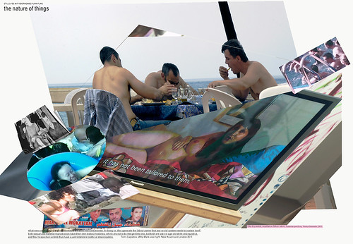
Jan van Toorn, The nature of things, from the series ‘Still Lifes with Borrowed Furniture’, 2011.
Francisco Laranjo, graphic designer, London
Eye is the world’s most beautiful and collectable graphic design journal, published quarterly for professional designers, students and anyone interested in critical, informed writing about graphic design and visual culture. It is available from all good design bookshops and online at the Eye shop, where you can buy subscriptions and single issues.