
Friday, 10:00am
16 June 2017
Brief encounters and the pleasures of ambiguity
Juno Calypso
Ryan Gander
Anna Ginsburg
George Hardie
It’s Nice That
James Jarvis
Noma Bar
Astrid Stavro
Triboro
Design history
Food design
Graphic design
Illustration
Music design
New media
Design, illustration, animation and anecdotes at Here London 2017
Here London, It’s Nice That’s annual conference, has become an established fixture on the design calendar, with speakers from a range of ‘creative’ disciplines showing their work, entertaining an audience of professionals and students with anecdotes, videos and slide shows of career highlights writes John L. Walters.
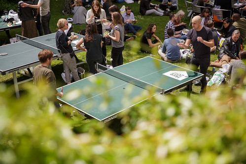
Last Friday’s event (9 June 2017) went as smoothly as ever, in the setting of the Royal Geographical Society in West London. When you leave the 700-seater auditorium, there is a marquee for drinks and a lawn for lounging or ping-pong. There were activities set up by Glasgow Risograph printers Risotto, ‘robotic drawing board’ Joto and sponsors Adobe. There are no questions from the audience – it’s not so much a conference as a ‘show and tell’.
Table tennis in the Royal Geographical Society garden. Photo: Tim Bowditch for It’s Nice That.
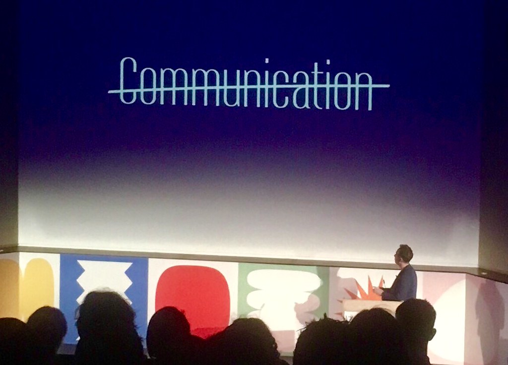
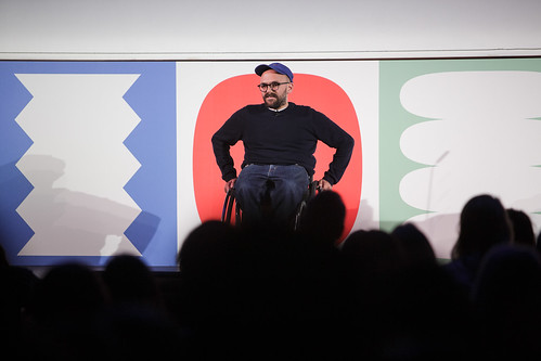
Top: Triboro partner David Heasty questions the importance of ‘Communication’. Photo: JLW.
Between them, the programme’s ten speakers embraced some contemporary approaches to fashion (Christopher Raeburn), photography (Juno Calypso), art (Marguerite Humeau and Ryan Gander) graphic design and typography (Astrid Stavro of Atlas and David Heasty of Triboro) and illustration (James Jarvis and Noma Bar), plus animation by Anna Ginsburg, a last-minute replacement for Carlotta Guerrero. Graphic artist George Hardie – well known to It’s Nice That founders Alex Bec and Will Hudson from their time at Brighton – provided the finale. (Disclosure: I only witnessed five of the presentations.)
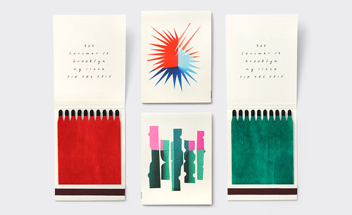
Matchbooks for Sauvage, part of Triboro’s identity design for the New York restaurant.
Triboro’s Heasty made a strong argument for naming what they do graphic design rather than communication. ‘Everyone is a communicator, now,’ he said, filling his screen with politicians, advertisers and TED talk speakers. He founded the Brooklyn studio with German-born designer Stefanie Weigler during the global financial meltdown in 2008. Since that uncertain time, the couple have developed an impressive portfolio, with clients including Justin Timberlake, restaurants, start-ups, apps and Google, for their abandoned Ara phone. Many of the projects feature Heasty’s own custom typefaces.
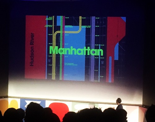
Detail of Triboro’s Wrong Color Subway Map, one of the studio’s self-initiated projects.
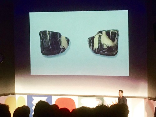
Heasty declared an appreciation of ambiguity in design; a love for images and messages that were not obliged to reveal everything in one hit. Music design has traditionally given graphic designers and illustrators the opportunity to make work that goes beyond and often confounds mere ‘communication’, as George Hardie’s talk confirmed later in the day. Heasty’s final slide was somewhat Hardie-esque – a photograph of a stone he had picked up in childhood. One side looks like a bear; the other, a dog.
‘What can you see?’ Heasty’s pet rock.
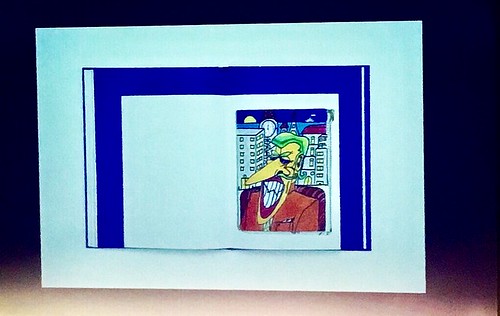
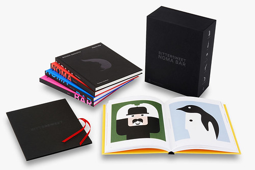
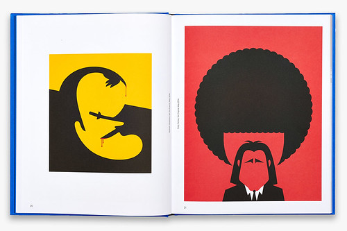
Heasty’s pet rock segued nicely into Noma Bar’s presentation, themed around Bittersweet, the illustrator’s luxuriously packaged five-volume book, designed by Fernando Gutiérrez for Thames & Hudson. Bar’s use of negative space is instantly recognisable, not just for his pared-back line, but for the distinctive way he marshals the raw material of his images. Berlusconi’s face is sketched in by a woman’s leg and a pair of panties (a reference to his ‘Bunga Bunga’ parties) and Elvis Presley’s face is made from three guitars and a quiff. However one of the nice surprises of Bar’s presentation was a portfolio of crude but assured drawings from when he was twelve years old.
Page from Noma Bar’s schoolboy sketchbook.
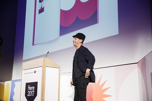
Noma Bar at Here London 2017. Photo: Tim Bowditch for It’s Nice That.
Noma Bar: Bittersweet, Thames & Hudson, £200.
Noma Bar – Quentin Tarantino (L) and Samuel Jackson Jr. and John Travolta in Pulp Fiction.
Anna Ginsburg (stepping in to replace the absent Carlotta Guerrero) kicked off an impressive talk with her topically political ‘Theresa Mayonnaise’ gif, a rotating aubergine and a short showreel that demonstrated her command of hand-made marks, rotoscoping, ‘jolly vaginas’ and whistlestop storytelling. To make segments for her ultra-low budget animated short Private Parts, Ginsburg approached twelve favourite animators; eleven said yes. The results, synchronised to audio of real-life conversations about female anatomy, were hilarious, frequently moving and packed with unexpected metaphors and more ambiguity, including a hypnotic ‘vagina as Rubik’s cube’. ‘Animation brings your wildest fantasies to life,’ said Ginsburg.
Anna Ginsburg, Private Parts.
After the intensely visual content of his predecessors, Ryan Gander came across more like a stand-up (or sit-down), with memorable soundbites such as: ‘We’re not here forever, and living is pretty ace.’ Since he had apparently decided with the organisers that showing too much of his actual work would be ‘boring’, we were treated to family snapshots, Instagram (‘it’s an addiction’) screenshots and his ‘business card’. This turned out to be Peter Saville’s business card, over which he had scribbled his London studio address. He had also added three words: ‘Exercise’, ‘Slowness’ and ‘Empathy’, eventually revealed as the core themes of his presentation.
Ryan Gander. Photo: Tim Bowditch for It’s Nice That.
Graphic artist George Hardie was the final act of the day, starting with his frequently cited: ‘I notice things and I get things noticed.’ (see ‘The rules of the game’ in Eye 58.)
George Hardie. Photo: Tim Bowditch for It’s Nice That.
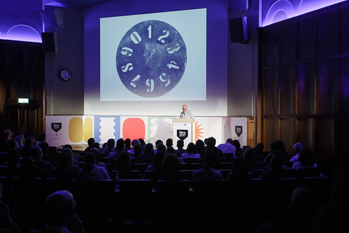
Hardie whizzed through his long career to everyone’s delight, delivering deadpan remarks along the way: ‘I’m very keen to avoid drawing people,’ and ‘Why do I teach? For money of course!’, ‘a lot of my work is about saying this looks like that,’ and ‘The thing about graphic design is: you have to know a lot.’
Black Sabbath’s Technical Ecstasy (1976). Art direction: Hipgnosis, featuring artwork by George Hardie.
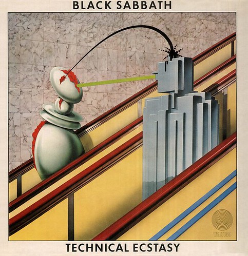
He restricted discussing his music design – about which he is famously diffident – to a handful of slides. He told us that he once went on holiday leaving behind a piece of black and white artwork with instructions for a colour re-toucher. He didn’t see the finished work, the robotic ‘brief encounter’ sleeve for Black Sabbath’s Technical Ecstasy, until it was printed.
Hardie’s extensive exhibition ‘Fifty Odd Years’ (held in Brighton last spring) has yet to tour, but admirers of his work can see many examples of his music design work in ‘Pink Floyd: Their Mortal Remains’, currently packing them in at the V&A in London.
John L. Walters, editor of Eye, London
Eye is the world’s most beautiful and collectable graphic design journal, published quarterly for professional designers, students and anyone interested in critical, informed writing about graphic design and visual culture. It is available from all good design bookshops and online at the Eye shop, where you can buy subscriptions and single issues.