
Saturday, 10:00am
19 September 2020
Crouwel’s institutional intuition

Wim Crouwel
various designers
Total Design
Design history
Graphic design
Posters
Reviews
Events and exhibitions
On the first anniversary of Wim Crouwel’s death, Alex J. Todd recalls a visit to the Stedelijk Museum exhibition ‘Mr. Gridnik’
On 19 September 2019, nine days before the opening of ‘Wim Crouwel: Mr. Gridnik’ at the Stedelijk Museum, Crouwel died, aged 90, in Amsterdam, writes Alex J. Todd.
The exhibition, which brought together a broad range of Crouwel’s work – including posters, identities, catalogues and typefaces – was a tribute to a man whose contribution to Dutch graphic design is considerable.
In the 1960s and 70s, when he was at his most prolific, it was Crouwel’s sharp sense of his own milieu – of burgeoning international business, of technocratic governance, of space-age modernity – and design’s role within it, that saw him foster a reputation as a new kind of graphic designer in the Netherlands. Crouwel was not just an image-maker, but also a businessman, a statesman, and, as one of the founders and managers of the Total Design studio, an institution.
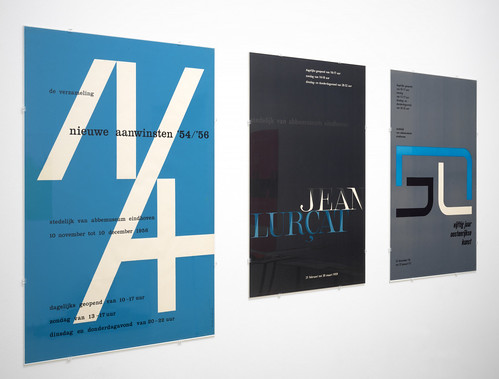
‘Wim Crouwel: Mr. Gridnik’, installation photographs by Gert Jan van Rooij showing posters designed for the Van Abbe Museum (1956-59) by Wim Crouwel and collaborators.
Top. A selection of publications on the subject of Crouwel, including Frederike Huygen’s monograph Wim Crouwel: Modernist (2015) and the Unit Editions catalogue from the London Design Museum’s 2011 exhibition ‘Wim Crouwel: A Graphic Odyssey’.
In the six compact rooms of ‘Mr. Gridnik’, tucked away at the rear of the Stedelijk, we were given glimpses into the evolution of the approach that made Crouwel so inimitable. In posters and catalogues for the Van Abbemuseum in the late 1950s and early 60s, and at the Stedelijk Museum in the following decades – alongside works such as his New Alphabet, designed in 1967, or his calendars for the printer Erven E. van der Geer (from 1956 onwards) – visitors saw the steady expansion of Crouwel’s rational, Modernist approach which, by the 1970s, would become the go-to aesthetic for institutions across the Netherlands. Displayed in the exhibition’s tight spaces, one was continually struck by the variety, intelligence and vigour of these designs. The groupings that showed Crouwel’s numerous work-in-progress sketches, for posters and typefaces, were especially captivating.
Exhibition catalogues designed by Crouwel for the Stedelijk Museum. Installation photos from ‘Wim Crouwel: Mr. Gridnik’ by Gert Jan van Rooij.


In addition to this wide-ranging selection of Crouwel’s work, the exhibition also presented Lex Reitsma’s documentary, Wim Crouwel: Modernist (2019), co-produced with Avrotros. The film – sharing its title with Frederike Huygen’s 2016 Crouwel monograph designed by Reitsma (see Alice Twemlow’s review in Eye 93) – runs for 53 minutes and is organised into ten thematic chapters which cover aspects of Crouwel’s life and range from ‘wim’, which surveys Crouwel’s upbringing in Groningen through interviews with family and friends, to ‘influences’, which charts the seminal moments in his development.
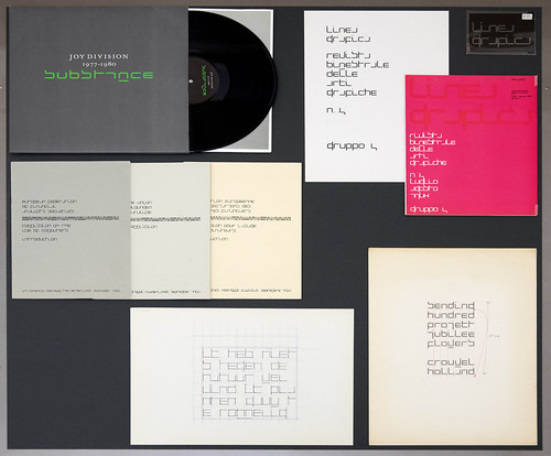
Examples of Crouwel’s 1967 New Alphabet in use, including a 1968 cover for Linea Grafica magazine (top right), and Peter Saville’s well known sleeve design for Substance, the 1988 compilation album by the British band Joy Division (top left).
In the latter stages of the documentary, we see Crouwel collaborating with Dutch designer Floor Wesseling on a typeface for the Netherlands’ 2014 World Cup football kit – in which he reprimands Wesseling for breaking his initial grid – and navigating the WCNA (Wim Crouwel New Alphabet) app, produced by Toon Lauwen, on his iPhone. It is in moments like these that the persistence of Crouwel’s influence was made clear.
Yet, as aspects of this exhibition highlighted, there remain facets of Crouwel’s work and career that still need more attention.
Installation photo by Gert Jan van Rooij showing posters designed for the Stedelijk Museum by Wim Crouwel and collaborators.

For instance, Crouwel’s posters for the Stedelijk, for which he was the designer from 1964-85, were organised into typological grids to emphasise their systematic design. This is a common approach when displaying Crouwel’s work – in both printed and exhibition formats – but it needs examination; for while it might encourage a more holistic view of Crouwel’s design formula, it also obscures our understanding of these posters as objects that were, first and foremost, required to operate individually.
Closer scrutiny is also required regarding the role of Crouwel’s collaborators and assistants. The captions, themselves cursory, infrequently suggested the presence of others, and the topic is gently explored in the ‘studio’ chapter of Reitsma’s documentary, but if histories of graphic design are to diverge from the cult of individual ‘worship’, a re-consideration of how individuals use (and credit) the labour of others is crucial. Many of Crouwel’s designs shown in ‘Mr. Gridnik’ were designed in partnership with fellow designers, or, in some cases – as an interview with Crouwel’s former assistant Daphne Duijveslshoff in Reitsma’s documentary suggests and as Huygen has noted elsewhere – almost entirely by the hands of others. The work of designers such as Duijveslshoff and Jolijn van de Wouw constituted a sizeable portion of an output often credited to Crouwel alone.
Installation photo by Gert Jan van Rooij showing posters and catalogues designed for the Stedelijk Museum, including those designed by the Stedelijk’s former director Willem Sandberg, who preceded Crouwel as the museum’s graphic designer.

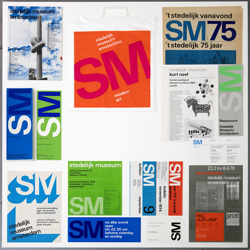
Promotional materials for the Stedelijk Museum, showcasing the flexibility of Crouwel’s identity system.
There were moments here, however, that hinted at new approaches. The exhibition began with a survey of designers that, like Crouwel, have left indelible marks on the Stedelijk’s visual materials, such as Willem Sandberg, Anthon Beeke, Wild Plakken, Mevis & Van Deursen and Experimental Jetset. This is an intriguing method for framing Crouwel’s museum work and could have – if given more consideration – offered considerable insight into the singularity of Crouwel’s longstanding relationship with the Stedelijk.
The exhibition’s final room included a series of enlarged newspaper and magazine articles extolling Crouwel’s contribution to Dutch visual culture. And while these gave a sense of the often positive reception of Crouwel’s work, there is perhaps more to be learned from voices outside the established design press. As Frederike Huygen has shown, journalists in the 1970s, such as Renate Rubinstein in the Vrij Nederland, saw Crouwel’s work as symbolic of ‘an entire field of Dutch ugliness.’
While it may feel antithetical to call for a more critical perspective on the occassion of a tribute, it was Crouwel’s open engagement with, and often his deft negotiation of, these public and professional complexities that make him such an intriguing figure in the history of Dutch graphic design. And if we are to appreciate Crouwel fully, they should play a more central role in the narrative.
‘Wim Crouwel: Mr. Gridnik’, Stedelijk Museum, Amsterdam, the Netherlands. 28 September 2018 – 22 March 2020.
Alex J. Todd, design historian and writer, London
Crouwel’s calendar designs for the Dutch printers Ervan E. van de Geer, which he designed annually between 1956 and 1982. Shown here are (from top left to bottom right) Crouwel’s designs from 1963, 1976, 1973 and 1977.

Eye is the world’s most beautiful and collectable graphic design journal, published for professional designers, students and anyone interested in critical, informed writing about graphic design and visual culture. It is available from all good design bookshops and online at the Eye shop, where you can buy subscriptions and single issues.