
Autumn 2019
Everyday people

Emma Thomas and Kirsty Carter’s Apfel, A Practice for Everyday Life, brings design into the art world, and makes design an art
Since forming in 2003, A Practice for Everyday Life (Apfel) – co-founded by Emma Thomas and Kirsty Carter – has developed a brand of graphic design that resists classification. Minimalist yet expressive, resolute yet flexible, their designs are a case study in considered conceptualism.
Working almost exclusively in the cultural sector, Apfel boasts a roster of regular clients that includes the Tate, Phaidon, Modern Art Oxford, the V&A, the Barbican and Book Works. Apfel also works closely with a number of independent artists and galleries, producing identities, exhibition designs and publications.
Apfel’s studio is now home to a team of six – Thomas and Carter, two additional designers, a project manager and a communications manager. Despite this growth, Apfel still occupies the same space, backing on to a mews in London’s Bethnal Green, that they moved into sixteen years ago. Built in the late nineteenth century as workshops for furniture makers, the double-storey studio contains a series of open spaces that combine neatly curated displays with minimalist functionality.
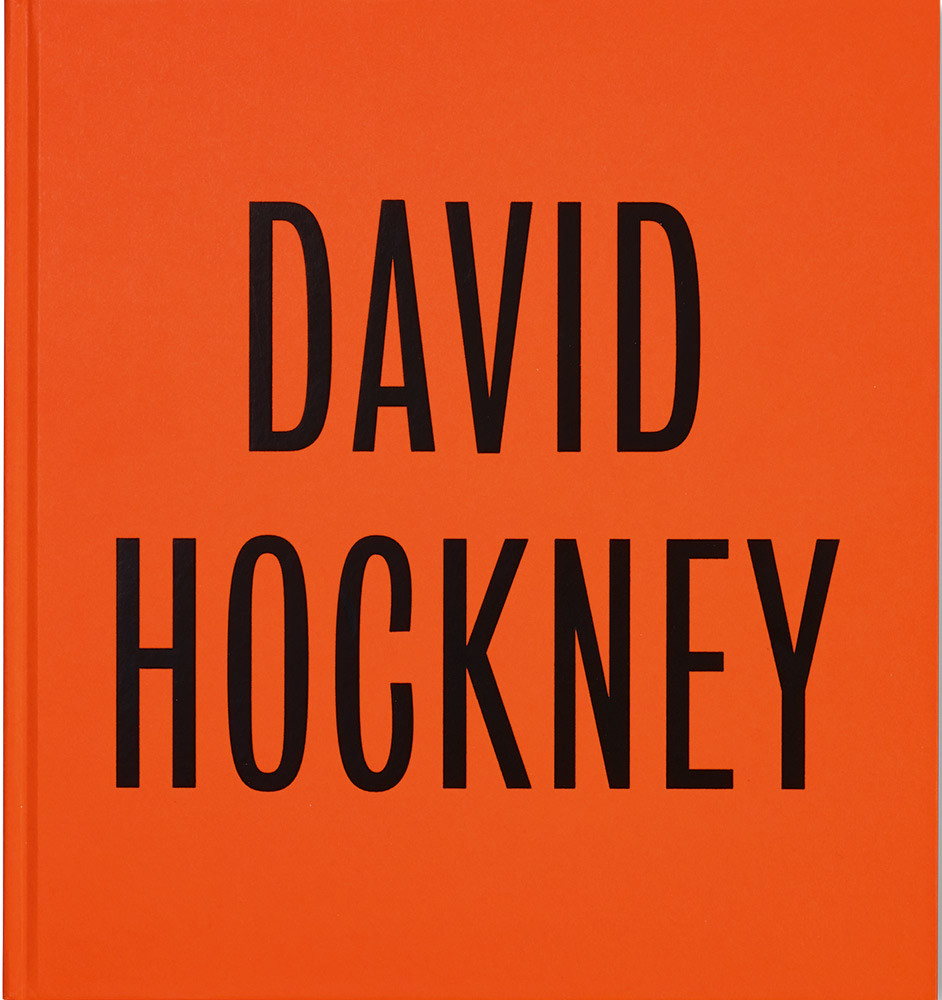
Apfel’s all-type cover for the hardback edition of David Hockney, 2017, published by Tate Publishing to accompany a career retrospective of the artist at Tate Britain. Top. Photo by Elisabeth Scheder-Bieschin.
On the upper floor, typically reserved for round-table team meetings, the walls are covered in posters and printed ephemera that serve as a reminder of the reasons that Apfel has become the go-to studio for artists, galleries and cultural institutions in the UK, Europe, and the United States.
The bias towards culture of Thomas and Carter’s client base is an extension of their work with artists and curators while they were students at the Royal College of Art in London, where their partnership began. After graduating, neither Thomas nor Carter had any doubts about setting up their own studio. ‘It was such a natural progression,’ says Carter, ‘neither of us had a desire to go and work in other studios […] We wanted to continue our practice, together.’ Their determination to work independently has meant that their approach to graphic design has been nurtured from within. ‘The sort of things that we’ve evolved here have come through conversations between ourselves,’ Thomas says, acknowledging the kind of considered conceptualism that has become the studio’s trademark.
Having established a design studio at the start of the 2000s, Carter attributes the success of Apfel to their avoidance of the ‘fashion and style’ that gained notoriety in the UK in the 1980s and 90s. ‘We’re not risk takers,’ she says. Instead, Apfel has always sought to bring a sense of attentive minimalism to its projects. When the pair redesigned the identity and editorial layout of the Architects’ Journal in 2005, it was to the details that they were drawn. Photographs – which were from now on to be commissioned in an attempt to increase editorial harmony – were composed to overlap or hang as if pinned on a studio corkboard, bringing a sense of a building’s ‘progressive state’ into the layout’s design; while their choice of typeface, the sans serif face Akkurat, mirrored the crispness of the magazine’s architectural features.
Custom typefaces designed by Apfel. Monumental is a display typeface designed for the exhibition ‘David Adjaye: Making Memory’ at London’s Design Museum in 2019.

Minimalism does not mean that the work is always simple, though. ‘Someone will take it at face value, and we hope it works,’ Thomas says, ‘but then there are other layers that we really enjoy and hope that someone may notice.’ Apfel’s 2018 identity for Midgramme, a New York-based, non-profit arts publishing programme, is a case in point: the logotype’s quirky ‘double m’ is both a distinctive detail and, when turned on its side, an illustration of stacked books – a motif that Apfel applied throughout Midgramme’s stationery.
Thomas is pleased that this playfulness has become part of their reputation. Discussing their recent design of Niki Segnit’s Lateral Cooking, which represents the interconnected nature of the book, she says: ‘They came to us with a brief knowing that we wouldn’t just take what we were given and give them back what they expected. They understood that we’d come back with something that was going to be a surprise in some way.’
When sifting through Apfel’s impressive catalogue of work, it’s the unpredictability of their minimalist approach that is most striking. Far from formulaic, Apfel’s designs represent a process of locating a project’s substance and bringing it to life. This animation of details is, as Carter admits, ‘quite consuming’ in terms of both time and effort, and their hand can be detected in the smallest of graphic signals. Such gestures are frequently typographic, such as the custom typography for artist Andrés Sandoval’s Periferia (2018) and the identity they created in 2014 for Kettle’s Yard in Cambridge, or the rotating page numbers in Haroon Mirza’s Movement 1 catalogue (2011). More tactile techniques can be seen in the knotted folding of their booklet for ‘Leonor Antunes: a seam, a surface, a hinge, or a knot’ for the Portuguese pavilion at this year’s Venice Biennale.
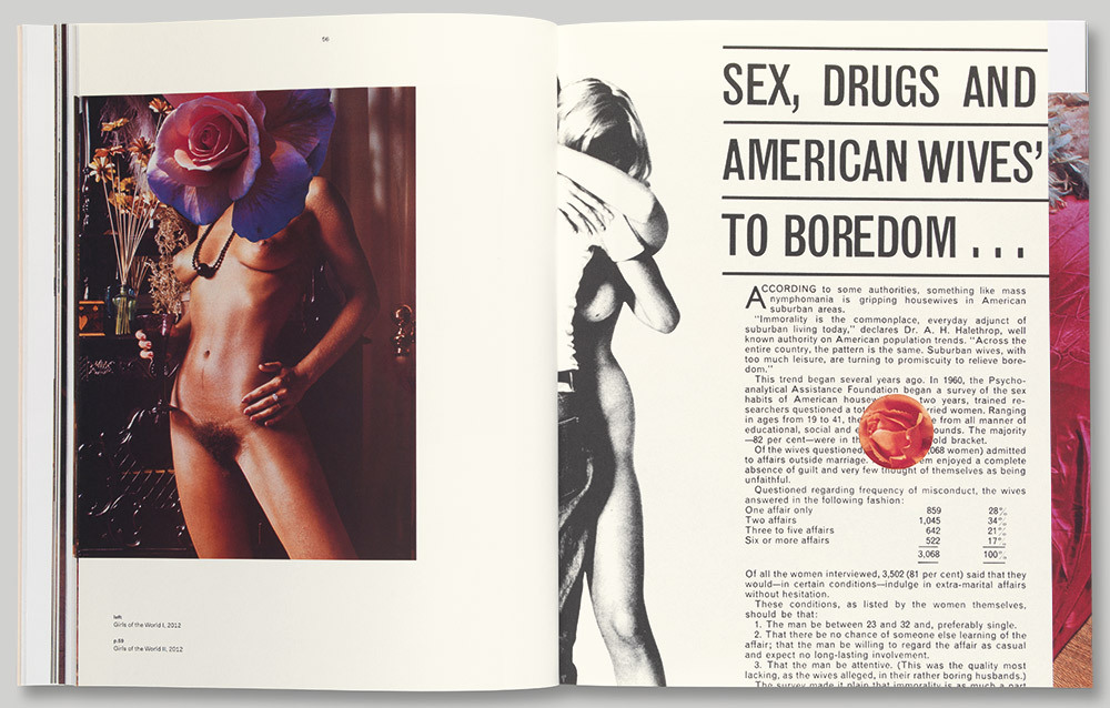
Above. Spread from Linder, 2015, published by Ridinghouse.
The engaging, often complex nature of the subject matter Apfel works on is a product of their longstanding relationship with independent artists and galleries. ‘Our choice of clients is quite particular,’ Carter says. No doubt their reputation makes that position easier to take, but it is one they have occupied since the start. ‘Working with artists and on catalogues has always been the backbone of our business,’ Carter says, but points out that the nature of the independent art world – labour-intensive and under-funded – means that a certain quantity of projects is necessary to make this selective approach viable.
Success in this corner of cultural production has been the result of healthy collaboration, which Carter and Thomas believe stems from their own partnership. A good illustration of this collaborative spirit can be found in their work with the artist Linder, for whom Apfel has designed a monograph and two exhibitions. Even in their first collaboration – Linder’s 2013 exhibition ‘Linder: Femme / Objet’ at the Musée d’art moderne de la ville de Paris – Apfel felt comfortable asking the artist to help them negotiate a dingy stairwell through which visitors would have to pass. Carter and Thomas suggested that Linder make a whole new work.
Cover of Linder, 2015.
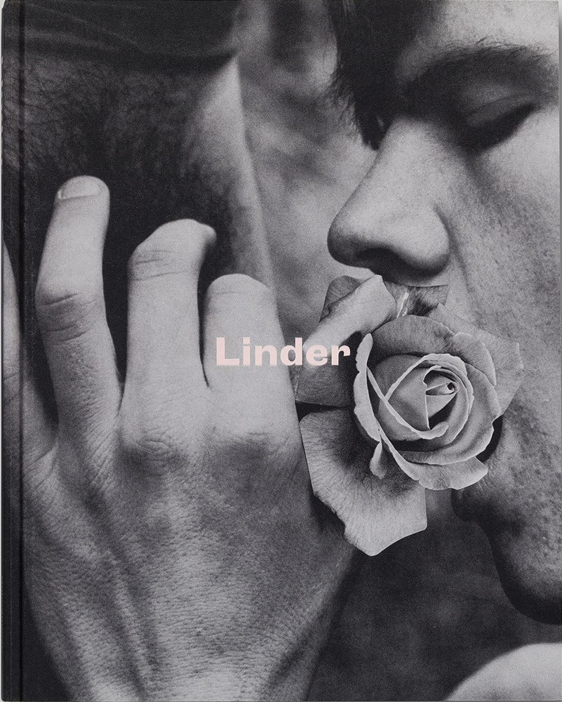
A similar give-and-take was evident when Apfel designed Linder, a printed survey of the artist’s work published by Ridinghouse in 2015. Working closely with Linder to select the images and establish the book’s structure, Apfel introduced a series of ‘physical interventions’, including shifts in paper stock, die-cut peepholes and pages split in half like Dutch doors.
Perhaps most impressive is Apfel’s track record in establishing relationships with both independent artists and national institutions. Apfel has worked with Tate since the mid-2000s, when it was invited to design a series of games to introduce children to the gallery’s programme. Since then the projects have got bigger and Apfel has worked with Tate on campaigns, museum guides, catalogues and exhibitions. The longevity of the relationship has brought its own rewards. Carter notes: ‘Having worked for an institution for so long you start to win their trust.’
In 2017, Apfel suggested a purely typographic cover for Tate Britain’s David Hockney retrospective. ‘David Hockney was the first book that we really pushed on them to do a typographic cover,’ Carter says, ‘and perhaps if we hadn’t worked for them for years that would be quite difficult.’ Until then, every Tate catalogue had included an image of either the artist or an artwork on the cover, and it took both dedication and compromise to convince Tate that typography could work by itself. Apfel’s solution was to cover the hardback edition in a glowing orange cloth, to match Hockney’s vibrant colour palette, and set the type in Bureau Grot Compressed. Bureau Grot is a sans serif inspired by nineteenth-century grotesques made by the Stephenson Blake foundry, which was originally rooted in Hockney’s home county of Yorkshire. With the softback edition, published at the same time, Apfel was less resolute, combining typography with full bleed artwork.
Apfel has cultivated a similar relationship with the Barbican Gallery, another titan of the British cultural sector, designing a number of exhibitions and catalogues. The first of these, the 2012 ‘Bauhaus: Art as Life’ exhibition, is a good example of how Apfel’s detail-oriented, collaborative approach can manifest itself on a large scale. Working – as they often have – with London-based architects Carmody Groarke, Apfel produced a design that combined installations, large-scale images and a rigorous adherence to Bauhaus principles of colour, typography and layout across all aspects of the exhibition, even deciding the colours on the wall – something, Carter says, ‘you wouldn’t usually assume was the graphic designer’s role.’
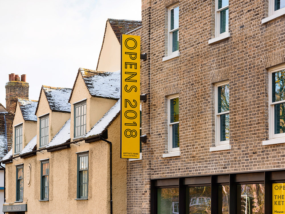
Visual identity and marketing materials for Kettle’s Yard, 2014, an art gallery in Cambridge, UK, for which Apfel also designed a bespoke cut of Super Grotesk. Tote bag design for the ‘Oscar Murillo: Violent Amnesia’ exhibition at Kettle’s Yard, 2019.
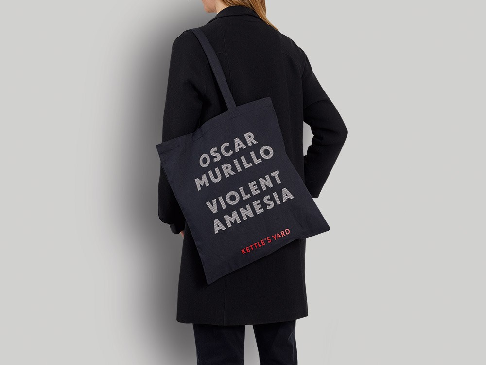
Banner outside Kettle’s Yard, 2018.
Exhibitions have also provided a space for Apfel to consider the importance of narrative. ‘I think that’s what’s so interesting with an exhibition design, you can look at all of its facets and really shape the way a visitor experiences that artist’s work,’ Thomas says. The marketing campaign for the Bauhaus exhibition, for example, focused on a single image: what may have been either Lis Beyer or Ise Gropius sitting on Marcel Breuer’s B3 club chair wearing a mask designed by Oskar Schlemmer. For Thomas and Carter, this image not only articulated the variety of the Bauhaus’s output, but also ‘celebrated the role of women in what has historically been depicted as a rather male-dominated environment.’
Exhibition graphics for ‘Lee Krasner: Living Colour’, 2019. Three-dimensional design by David Chipperfield Architects. Photograph: Thomas Adank.
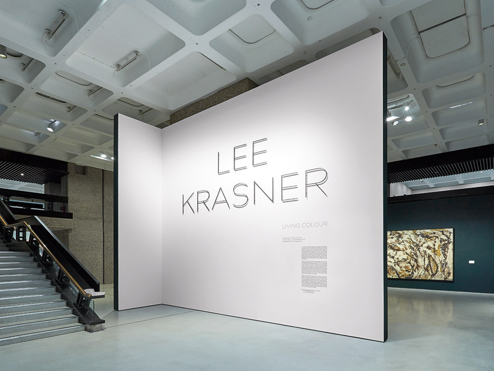
More recently, Apfel has designed identity, graphics and catalogues for the Barbican exhibitions ‘Modern Couples: Intimacy and the Avant-Garde’ (2018) and ‘Lee Krasner: Living Colour’ (2019), both of which stress how under-appreciated women have been in the canons of art history. ‘It gets us excited now,’ Carter says of the feminist undercurrents that run through such projects. ‘It’s about being more conscious of what we feel is important in life, and I think that’s just come with maturity.’
‘IN’ tote bag, 2018, designed to support the UK’s continued membership of the European Union.
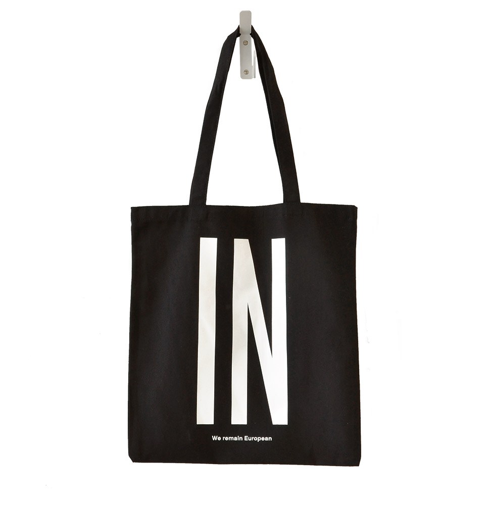
Carter’s reflections are indicative of a larger shift in Apfel’s practice, in which the designers have begun to embrace their own political stance more openly. In 2015 Apfel designed a poster to raise funds for the Labour Party’s general election campaign, while in 2018 the studio expressed support for the ‘Remain’ position on Brexit by designing a run of ‘IN’ bags. This was, for Carter, ‘the first moment that we, as authors, were like: “This is what we believe in.”’ Both projects have since sold out on Apfel’s online shop, an outlet for more idiosyncratic projects in the shape of prints, wall hangings, stickers and limited editions, as well as political statements. ‘It’s about doing some projects that were a little bit more from us, and the shop enabled us to do that,’ Carter says. The shop is also indicative of Thomas and Carter’s pragmatic approach to the economic realities of practising graphic design in a mainly cultural context. Creating their own platform for self-initiated projects ensures that profits are easily reinvested in the studio and its staff. Similar reasoning led them to purchase their studio space in 2016.
Detail of the Hepworth typeface, 2011, designed in collaboration with Emma Williams as part of Apfel’s visual identity for The Hepworth Wakefield art gallery in West Yorkshire, UK, 2011.
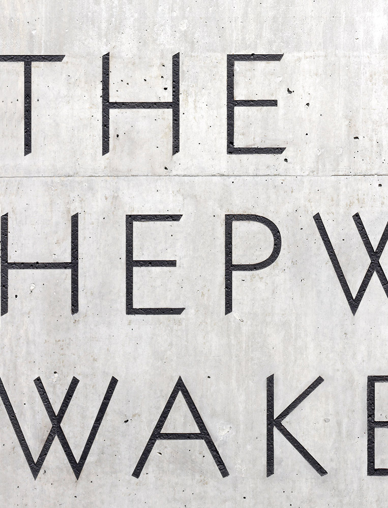
Apfel are now in the process of establishing their own type foundry. ‘We’ve always put so much energy into developing typography,’ Carter explains. Perhaps the best-known example is the identity for The Hepworth Wakefield art gallery in West Yorkshire, for which they designed a custom typeface that reflected not only the era of Barbara Hepworth’s early career, but also the formal particularities of both Hepworth’s work and the building, designed by David Chipperfield, in which the work would sit. ‘It’s something that we really enjoy bringing into a lot of projects. So, we wanted an avenue for it,’ adds Thomas.
Covers of The Happy Hypocrite, an annual journal of art writing published by Book Works.
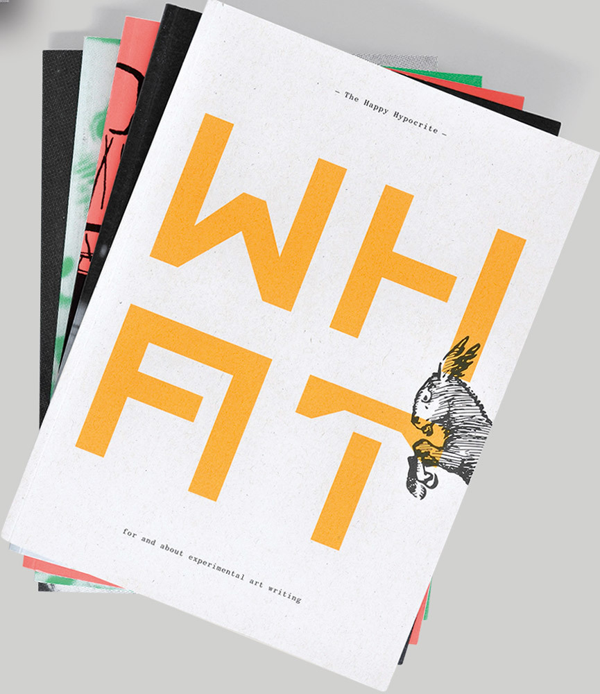
The foundry will, first of all, be a space for Apfel’s back-catalogue of type designs. That will not include the Hepworth typeface, which is owned by the museum, but will include font families such as Monuments, which Apfel designed for the ‘David Adjaye: Making Memory’ exhibition at the Design Museum in 2019, alongside those devised for clients such as The Happy Hypocrite – an annual journal of art-writing – Phaidon and Feilden Fowles Architects. For Thomas and Carter, the most exciting part is seeing how their designs can evolve in the hands of others. For the typefaces, as Thomas suggests, ‘go out into the world, rather than just exist within our studio.’
Alex J. Todd design historian and writer, London
First published in Eye no. 99 vol. 25, 2019
Eye is the world’s most beautiful and collectable graphic design journal, published for professional designers, students and anyone interested in critical, informed writing about graphic design and visual culture. It is available from all good design bookshops and online at the Eye shop.