
Wednesday, 3:58pm
11 April 2012
From sideline to centre stage

Tina Roth Eisenberg
Jessica Hische
Peter Cho
Kutlu Çanlıoğlu
Erik Spiekermann
Oliver Reichenstein
john d. berry
Graphic design
Reviews
Technology
Typography
TYPO San Francisco shows the way digressions can become the main event
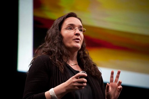
The level of talks at TYPO San Francisco was uniformly high, writes John D. Berry (also a speaker at the conference). Both days were opened by lively, inspiring women: Tina Roth Eisenberg (below, aka SwissMiss) and Jessica Hische on the second.
The official theme was ‘Connect’, but a new, unofficial theme emerged, starting with the very first talk, Eisenberg): ‘side projects’. She told us vividly how her many side projects had turned into popular and sometimes profitable websites and businesses of their own, without her ever intending it. The next morning, Hische mentioned them again: ‘If Tina is the queen of side projects that turn into revenue streams, I must be the queen of side projects that have no prospect whatsoever of making any money.’
By the end of two days it seemed as though everything anyone did was in some way a side project. Or, as a writer I knew once put it: ‘Digressions – the only way anything ever gets said.’
There were two tracks of programming, which made it hard to decide which speaker to hear. Sometimes it was impossible; the main track was in the large theatre at the Yerba Buena Center for the Arts, but the second track was in the nearby Screening Room, which proved to be too small for anything popular.
Above: Jessica Hische on "Uniting Nerds Through Typography"
Peter Cho’s talk about Inkling’s innovative approach to e-books and reading was in the early-lunchtime spot, with nothing scheduled opposite it; there was a long line of people waiting outside the building to get in, and only some of them made it.
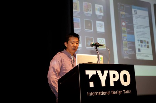
Above: Peter Cho talks about ‘Inside Inkling: Lessons from 30 Months of Designing an E-Book Platform’.
The most fascinating presentation to me was by Kutlu Çanlıoğlu of the BBC World Service, who effortlessly described the problems of consistent typography and layout across two dozen different languages in a number of incompatible writing systems. He then showed us how his team had solved those problems to create a grid-based Web interface despite the vagaries of HTML. As an example, he zoomed in on the problem of the Arabic script, which is used not only by Arabic-speakers but by speakers of Urdu, Farsi, and Pashto (among those currently served by the World Service) and which have very different typographic conventions and character sets. Nassim, the typeface developed by Titus Nemeth, was adapted for use by the BBC across all four languages.
Below: Designer Kutlu Canlioglu on ‘BBC’s Global Experience Language in 27 Languages and 9 Scripts’.

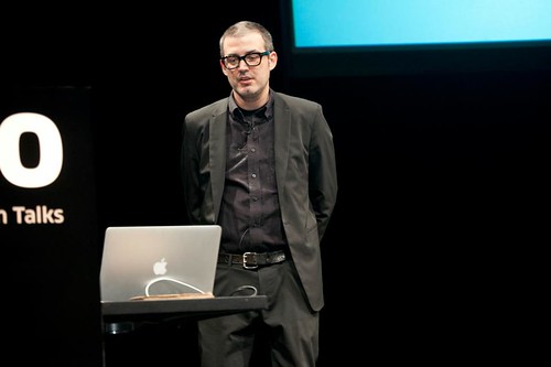
Oliver Reichenstein (below) of iA meditated on the problem of giving digital media ‘continuity’ with our everyday physical lives. He began by showing a clip from the TV show Mad Men, an emotional sequence about design, family photos, and nostalgia – then showing it again imagined as a Facebook Timeline. The first one, he said, could bring tears to his eyes, while the second only invited laughter. From there he went into a quite detailed look at how we read text onscreen, pointing out that even with Retina displays there is no single solution, no one size and style of type that looks the same on everyone’s screen. He suggested that rather than search for responsive layout that adapts to the size and orientation of the screen, it might be more important to adapt to the screen’s resolution and rendering capabilities, and to create fonts for the screen in finely-adjusted ‘grades’ of very slightly varying weight, just as newspaper typefaces are designed for different kinds of paper stock.
The conversation in the halls and out on the sunlit plaza was free-flowing. One Dutch designer who had also attended last autumn’s TYPO London told me that the main difference between the two TYPOs was how much easier it was to meet people and get into conversations in San Francisco. Of course, he told me this while we were waiting in line at the taco truck outside the Friday night After Party; once we got indoors, the noise level was so great that it was nearly impossible for any conversation at all.
More about TYPO at typotalks.com.
Eye is the world’s most beautiful and collectable graphic design journal, published quarterly for professional designers, students and anyone interested in critical, informed writing about graphic design and visual culture. It’s available from all good design bookshops and online at the Eye shop, where you can buy subscriptions and single issues. Eye 82 is out now – you can browse a visual sampler at Eye before you buy on Issuu.