
Monday, 12:00pm
14 April 2025
Remembering Gerald Cinamon
Geoff Duffield recalls meeting Gerald (Jerry) Cinamon for the first time at Penguin Books.
I first met Jerry in early 1981, where we both worked at Penguin Books, writes Geoff Duffield. He was already on the way to becoming a design and typography legend, I was the most junior of junior production controllers. He was 50, I, a naïve 23. Years before joining Penguin, Jerry had received a Master of Fine Arts degree from Yale University with teachers that included Alvin Eisenman, Norman Ives, Josef Albers, Herbert Matter, Armin Hofmann and Paul Rand. In 1960, he moved to London with his English wife and young family.
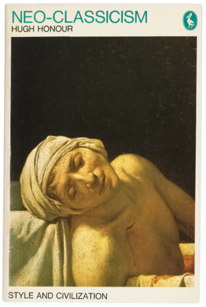
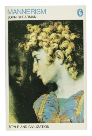
He had already made his mark upon the British design scene with his distinctive approach to illustrated book series such as ‘The Architect and Society’, ‘Style and Civilization’ (see below) and the revised ‘Pelican History of Art’. See ‘In the right place’ in Eye 88.

At the time of that first meeting, I was new to Penguin’s production department, and my task on that particular March afternoon was to walk across to the design department, taking the cover artwork for a 40th anniversary facsimile version of Worzel Gummidge to Jerry for his final approval of the design before it was sent to the printers.
As I walked towards him on that spring afternoon, I could have no idea that he was to become the catalyst for such change in my life – he was my very own personal influencer. He opened my eyes to design, and specifically working with book designers, which was so fundamental to my own life in publishing.
To set the scene, the Penguin offices in London at that time were in Kings Road, Chelsea. 1981 was a tumultuous year of industrial strife, the Brixton riots, the attempted assassination of US President Ronald Reagan, but work and life in the publishing bubble was a relatively cocooned, relaxed affair. My colleagues and I would often take time out to gaze down from the fifth floor, through the large plate glass windows, and watch the Mohican hair styles of the punks float past.
When we weren’t watching the punks, we’d stand around the large grey plastic box in the centre of the fifth floor. It was a fabulous, state-of-the-art phenomenon called a ‘fax machine’. We’d gather round it and marvel spellbound as a memo typed barely half an hour previously in New York, now arrived in the exact same form into the Chelsea office, like some kind of sorcery. As if working in Chelsea wasn’t exciting enough, the offices were open plan – the office had no internal walls. It may have been 1981, but we were already living in the future.
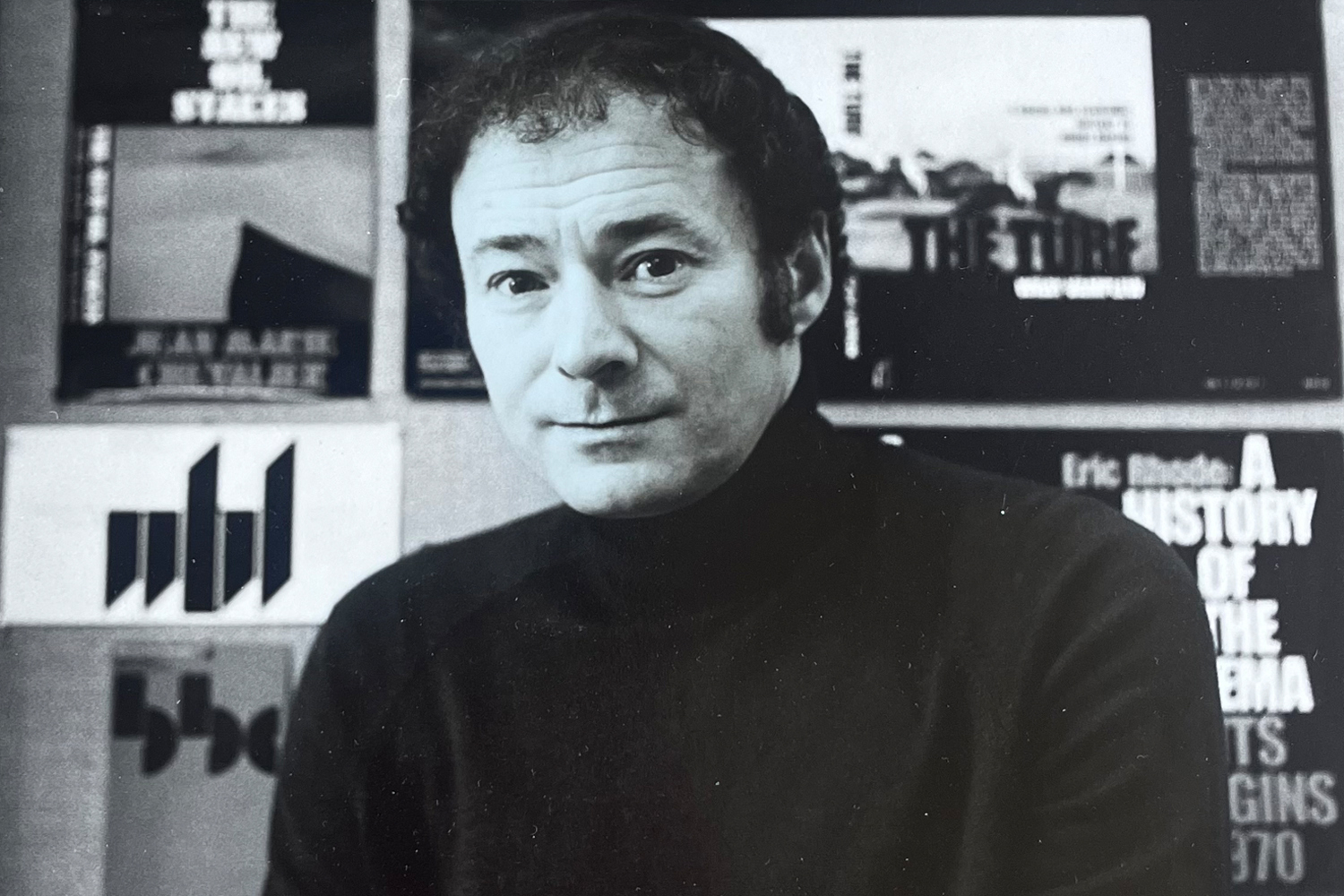
Jerry Cinamon in the early 1980s. Photo provided by Beth Cinamon, Jerry's daughter.
I could see Jerry’s desk from my own tiny cubicle, about twenty metres away. When I say, ‘Jerry’s desk’, I actually mean a raised platform that appeared to morph out of the floor to become an altar of graphic design, bathed in natural light, twice the size of any other desk, supporting numerous, perfectly organised, piles of paper, each representing dramatic design solutions for future Penguin books.
I left my desk with the cover design and walked towards him – nobody had introduced us – and here was I, a complete novice, approaching the chief designer for Penguin Books. He was clad in a black polo neck sweater, his face framed by dark sideburns speckled with grey, and although he had a swivel chair, he was actually standing behind this vast desk … looking more like a keyboard player in one of the emerging New Romantic bands, than a book designer.
I presented the proposed Worzel Gummidge cover design to Jerry, much in the same way that a subject would make an offering to a Mayan king, deferential, barely able to meet his eyes. I was so nervous, I didn’t say anything. This was my first proper job. I watched his eyes scan the design before pronouncing it up to scratch. He then smiled at me – that smile his friends and colleagues all came to know, the twinkle in the eye that often preceded some form of mischief, and he asked me my name. He said, ‘Do you like photography?’.
Never one to miss a detail, Jerry had spotted me peeking at a small pile of black & white photos on the edge of his desk. I said that I did, and he showed me the images. They were photos of gravestones. What interested Jerry were the different carved letters on each of the headstones. We had a chat about them, and a little bond was formed. From that, we swapped opinions about each other’s photos over the next few weeks, bringing our favourites into the office for each other’s feedback.
His feedback on my images was always honest, direct, and often playful, characteristics of Jerry that were apparent in his work, too. They were also evident in the way that I saw him talk to his design team. He was encouraging, supportive, and more than anything certain. It was this certainty in his design beliefs that struck me, but it was always lightened by a softer observation. When looking at his team’s work, you'd hear him say ‘I like that’ or ‘maybe you’re right’ or ‘that reminds me of …’.
Penguin was, and still is, the epitome of book publishers – Jerry’s influence as chief designer ensured that they stayed the best. That’s his professional legacy.
Personally, though, I will never forget that first meeting. Because it was the start of something. On that spring afternoon, 44 years ago, he was a new publishing colleague. Leap forward a lifetime, and he’d become a mentor, friend, inspiration, and most of all, my mischievous imp of a father-in-law.
Geoff Duffield, photographer, environmental activist, London
This text was adapted from a speech that Geoff gave at a memorial for Gerald Cinamon, his father-in-law, held at Pentagram, London, on 13 March 2025.
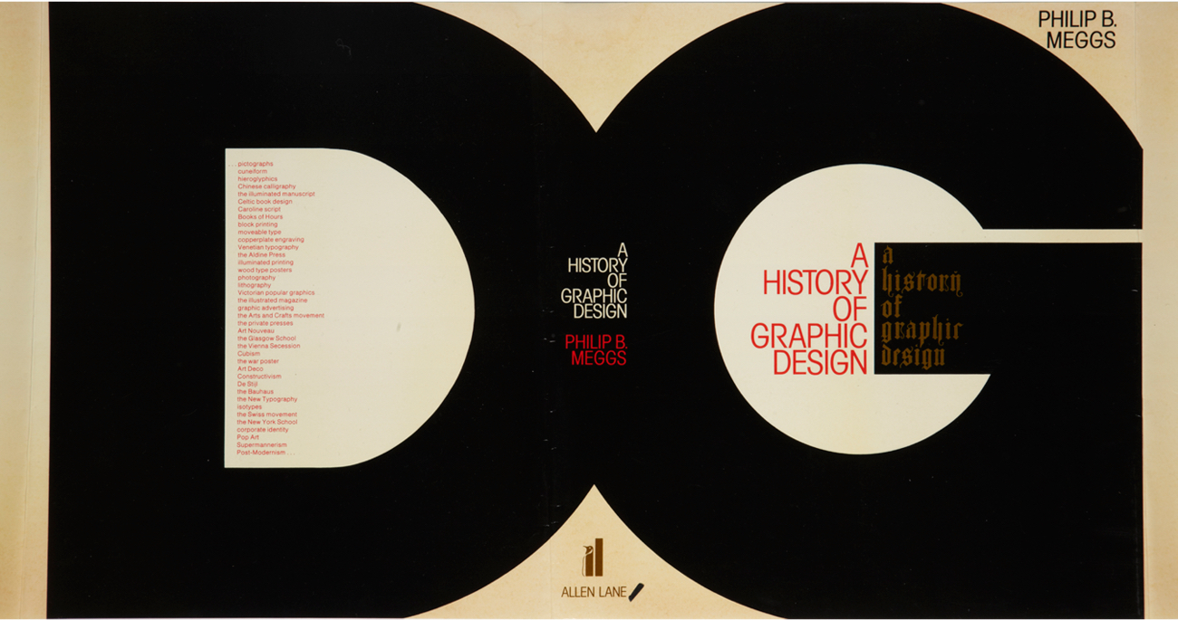
Cinamon’s cover design for the first British edition of Philip B. Meggs’s A History of Graphic Design, 1986.
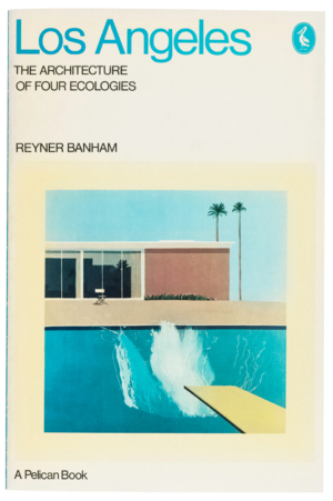
Los Angeles by Reyner Banham, for which Cinamon used David Hockney’s A Bigger Splash (1967) used as the cover illustration, 1971.
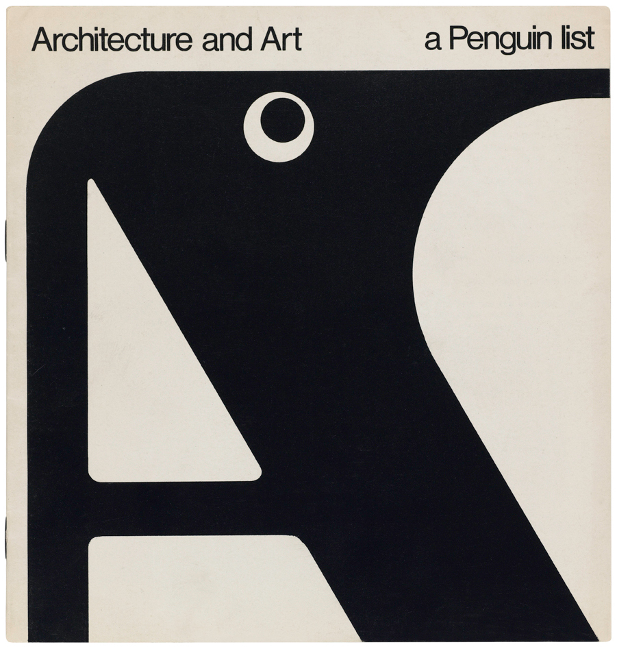
Cover of eight-page Penguin list, 1967, one of Cinamon’s first freelance jobs for the publisher.
Eye is the world’s most beautiful and collectable graphic design journal, published for professional designers, students and anyone interested in critical, informed writing about graphic design and visual culture. It is available from all good design bookshops and online at the Eye shop, where you can buy subscriptions and single issues.