
Friday, 4:23pm
10 August 2012
Golden conundrum
Five years on, the ‘dissonant’ London 2012 visual identity still doesn’t work. Meanwhile, designers pine for Tokyo, Mexico City and Munich …
By Elizabeth Glickfeld
‘Let the games begin,’ they said, and so to the latest round of logo-bashing writes Elizabeth Glickfeld. It’s lucky logos don’t have feelings.
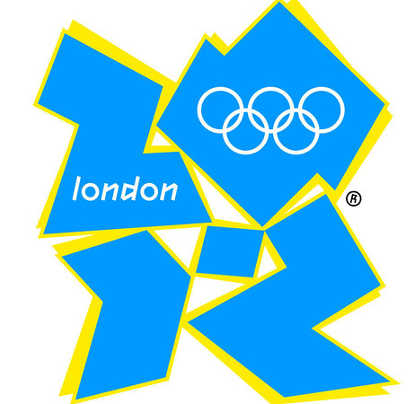
Since branding consultancy Wolff Olins unveiled the London 2012 Olympics logo, designed by Luke Gifford and others in 2007, the jaunty mark has been the object of numerous perjorative metaphors. It was like a swastika, the word ‘Zion’, cartoon character Lisa Simpson engaged in a sexual act or a middle-aged man trying to look cool on the dance floor. It induced epileptic seizures. The design press compared it, unfavourably, to the visual identities of Tokyo 1964, Mexico 1968 and Munich 1972.
Five years on, and now that London’s Olympic moment has finally arrived, it is probably time to move past the name-calling and consider exactly why the London 2012 visual identity is a failure.
Don’t get me wrong: I too appreciate the formal beauty and resolution of the designs for Tokyo, Mexico City and Munich (by Yusaku Kamekura, Lance Wyman and Otl Aicher respectively). I admire Kamekura’s counterbalancing of a red minimalist disc with the five Olympic rings; the happy conflation of concentric lines in the art of the Huichol Indians and the then contemporary Op Art (see ‘This is 1968 … this is Mexico’ in Eye 56); the chequered ‘wreath of rays’ (Viktor Vasarely’s Bright Sun) and accompanying pictograms designed according to the ethos of the Ulm school. Each of these identities combined highly resolved geometry with appropriate spirited subliminal associations that were then applied to all aspects of the graphics programme in a total design approach. Each brought something new to the task of visualising the Olympics, whether it be the abandonment of classical imagery, the first use of the pictogram, or the first licensed use of an emblem for merchandising.
They also conveniently married the universalising tendencies of Modernism to their local needs. Modernism proved a useful vehicle for asserting centrality or contemporaneity on the world stage, for elevating the image of a third world city , or for reinventing a country as a technological powerhouse. A style that aspired to be rational and functional suited the complex practical and logistical demands of the unruly Olympic project.
Apart from the last factor, none of this has been in London’s remit, and anyway even as they purport to espouse enduring values, the Olympics are never what they used to be. They are flashpoints for, among other things, changing configurations of power and nationalist self-perception.
There is no doubt the designers of the London 2012 logo could have made their job easier. They could have redrawn the usual range of nationalist icons and symbols to capture the zeitgeist – see the logo for Team GB, for instance – and we would probably all be politely applauding the result’s elegance and harmony much as we did the contemporary British classicism of Kate Middleton’s wedding dress. This, however, was never the intention.
If the London 2012 logo is ugly, garish and awkward, it is purposefully so. Wolff Olins have openly admitted its aspirations for an identity which would convey 'dissonance' and which would 'break the rules of corporate identity.’ (See AIGA conference review in Eye 66.) At the time, I wondered what processes and procedures could be put in place to achieve a visual identity designed according to anti-aesthetic principles. Perhaps it could draw on Britain’s rich sub-cultural history, on the legacy and impulses of punk and new wave, for instance, or somehow acknowledge the age of user-participation. (See the FastCo interview with the agency’s Brian Boylan and Ije Nwokorie.)
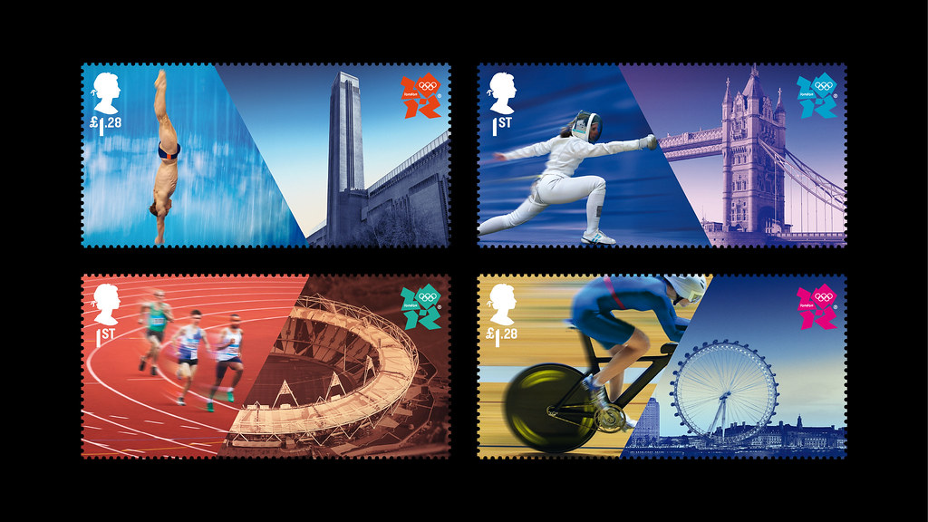
Alas, the logo’s application has been profoundly disappointing, showing complete disregard for any resulting visual resonance or association. When the original yellow shadow is reversed on a coloured background, the impression is of nothing more than a cartoon. Add the saturated colour scheme of an ostensibly welcoming bank, the open-ended management-speak inciting someone to inspire an unnamed generation, a web of intersecting lines, sometimes outlined, sometimes filled in to create an aesthetic of shards like much 21st-century break-the-grid architecture, and an intentionally gawky typeface (2012 Headline, designed by Gareth Hague), which is unfortunately not useful for the demands of legibility in wayfinding, and the sum total of what is communicated is nothing much at all. Then there is the recourse to old methods, which, eschewing the block-like quality of the logo and adopting the diagonal linework of the typeface, have resulted in a set of unsatisfactory pictograms. Surely communicating dissonance, as Wolff Olins said it was trying to do, is not the same as making a mess.
This raises the question of whether the stringent rules and top-down conventions of branding can ever be reconciled with more egalitarian values. Wolff Olins claims that many attempts on its part to reinvent the conventions of branding for an age of participation and social media, such as its proposal for the painting of a ‘ninth lane’ through many towns and for a campaign to encourage the general public to generate their own logos, were zealously quashed by LOCOG in the interests of protecting the Games’ corporate sponsors.
It is worth noting here that versions of the logo made by others, such as the one for the education programme, which fills it with neatly arranged bright coloured pencils, have been considered successful.
Wolff Olins’s stated aims for the logo have also been given a different take by Greg Nugent, the director of marketing, brand and culture for the Games, who with the help of FutureBrand implemented the ‘One Look’ programme with the explicit goal of making all parties and places involved in the Olympics – airports, venues, government bodies, sponsors and London boroughs – look the same. (See ‘London 2012: the look of the Games’ in Creative Review.)
Whether they have succeeded is debatable. What is clear is that the powers that be failed to come up with a process that delivered an appropriate graphic language for this time and place. What they have done is expose a conundrum and some of the difficulties of the relationship between dissonance and coherence.
In 2012, any impulse on the part of the public to join in the Olympic spirit must be traded for the commitment to drink Coke, eat McDonald’s and pay for it by Visa. (That is, if you have managed to get a seat not already owned and left empty by another corporate sponsor.) As it stands, the London Olympics 2012 identity still looks like a corporate disaster. Oddly then, perhaps in this climate, it is a fitting sign of the times.
Elizabeth Glickfeld was a graphic designer before becoming a lecturer in design theory and history in Melbourne, Australia. She recently graduated from the Royal College of Art with an MA in Critical Writing in Art and Design.
See also: Olympic Graphics watch #1 and #2.
David Heathcote’s ‘Aggravation’ in Eye 56.
‘Despite Despite Changes, There’s Little to Love in 2012 Olympics Logo by Alice Rawsthorn, International Herald Tribune, March 2010.
Eye is the world’s most beautiful and collectable graphic design journal, published quarterly for professional designers, students and anyone interested in critical, informed writing about graphic design and visual culture. It is available from all good design bookshops and online at the Eye shop, where you can buy subscriptions and single issues. Eye 83 is out now, and you can browse a visual sampler at Eye before You Buy.