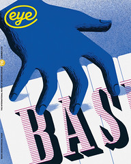
Summer 2010
Attacked by music, type and light
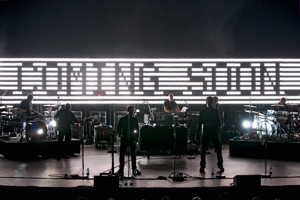
Technology on tour. Noel Douglas talks to UVA’s Matt Clark about their sets for Massive Attack
Formed in 2002 to create the set design for Massive Attack’s 2003 world tour, United Visual Artists (UVA) originally comprised graphic designer Matt Clark, VJ / director Chris Bird and developer Ash Nehru. UVA’s work includes installations and performance with clients in music, fashion and culture.
Matt Clark
‘I was working on the stage set design for Leftfield’s Rhythm and Stealth tour in 2000, and that was where I met Chris [Bird]. We heard Massive Attack were planning a tour, and the production manager of the Leftfield tour was doing it, so we arranged a meeting with their management.
‘Initial discussions with the band in 2002 were about how bland most visuals are. Often the performer doesn’t want to be outshone, but Massive Attack don’t operate like that. For the “100th Window” tour, we said what if we create a show where there is a giant screen but no video, it’s all information and that information is real, even if it is abstracted, so the idea was that all life can be represented by digital information, with a narrative that ran from the small to the infinite, from on / off binary through to biological systems into newspaper headlines, real-time statistics, etc.
‘The most recent tour is more political, it’s a mixture of being at the gig, having a good time with your friends, reading something quite dark and challenging, then juxtaposing that with something completely banal like “Jordan has boob job”! Your mind is being pulled all over the place while also being attacked by the music and lights.
‘So Ash, Chris and I came up with the crazy idea that the set would change every day, it would all be text- and information-based. We were going to 37 different countries and we’d translate it into all these different local languages.
‘Ash wrote a piece of software that had a timeline, you could feed in text files and it would print it, but it could not use True Type fonts, and so all the fonts, typography and grid systems had to be half-programmed in and half made as bitmaps.
‘We didn’t want it to look like a piece of motion graphics – it had to look like a real information board, so the fonts had to work in very low resolution. You have to lay them out in a very particular way, so the software ‘knows’ that that square is a letter ‘A’ or a number ‘2’ or whatever, and then it prints these as bitmaps.
‘We’re trying to work out how to do the type for the shows coming up in Japan and Taiwan, because the screens make it difficult enough to read Roman script, let alone a pictogram-based language. So we’re working with a Japanese designer to overcome that problem; otherwise we may try a more phonetic approach.
‘Unlike the first show design, where you were looking into a “window” or a computer screen in terms of the aspect ratio, the 2008 show for Massive Attack, which we have been updating ever since, is more sculptural, less a monitor, more a message board, but it was all designed around a font.
‘This is a festival tour, so you have to design it so it can be wheeled off stage quickly, but it has to have an impact on a big stage too. I’ll have 3D [Robert Del Naja from Massive Attack] saying: ‘I want a message board, I want big slogans’, so you have to think how to do it.
‘We have bespoke LCD modules that clip together to form a larger screen, so it’s part message board, part light sculpture and part video screen. It has to be ‘pixel perfect’, because a serif font would look fuzzy and like a video screen, whereas if you address each pixel perfectly it really comes out at the audience and looks like a message board.
‘The final twist is that there are only so many of these screen modules you can fit in a truck – so you are designing for modularity, and for legibility of text while creating depth and sculptural qualities – but also so it can all fit packed away on these trucks! But I love those constraints – they force you to be more creative.
‘So it’s getting a balance between the lights, the visuals, the audience, the performers … It’s a multilayered thing, you’re not trying to outperform the performer, and often projects don’t allow for a lot of creative room, especially if you are essentially trying to create a backdrop to the performance.
‘But we have been spoiled by the Massive Attack projects because you can’t beat the experience of the live event and its social nature and playing with that as a canvas is just incredibly exciting.’
First published in Eye no. 76 vol. 19.
Eye is the world’s most beautiful and collectable graphic design journal, published for professional designers, students and anyone interested in critical, informed writing about graphic design and visual culture. It is available from all good design bookshops and online at the Eye shop, where you can buy subscriptions and single issues.