
Autumn 2012
Beatrice Warde: Manners and type
Sara De Bondt introduces a transcript of a rediscovered 1959 interview with Warde.
Beatrice Warde (1900-69) was an American typographic expert who was the publicity manager for the Monotype Corporation and editor of the Monotype Recorder and Newsletter for most of her career.
Well known for her essay ‘The Crystal Goblet’, and the broadsheet ‘This is a Printing Office’, she was also a prolific writer, researcher and public speaker. Here designer Sara De Bondt introduces a transcript of a rediscovered 1959 interview with Warde.
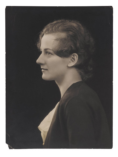
Portrait of Beatrice Warde, 1925, not long after her arrival in London. Photographer unknown.
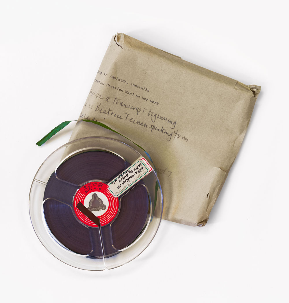
Top: one of the spools of magnetic tape recording the Australian radio interview with Warde discovered by Sara De Bondt at St Bride Library. Photograph: John Bodkin.
From the archive of St Bride Library, London. Thanks to Dr Shelley Gruendler for caption information.
While preparing for the ‘Out of the Box’ archive event at St Bride Library, London (28 June), organised by Eye magazine, I discovered a small box of audio recordings in the library’s Beatrice Warde collection, writes Sara De Bondt.
I was allowed to copy digitally the magnetic tape of a radio interview with Warde, recorded in Adelaide, Australia, in 1959, so that Warde’s words could be heard in her own voice once again. The following text is an edited transcript of the interview. (Note that in the unedited version, some questions were asked twice: Warde’s answers have been spliced together to avoid repetition.)
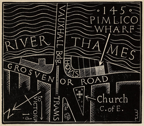
Location map of Beatrice Warde’s Pimlico Wharf address, designed and cut by her close friend Eric Gill as a greetings card, Christmas 1934. From the archive of St Bride Library, London.
Interviewer: One of the few women typographers in the world has just visited South Australia. Although Mrs Beatrice Warde was born in New York, she has been associated with the Monotype Corporation in London for over 30 years. Her career there has brought her into close co-operation with leading typographers and book designers from many countries. Mrs Warde, what does your work actually involve?
Beatrice Warde: Well, it involves writing a good many articles and giving a good many lectures on the history and the design of the printed word, and advising innumerable people on how their printed matter should look: book publishers, periodical people, advertisers, professional people, all sorts of people.
I: Does this mean you had to go through the printing trade?
BW: No, the printing trade is barred to women, on the craftsman level. You can’t be apprenticed to the printing trade if you’re a woman, except in certain forms like binding and all that, and that’s been true for many centuries. But of course in design, anyone who has a good sense of design can make the grade if they know their stuff – whether he or she is a man or a woman …
I: When did you first become interested in the fine art of printing?
BW: Well, indirectly when I was a child of thirteen, at a progressive school in New York. They gave me a lettering pen and taught me the great secret of calligraphy and good handwriting, the italic hand and all that. And I found that it interests everyone in the shape of letters, and it led me into an interest in typography.
I: And what prompted you to start your career under a man’s name [Paul Beaujon]?
BW: Well, I wanted a pen name. I wasn’t quite sure at that time (which is a long time ago) that women would be taken quite as respectfully. I thought that if I was going to have a pen name, I might as well have a man, and I took a Frenchman’s at that, to make it a little more mysterious.
And they all thought this learned Frenchman wrote English remarkably well. They were particularly interested that he was quoting Lewis Carroll, they didn’t think that many elderly Frenchmen knew how to quote from The Hunting of the Snark.
I: It’s obvious that you have found your work absorbing and interesting. Is there any opening in this field for women?
BW: There is a considerable opening now in England, there are a number of brilliant typographic designers, and in America. But in the printing trade proper I was very much impressed to meet in Adelaide the only woman-employing printer in Australia, and one of the very few women-employing printers in the world. Mrs Clarke, whom I met at the Adelaide Business and Professional Women’s Club, is in charge of one of the smartest and best equipped small printing offices I have ever visited, and I was very delighted to meet her.
I: Was it a sudden decision to pursue your career in England?
BW: Well, in a way it was sudden and dramatic. I was the assistant librarian at a great typographic library in America, and we had an exhibition of modern typography, and some material came from England, which convinced me that the typographic future in design, particularly book design, was in London. What the Composing Machine, the Monotype Composing Machine, was doing made me realise that hand-setting of fine printing was relatively a thing of the past.
So I came and did freelance research work unaccompanied in England, and was eventually offered a job. [In fact, she was accompanied by her then husband, the printer and book designer Frederic Warde. They divorced two years after their arrival in England.]
I: What’s the main purpose of your visit to Australia?
BW: Well, really, [there are] two, I suppose. I’ve been invited to speak at a good many graphic arts groups, printing schools, university groups and places like that, about the look of the printed word. And as I go from place to place, I’m collecting examples of good-looking printed matter to take back to London, where I think they need to have more indication of the significance and good things that Australian typographers are now doing.
That’s not only fine books – one of the finest of which, by the way, I found in Adelaide, that limited edition of The Voyages of Captain Cook, which was commissioned by the famous Limited Editions Club of New York – but also little day-by-day things which show the standard of lettering in the community.
Letterheads, of course, because those are the voice of the firm, and it shows whether the firm has good manners or bad manners, you might say, but also beer coasters, wine labels, little amusing things like that.
I: Have you formed any opinion on the standard of Australian printing?
BW: I think it’s more interesting as a potential than as an actuality. I see very interesting things starting in the schools; some of the advertising people are doing remarkably interesting improvements in the standard of their work; and some of the best printed books of the year have been produced in certain printing offices in Australia. The general standard is not yet up to that of the international level, such as that of England, Switzerland and Germany, but it is rapidly getting that way.
I: What do you think we can do to raise our standards?
BW: I should say first of all pay great attention to the graphic art schools, because there, where the printing trade and the commercial arts meet and work together, you will find the basis for a vigorous and nationally proud school of typographic design. Every manufacturing export country has got to pay the greatest attention to its printed matter. The letterhead, the sales catalogue, the price list which go abroad, advertising manufactured goods, must be up to the standard of the other nations which are competing for those markets. Australia has not until now been a manufacturing country – by and large, it’s a raw material country, and as such has not paid sufficient attention to its export literature for quality, but that is,
of course, coming very rapidly up.
I: What do you think good printing should aim at?
BW: I think the real purpose of good printing should be to convey what the author is saying to the reader with the minimum of impediment. The great thing about printing is it should be invisible. You should know what the author or the writer is saying, and not be adversely affected by any show-off-ism or ugliness or sloppy look about the medium through which his words are being conveyed. Just as I am trying now to talk distinctly, because I think it’s better manners to do so than to go ‘umwouah-huoah-weuh’, just the same way printing should be distinct and pleasant through good type design and good, what the printers call, machining – that is to say press work, the putting of the ink on the paper, a very great art – because it’s good manners to the people who are going to read it.
I: What do you think is the best way of raising a print-conscious public?
BW: Ah, well, you’re implying that a print-conscious public is a good thing for printing, and you’re very right. Without a considerable body of public opinion in favour of good, well-mannered printing, the printing industry cannot do its best. And I think the best way to get a general, high, critical standard in the public at large, and the print buyers at large, is to start ’em young with a thing they can do with their own hands, and that of course is good handwriting.
Good handwriting is every citizen’s privilege to be taught, and it will help him to pass his examinations, because examiners, you know, are always biased in favour of the boy or girl who writes legibly, clearly and attractively. It will help a boy to get his first job, you know – ‘Answer this in your own handwriting.’
You don’t want to write in a sprawly, ill-formed hand that makes you look like a pimply adolescent on the paper, you want to write in a fine, clear bold italic hand that has no age look about it at all, it’s just anybody’s hand. Now that sort of thing makes you conscious of the look of printed letters, poster letters, engraved letters on buildings, all that sort of thing.
I: Do you think good book design can help introduce children to reading?
BW: Most certainly it can. Taste can be warped in the early years more surely than any other way. Now there are thousands of children in Australia who will never see any other kind of printed book than a schoolbook. Therefore the schoolbook, the look of it, is the most important aspect of all typography.
Give young children attractive-looking schoolbooks, beautifully illustrated with decent and dignified typefaces, and you’ll do probably more to accustom them to looking confidently and trustingly to printed books than any other method. There are many rivals now to the printed word, including the one I am using at this moment, but there is nothing like printing for staying with you. It goes – as I know through the war – it goes down into a bomb shelter with you, when nothing else can.
First published in Eye no. 84 vol. 21, 2012
Eye is the world’s most beautiful and collectable graphic design journal, published quarterly for professional designers, students and anyone interested in critical, informed writing about graphic design and visual culture. It is available from all good design bookshops and online at the Eye shop, where you can buy subscriptions, back issues and single copies of the latest issue. You can see what Eye 84 looks like at Eye before You Buy on Vimeo.