Winter 2008
Buying into the Norm cosmos
The Swiss practice’s typefaces are quirky, oddly popular, and deceptively simple – also a critical response to neutrality
For Zurich-based graphic designers Norm, their career has been like a ride through the evolution of designer-friendly computer technology. But, while their founders claim to have been the first in their school to work with digital technology back in the early 1990s, they have resolutely stuck to designing for print, adopting type design as their medium for pushing the boundaries.
Your first point of contact is likely to be their website (www.norm.to). In an unprepossessing window, one word appears, lowercase, underlined, ‘norm’, rendered in Simple, the second of their four typefaces. Click on ‘norm’ and all hell breaks lose, with mini pop-up windows littering your screen.
‘I’m sorry about that website,’ says Manuel Krebs, one of the studio’s founding members, in a resigned tone that suggests he has moved on from that moment of playful anarchy. ‘We did that in 1999 when Flash was hot, and we programmed it; that was when you could make a website yourself. We had lots of time, no commissions.’ Krebs’s contrition signals more than simply an evolution in taste. ‘We love print, we’re not Web designers, we’re graphic designers for print, and typographers.’…
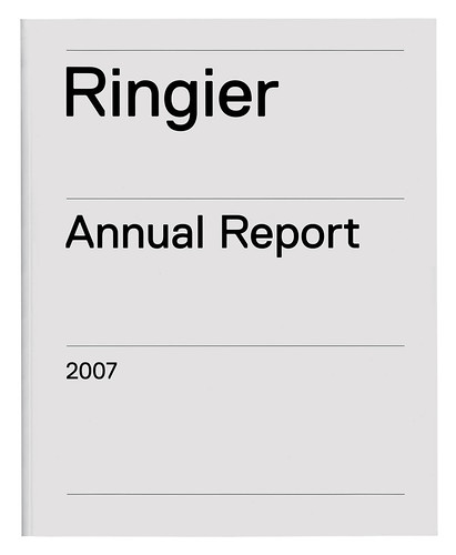
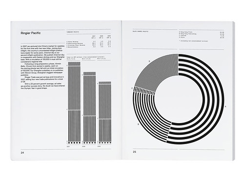
Norm comprises its founders, Manuel Krebs and Dimitri Bruni, both born in 1970, plus Ludovic Varon, who has worked with them for several years. Their work includes book designs for galleries, artists and some of Europe’s most discerning publishers, including Steidl, JRP Ringier, Die Gestalten Verlag and Tate Modern. They also regularly collaborate with the multimedia installation artists Peter Fischli and David Weiss (famed for their filmed experiment The Way Things Go) on exhibitions and books. One such collaboration was the 2007 annual report for the Swiss media conglomerate Ringier AG, which every year invites artists to design its most important public document. In this no-nonsense monochromatic presentation, horizontal rules delineate the pages, with information graphics demarcated as graduated bands of black and white stripes, sitting perfectly within the grid, gently oscillating like an Op Art experiment. Norm reconfigured some of this material for Fischli and Weiss’s book, Sonne, Mond und Sterne (JRP Ringier, 2008), a hefty – 800 pages – flow of imagery, slogans and information. The designers are happy to rework elements, seeing it as an opportunity to perfect formats and rectify mistakes.
A cryptic Introduction
Krebs and Bruni met at the Schule für Gestaltung in Biel / Bienne, Switzerland, in 1991. ‘When we got to college, there was one computer. When we left in 1996, there were twenty … but we still designed by drawing one letter at a time, by hand,’ recalls Krebs (who speaks for the studio throughout this piece). ‘I remember a third-year student talking about Photoshop – “It’s too complicated, you’ll never be able to use it!” But we were really happy with technology. School was for research, we weren’t into commercial work.’
Aware that in ‘the real world’, designers such as Neville Brody and the Emigre circle were making ‘very basic’ typefaces, they started designing them too. ‘We’d make a new typeface for a flyer. You could do that then, you could make a pixel typeface in a day or two, constructing letters on a square; it was an okay solution, a thing of its time.’
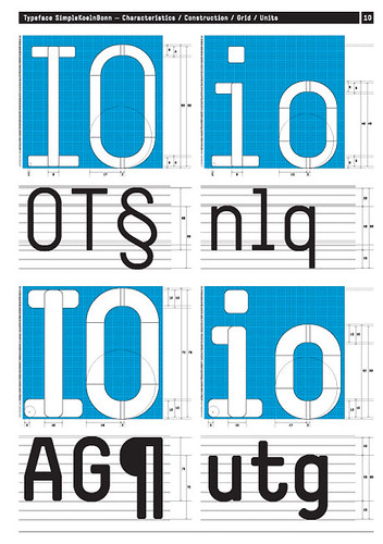
Top: SimpleKoelnBonn (2003) was developed exclusively for signage at Cologne-Bonn Airport, designed by Integral. The earlier version was redrawn as a proportional typeface. Pictograms and colour-coding feature in the signage solution, creating a deliberately ‘friendly’ tone for this ‘budget’ aitport.
Below: The Ringier Annual Report (2007) was designed in collaboration with Peter Fischli and David Weiss, using Replica. Norm design exclusively with their own typefaces, and consider each project a ‘test drive’. For Norm, repetition aids refinement – encouraged by Jan Tschichold’s adage that an ugly proportion makes an ugly book, Norm stick to the format proportions of two-to-three or three-to-four. They have even drawn these proportions on a table in their studio, and they test layouts against these ‘hardcopy’ templates.
They founded the studio on 1 January, 1999, after a brief and less than satisfactory period working separately in corporate identity and advertising (Bruni in Zurich and Krebs in Geneva), when they were always last in line, after the art director, creative director, head of the studio, and the client had had their say. In their words, their roles were reduced to ‘deciding whether to use Helvetica or Univers’.
Norm set up shop on Pfingstweidstrasse in Zurich, where their neighbours include Cornel Windlin and Stephan Müller, the founders of Lineto, which now distributes their typefaces and self-published books (lineto.com). Having ‘no commissions’, Krebs and Bruni produced their first self-initiated book in 2000. Part manifesto, part type specimen, Introduction – ‘this is us’ – showcased Normetica, their first commercially available typeface.
Introduction was ‘cryptic’, admits Krebs. ‘That wasn’t a strategy. We just did it, after talking about it for years [they had experimented with a magazine prototype when they were at college]. We can only self-publish if we develop the contents ourselves and are not in debt to any need to explain. The first book was cryptic because we weren’t sure about it, and it’s easier to do something complicated than to be clear.’
Normetica (2000) displayed steadfast feet on the ‘i’ and a generous bucket to the ‘y’. Despite Norm’s claims to being ‘totally self-centred and self-focused’ when it comes to the designers’ own publishing projects, their typefaces are, by contrast, playfully pragmatic hinting at their useful nature by displaying a beguiling openness, thanks to the addition of ‘feet’, ‘hooks’ and ‘bowls’.
Fancy free
Norm’s second book, The Things (2002) – ‘this is our world’ – was a mash of graphs and diagrams, highlighted in process colours, with layers of information so thick and treacle-like they defy explanation, as Krebs admits. ‘We did the visuals first, then the writing and realised that didn’t work. By adding words, the visuals lost their impact.’ Like Introduction, they edited, published and produced it themselves, but this time approached Die Gestalten Verlag to handle the distribution (‘the investment of time is too big’).
The book may have been visually confused, but the accompanying typeface, Simple (2002), was not. It is monospaced, with similar family values to Normetica, and you could catch fish with the hook of the ‘r’, but its slimmed-down silhouette makes it more user-friendly than its predecessor. (Readers will note that Simple is the face used for the Eye Forum announcements.)
When Ruedi Baur of Integral produced his successful pitch to design the signage for Cologne-Bonn airport, Simple was the type he specified. The idea, Krebs says, was to have ‘a very particular’ typeface that would identify the airport’s official communications within a crowded visual landscape. The problem was that a monospaced typeface could not work for such a complex commission, so Norm had to redesign it as a proportional typeface. The result, SimpleKoelnBonn (2003), is an almost completely new face; all the letters have been reshaped, with the exception of the ‘o’. Though the generous ledges have been reined in, this ‘corporate’ version is still quirky enough to stand out.
Slower off the grid
Replica (2008) is a very different animal. While Simple took three months to design, this typeface has taken almost as many years. Krebs puts this down to technology, and the way the means used to develop a typeface has an inordinate effect on the result. As the software has evolved, the look and functionality of typefaces has also changed, not least because of the requirements of Open Type faces, running to tens of thousands of characters. ‘Replica is a thing of its time, so it’s more sophisticated.’
Like Simple, Replica was conceived in tandem with a book project on the theme of ‘two-dimensional space’. This time, Norm adopted a more conventional approach, writing the words first, so that its argument would be clear. But although the book is yet to be designed, the typeface has already been launched.
While ‘test driving’ Replica on live projects, Norm recognised that the early ‘more standard’ version had ‘no key reason for being unique’, so they set about finding one. ‘We wanted to make a “virgin” typeface – not a variation on a theme but a new Grotesk,’ says Krebs.
Technology was the key. While FontLab Studio – the preferred tool for today’s typeface designers – is an incredibly sophisticated program, Krebs and Bruni argue that its underlying grid structure is too prescriptive. Going against the received wisdom that the finer the grid, the more choice and flexibility the designer enjoys, ‘we decided to create an opposition to technology, by restricting the number of grid lines we draw with, using only every tenth line’. This offered the possibility of creating a typeface that was both universally functional and had enough eccentric characteristics to be recognised alongside similar Grotesks and in the wider chaos of our crowded typographic landscape.
Norm’s solution was two-fold: the same diagonal bevels were used for both inside and outside joints – ‘Print technology is so good these days you don’t have to worry about ink traps’ – and the designers made vertical cuts on all the diagonal lines so you can set it ‘really tight’.
And the name? Again, two distinct reasons: ‘From afar, the typeface looks familiar – a replica – but close up you can see it’s something new,’ says Krebs. ‘Also, the French word ‘réplique’ means a harsh answer, and this is a réplique to Helvetica, Univers and Unica.’
Cornel Windlin, who works closely with Norm to bring the studio’s typefaces to a wider audience, sees the advantage of creating ‘quirky’ typefaces, however deceptively simple. ‘Each of Norm’s typefaces is popular, which is unusual, as quirky does not usually sell. But people seem to buy into the ideology of “Norm-ness”. The fonts may be limited in some respects, but we have reached an audience that appreciates those limitations as enriching.’
Replica may be more problematic, though, as its ‘quirks’ become obvious only when used at larger sizes. At text size, all Grotesks and sans serifs are prone to overcrowding and bad spacing, and need to be handled with care. But while no typeface designer can totally mitigate misuse, the two special features of Replica, the diagonal bevel and the vertically cut diagonal stroke, address the most glaring issues to afflict such typefaces: the variations in letter width that are obvious at smaller sizes, and the ungainly bites out of joints at larger sizes.
Nearly normal?
Making something unique but universal in a cultural climate that strives for novelty and declares that everything is possible, is a daunting prospect. By embracing technological invention without being dictated to, Norm’s designers have found their own method for dealing with those endless possibilities. ‘We narrow the fields of what is possible,’ says Krebs, unabashedly.
For Norm, it is all about standards, parameters and templates, setting them and pushing against them, to discover creativity and innovation within a set of limits, by way of repetition and constant refining.
Windlin has observed that method at work: ‘They are clearly working on creating their own Norm cosmos, which has its own sets of rules and preferences. Their fonts are an important part of their aesthetic, and they always have a clear reason to do things the way they do. They’re meticulous about their typefaces … to the point of obsessive compulsion.’
Spread from the Ringier Annual Report (2007), designed in collaboration with Peter Fischli and David Weiss.
Liz Farrelly, writer, editor, Brighton
First published in Eye no. 70 vol. 18 2008
Eye is the world’s most beautiful and collectable graphic design journal, published quarterly for professional designers, students and anyone interested in critical, informed writing about graphic design and visual culture. It is available from all good design bookshops and online at the Eye shop, where you can buy subscriptions and single issues.