Summer 2006
Cheap Jack Flash
Fluorescent inks – costly, dramatic, even ‘vulgar’ – provided 1950s designers with a fresh challenge
The Wokingham Road, where it skirts the eastern edge of Reading, is a well worn strip of convenience stores, beauty salons, tool shops and kebab joints. Here, too, is a ‘Books For Amnesty’ where Amnesty International raises money by selling donated books. A year ago, while scanning the unpromising spines of 50p titles in a cardboard fruit crate, I came across one whose words had faded almost to illegibility. Five green arrows and the imprint were all that remained. The arrows beckoned a closer look, and when I turned up the cover ‘Fall out’ glowed at me in big fluorescent orange letters. Beneath, an anxious subtitle ran ‘radiation hazards from nuclear explosions’.
For anyone seeking meaning in the artefacts of graphic reproduction, this would be a welcome find. The equation of fluorescence with radiation of a wholly more menacing variety was apt, if a bit obvious. But the equation had a subtler second dimension: radioactive half-life and its correlation with the notoriously fugitive nature of fluorescent ink responsible for the present state of the spine (ah, if only Strontium-90 decayed as quickly as fluorescence’s analogous fading … ). And there was more: the cover’s second colour, a dull green, was in fact a livelier green overprinting the orange, in effect ‘shielding’ the reader from the latter’s fluorescence and surviving in its true chroma only in places. Sophisticated work – and uncredited.
I wondered if Fall out was the first time a link between fluorescence and nuclear catastrophe had been made. The book itself was an early contribution to the anti-nuclear argument in Britain. Published in July 1957 with a foreword by Bertrand Russell, the copy I held was the second edition issued only seven months later and at precisely the moment (February 1958) when the Campaign for Nuclear Disarmament was launched, with Russell a founding member. Fluorescent inks didn’t seem much older, so perhaps the equation had once been novel and was now submerged under other associations – psychedelia and punk – more persistently attached to fluorescent effects.
Throwing light on the matter would mean tracing the early career of fluorescent inks in Britain, from whence Fall out had emerged. I recalled an article in the trade journal Printing Review (Winter 1952–53): ‘Fluorescent inks and paints’ by T. Thorne Baker, director of research at Dane & Co, a London ink manufacturer. Baker felt his subject needed little introduction since readers would already be familiar ‘with the change in advertising which has come about during the last eighteen months. “Posters” or advertising announcements have been made much more arresting to the eye by being printed in coloured inks which appear to be “alive”.’ A second article, ‘Fluorescent printing inks’ by K. J. Reed in The Penrose Annual for 1952 (vol. 46) was more revealing: ‘in the spring of 1950, posters printed with coloured inks of startling brightness were displayed for the first time in this country. They immediately aroused widespread interest among advertisers and printers alike and the impression made on the general public was so pronounced that articles and letters on the subject appeared in periodicals and in the national press.’
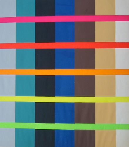
Designs by Ashley Havinden. Demonstration chart with fluorescent inks, 279 x 197mm, in ‘Designing for fluorescent printing’, The Penrose Annual, vol. 46 (1952).
Early press
A likely periodical of the kind Reed mentioned is Advertiser’s Weekly, in 1950 an exceptional source of advertising and printing trade news. Its first mention of fluorescent ink was an inconspicuous item of 15 June. ‘New ink glows in daylight’ reported on an ink that ‘fluoresces in daylight and glows in the dark’, to be seen on a Crazy Gang poster in Coventry Street, Soho. Silkscreened by Greenwood Developments Ltd, the poster demonstrated ‘a new dimension in colour – neon in print’. While Greenwood marketed the effect as ‘Hypnocolor’, the ink itself was identified as ‘Day-Glo’. It could be used ‘with particular effect on a part of a poster, such as a title-line, a pair of eyes, or a girl’s lips. In pitch dark it will, of course, glow brilliantly under an invisible ultraviolet ray.’
In the months that followed, Advertiser’s Weekly treated uses of fluorescent ink or paint, however minor, as newsworthy. ‘Display that glows in the dark’ (13 July) illustrated an outdoor display in Piccadilly for Yardley perfumes, its leaves, bouquet of flowers and banner lit by eight UV lamps, causing them to glow at dusk and at night. ‘Already the display has caused much attention from passers-by.’ On 3 August ‘Electron colours make pictures “spring to life”’ noted the availability of ‘Electron’ branded fluorescent inks claimed to be sixteen years in development. By 17 August, the ‘First U / V Day-glo poster?’ was discovered at the Garrick Theatre, Charing Cross Road, announcing the ‘sexcess’ Always Afternoon. Its fluorescent lettering had been superimposed on a ‘languorous, hand-painted beach scene’ and illuminated by five UV lamps at night. And on 14 September, news of Ward & Lock’s fluorescent window displays for Dornford Yates’s unapologetically upper-class Lower than vermin, claimed to be a first for book publicity.
It is easy to see why Advertiser’s Weekly devoted such attention to the new fluorescent phenomenon. It was a welcome innovation for posters in particular, multiplying their visibility and (as it surely followed) their effectiveness. It served the assertion that posters remained a potent tool of advertising, a notion promoted through features on new poster work and exhibitions, and statistical reports on their effectiveness. And there were implications for other developments in the printing and advertising trades, including the growing popularity of silkscreen printing, at first the only process for which fluorescent inks were available; and the often contentious matter of outdoor advertising, where efforts to populate vacant bomb sites, terrace-end walls, and other open spaces with billboards and poster hoardings met with new regulatory controls under the 1947 Town and Country Planning Act.
By early autumn 1950, Advertiser’s Weekly offered its readers an in-depth review. Alan Betts, in his ‘Outdoor advertising’ column for 28 September asked ‘What is the future of Day-Glo?’. His short answer was ‘used intelligently, the new fluorescent colours are here to stay’. He remarked that ‘people have been stopped in their tracks by these new colours which have been appearing on bus and outdoor sites. It is not often that an advertising medium has such a marked effect on the public.’ After explaining the principles of daylight fluorescence, he offered advice on using Day-Glo and listed recent and conspicuous fluorescent posters for Sunset Boulevard, John Bull magazine and the Daily Express. He also proposed that Day-Glo be used for packaging: on store shelves, it would ‘reach out and take shoppers by the eyes’.
The riposte to Betts’s upbeat review was not, however, long in coming in the guise of a letter from an agitated reader in Epsom (placed, ironically, immediately beneath an advertisement for Day-Glo printing services). It challenged mere visibility: ‘is it more important to be seen . . . or to be understood and accepted? No doubt many advertisers would adorn their posters with neon tubing if it were cheaper; these people now coruscate in Day-Glo. But after novelty evaporates, will the subordination of good design and artwork to a single eye-attacking trick, however forceful, prove to be worth it?’ Seeming to invoke the strategic conundrum of Mutually Assured Destruction that so typified the early Cold War, the sceptical reader argued ‘surely Day-Glo is most effective – in its limited way – only when the other fellow hasn’t got it? And when he has, when we have a row of posters each superimposing unlimited fluorescence on limited design, will the passer-by bear to take in their messages?’
News, views and reactions in the trade press, and the undeniable popularity of fluorescent colours formed the backdrop for perhaps the most earnest exchange of information on the matter, a symposium convened on 4 April 1951 in the august surroundings of the Royal Society of the Arts (RSA) in London. The speaker was the above-mentioned T. Thorne Baker, accompanied by Mr Dane of Dane & Co, then sole British manufacturer of Day-Glo inks. In the chair was Ashley Havinden, a well known advertising art director whose forward-looking design work and habitual interest in the Modernist avant-garde made him a sound choice to lead the proceedings. Of interest too was the RSA’s practice of recording, transcribing and publishing its symposia, so preserving in their Journal (vol. 99, 1950–1) a transcript not only of Baker’s paper but of the audience discussion that followed.
Baker’s technical disquisition ‘Fluorescent inks and paints’ described the development of fluorescent dyestuffs and the not insignificant hurdles overcome in their translation into bright, durable pigments for inks and paints. Among the many facts noted was the conspicuousness of fluorescence at dusk and dawn when the proportion of ultraviolet increased relative to visible light. This gave advertisements printed with fluorescent inks at least two hours added visibility over those printed conventionally. The same principle held true in damp and overcast conditions. Baker acknowledged that the challenges of fluorescent dyestuff chemistry at present limited the Day-Glo palette to a few crude hues, though he hoped it would soon become larger and more permanent, picturesque and congenial.
The ensuing discussion was launched by Havinden’s telling remark that the development of fluorescent inks and paints reminded him of ‘atomic research, which although intended to help humanity so much will we fear have just the opposite effect. I think fluorescent or Day-Glo printing is almost like atomic warfare amongst the posters.’ He recollected his own first sighting: a hoarding announcing Frank Sinatra’s engagement at the London Palladium in July 1950. When Havinden discussed the hoarding later with poster designer Tom Eckersley, both men were unimpressed. But Havinden soon concluded that fluorescent colours were not the problem, rather the people using them: they might be less readily misused if competent designers had been employed. Now ‘quite a few of our clients will not have anything to do with Day-Glo. They regard it as crude and vulgar’, unfortunate when far more might be expected. ‘I feel sure that if this invention had been available in the days of the great fresco and mural painters, artists like Michelangelo, for instance, would have enjoyed exploring its possibilities. I think that alert contemporary designers should be excited by the opportunity of using any new method of expression, and particularly one which has such magnificent visual properties as Day-Glo.’
During the discussion, new facts followed from audience questions. Most intriguing were Dane & Co’s quality control measures. The company licensed Day-Glo only to select printers who agreed to fourteen rules of good practice. These covered cleanliness (Day-Glo was especially prone to streaking from impurities), substrate choice, and ink coverage and density. The rule on density aimed to discourage printers from extending their ink and so diminishing its fluorescence – understandable when it emerged that Day-Glo was seven times the price of conventional ink. As the meeting drew to a close an audience member thanked Day-Glo for brightening the industrial north of England. Mr Dane chipped in that Dane & Co’s office girls had begun painting their fingernails in Day-Glo colours, which, he added sourly, ‘looked terrible’.
The symposium proved a topical anticipation of the Festival of Britain that opened the following month, where the bright, clean colours of its South Bank architecture and exhibits were much remarked on. A retrospective of Festival work was included in The Penrose Annual for 1952, and it is here that a sequel to the RSA event can also be found: Ashley Havinden’s article, ‘Designing for fluorescent printing’. In it he sought to supply examples of competent fluorescent printing he claimed were otherwise lacking. Havinden began by brushing aside any lingering doubts: fluorescent printing was no ‘flash-in-the-pan trick effect’ or a ‘cheap-Jack’ stunt, but one of the major innovations in poster production of the past 25 years. He hoped that not too much harm had been done by second-rate work and that advertisers with foresight would give it another chance. ‘Top-rank’ designers were needed to transform fluorescent printing into ‘the great visual asset’ he knew it to be.
Accompanying his text were two demonstrations of requisite sophistication, the first a chart of five fluorescent bands traversing six colour fields, the other a vaguely surrealist landscape along the same lines. Both placed modest amounts of fluorescent colour against larger, darker or muted backgrounds to judge the comparative effects. Havinden summarised the results in seven recommendations amounting to maximum impact through strategic restraint. It was apt advice, serving his aesthetic ends while holding cost and vulgarity in check.
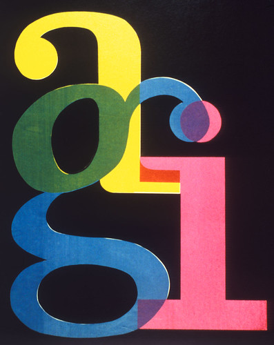
It is uncertain how many ‘top rank’ designers took note, but one who did was F. H. K. Henrion, who used fluorescents for at least two projects: packaging and a counter-top showcard for Fluocolour products, and a poster for the 1956 Alliance Graphique Internationale (AGI) exhibition ‘Design in advertising’ in London. In the latter, fluorescent letters were overprinted in a design that largely adhered to Havinden’s recommendations; it can hardly be coincidental that he and Henrion were the exhibition’s co-organisers. If the pair sought to persuade their eminent fellow designers of fluorescent printing’s glorious possibilities, the poster, cascading down a flight of stairs to the exhibition entrance, would surely have settled the matter one way or the other.
Designs by F.H.K. Henrion, for ‘design in advertising’, Alliance Graphique Internationale (AGI) exhibition, RBA Galleries, London, 14-30 June 1956.
Manners and anxieties
In July 1951, a dyspeptic Charles Rosner, in ‘The changing background of the poster’ (Graphis 36), written on the occasion of the ‘International Poster Exhibition’ in London, lamented the poster’s increasingly marginal role. It had, he believed, ‘lost its position among the various advertising media … displaced in an atomic age, when manners count less and slickness is the order of the day. It is crammed out of cities, and it is accused of interfering with the beauty of the countryside.’ The commercial advertiser who used it now was ‘like the theatrical producer who knows best what his public wants, looks at the lowest denominator and invariably fails in his ventures.’
While nowhere mentioned in his essay, Rosner’s remarks about posters also convey a sense of the circumstances of Day‑Glo’s introduction into Britain. Equally revealing is his seemingly instinctive example of theatre promotion – a frequent application for fluorescent colours – as self-evidently crude and unambitious. If Rosner’s characterisations are taken as fact, then fluorescent colours could only have worsened the poster’s supposedly imperilled situation. But some like Havinden and Henrion clearly thought the opposite: that here was a new avenue to creativity able at the same time to mount a rearguard defence of a valued constituent of their livelihood.
Accounts and evidence offered here suggest that in Britain at least, popular entertainment was the context in which the new fluorescent colours were at first most consistently applied. But some observers clearly felt that fluorescent colours also resonated atomic age anxieties and, as in Fall out, were a suitable trope for nuclear hazards and The Bomb. Whatever associations they first had, fluorescent colours present special challenges as historical artefacts. Fading can disguise them. If they survive light decay, their fluorescence cannot be reproduced with conventional inks. Nor will a reproduction reveal that fluorescent colours are present unless they are so described in words. One solution is to reconstruct the original work. When F. H. K. Henrion mounted a retrospective exhibition in 1960, he recreated his Fluocolours and AGI designs and inserted them manually into the exhibition catalogue, Designing things + symbols. But reconstruction invites distortion, as recently in DotDotDot 11 where the Sex Pistols’ Never mind the bollocks sleeve was newly made, perhaps wishfully, in two fluorescent colours (yellow and pink) when the original contains only one (the pink). While in each of these instances the underlying strategy is worthy, both demonstrate the difficulties of reproduction and representation fluorescent colours pose with urgent effect.
First published in Eye no. 68 vol. 17 2008
Eye is the world’s most beautiful and collectable graphic design journal, published quarterly for professional designers, students and anyone interested in critical, informed writing about graphic design and visual culture. It is available from all good design bookshops and online at the Eye shop, where you can buy subscriptions and single issues.