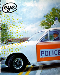
Summer 2004
Crash covers
anonymous designers
uncredited designers
various designers
Chris Foss
James Marsh
Michael Ian Kaye
Melissa Hayden
Kothuis Art-Team
Atelier Pascal Vercken
Henry Sene Yee
Carin Goldberg
Roy Lichtenstein
Jonathan Wenk
Larry Rostant
David Cronenberg
J. G. Ballard’s novel resists attempts to summarise it with a single image
J. G. Ballard’s Crash is one of the most original and disturbing British novels of the past few decades and for many of his admirers it is his most extraordinary book. When it was published in 1973, Ballard was already recognised as a writer of great visionary power and today he is viewed by many as one of Britain’s finest creators of fiction. Crash went even further than his earlier book, The Atrocity Exhibition, in which some of its sexual and technological themes first emerged. It’s a novel that tests the limits of the reader’s taste and sympathies in the most profound ways and it has always provoked strong reactions – positive and negative.
The publisher’s reader, a psychiatrist’s wife, who was given the task of assessing Ballard’s manuscript, famously declared: ‘The author of this book is beyond psychiatric help.’ Novelist Will Self has said: ‘I only have to look at a few paragraphs of Crash to feel I am in the presence of an extreme mind, a mind at the limits of dark imagination.’ This was a commendation. ‘How many people are there who’d want to read a book like Crash?’ Ballard once asked. ‘Not many.’
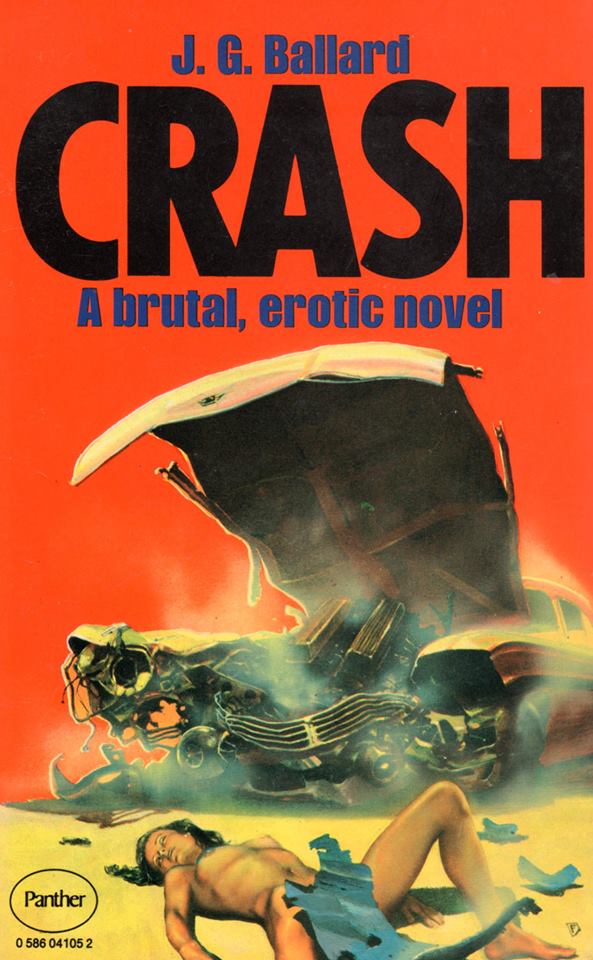
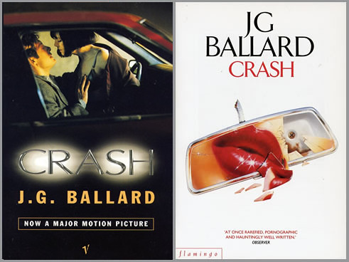
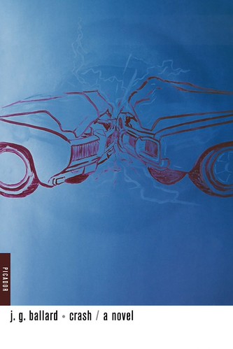
Covers for different editions of the novel Crash by J. G. Ballard, first published by Jonathan Cape, 1973. From the collection of Rick Poynor.
Top: Panther edition, 1975, illustration by Chris Foss.
Below: Triad edition, 1985, with illustration by James Marsh and Vintage edition, 1995, using photograph by Clare Godfrey.
Yet Crash, described by Ballard himself as a ‘psychopathic hymn’, did find a following. It became a cult book, appealing to a following similar to that of William Burroughs, a writer Ballard constantly praised. It was the type of novel a post-punk rock band might enthuse about. Over the years it has appeared in French, German, Italian, Dutch, Spanish, Portuguese, Greek, Finnish, and Japanese translations. After several false starts Crash was filmed by David Cronenberg in 1996. In Britain, the film’s release prompted a moral panic. Set in the motorways, access roads, flyovers and multi-storey car parks around London Airport (now Heathrow), the book imagines a society in which the car crash has become the focus of a deviant new sexuality.
At the centre of the story, narrated by a director of TV commercials called Ballard, is ‘hoodlum scientist’ Dr Robert Vaughan, who drives around photographing crash victims and having sex in cars. Vaughan dreams of dying in an accident with film star Elizabeth Taylor.
Vintage edition, 1996, using Jonathan Wenk’s photograph from the David Cronenberg movie version of Crash (left) and Flamingo edition, 1993, illustration by Larry Rostant (right).
During his research, Ballard acquired Crash Injuries, an American medical textbook full of comparisons of wounds caused by different makes of automobile, and his language fuses clinically precise descriptions of sex acts and terrible injuries with an almost hypnotic lyricism: ‘In his vision of a car-crash with the actress, Vaughan was obsessed by many wounds and impacts – by the dying chromium and collapsing bulkheads of their two cars meeting head-on in complex collisions endlessly repeated in slow-motion films, by the identical wounds inflicted on their bodies, by the image of the windshield glass frosting around her face as she broke its tinted surface like a death-born Aphrodite, by the compound fractures of their thighs impacted against their handbrake mountings…’
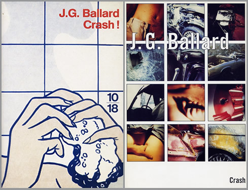
10/18 French edition, 1992. Detail from Roy Lichtenstein’s Woman in bath and Noonday Press, 1994. Design by Michael Ian Kaye and Melissa Hayden.
I read the hardback first edition of Crash as a teenager, soon after it came out. I was already a devotee of Ballard’s other books, but I loved Crash’s extremity, its sense of moral danger, its willingness to probe dark areas of the psyche, and the toxic beauty of its prose. When the paperback appeared in 1975, I read the book again. In 1980, on a trip to Paris, I saw the Livre de Poche translation and bought it – it contained an introduction by Ballard not then available in English. Over the years I collected editions of the book, partly to see whether any publisher would ever produce a visual interpretation that achieved the concentrated power of the quotation above. Ballard is an intensely visual writer. He has said that he felt more at home with artists such as his friend Eduardo Paolozzi and Richard Hamilton than he did with other writers. He attended ‘This is Tomorrow’, organised in 1956 by Hamilton and others at the Whitechapel Art Gallery, made collages (see Eye no. 23 vol. 6), staged an exhibition of crashed cars in 1969 at the New Arts Labs in London, and often referred to Surrealist painters such as De Chirico, Ernst and Dali. In ‘The Coming of the Unconscious’, an essay written in 1966 for New Worlds magazine, he described the images of Surrealism as ‘the iconography of inner space’.
This is rich and provocative source material for designers and illustrators. How to visualise a piece of writing which is prepared to be, in Ballard’s words, ‘openly pornographic’ as a literary stratagem? On the whole, though, image-makers have been defeated by Crash. A book that ought to have inspired covers to match and reflect its status as an underground classic has often received visual treatments marked by incomprehension and evasion. I was curious to know how Ballard viewed this. He didn’t wish to be interviewed – reviewing the covers would, he suggested, be ‘rather too close to an autopsy on myself’ – but he was willing to make notes on some of them if I sent him photocopies.
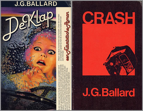
Bruna Dutch edition, 1980. Design by Kothuis Art-Team.
Minotauro Spanish edition, 1979. Uncredited design.
The first jacket, published by Jonathan Cape in 1973, shows a jutting gear stick, presumably intended to be phallic, in front of a towering three-dimensional titlepiece that occupies most of the cover. This still rankles with Ballard, who describes it as ‘monstrously bad, one of the worst book jackets ever – for sheer ugliness and crudity, impossible to beat’. Few of the Ballard hardback covers produced by Cape in the 1970s and early 1980s were any good. The first UK paperback edition of Crash, however, illustrated by science fiction artist Chris Foss, retains its power. ‘Superb, in many ways the best ever,’ notes Ballard. ‘Quasi-realistic, but in the right way, like a movie poster of the 1950s – brought into brilliant focus by that line – “A brutal, erotic novel”.’ Foss, an illustrator of The Joy of Sex (1972), treats the image as an opportunity for lurid, pulp-style exploitation. There is nothing quite like this scene in the book.
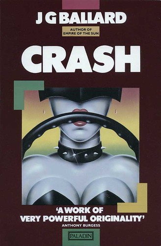
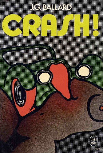
This cover established the principle iconographic elements – woman and car – that feature in many subsequent interpretations. In 1985, the novel was reissued as part of a new, oppressively black-bordered series with an illustration by James Marsh, showing a red-lipped Amazon at the wheel, clad in studded leather. This connected the book with emerging trends in fetish clothing and a fashionable flirtation with S&M, but it had nothing to do with Ballard’s vision. By 1993 the woman was reduced to a pair of pouting red lips framed by a shattered rear view mirror. Ballard dismisses the cover as ‘too lipsticky – “neat”.’ His 1974 introduction, which might have offered additional clues, is reprinted in both editions. Crash, he writes, is ‘an extreme metaphor for an extreme situation, a kit of desperate measures only for use in extreme crisis … Will modern technology provide us with hitherto undreamed-of means for tapping our psychopathologies?’ Neither cover shows any hint of these concerns. The tacky Livre de Poche edition, in which a car’s radiator grille metamorphoses into a flesh-licking tongue, once again misses the point.
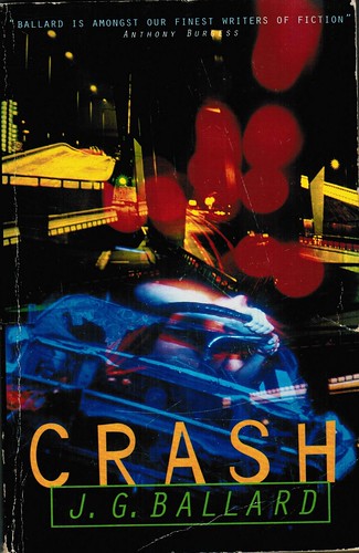
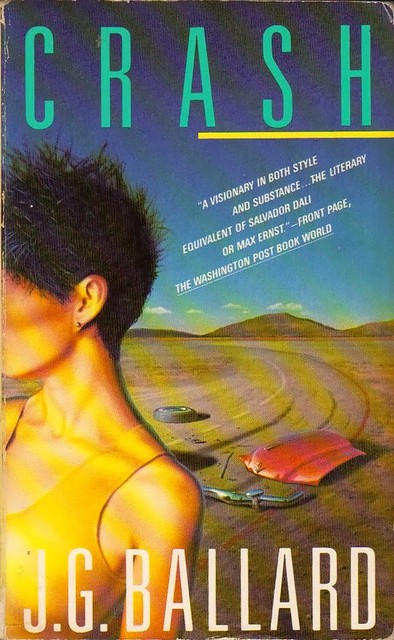
Where interpretations of Crash by male image-makers tend to present female sexual personae as victim or vamp, women designers and image-makers have been inclined to neutralise the book’s violent eroticism. A 1985 US paperback, designed by Carin Goldberg, with wide-spaced ‘new wave’ typography, arbitrarily transplants Crash to the American desert, where a faceless female who looks like a misplaced fashion model wanders away from some totemic car parts scattered in the dust. The cover’s Surrealism-lite bears only the most tenuous connection to the novel. Photographer Clare Godfrey’s cover image for the 1995 UK edition, which is still on sale, treats Crash as a kind of ecstatic fairground ride. The hot neon colours and chaotic superimpositions relate to a scene in which Vaughan and the narrator cruise the expressways while under the influence of LSD, but the image is strangely depopulated and Crash’s relentless sexual content is suppressed.
Livre de Poche French edition, 1973. Design: Atelier Pascal Vercken.
Crash is peculiarly resistant to attempts to summarise it with a single image. Its synthetic literary method depends on the conjunction within a verbal image of phenomena that are usually discrete. Ballard insistently establishes geometrical relationships between the body parts and postures of his characters and the technology that surrounds them: ‘By entering her vagina among the metal cabinets and white cables of the X-ray department I would somehow conjure back her husband from the dead, from the conjunction of her left armpit and the chromium camera stand, from the marriage of our genitalia and the elegantly tooled lens shroud.’ In the late 1980s, collage and montage became increasingly prevalent means of expressing thematic complexity on book covers. If ever a novel called out for a mode of evocation based on fragments and juxtaposition, it was Crash, but it was 1994 before an American design team explored this possibility.
Michael Ian Kaye and Melissa Hayden’s cover for Noonday Press makes Crash look like the cult novel that it is. ‘I loved the book,’ says Kaye. ‘It was so much about cars and sex that it seemed stupid to hide that. We went to a junkyard. We were both really into this project.’ Hayden’s boyfriend was also involved in the shoot and, for once, both sexes are presented as equally implicated in Ballard’s nightmare marriage of technology and desire. It was Hayden’s photographic concept, but at the junkyard they passed around a Polaroid. The grid of twelve pictures on the cover shows smashed and crumpled bodywork, a hand clutching a roll of film, a man’s jeans open at the fly with the suggestion of an erection, and a woman’s hand delving for her crotch. A glimpse of breasts or buttocks can be seen through a broken windshield. ‘They all represent little blips of the experience,’ says Kaye. ‘Using the grid speaks a little more to the futuristic quality without being so literal. It was about lots of little ideas making up the whole.’ The ‘garage font’ title typeface, a sans serif to which serifs have been applied selectively, adds to the mood of unease. With cult-like understatement, Kaye positions the title in the bottom right-hand corner as a kind of full point to the design.
Picador USA, 1990s. Design by Henry Sene Yee. Painting by Davin Watne.
Ballard, who had never seen this version of Crash until I sent it to him, found the cinematic treatment ‘a bit too literal – if the novel is a psychotic hymn, this hardly suggests it’. But then no cover has succeeded in fully expressing the delirium of Crash. The 1996 UK film tie-in version, which Ballard, a supporter of Cronenberg’s interpretation, does admire, was another missed opportunity. The cover is based on a scene showing actress Holly Hunter (Helen Remington) straddling James Spader (James Ballard) in the front seat of a car. While the image conveys nothing of the perversity of either book or film and only hints at the role of the car, it does carry an erotic charge, acknowledging sexual interaction as the book’s subject in a way that few Crash covers have dared.
The cautious handling of Crash, even now, is all the more surprising when one considers the prevalence of pornographic imagery in contemporary culture. As a work of bizarre prophecy, the book was far enough ahead of its time to be truly shocking, though only a fool would imagine that Ballard thought we should crash our cars for sexual thrills. Crash’s explosive collisions of flesh and metal are, as Ballard says, a metaphor, taking social tendencies and following their trajectories to discover where they might lead. In his introduction, he notes that ‘we live in an almost infantile world where any demand, any possibility, whether for life-styles, travel, sexual roles and identities, can be satisfied instantly’. If that was true in 1973, it is even more the case today. At the time, Ballard described the book as ‘cautionary’ and ‘a warning’, but he has wavered on the question of whether Crash is a moral indictment. In 1997, he told cultural critic Mark Dery that the novel illustrates the process by which ‘formerly aberrant or psychopathic behaviour is annexed into the area of the acceptable’ and he pointed out how the proliferation of new communications technologies was aiding this process.
GQ recently ran a story about ‘dogging’, a sexual subculture in which people use the Internet to arrange meetings where they have sex in parked cars while others watch. The item was illustrated by the Hunter and Spader shot used on the cover of Crash.
Vintage edition, 1985. Design by Carin Goldberg. Illustration by Chris Moore.
Rick Poynor, writer, founder of Eye, London
First published in Eye no. 52 vol. 13 2004
Eye is the world’s most beautiful and collectable graphic design journal, published quarterly for professional designers, students and anyone interested in critical, informed writing about graphic design and visual culture. It is available from all good design bookshops and online at the Eye shop, where you can buy subscriptions and single issues.