
Summer 2020
Minjoo Ham: Ode to darkness
Minjoo Ham’s charming heavyweight Hangul typeface, inspired by Korean movie posters, is now available in a Latin version
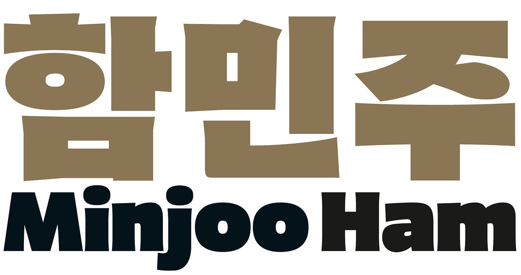
While we have seen plenty of typefaces from the Western hemisphere that underwent extensions to so-called ‘non-Latin’ scripts in the past, it is refreshing to see this process reversed more recently: South Korean type designer Minjoo Ham created the heavyweight display face called Dunkel Sans, initially released only in Hangul [the alphabet of the Korean language] with the young retailer Future Fonts. Dunkel Sans is an ode to typographic darkness and to the minimum amount of counter space. Aer its early success a Latin companion followed.
The idea to draw a dark-weight Hangul alphabet occurred to Ham when she studied the lettering in mid-century Korean movie posters, particularly a large-format announcement of Shakespeare’s Hamlet.
Those extra-bold, handmade and almost peculiar-looking letterforms are rarely seen in contemporary Korean typefaces, but that is not the only reason why Ham was intrigued by them. Weights considered ‘heavy’ or ‘black’ are not dark enough in most Korean typefaces, which has a lot to do with the nature of Hangul. The letters in ‘Hamlet’ are not simply arranged horizontally: but within blocks of syllables in two dimensions. As a result, design challenges in three-storey characters like: ㄹㅌㅎㅃ increase considerably.
Dunkel Sans Heavy in Hangul and corresponding Latin setting.

Ham really wanted to push those boundaries. She began by drawing dense multi-storey syllables such as: 뺄를흘 and created just enough counter space in the letterforms, making them still legible at 24 point. The result is an ultra-bold statement: unconventional in the best sense, it is heavy, but agile, truly dunkel (German for dark) and charming. It has condensed and expanded widths as well as all the instances between them thanks to its variable font format.
Shortly after graduating from the Type and Media course at KABK (Royal Academy of Art, The Hague) in 2015, Ham started her own type design studio in Berlin with a focus on multi-script font families. With Future Fonts, she joined a marketplace in which independent type designers can release typefaces in progress. Due to many borrowed (mostly English) words in Korean, Ham naturally had a Latin addition to Dunkel Sans in mind when it was released in September 2018, though enquiries from online fans definitely accelerated the follow-up of its non-Hangul counterpart almost a year later. It perfectly captures all the characteristics – from stroke endings to counter-forms – of the original. More experimental approaches to Hangul typefaces are in the pipeline, and Minjoo Ham certainly is a type designer to watch in the future.
Ferdinand P. Ulrich, typographer, type historian, lecturer, Berlin, Germany
First published in Eye no. 100 vol. 25, 2020
Eye is the world’s most beautiful and collectable graphic design journal, published for professional designers, students and anyone interested in critical, informed writing about graphic design and visual culture. It is available from all good design bookshops and online at the Eye shop, where you can buy subscriptions and single issues.