Winter 2010
Pin point
Jack Schulze praises the ‘US space programme’ of mapping
Google Maps is one of the most omnipresent and recognisable elements in the visual landscape, with such a consistent graphic language that it is hard to think of a parallel. Who would think to parody an A-Z now when referring to the language of urban maps?
Although Google refers to its outputs as distinct, each of their hyper-functional browser-based tools represents a limited surface of the broader Google system, whose mission statement is ‘To organise the world’s information and make it universally accessible and useful.’ Yet it would be a mistake to see Maps as distinct from Search; it is a single graphic representation, shaped around the value of a solution to a wayfinding problem.
Google derives nearly all of its revenue from sponsored links (recently renamed ‘Ads’) associated with its core search engine. The company’s mission to resolve all information into a form it can deliver to you in the shortest possible time is one of unparalleled technical complexity. This is comparable to eradicating polio, or the US space programme – a fantastic voyage across the new frontier of information. Other online maps exist but none achieves the unified simplicity and scale of familiarity enjoyed by Google Maps.
The ‘graphic design’ of Google Maps cannot be characterised in traditional terms. The language is too entangled with the behaviours of the generation of the data and the way it is delivered. When a Google map appears, it is an animation on pause; each tile like a single frame in a stream of data, ready to twitch into life. This is just one strand of the complex flows of information, intertwined with all the others we follow.
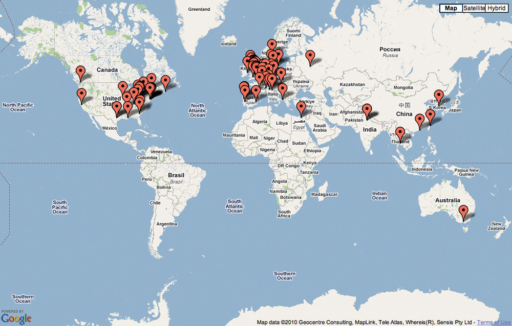
At the heart of the Google Maps visual language is the pin, which works as both logo and function. Writer Justin O’Beirne attributes the effectiveness of Google Maps to a combination of typographic shading and larger white outlines on the type. Yet though it is possible to discuss such graphic details in the renderings, they are more the outcome of a collective effort – of computer science and engineering – than an individual feat of design like those of Harry Beck or Alfred Wainwright (see pages 48-49). Google Maps marks a shift in emphasis away from the craft roots of graphic design towards graphics that are generated by programmed systems.
Google Maps offers live, shifting representations of a complex interplay between utility and constantly changing contexts, content and commercial ambitions in one of the world’s fastest growing, most lucrative markets. More than a map, it is a kind of ‘macroscope’; a tool set that makes sense of a system we are using on the outside while changing from within. Its graphics wriggle like robotic scaffolding, shifting to present and help make quick sense in the largest machine humans have ever built.
Jack Schulze is a co-founder and principal of Berg London.
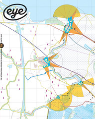
Top: the graphics of Google Maps are merely the surface of an evolving electronic atlas, yet the coloured pin serves as a distinctive branding device: in Japan you can buy paper fans made in this shape. Google’s next plan is to map the sea beds.
First published in Eye no. 78 vol. 20.