
Summer 2015
Reputations: Fred Smeijers
‘My father was a mechanic. Respect – for tools and for the material with which you work – is one thing I got from him. When the chisel is not sharp enough to do a certain job, even if it is just one cut, do not think you can get away with it. Sharpen the chisel properly and only then use it for what you wanted to do.’
Fred Smeijers (b. 1961) graduated at the beginning of the digital era of type; his first job was at the Dutch company Océ, editing bitmaps. Smeijers’ first type family, FF Quadraat (1992), was among the earliest releases from the pioneering digital foundry FontFont; this, and FF Scala by his friend Martin Majoor, would define the text typography of the 1990s. In 1996 Smeijers published Counterpunch, an examination of the techniques of sixteenth-century type production; the book was set in Renard, a new typeface based on the work of the sixteenth-century Flemish punchcutter Hendrik van den Keere. Smeijers’ Arnhem (1999), designed at the Werkplaats Typografie for the newspaper Nederlandse Staatscourant but not used, was hailed by Robin Kinross, whose Hyphen Press published Counterpunch, as a successor to Times New Roman.
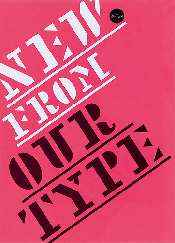
In founding OurType in 2003 Smeijers led the way in the development of small foundries selling a limited collection of quality types – OurType’s releases included Smeijers’ Fresco and Peter Verheul’s Versa (1998), Sansa (1999) and Ludwig (2001). In 2012 OurType released a collection of stencil types, co-curated by Eric Kindel, and put on an exhibition devoted to the stencil letter.
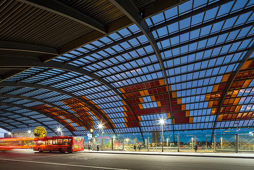
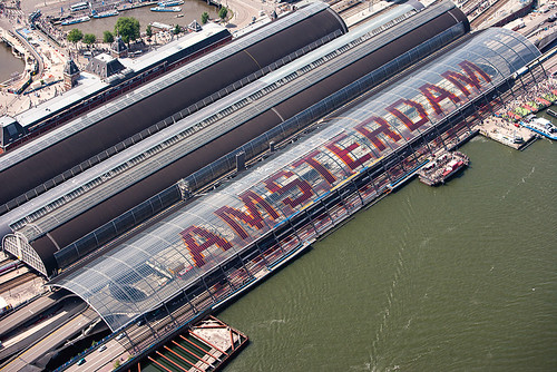
Smeijers’ second book, Type Now (2003), a collection of writings, lectures and notes, took a fiercely critical stance toward the issues then facing type designers and articulated a manifesto of practice for the future. In 2004 Smeijers began teaching at the Hochschule für Grafik und Buchkunst in Leipzig. With ever-increasing demand for his custom types, stimulated by the ones he made for Philips and Canon, his work has found a place outside the realms of book and text typography, embracing product and interface design as well as the detail of the way type is displayed on screens. The roof sign on the bus station at Amsterdam Central Station, designed with Erik Vos of Het Lab, is the largest public lettering in Europe. A new book is on the way, continuing research begun with Counterpunch.
Through all these activities, with their basis in research and history, Smeijers has developed a singular perspective on type design. Without having a ‘style’, Smeijers’ types are recognisably, immutably his. His individuality is the product of several factors: a deep conception of material and its history; a fluidity of drawn line; an engagement with technology; and a rebellious spirit. This shines through a collection of types that are reference points for the plasticity of type design and its close bonds with language and perception.
Midway through the two-day conversation that formed the basis of this interview, Smeijers turned to me and said: ‘You know, these days I think of myself more as a researcher than a type designer.’ This aside – delivered as we studied, through a microscope in Antwerp’s Museum Plantin-Moretus, the impression of a single punch in a Hebrew character – contains the essence of Smeijers’ types and the key to their enduring quality. It comes down to material.
The formal material of type is the alphabet, but Smeijers’ conception of this is broader and deeper than that of many others, embracing the ways in which letters have been made across time, with pens, punches, casting, printing, pixels and myriad typesetting technologies. This conception informs every stroke of his work.
Correspondence from the period – mostly invoices for work done by third parties, such as punch-cutting, or the casting of a new supply of type. Seen here is part of a small collection of printed fragments, the so-called ‘Le-Bé-Moretus collection of fragments’ from 1599 housed in the Plantin-Moretus printing museum in Antwerp.
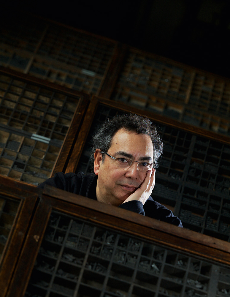
Top: Portrait by Phil Sayer.

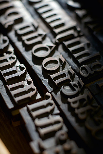
Punches cut by Claude Garamont not long before his death in 1561.
The steel letter-punch is the mother image of a printing letter or character. The punch was used to press into a matrix, a small copper bar that retained an impression or copy of the punch. This could be done more than once, so multiple sets of matrices could be made from one set of punches.

Matrices for the capitals ‘O’, ‘Œ’ and ‘Q’, dating from about 1549.
A matrix was put into a casting mould. A copy was then made from the matrix by pouring liquid typemetal (an alloy that mainly contained lead) into the casting mould. In this way numerous copies – pieces of type – could be cast.
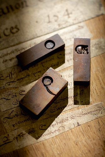
Wooden punches in the Plantin-Moretus collection, cut in 1575 for the creation of poster type by casting in sand. These wooden letterpunches were used for making a impression in fine sand by simply pressing the punch into it. Liquid typemetal was poured into the impression left by the punch. These punches are about 82pt.
Mark Thomson: What drew you to letters?
Fred Smeijers: At the age of fifteen I took my drawings to the Rietveld Academy in Amsterdam. I walked into the cafeteria and a student pointed me to a professor of illustration called Van Heusden who kindly had a serious look at my drawings. He said, ‘You’ve definitely got something in your fingers, but you are very young. Draw more from life. Draw your dog. Draw a potato from various angles, but I still need to see it’s the same potato.’
When I was eighteen, I applied to three different schools of art. I was accepted by all of them. In the end I chose the school of art in Arnhem. In the first year we had to write with a broad-nibbed pen and make simple layouts by hand. Alexander Verberne, our teacher, showed me a copy of a page from [sixteenth-century scribe] Arrighi’s writing book La Operina, and I said to him, ‘Are you fooling us? Can people write that rhythmically, that controlled?’ Since then I’ve been hooked on the broad-nib pen and on writing formal letters.
Verberne was very stimulating as a teacher. He was also a friend of typographer Gerrit Noordzij, who brought us into contact with some of his students and former students, such as Erik van Blokland, Just van Rossum, Peter Verheul and Petr van Blokland. Other influential people for me in Arnhem were Jan Vermeulen and Karel Martens. Martens is a real artist / designer; Verberne and Vermeulen were – they are both dead – real typographers. I had a feeling I could trust the three of them.
MT: Did you meet [Dutch type designer] Bram de Does then?
FS: We visited him a couple of times and he would tell us about his career and show us various things, also his experiments. As a designer he is able to make clear, ‘This is what I stand for and I won’t accept any concessions’ – but in a friendly way. When Autologic released [De Does’s typeface] Trinité, that was an eye-opener. In later years he gave me some valuable criticism on Renard.
Niko Spelbrink (who was a partner in BRS Design in Amsterdam) made us aware of the technical side of composing type, a crucial step. And Gerard Unger (see Eye 3 and Eye 40) brought together all the young Dutch type designers in 1986 to break the ice – a good and kind gesture.
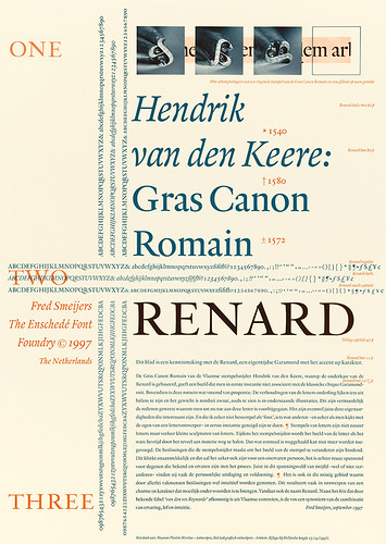
The first specimen of Renard (1997). Specimen design: Fred Smeijers. Typeface: Renard, The Enschedé Font Foundry [TEFF], originally designed in 1992.
For the design of this Garamond-style letter, Smeijers took as a starting point the two-line Double Pica Roman of Flemish punchcutter Hendrik van den Keere, cut ca. 1570 and shown in Plantin’s folio specimen ca.1585.
MT: You’re working on a collection of new types in the ‘Garamond’ area?
FS: Yes, we already have the name Garamond, from the sixteenth-century French punchcutter Claude Garamont. France was rich in punchcutters whose output can be ranked with Garamont, including Robert Granjon and many lesser known names. However the word Garamond eventually became the designation of a certain size of type (approximately 9 pt), and in the early twentieth century most type foundries produced their ‘Garamond’. Garamond has become a synonym for a class of text typefaces rooted in the middle of sixteenth-century France. (I first labelled this project ‘Quatre-Garamond-sans-Claude’!)
I started this project out of personal interest, to show the richness of this period by putting essential characteristics of other punchcutters from the sixteenth century into new type families. I am including something from Robert Granjon, Hendrik van den Keere and Pierre Haultin as well as Claude Garamont, and the work of one of their common sources of inspiration from a generation earlier, Simon de Colines.
MT: What interests you so much about types from the sixteenth century?
FS: In my book Counterpunch I was trying to answer the question, ‘Why are the serifs so thin?’ The question was asked by technicians at the manufacturing firm Océ, at the start of my professional career in the 1980s. To answer this, we can start by looking at the source of the typographic letter: punches, probably the earliest punches available, and they are in the Museum Plantin-Moretus in Antwerp. So I went there in 1986 and I keep going back.
For a large part, my early type-designing career started right there in the sixteenth century. That was good because there was so much material being produced then, and many things that are a standard today started in those days: small caps, italics and more. The typographic versions of many non-Latin scripts are rooted in that century. Any roman typeface made between 1520 and about 1580 by a French or Francophone punchcutter belongs, in principle, to the Garamond category. What we consider a normal roman seriffed text typeface was developed and made into a standard during that century, so somehow I can never get enough of that era.
And I’m pretty sure these five typefaces aren’t going to be my last ones. You might think they are easy to make, those typefaces, because they are so broad-nib-based, and there are clear printed samples available. But tracing a printed sample has little value here. For me it is much more looking at a sample through eyes that are able to condense and make vivid the whole oeuvre of a certain punchcutter, so that it makes sense for today as well as tomorrow and which at the same time adds value to the original sources. I hope that future publications such as my next book – nicknamed Counterpunch II – will help to create a better background for understanding these motivations.
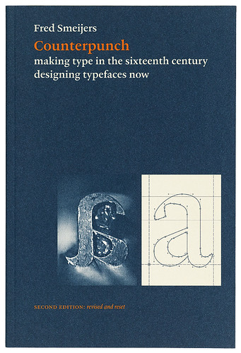
Counterpunch (Hyphen Press, second edition, 2011). Design: Corina Cotorobai. Typeface: Haultin, in development.
The second edition of Smeijers’ 1996 book was completely reset in a new Smeijers type based on the work of Pierre Haultin. The cover illustration gives a taste of what is to come in the book: a searching examination of the relationship between sixteenth-century punchcutting and contemporary digital type design.
MT: Tell me about the research you’ve been doing into casting.
FS: Justin Howes, the late type historian, was preparing to come to Antwerp to do a casting project at the Museum Plantin-Moretus. He stayed at our place a couple of times and our discussions usually went on late into the night – we developed a friendship. Justin said I should take up hand-casting, but I always replied: ‘You do the casting part and I’ll do the punchcutting.’ But then he died, unexpectedly, so I decided to honour his advice and took up hand-casting and I can only say, he was right.
Since then I’ve discovered and probably rediscovered a number of new things and points of view which are going to be published in Counterpunch II, looking again at artefacts to see what they can tell us, but this time with more precision than was possible in the early 1990s. Sixteenth-century methods were essentially different.
Thinking along the lines of ‘cutting punches and working in a tradition that has remained unchanged for five centuries’ is a popular and romantic view, but it is wrong. What I have found is by now more than enough for a serious publication and I have lectured on these new conclusions regularly since 2007.
MT: Your forthcoming Counterpunch II will be published by Hyphen Press. How did that relationship come about?
FS: I owe a lot to Hyphen, and to its publisher Robin Kinross. Robin was on a trip in the Netherlands to interview Gerard Unger for Eye magazine (no. 3, 1991). Then typographer Françoise Berserik, a friend of Robin’s, told him to visit these young type designers in Arnhem – Martin Majoor and me. Martin told me to take a day off from Océ because Robin Kinross was visiting. I collected some material, I showed him some print-outs of Quadraat and other things, but also this manuscript, the very beginnings of Counterpunch, handwritten with illustrations. The bell rang, I opened the door and there was this tall friendly man. We talked and talked. When he saw this manuscript, he scanned through it and he was interested, and things went on from there.
At the time I was also doing small freelance jobs for a number of Dutch publishers, but I didn’t like their attitude. And then suddenly here was this totally different publisher [Kinross], so I thought, why not? In 1996 a book like Counterpunch would never have seen the light of day in normal publishing circumstances.
MT: Hyphen’s books have frequently used your typefaces, and they are among the best examples of those types in use. How did that come about?
FS: I wanted Renard for Counterpunch, but otherwise I never asked Robin to use my typefaces. It has always happened at his request. He’d ask, could he try this and that, such as the Arnhem typeface. And I think it helped give people an awareness of Arnhem. He started to use it for the first time in a new edition of Norman Potter’s What Is a Designer, then in the foreword by James Mosley (see pp.62-73) in the reprint of A View of Early Typography by Harry Carter. Designers saw it and thought, ‘Hey, what’s this typeface?’ And when they came to know it was Arnhem, they sent me emails saying: ‘Can I buy the font, or fonts?’ So it gave Arnhem a start.
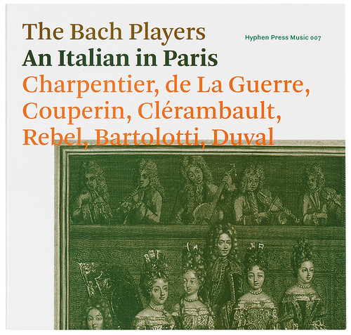
Digipak for CD by Bach Players (Hyphen Press Music, 2014).
Design: Robin Kinross. Typeface: Arnhem, OurType, originally designed in 1998.
Robin Kinross’s Hyphen Press was an early champion of Smeijers’ typefaces. Kinross began issuing CD releases as Hyphen Press Music in 2008 (see Reputations, Eye 80).
MT: And that led you to start OurType?
FS: OurType was based on an earlier idea of mine from the mid-1990s: to have our own foundry, and only with work by Dutch type designers. But that never happened, because type designers can be awfully difficult people to deal with. We never got further than the usual discussions about the name and the logo. So I thought, well, I’ll start my own foundry.
Type is a strange thing. A lot of badly designed fonts are still good enough for a lot of purposes, so I think standards are falling. Or to put it differently, a lot of successful type designs are not well made, aesthetically or technically. The whole type design hype became very big, and is still growing, and not only because of the courses in The Hague, Reading and other places. So if you have something that really grows, then there is this pyramid-effect where the base grows a lot and the tip, though also growing, is far, far less. There are more good typefaces being released than, say, twenty years ago. But compared to the amount of not-so-good or mediocre stuff, this number is not significant.
At a recent lecture in Brazil I said that type design is basically dead, and the audience probably did not like to hear that. Of course there are other people, more optimistic, who say there are still openings and they talk about all the non-Latin work, for example. And there are openings in the technical sphere, like webfonts. But that is simply technique: today this, and tomorrow it’s that. You rarely see something fresh, innovative, original. And I miss that.
MT: Counterpunch is dedicated to your late father.
FS: My father was a mechanic, able to fix and adapt all kinds of machines. He was pragmatic. First the problem has to be solved. Second if it is the kind of problem which might return, its solution should be such that it can be reused in an easy and quick way. Third, time and materials should be kept to a minimum: work steadily but avoid haste. Fourth, should it also look good? No. If stages one to three are solved in a good way, then I am already a happy man!
Respect – for tools and for the material with which you work – is one thing I got from him. When the chisel is not sharp enough to do a certain job, even if it is just one cut, do not think you can get away with it. Sharpen the chisel properly and only then use it for what you wanted to do.
MT: I don’t think there are many digital type designers or designers designing type digitally, now, who are engaged with the hand part of history but also actively making stuff by hand in the way that you are. Would you agree?
FS: If you look in my studio you see three big screens in one corner – that’s the digital part – and behind there is a table with a lightbox. The rest is all about anvils, vices, hammers, gauges, drills, machines, acid for etching, files, burins, chisels for wood and metal – punchcutting stuff. There is a little cylinder press and a corner for casting. I like doing things by hand, and I can only say to anyone, whether you’re a designer or not, don’t be afraid of it, it is enriching. Doing things with your hands can give great pleasure and can also give results you would never have got if you had stayed behind the screen, because these are different worlds.
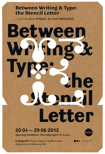
Exhibition invitation, 2012. Design: Catapult. Typefaces: Bery Tuscan, OurType (originally designed in 2007), and Ludwig, OurType (originally designed in 2001).
‘Between Writing & Type: the Stencil Letter’, curated by Smeijers and Eric Kindel (see ‘A tradition with breaks’, Eye 86), launched a collection of stencil types from OurType. The Antwerp exhibition also included many historical examples of this subtle and practical technique for creating letters.
MT: In Type Now (2003), you discuss the importance of creating original designs and propose a code of conduct. Your position was strongly supported by some and dismissed by others. Ten years on, with an ever-growing community of type designers, do you feel anything has changed?
FS: Type design is an applied art – that is agreed. So where does the ‘art’ bit come in? There is an innovative aspect; a visual sensibility; knowledge of use and its history; a sense of craft. All this is necessary in order to start at the beginning, and in the end there is a type design.
So the art part is a visual matter, not a technical one. There are, of course, exceptions. The technicalities can be a essential part of the design – like Beowulf in the 1990s, Verdana or, to a much lesser extent, a more recent typeface like Fakt. Nevertheless general appreciation counts mostly for the artistic, not for the technical side of things.
The technical changes on various levels are largely responsible for the growth of type design. One of those levels (and not the least important one) is that it has become a lot easier to come up with a design that looks acceptable at first sight. But this does not mean that new things are automatically genuine or authentic. The type design community fails to be critical enough towards itself; we seem to welcome everything … this attitude will ensure a waterfall of mediocrity.
We cannot pretend to be an applied art and at the same time accept, on a large scale, working methods that are even contrary to such a definition. In the long term, society will not accept it. Let’s get back to normal, and use our skills to say: this qualifies for a genuine design and that is a good study but far from mature, and the third is indeed a cunning tweaking job disguised as a type design!
Consider [Excoffon’s] Calypso from the 1950s: the ‘art’ part is immediately evident, even today; the very first release was even produced for hot metal. So for its own days it scores very high on all levels, except one – it is definitely a display face, which means that it scores low on the fit-for-general-purpose axis. However the fact that it is not really usable today does not take away much from its innovative character and its design still demands a respect in a natural way.
The last version of Garamond Premier Pro is the opposite. It scores high on the fit-for-purpose-axis yet for 95 per cent of its users it scores very low on the art part, for it looks very normal: there seems nothing special about it, they cannot see the artistry at first sight. However it is very well executed and is adapted for present day use in terms of the variations in weight and the number of glyphs and scripts available. Yet the art part is a result of serious study concerning the work of Claude Garamont and the entire Garamond class. Within this narrow spectrum Garamond Premier Pro has its own place which ranks pretty high; all the consultancy combined with the experience already achieved by Robert Slimbach results in a high quality piece of work which is and remains genuine. Today there is a peak in type design, yet we have few Calypsos or Garamond Premier Pros to show for it.
MT: Some time ago you released a collection of display fonts, the stencil fonts series. What prompted this?
FS: I wanted the exhibition ‘Between Writing & Type: The Stencil Letter’ to show to the public that OurType is not just about text typefaces. We can also produce light-hearted yet solid designs. Most stencil fonts have a story to tell, and all together they’re a nice collection. Such display typefaces work best when used as an accent – when they are a small part of a larger typographic composition. But when a Japanese designer uses, for whatever reason, Bery Tuscan, and he needs a proper matching Tuscan Yen character, then it is there.
MT: What about your commissioned work? You have a long history with Philips, then Canon-Europe, now most recently Samsung.
FS: I love to solve problems. In the early years of the digital revolution I did a huge amount of custom work. Sometimes it’s ‘We need a nice logo’. From a more technical point of view it’s ‘We need a bitmap font for a certain user-interface, which has to be monospaced, but the pixel ratio is a bit strange. So can you solve that by next week?’ Yes, of course I can do that. In those days it was possible to earn a good living with two simple programs, Fontographer and Fontastic, the latter a black-and-white bitmap editor running on a Mac. It was going pretty well until things started to get more and more complex technically and that’s when I took up TrueType hinting. But the arrival of OpenType gently put a lot of TrueType problems to the background. And so retail fonts got a boost. Everybody wanted – and was able to – sell their retail fonts online: fast, reliable, available to anyone. That’s when most clients became anonymous, just people who simply buy fonts.
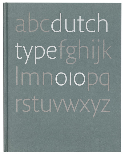
Dutch Type (010 Publishers, 2004). Design: Bart de Haas and Peter Verheul. Typeface: Fresco Sans, OurType, originally designed 1998.
The cover of Jan Middendorp’s Dutch Type was an early use of Fresco Sans. Fresco continued to expand in the next decade, with many styles and variants added to the basic serif / sans serif family.
MT: You don’t want to know who is buying them?!
FS: The world of type has changed a lot and still keeps changing. The climate now is very different from that of the mid-1990s. It is not so usual now to know your clients, at least not all of them. There is nothing special now about a change of typeface. Acquiring fonts is the same as buying anything else over the internet. It is not that you do not want to know your clients, it is simply not that customary any more.
As in general graphic design, commissioned work and the field of custom fonts has expanded, but also been inflated over the years. Budgets got smaller and smaller. Sometimes it is downright tight. If the outcome has to be something which is not very interesting, or which might even be damaging for your reputation, then it is probably better to turn it down.
Clients come to me for a certain expertise, a signature. They want my hand and no other. Even though I work within the constraints of a brief, they give me carte blanche and that attitude is extremely important to me. But it’s a freedom that I do not take for granted. On the contrary. It is a pressure factor, but one that probably channels the best I can give at that moment. Because most custom fonts must be executed within a fairly tight schedule, they do not have the time to mature. So in those circumstances most of us operate on creative autopilot, so to say, where one’s talent, design vocabulary and experience pretty much shape the result.
I’m happy to have just a handful of such projects but keep the quality bar high. A lot of type designers think you are only successful if you make custom fonts, but for me the opposite is nearer to the truth – the less custom work you have to do, the more successful you’ll probably be. I have to teach, I have to do research, I have to write, compile lectures, cut punches, organise exhibitions and I have a family to take care of. All this next to designing ‘non-custom type’. The art is to make type design not boring.
MT: The best text typefaces have a kind of ‘character’: anodyne types kill text. But how much character is enough, and how much is too much?
FS: One of the reasons why so many typefaces are equal in mediocrity, is that they are made with the same thoughts, with the same techniques, with the same recipes, within the same span of time. When all this reaches a certain volume and speed of production, it becomes increasingly obvious – in fact it becomes hard to ignore. Many new designs might ‘differ’ from each other, but on the whole they all speak the same language. It is possible that a new type design is really not much more than the sum of a certain number of rather basic elements.
These elements usually are: sufficient knowledge to handle certain bits of font design software. Basic knowledge concerning the structure of the main Latin scripts: capitals, lowercase, upright and italic. The ability to apply this knowledge to letter shapes that you have made yourself or to slightly adapt existing shapes. To apply all this coherently to a sufficient number of glyphs. The job is usually done in under a year.
This was perhaps enough twenty years ago. Whether this gives worthwhile results now is, I think, a good question to ask.
You can also look at this differently and say that all these basic elements do represent quite a steep learning curve. My answer would still be about the same, indeed twenty years ago it might have been the same. But we have to consider the present-day situation in which the knowledge is available and transferred effectively. Further, the software and all kinds of helpful extensions are also there, well documented, cheap and directly accessible. They have also been greatly improved over the years. This was not the case twenty years ago. So how steep is that learning curve actually? I think it is not that steep at all and it is about time we stopped fooling ourselves.
A designer needs to keep on studying, working and gaining experience, so that he can create his own rules to stand next to the basic ones. Those basic rules are a given fact, but the interesting thing is to deviate from them. I’m not referring here to the behaviour of a monkey in a porcelain shop. It’s difficult to put a finger on this exactly, because it is not on the level of plain knowledge transfer.
So if I say to a student, ‘Listen, you can probably use the curved part of a “b” for a “p” too.’ OK, then he has this little Aha-moment and knows what to do. But other levels are not an automatic fit. Often these levels – whether they’re in music, dancing, painting, even cooking – are too complex to put into words. Rembrandt couldn’t tell his students how to make a drawing as exciting and lively as his. To a certain extent the same goes for type design.
MT: And that accounts for the slickness?
FS: Well, the slickness is partly a matter of screens and software. For instance, I sometimes have to pick up old data and am forced to make use of completely outdated hard- and software. In doing so you are catapulted back to 1994 or so. Quite a shock! It is not just a matter of larger screens, which have anti-aliasing and all the colours you can imagine – not those bitmapped rough black-and-white contours from back then. The amount of control, precision, and the ease of managing it all – that is so much better in 2015 than it was in 1990. Technology has enabled designers to be more slick and to make curves more smoothly than ever before. Take today’s visual world – photographic realism has taken the upper hand! To put things crudely, nowadays, we have the following situation: a young designer brought up in the digital era, with little reference to the non-digital or analogue world, has to create things. What else is left to do than to pull crispy lines, shove nice coloured surfaces against each other, and on top of that you put some nice photographs, right there, on that smooth Retina display of yours? As soon as you try to do something not slick, in such technical circumstances this right away starts to look like a fake. Somehow it seems that the current technology only allows for slick. This seeps through everything, and type is no exception.
MT: But then that technique drains something from the reading quality of the text, doesn’t it?
FS: Probably. Bram de Does once said, ‘Too much harmony is counterproductive in long-term reading, old-fashioned reading.’ And I’m convinced he’s right. That’s why very smooth typefaces on very smooth white paper with a high contrast between the black and white is not so favourable for our brains. They have to face too much graphical tension. It’s too contrasty, too slick, too thin, too glossy. And that seems to make you tired very quickly. I think that often what comes out from a good laser printer, 600 dpi – for old-fashioned, long-term reading, like a novel – is very good. It has the right roughness, it’s all that carbon on the paper. It’s sometimes not very equal or consistent, and I think it’s very true that if everything is too consistent, then for long-term reading it’s not that suitable. You have to have a kind of random inequality – that seems to help.
OurType specimen, 2012. Design: Corina Cotorobai.
Typeface: Puncho, OurType, originally designed in 2007.
OurType announced the release of a series of stencil types in a specimen featuring Smeijers’ Puncho, based on stencil letter punches made by S. M. Spencer of Boston, with a capital height of about 3mm. The practical limitations of creating and using punches at this size resulted in Puncho’s unusual shapes, which bind together to create readable text at small sizes.
MT: Your text types share a certain quality that seems to flow between and beneath them. It’s not a question of style, but of something more substantial, which is at the same time more or less invisible: it’s a deep feeling. But this must be subconscious for you?
FS: That’s difficult to answer because it’s difficult to look from my own point of view at my own work. Typefaces need to mature. So I work on ten to twenty typefaces at the same time and they are all on my computer, being touched up and reviewed by myself over a period of more than five years, sometimes ten or fifteen years. And then, from a group of ten I might discard eight because the other ones, those two left, have so much more than the rest, and that’s the quality that I need.
MT: In what direction do you think type will go in the future?
FS: It will be difficult to define what a good typeface should be in terms of usability. Should it be about webfonts? Or should it have other scripts? Personally I don’t need Arabic, or Cyrillic. A basic Latin font is just fine for writing my emails. But in other areas a variety of supported scripts is going to be important. So I think there is going to be a split in high-end typefaces concerning scripts and usability. But that doesn’t mean the smaller families have to be of less quality in terms of design and execution. You can design large families, tools for our global world. Or you can say, I just want to make a nice menu card for a restaurant or a letterhead. Not everybody wants to be global, or has the need to reach out that wide. So there will be two directions, I think. Big families, global, that are suitable for any problem. And designer stuff that has to be good, but not necessarily big.
It’s difficult to predict the future because we are in a daze. In fifteen years’ time people might say, ‘Look at that, back then they thought Twitter this, or Google that. How naive they were!’ We need years of living with technology to see what it really does to us, or what real value it has. But it’s hard to believe that there are going to be movements like the avant-garde of the 1920s. Nowadays everything is chopped up into smaller pieces and for almost everything there is a place. So it’s going to be a niche world. And that, in principle, is good, for any designer – because a niche world is usually very open for design. The downside of it is the lack of budget. On the one hand, there will be those huge corporate worlds. On the other, there will be many areas that contain a lot of slices of the same. Since type can be seen also as a reflection of the society it serves, it seems to me that we are right in the middle of this.
MT: So have you fed all of this experience into your own teaching career?
FS: I started teaching too early, when I was too young. It was 1988, or 1987 even. My old school of arts was missing a letter teacher, someone who would teach the students to write with a broad-nib pen and explain the principles of letter shapes. At 27, you are not mature enough to teach other young adults.
Nowadays, my experience clearly counts: you can dispel the myths and you have a lot to reflect upon. You also have examples from your own career. I can easily show why one thing works here but not there. There are many young talented designers who make good designs in all kind of fields. But if you look more closely, a lot of those good designs are just jokes, like sneakers with high heels, a ‘plastic’ cup, made out of real porcelain. The deliberate use of non-design, such as a bad version of Times Roman in combination with Palatino. Those paradoxes, those contrasts, are not really anything substantial, they smell of designers being unwilling to face the real problem. Good design is something else. It doesn’t mean good design can’t be frivolous, or happy, or joyous, but it is something more than just a contemporary gag.
MT: What’s your favourite book?
FS: There are at least two kinds of favourite. First the books you read, and the other group is based on looks. The nice-looking book is for me not ‘beautiful’, because that is somehow too strong. The books that please me by their looks appear sympathetic, well made, uncomplicated, well proportioned.
When it comes to reading, two small books remain my favourites. One is by Winston Churchill, Painting as a Pastime, in which he tries to explain the value of having a hobby for all those who have rather demanding and very focused professions. The other is by W. A. Dwiggins, A Technique for Dealing with Artists. It was written around 1930. It’s a manual for commissioners to insult or manipulate their designers – it includes all kinds of advice and tricks. For example, ‘Flattery is effective with artists of minor rank. As an artist’s ability rises in degree the effect of direct flattery diminishes.’ It’s very funny, vividly written, and has an edge to it.
MT: Winston Churchill and Dwiggins is an unusual combination!
FS: Well, there are one or two interesting things that Churchill says in this booklet. One of them – and this thought became my life motto – ‘It’s no use doing what you like, you have to like what you do.’ Be at peace with yourself and what you do, and do not strive for ‘I’d like to do this, or I’d like to do that.’ Just make your decision. Accept it and do it as well as possible. Make it work, make it likeable – that’s one of those mantras designers should have. They should be able to transform a not-so-interesting job into something with some level of pleasure, because if a designer is happy it is more likely that he will come up with something good.
Large-scale custom lettering on the bus station on the IJ (waterfront) side of Amsterdam Central Station, 2014.
Design: Fred Smeijers with Erik Vos, Het Lab. First commissioned in 2002 by Benthem Crouwel Architects, this design is a sublime inversion of scales. Though it is the largest public lettering in Europe, it can be seen as a coarse grid of pixels, which echoes work from the start of Smeijers’ career – editing bitmaps and hinting typefaces for the low-resolution screens and laser printers of the 1980s. Photographs by Jannes Linders (interior, above) and Paul Deelman (aerial view, left).
Special thanks to Robin Kinross, Corina Cotorobai and the Museum Plantin-Moretus Antwerp for their assistance.
Mark Thomson, designer, typographer, London
First published in Eye no. 90 vol. 23, 2015
Eye is the world’s most beautiful and collectable graphic design journal, published quarterly for professional designers, students and anyone interested in critical, informed writing about graphic design and visual culture. It is available from all good design bookshops and online at the Eye shop, where you can buy subscriptions, back issues and single copies of the latest issue. You can see what Eye 90 looks like at Eye before You Buy on Vimeo.