Summer 2001
Reputations: Gerard Unger
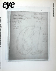
‘Papers have all kinds of information on the same page; very distressing and very joyful; gossip and facts. I wanted to bring that variety, that liveliness into the typeface design.’

Gerard Unger is a quietly ambitious typeface designer whose fonts have achieved a popularity and ubiquity that few superstar designers can equal. Born in The Netherlands in 1942, he has been involved in digital type design since 1974: for print (Dr-Ing Rudolf Hell GmbH, now Linotype Library); for office use (OcZ Nederland, Venlo); and for the screen (Philips Data Systems). Unger studied at the Gerrit Rietveld Academy in Amsterdam from 1963-67 and he has taught there for more than 30 years. Since 1994 he has been a visiting professor of typography and graphic communication at the University of Reading in the UK.
The many typefaces he has designed include Hollander (1983), Flora (1984), Swift (1984-86), Swift 2.0 (1996), Amerigo (1986), Oranda (1986), Argo (1991), Gulliver (1993), Paradox (1998), Coranto (1999) and Vesta (2001), a new sans serif. Many of these are used internationally in newspapers and magazines: for example Coranto for The Scotsman and the Brazilian newspaper Valor, launched in 2000; Gulliver for USA Today and Stuttgarter Zeitung. Swift (see Eye no. 3 vol. 1) has acquired the status of a late twentieth-century classic.
He has also designed several typefaces for signage, including the one used for the Amsterdam Underground and in 1996, in conjunction with the Leiden-based company n|p|k industrial design, a new face for Dutch road signs, commissioned by the Dutch tourist organisation ANWB. He made a personal contribution to the tradition of public lettering in Rome when he was commissioned to developing an orientation and information system for the City of Rome’s Jubilee year 2000. He headed a team of six designers, working again in conjunction with n|p|k. Part of this project was a new type family, Capitolium (1998), to be used in seven languages and in different technologies, including public touch screens.
Unger also designs corporate identities, magazines, newspapers and books, writes regularly about graphic design and typography and lectures abroad. He claims he is proud to remain an ‘old-fashioned designer, satisfying clients, solving problems,’ continuing a Dutch tradition of text face design for reading. ‘Over the past decade,’ he says, ‘while many designers were producing post-structuralist, post-industrial, Deconstructivist designs and … more interested in how things look than in what they have to say, I remained interested in content first.’
Awards include the H. N. Werkman prize (1984) and the Maurits EnschedZ prize (1991). He is on the board of the Association Typographique Internationale (ATypI) and is a member of the Alliance Graphique Internationale (AGI). His Dutch language book about the the reading process, Terwijl je leest … [While you read …], was published in 1997 by De Buitenkant in Amsterdam.
Portrait by Anthony Oliver, taken in the Department of Typography & Graphic Communication at the University of Reading, 2001.
John L. Walters: When did you first begin to notice type and letterforms?
Gerard Unger: My father worked for a textile manufacturer, Rayon, so I grew up hearing about graphic designers and seeing their products – Rayon Revue by Otto Treuman, for example.
JLW: Was your father a trained artist or designer?
GU: He was the son of a trained typesetter. My father was a commercial man, with a self-taught interest in design and the arts. Publicity was part of his job.
JLW: Were the other members of your family talented?
GU: My eldest sister paints. My eldest brother, who became an art historian, used to communicate with a friend, who is now a famous illustrator, through self-drawn magazines with comic strips.
I was born during the war – dark days. After the battle of Arnhem, in September 1944, our house and much of its contents were damaged, including my father’s library. I was given a lot of parts of books, including some printed by Plantin, copies of Arts et Métiers graphiques and a publication designed by Piet Zwart for the PTT. I can remember myself improving his work liberally with a pencil.
JLW: You used them as scribbling books?
GU: Yes, I scribbled all over Piet Zwart (it was a ruined copy already). My father brought things home: catalogues designed by Sandberg; and books, mostly French, as he was a Francophile.
JLW: Did you note other examples of design and type that you wanted to ‘improve’?
GU: One of my part-books was an atlas. I spent hours studying the way mountains were represented. Inspired by Arts et Métiers graphiques, I spent one whole summer holiday designing banknotes for every country in the world – black and white only. I must have been eleven or twelve.
JLW: When did you decide to become a designer?
GU: During my extremely unsuccessful stay in secondary school, I designed posters, programmes and backdrops for most of the school plays.
JLW: You found school difficult?
GU: I suffer from a mild form of dyslexia. I have problems with numbers especially. So, by the time I had gone through the military service, there really was no other choice. I went straight to the Rietveld Academy. I had started drawing type already, after seeing an exhibition of work by Van Krimpen for the Dutch PTT: simple drawings with pencil on paper. I realised that all you need is a pencil and paper and you’re in business. My career started in the classical way, by imitating a master.
JLW: What did you learn at the Rietveld?
GU: You have to realise that education over the past 30 to 35 years has changed enormously. My final show included a poster, an annual report, a menu, a stamp, all kinds of things like that, and one or two special projects. It was a very practical education. Nowadays students do their final show with one single project that is entirely personal … some of them are strange, weird, beautiful, but have hardly anything to do with graphic design.
So I think the best part of my education was that it forced one to be flexible. The change in graphic design after 1960 was enormous, so I think they were wise in training us that way.
JLW: So are current educational methods not preparing students for change?
GU: The emphasis nowadays is much more on personal expression than it was in my time, and I’m not saying it’s good or bad, I’m wrestling with it. When I see a chance to make the things I design more personal I’ll certainly do that, but that’s not the main purpose. I’m from the generation that saw graphic design as problem-solving and I’m still a problem-solver. That’s my first question: ‘What’s your problem?’
Even within the Netherlands there are huge differences. A colleague who was teaching at the art school at Utrecht and at the Rietveld Academy asked her students to design a browser. The Utrecht students said: ‘OK, what exactly is a browser, what does it do, for whom shall I make this browser …’ At the Rietveld the students said: ‘Browser? What do we need a browser for? What else could perform the functions that a browser could do?’ The Rietveld is more anarchistic.
JLW: Was it like that in the 1960s?
GU: Much less. Then it was: ‘Graphic design is all right. Advertising is bad. That’s commercial, and commercialism is a dirty word.’ I thought that was all nonsense and I wanted to hear the pros and the cons, and that’s why I followed the lessons of two teachers with opposing opinions. One was from the Piet Zwart direction of design, of The Hague school and the other was a more traditional designer. To have those different view clashing within myself was very instructive.
JLW: They would respond differently to the work?
GU: Yes, almost by definition, but I would always try to make what I thought was best for myself. I never tried to please either of them.
JLW: Is the teaching world totally different now?
GU: Absolutely, though some issues have not disappeared, such as the whole attitude towards branding. There’s still the old division between the commercial and the anti-commercial: people who feel they are more artists and don’t want to be corrupted. I’ve always thought that to be a rather silly notion, because as soon as you accept money for something, whether it’s for a painting or not, it’s a commercial thing – you have sold something.
Teaching
JLW: What is your main role [at Reading] as a teacher?
GU: I wanted to combine these scholarly surroundings with the anarchistic atmosphere of the Rietveld Academy. Students at Reading have to write a lot of essays, pass a lot of examinations. The emphasis is on design that relies heavily on theory, which is information design. So the pure kind of graphic design, with freedom to handle shapes, colours, themes, whatever, does not exist at Reading. It’s the other way round at the Rietveld. There is hardly any theory, which is a very Dutch thing, by the way. It’s not that my colleagues don’t know anything about theory and history, but they pick that up outside the classroom.
So I take parts of the Reading education to the Rietveld and vice versa. I gave a lecture I had prepared for Reading at the Rietveld and when I asked for questions, one student got up and said: ‘It’s not a question, it’s more a command. Can we have more of these lectures.’ A great compliment.
JLW: Do you feel that your students leave these institutions prepared for the world of graphic design in the way that you were?
GU: That is one of the great wonders of education in general. As soon as you turn these people out into the real world, it goes right! Students who have never been told that graphic design is problem-solving seem to find out with their first meeting with the client that it’s about solving problems. They have no difficulties finding that out and getting along with it.
Typography and Reading
JLW: When we interviewed Graphic Thought Facility (Eye 39), they talked about the lack of interest in typography among students …
GU: That’s a general problem. One of our national newspapers in the Netherlands is complaining that they can’t find well trained typographers. It’s the same in Germany. Students go for designing for the screen, and not for paper. I have the impression that it is a temporary development. What is bad is that the institutions go with the flow to try to please their students.
JLW: Do you mean that there’s a danger that the institutions are driven by demand from students rather than from what needs to be taught?
GU: Yes, ten years ago it was normal practice to teach typography. Now I have to prove to my colleagues that typography is a necessary thing to teach, and I have to sell it to the students. That I have to defend my niche is not a bad thing, but now the niche is almost not there. That’s not good.
I once did a lesson about what pictures cannot say. I asked my Rietveld students to draw a hunting dog. Next question was: now, draw me a picture saying: ‘What kind of dog is this? Draw a picture of the question.’ And then someone drew the same dog with a question mark. I said ‘No, the question mark is part of the typographic repertoire. It’s not a picture, but a totally abstract symbol.’ It turns out that something as mundane as a precise question you can’t put in a picture.
You could say that readers don’t know one bit about typography, so we can do as we please, yet as soon as you change something in a newspaper there is an uproar. That was one of the things that I wanted to get at in my book. It tries to trace what readers know and what a type designer can do with that knowledge.
The newspaper is an ubiquitous typographic object. From the 1950s on, type sizes in newspapers have gone up gradually, from 8pt to over 10pt in some cases, which is an enormous increase. I have spoken to many people about this, newspaper people, researchers. Nobody can tell me what has caused this. When you look at other factors – better lighting in the homes; improved spectacles and contact lenses; the quality of paper – you would expect the opposite.
I would love to have some research that says: ‘Listen, you’ve been making some nice type designs, but you’ve gone about it in the wrong way. If you really want to improve typefaces, you should do something drastically different.’
That kind of information does not exist yet. What you have is comparative research based on, say, a choice between three different type designs, which can only say that one design reads better than the other two. I’m reading lots of books about the way the brain functions. There is a wonderful institute in the Netherlands where they do neurological studies in relation to language.
For the first time in history neurologists and linguists are able to look inside the human brain, to see it functioning at the moment language is being processed by the brain.
JLW: Do you think that neurological research will actually give designers new tools in the future?
GU: Yes, but the information I want to move type design ahead and improve legibility is not available. So I’m groping around in the dark. With Coranto, and even more with Gulliver, I experimented to see whether my changes would make a more legible typeface. It’s purely empirical.
Newspapers
JLW: Gulliver is used in both USA Today and Stuttgarter Zeitung, but in very different ways.
GU: That’s the most amazing thing … you would almost think they use two different typefaces.
The Americans used Gulliver in an American way – they’ve taken away space from between the characters, condensed the characters, blown them up, made them bigger and taken away space from between the lines.
JLW: Are you comfortable with that?
GU: They went too far with it, so they went one step back – when they launched it was even more inflated. The Germans have a much more cerebral approach. One shouts in your face where the other is cooler, keeps its distance. I like the Stuttgarter Zeitung better, but I’m excited by what USA Today did with the typeface. It was something I would never have done myself and they claim it works, for three million copies per day.
JLW: What was the first publication to use Gulliver?
The NBLC, Nederlands Bibliotheek en Lectuur Centrum [National Institute for Libraries and Reading Matter] bought Gulliver for its annual guide, Gids voor de informatiesector, and asked me to do a redesign. We saved about twenty per cent space and it became a lot clearer, more legible.
JLW: So you were aiming for economy and clarity.
GU: A disappointment of launching Gulliver in 1993 was to find that designers are not much interested in saving paper. I used to present Gulliver as an ecological typeface, but nobody was interested. However, the legibility drew a lot of attention.
JLW: Was it meant to be a solution to a problem?
GU: I saw a need. With Gulliver, I designed something that wasn’t there. That’s what I always try to do. It took about two to three years, which isn’t too long. I can remember one day I started to do a couple of funny experiments in setting little blocks of text in, say, nine point and then setting the same block of text with slightly reduced type size but slightly widened. When you reduce the characters’ height but make them slightly wider, the amount of white space within the characters remains the same, so the type doesn’t look smaller.
JLW: What technology did you use to do this?
GU: I went back and forth between Fontographer and Quark XPress. The moment you have a couple of experimental characters in Fontographer, you can turn them into a font and apply them in Quark XPress and make printouts in different sizes … It’s an enormous improvement – it allows you to keep the distance between initial idea and final product almost minimal. You can make visible your first thoughts within one morning.
JLW: Do you miss the passing of the older methods?
GU: Not really. The advantage of paper and pencil was that being such a slow process you had lots of time to reflect – but that is something you simply have to build in. You have to sit back …
JLW: So it still takes the same amount of time to design a font?
GU: Absolutely. When you do it the right way, exploring all the possibilities of a new type design still takes about two years. But in those two years you can get a lot further.
JLW: What were the challenges you tackled in designing Coranto?
GU: The ideas behind Coranto are less revolutionary than those behind Gulliver. Newspapers are printed so much better that you can bring more atmosphere to the page than before, you have fewer distortions to reckon with.
JLW: What atmosphere were you aiming to bring?
GU: Newspapers have all kinds of information on the same page – very distressing and very joyful; things of minor interest and things of major interest; pure facts and gossip. I wanted to bring something of that variety, that differentiation, that liveliness into the design.
JLW: How do you begin a new font design?
GU: There is already a lot of information from previous designs, from reactions to previous designs, from talking to newspaper people, from talking to readers … so sometimes you get the idea that there is a need for something else. Then I will sit down one day and work around this big idea. When such a design is in its early stages you show it around to get reactions.
JLW: Did The Scotsman commission Coranto?
GU: No. Ally Palmer, The Scotsman’s designer at the time, saw Coranto at a newspaper conference in Copenhagen and wanted it. Ally then worked with Simon Esterson and John Bellknap on the new Brazilian newspaper Valor. I got all kinds of feedback from the Brazilians. Simon and John used to call me up in the middle of the night and put me through to the editor who explained that my diacritical marks were not right. Also: ‘We don’t want any ligatures – f and i must be separate characters. Please redesign your font in such a way that the two will meet and not cause a problem.’ Newspaper people don’t like ligatures. They want a sturdy, basic design, with nothing fancy. There’s a kind of toughness about newspaper design – although this is an extremely elegant paper.
JLW: How do you deal with criticism from clients?
GU: There are people who tell me they would never use my designs. But sometimes you don’t know how to interpret the feedback you get.
One of the first newspapers to use Swift was Het Parool in Amsterdam. They liked it as a text face but would never use it for headlines. They said that in the big sizes you can see how Swift is put together and they didn’t want that.
Then, a couple of years later Jeff Level mentioned Swift in a talk at a Society for News Design conference in Boston. A woman got up and said: ‘That’s nice that you show Swift, because we use Swift as our headline typeface in the Arizona Republican.’ Jeff said: ‘That will please the designer of Swift, who is sitting right next to you.’
‘What! I thought he had died years ago!’ the woman blurted out.
The response to Gulliver was also contradictory. Erik Spiekermann liked it, but said that if he ever used it he would add extra space between the characters (+2 tracking in Quark XPress). And then a year later someone from Der Tage Spiegel called up and asked if they could take some space from between the characters and set it at -2 tracking. So there is such a thing as individual taste.
JLW: Do you see uses of your fonts that you totally disapprove of?
GU: Yes. But you can’t go around with a uniform policing your font usage.
JLW: Chris Vermaas would like that!
Yes – he’s tried to set up an organisation called the Type Police! (See ‘A New York state of mind’, Eye 40)
JLW: Why was it necessary to make a new version of Swift [Swift 2.0]?
GU: The first Postscript version was converted from old Ikarus data [URW’s system for describing letterforms as digital contours]. The conversion programs were far from ideal. Crummy fonts were the result, with many shortcomings, especially visible in the larger sizes and in TrueTypes. Many people complained.
JLW: What problems did you have to solve when working on the Dutch road signs?
GU: The main problem was the request to redesign the old typefaces (basically the same as those used in North America) in such a way that no one would note a difference. With the additional requests for more economy and improved legibility, this proved impossible. When the font was nearly finished, I found that I had changed it so much that it had almost become a new design. I decided to take it a step further and Unger-ified it, in that I opened up the counters more than I had already done (one of the secrets for improving legibility). It worked and the client never mentioned it!
JLW: Both street signs and newspapers communicate with ‘the person in the street’ … are there similarities in the way you design type for these two physically different media?
GU: No, they’re different. Long-distance reading (as I call it) of a few words on a sign is fundamentally different from the hurried reading of continuous texts in newspaper columns.
JLW: Did you decide quite early on that you wanted to be a one-man shop?
GU: Designers who become heads of a design group become more managers than designers. I’m quite good at managing but I don’t want to do it all the time. For example, for the Rome Jubilee project I worked with a group of six, myself included.
JLW: How long did that take?
GU: Five months, working day and night. I like working on my own, although my wife tells me I’m a much nicer person when there are others around me. I’ve nothing against other people being around me, the only problem is that I find it does not necessarily speed up things. You talk a lot more – not always about the work at hand.
JLW: You once joked about the Rome project (an orientation and information system for the city’s Jubilee in the year 2000) as being a case of ‘taking coals to Newcastle’.
GU: I didn’t want to make a revival or a straight copy of Roman lettering, like Adobe’s Trajan. So I aimed to continue Rome’s tradition of public lettering, in a modern way.
JLW: How did you approach your latest project, the identity for a mental institution in Holland?
GU: They had read about the Rome project in an Italian magazine. Zwolse Poort is a psychiatric hospital [poort means ‘City Gate’], which was a centralised organisation, hidden in the woods, but is now in the process of being decentralised and returning to society. Those patients who are up to it will live in more humane surroundings, with normal neighbours – under supervision.
I started with Decoder (from Fuse 2) and made this image for them with the idea that they are now going to be dispersed across many different locations while being seen as one organisation. There were these three ‘O’s in the name, which is almost heraldic. For the latest commission, the page dividers in their annual report, I started to take different bits out of this logo. Then I found this old catalogue with the most extraordinary photographs from the mid-1950s. I thought, it’s spring, early summer, they need something that will brighten up their spirits: I will take flowers.
Superstar Designers
JLW: You once said that you had ‘seen David Carson come and go’! What did you mean by that?
GU: Well, Neville Brody and David Carson achieved something that in graphic design and typography was nonexistent before them and that was superstar status. It’s not that I envy them, but for a lot of people there was nothing else. All the students wanted Carson on their curriculum and they wanted their work to look like his.
There was also Neville Brody’s influence: you saw second-rate Brody posters with all the Brody ingredients but without Neville’s touch. It never did him much harm. What I can’t understand was that there were so many people willing to trade in their own creativity for someone else’s. That they would use ready-made ingredients, an instant meal, instead of something that would take them the same amount of time to prepare themselves.
We have to get to grips with this superstar thing. I started professional life as an assistant to Wim Crouwel, and Wim is an absolutely charismatic leader. He’s charming and outspoken, and when he explained design you thought: ‘This is it, this is the solution, here’s the way to do it.’ I had a very tough time freeing myself from that influence, convincing myself that I had different ideas. I had to find my own footing.
John L. Walters, Eye editor, London
First published in Eye no. 40 vol. 10, 2001
Eye is the world’s most beautiful and collectable graphic design journal, published for professional designers, students and anyone interested in critical, informed writing about graphic design and visual culture. It is available from all good design bookshops and online at the Eye shop, where you can buy subscriptions and single issues.