
Summer 2014
Reputations: Irma Boom
‘I compare my work to architecture. I don’t build villas, I build social housing. The books are industrially made and they need to be made very well. I am all for industrial production. I hate one-offs. On one book you can do anything, but if you do a print run, that is a challenge. It’s never art. Never, never, never.’
In a time when print is under attack one might assume that Dutch graphic designer Irma Boom (b.1960) would be suffering, yet she is thriving as never before.
Her commissioners (a term she prefers to ‘clients’) have included Chanel, Rem Koolhaas and the Rijksmuseum. Fifty of her books are part of the collection at MoMA in New York, and the University of Amsterdam maintains her archive. She has won the Gutenberg Prize and the Leipzig Book Fair gold medal, and this October she will receive the Vermeer Award (the Dutch state prize for the arts, €100,000 to spend on a ‘special project’).
A designer starting out today would find it impossible to replicate Boom’s career. That is in part because of the digital revolution, but in greater part because the Dutch design scene that provided Boom with opportunities has changed utterly. The Government Printing and Publishing Office (Staatsdrukkerij), where she started her career, saw design as a tool to elevate the masses. It offered her the space to hone her skills before she set off on her own.
Her practice Irma Boom Office quickly took off. Paul Fentener van Vlissingen commissioned a book for the centenary of his company SHV known as the Thinkbook, without budget or time restraints (see review in Eye 24). It took five years, and by the time she finished it, in 1996, it was 2136 pages and weighed 3.5 kilos. The tome propelled Boom to international design stardom.
Her career, spanning three decades, is a string of hard‑earned successes. Boom struggles with the creative process as well as with her commissioners. Her commitment takes on marathon proportions: she reserves seven days a week, twelve hours a day for her projects. (She has a long-time partner, Julius Vermeulen, whom she describes as her greatest supporter and critic.) Boom searches for a uniquely specific editorial starting-point to translate to exceptional form. And with each new publication she seems to reinvent the book.
The downside of being the ‘Queen of Books’ is the risk of overpowering your subjects. For some projects, critics have denounced her for creating ‘an Irma Boom’. Even for her, though, there is uncertainty. While she maintains that the book, as a form, does not need to be defended, the market for quality printed books may not be big enough to sustain a sizeable community of commissioners, writers, designers and publishers. As their numbers shrink, so does Boom’s choice of producers and materials.
At this stage in her career, Boom is at the top of her game. There is much to look back on, but also a world left to explore. Her books on colour inspired a textile line by Knoll, and her fascination with textiles led to the design of a curtain at the UN building in New York. Though she is sometimes thought to be a digital sceptic, her work is heavily influenced by the rise of the internet. As long as there is a commissioner with a story to tell, Boom has the curiosity and force of will to give shape to that story.
The interview took place at Boom’s studio in Amsterdam in March 2014. The portrait photo and close‑ups were taken in April 2014.
Early days
Anne Miltenburg: Can you tell us about the graphic design ‘ecology’ that existed in the Netherlands when you graduated from design school in the 1980s?
Irma Boom: I was looking for an internship in my third year and I loved Swiss typography. So I applied to Total Design in Amsterdam, where Wim Crouwel was director, but I got rejected by his colleagues. ‘Do you always mix that many sans serif typefaces?’ they asked, and I said yes, because I thought it was an advantage. ‘That is not possible, we use Helvetica here,’ they replied. When I told my teacher back at AKI, the Artez Academy for Art and Design, he told me to go to the design department of the Staatsdrukkerij en -Uitgeverij the state-owned printing and publishing office. I thought, my God, there is nothing more dull … But it turned out to be the best place for me. I was working in an office with 30 designers and they trained me in making books and identities. I worked on an identity for the Ministry of Culture, for which Walter Nikkels had designed a wonderful logo. After my internship at the Staatsdrukkerij, I worked for three months at Studio Dumbar (an avant-garde studio at that time) and found out that graphic design could be fun.
Since 1920, the PTT Art & Design Department had commissioned artists, architects and designers to design its services and products. To me, the whole idea of Dutch design comes from the design policy of PTT, especially in the 1970s and 80s when Ootje Oxenaar was head of the department. [The PTT was the Dutch state-owned Post and Telecom Company, which was privatised in 1989. See ‘Official anarchy’ Eye no. 1 vol. 1.]
Working at the Staatsdrukkerij meant enormous creative freedom. Those were the heydays of art-book publishing. If you made a book cover, they would encourage you to use foil or special printing techniques. The department was a springboard for young designers who would work there for one or two years and go on to something more exciting. After my internship, I went to Dumbar and the Dutch television (NOS) design department. After I graduated I went back to the Staatsdrukkerij, and ended up staying for five-and-a-half years. I learned a lot. In retrospect, it was a very productive and super-creative time.
I did jobs nobody else wanted, like the advertisements for the publishing department, which was – thinking of it now – a smart thing to do because I could experiment. Those assignments were completely under the radar but they were seen by Oxenaar. He invited the designer of the ‘crazy ads’ to do one of the most prestigious book jobs: the annual Dutch postage-stamp books.
AM: Do you think that designers graduating today will have a harder time finding such space for creativity?
IB: Places like the Staatsdrukkerij don’t exist any more. When I started working there after graduation, I was immediately a designer (not a junior), and I quickly became a team leader. At that time I was very naive and fearless. I was not aware of an audience, and certainly not a critical audience! This vacuum is no longer possible for designers starting out today. I only became aware of the outside world after the prestigious postage-stamp yearbooks were published: hate mail from stamp collectors and design colleagues started to come in. But there was also fan mail.
The books polarised the design community. They won all the awards and a Best Book Award, my first one. In the jury report they mentioned ‘a brilliant failure’. Suddenly people knew who I was. I realised negative publicity has an enormous impact, more than positive publicity.
AM: Those projects put you on the map.
IB: At the Staatsdrukkerij there were often comments that I got all the nice jobs. So I said, OK, we will swap, and then again I would hear I was lucky, that I got the nice jobs. So we swapped again. But it is what you make of an assignment and how much effort you want to put into the job. And that is still true today. I put in seven days a week.
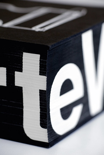
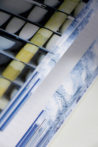
Detail of the printed edges of Every Thing Design, (Hatje Cantz, 2009). The dense, 864-page publication, as thick as a fist, has the dimensions of a postcard.
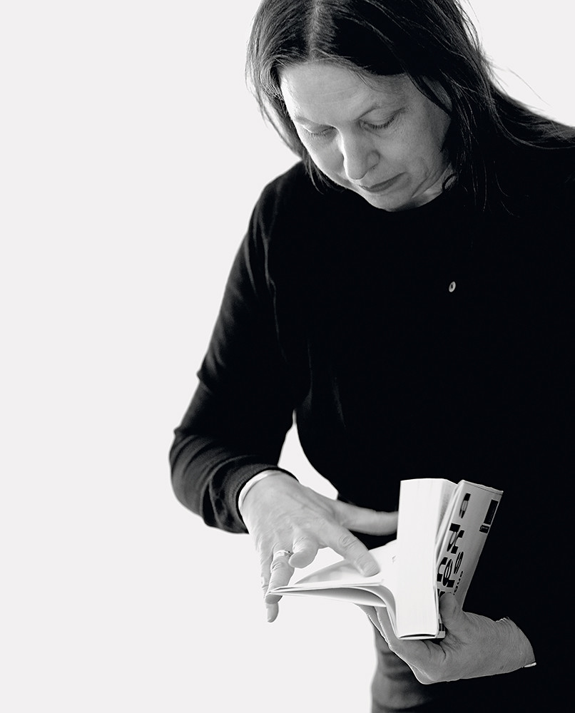
Top: Irma Boom in April 2014, leafing through a prototype for her catalogue for the Venice Architecture Biennale curated by her long-time collaborator and friend, architect Rem Koolhaas. The catalogue was published in June 2014. Portrait by Phil Sayer.
AM: So you don’t only make your own luck but also your own relationships?
IB: It is an intuitive decision if I take on a job. It’s all about trust. If there is no trust, it becomes really difficult. When I lived in New York and I showed my work there, people asked: ‘Why are there are no images on the cover? You need an image on the cover otherwise it won’t sell.’ And I told them that we don’t have that problem in the Netherlands. At that time we had the subsidy system, which gave designers more freedom. Marketing did not rule design. So I knew that it was better to work in the Netherlands. The good thing now is that I have a lot of work in the US. All great jobs!
AM: You must have great confidence to follow your instinct with such dedication?
IB: No, no, no. I’m just stubborn. I cannot do it differently. Stubbornness is an important aspect of what I do. I envision the book, and it has to be that vision. Like with the Nº 5 Culture Chanel book: I’d made it already in my head. I just need the commissioner to say yes.
AM: Yet the stubbornness must be offset by a charm that convinces your commissioners to see it too?
IB: I give a very low-key presentation. I never discuss layout details, I propose a concept. You can discuss a concept, you cannot discuss one centimetre to the left or to the right. I bring the concept down to an abstraction, and the other person can come into that abstraction with their own ideas: it becomes a mutual thought that you can bring to a higher level.
AM: This is what you call ‘The Argument’.
IB: Yes, exactly. I ask a lot of the commissioners, they have to wait … I’m circling my prey for quite some time and then I attack the idea and I don’t let it go.
AM: People do know that in the end you will deliver?
IB: Yes, absolutely, I am very reliable. I won’t let someone down. Maybe not in the schedule somebody else made, but I will get it done whatever it costs me.
AM: You have an unparalleled influence on both the design as well as the content of your books, yet I never hear you use the word ‘editorial’.
IB: I do use it, but it sounds pretentious, because I don’t write. I’m on the editorial board of every book. To me, it is such a natural part of making a book that I don’t talk so much about it. I define the structure of a book, discuss the writers, photographers. And I do all the image editing.
I compare it to architecture. I don’t build villas, I build social housing. The books are industrially made and they need to be made very well. I am all for industrial production. I hate one-offs. In one book you can do anything, but if you do a print run, that is a challenge. No restrictions also make it very difficult. I tell my students at Yale, we have to create our own framework. And if the commissioner does not do it, then we have to do it. It has to be comprehensive, otherwise it does not work. I’m absolutely a designer, I’m not an artist. When people say the book looks like an artwork, I don’t think it does. It’s never art – never, never, never.
Whose book is it anyway?
AM: But the books do look like an ‘Irma Boom’. So whose book is it anyway?
IB: I think it is so amusing that, in all matters, experts are expected to express their expertise, but when it comes to design, everyone talks about ‘serviceability’. In the preface to my book [Irma Boom: The Architecture of the Book, 2013], Rem Koolhaas says: ‘There is no “service” in Irma’s industry.’
It’s true, I’m not a service provider. If a designer is used, you see the designer’s ‘handwriting’. Otherwise you can ask anybody. When Otto Treumann was commissioned to design a poster, it looked like a poster designed by Otto Treumann. And when someone asks me to design a book, it will look like I designed it. That is why there are so many designers. It is about making choices and being specific.
Irma Boom: The Architecture of the Book (miniature edition, Lecturis, 2013). This is an overview of Boom’s career with an introduction by Rem Koolhaas and text by Mathieu Lommen. The miniature edition (41.4 × 54mm) has a big brother with identical content: the XXL edition 345 × 455mm that weighs 7.5kg. Each book has a stitched softcover binding and coloured edges, and is packed in a box.

AM: And Treumann chose you for his book Graphic Design in the Netherlands, despite reservations that you might dominate the end result?
IB: I think it was the editorial board that chose me. I was not even supposed to meet him, but I insisted: he is the subject and our meeting added a lot to the book. There is a photo on a spread that Treumann took, of Willem Sandberg and F. H. K. Henrion swimming. People [including Robin Kinross in his Eye 42 review] criticised me for placing it in the book. But those men were so important to Otto Treumann that when he was able to get close enough to take a photo he was euphoric. So the image received a prominent place in the book, because it was so important to him.
AM: So you feel you put Treumann in the spotlight, yet others felt differently. What happens when a book is not well received?
IB: During the design process I shared everything with Otto, but once it came out he would not even sign it for me. I think the people around him felt it was not a good book for him. The fact that it was a softcover was also not appreciated. Except for Anthon Beeke, who said: ‘You bring Otto Treumann into the 21st century.’ So the book lived a quiet life for a few years, until recently it was nominated for an award. Suddenly it was sold out. So perhaps it was not such a bad book after all. For me, the book is definitely one of the most important ones.
AM: Bringing an artist into the new century is also what happened with Sheila Hicks: Weaving as Metaphor.
IB: That’s my best example of what a book can do for a person.
AM: You could argue that there are downsides to a book bearing the stamp of its designer, but also upsides.
IB: In both cases, Sheila Hicks and Otto Treumann, it is the coming together of form and content that makes the books so good. Not only my ‘stamp’ on it. In the case of Sheila, it is her work, the texts, and perhaps also my design, the printing, the binding, the edges. All superb quality … It is a rare thing when it all comes together.
AM: Everything came together for Hicks, but with Treumann some critics did not feel that it did.
IB: I worked four years on the Sheila Hicks book. I made 50 models; we spent time together. We invested in each other, and that is an important part of the success of the book. There was freedom, time. Ingredients lacking in the Treumann book.
AM: Was there a lack of trust in the Treumann project?
IB: The editorial board felt it was weird for me to want to meet Otto. I wanted to make a book together with Otto, but I was not given the chance. But of course I looked him up anyway. Part of the criticism was also that it was printed badly. For the Dutch edition the images were not colour corrected. There was no budget for lithography, and so I held on to the design for three months trying to persuade them to invest in good image corrections, because colour is so important for Otto’s work, but they did not want to do it. After three months, I gave in.
AM: When it comes to someone’s life’s work solidified in a book, the stakes are high.
IB: I found it absolutely horrible, especially for Otto.
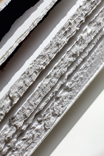
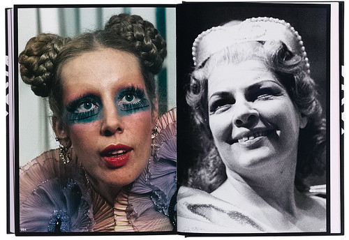
Boom regards Sheila Hicks: Weaving as Metaphor (Yale University Press, 2006), as her best book – an example of what her book design can do for an artist. The page edges were hacked with a circular saw to evoke the fraying edges of Hicks’s textile work – the book’s appearance has been compared to a bale of cotton.
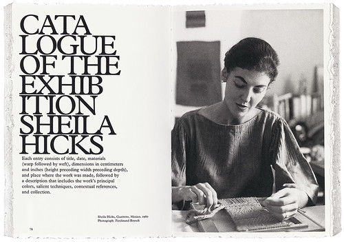
Spread from Sheila Hicks: Weaving as Metaphor, Yale University Press, 2006.
AM: It may be a comfort for some designers to hear that sometimes even a designer like Irma Boom cannot persuade a client to do colour corrections.
IB: Ha, yes. And of course you think that this will never again happen to you but sometimes it does.
AM: It must be difficult that both the success and failure of a book are immediately attached to your person?
IB: It is not difficult, it’s part of the way of working. Success has many fathers, as you know.
I find the Otto Treumann case a good story to tell every now and then, to illustrate how difficult it is to make something for someone. I prefer to make something with a person. The Sheila Hicks book is the other side of the coin, because that was also a long process but the success after publishing was immediately obvious.
AM: The commissioner of the Sheila Hicks book, Nina Stritzler-Levine, had initially fired you from the job but ended up being your best friend.
IB: The fact that she fired me was crucial. I thought she was joking. In Holland, if you are not happy in a situation you talk about it, but there was no discussion. And because I ignored her remark I kept on working on the book. I told myself: I worked already for years on this project and I will finish it. In fact, she helped me to be more sharp, more on the job, and the result is apparent. I fight for what I believe in, but I also know when to give in. But our struggle on the cover took a while. I wanted to make it without an image, and it took forever to agree.
AM: Endless struggle does not sound like knowing when to give in.
IB: Well, I have learned. I know when no is no, but at the same time, when the door is ever-so-slightly ajar, I still go for it. I blame myself – I should make the idea in my head more understandable to others. I can be persuasive though. I also notice when my two assistants try to explain something to a commissioner, and don’t get an agreement on it, but when I call, it’s fine.
But it’s also about the level on which you discuss the work. I don’t talk about red, yellow or green. When someone says they don’t like yellow, there is no way I can argue with that. When you can really discuss things with someone, you work with them. And I love that. With the Treumann book I felt that I had worked with him, that I had made something that was complete and right. That was why there was such an enormous hangover for me. It felt like a complete deception. But even though in the end the book did get credits, I blame myself for not having handled it well enough.
AM: In the end, no matter how closely you work with a person, how the collaboration is experienced might always remain speculation on both sides.
IB: With the Sheila Hicks book, the production had been so complicated (the binding had to be done twice) that I did consider not going to the launch. But when it was finally perfect and sent to New York, Sheila and Nina called and said it was such a beautiful book, I had to come. And I felt like saying that it had always been that beautiful book only they never understood it. There is that point of trust. You can visualise everything but at some point you just have to trust me and let me do my thing. But that trust is not given automatically; you have to earn it every time, again and again.
AM: Now that you are working more internationally, is that trust literally stretched further and thinner?
IB: I have always worked internationally. I’m abroad every week. I usually take the first plane in and the last plane out, so that I’m only gone a day. And I use that day for intense conversations about projects. The personal meeting is still the most valuable. You can email and call as much as you want and think you understand someone but there is nothing like personal contact.
AM: Your commissions seem to rise in status year by year. How many times can one re-invent the book? When someone at Chanel famously responds ‘C’est génial’ to your proposal, that sets the bar high …
IB: I walked around with the idea of the Chanel book in my head for over a year. These days people come with a certain interest and expectation. I don’t know if I can deliver every time. I am so much driven by the content. I will refuse a commission where they ask for ‘a special book’. It is paralysing. With each book I make, I ask myself what it is and why we should make it in the first place. The argument that I develop for myself often becomes the argument for the book, and leads to the idea at the heart of the book.
Represent Royal Tichelaar Makkum (010 Publishers, 2010), is a celebration of the ceramic manufacturer Tichelaar Makkum, the Netherlands’ oldest company. Here Boom employs decorated page edges and borders, based on a tiled pattern by eighteenth-century artist Cornelis Bouwmeester, to add colour and texture to the book’s spreads, as well as to the closed book.
The digital age
AM: Do you see the options for printed work dwindling?
IB: Absolutely. But what is good about it, is that there are so many books that are not worth printing. I am very happy with the e-reader and e-books – though I would like to challenge everyone who thinks that it is more sustainable to read on an e-reader than on a printed book, to consider the energy that it costs. I embrace digital technology because it enables me to make the books I make.
Take the SHV book, a landmark book in my career. It was made in the time between BC and AC (‘Before Computer’ and ‘After Computer’, to quote Massimo Vignelli), and you can see that it is based on the Internet: browsing through thousands of pages, no page numbers, going in and out, the endless zapping past images. Actually, we did not know it was even going to be a book when we started. The assignment was to ‘Look for the unusual’, and a book was usual at that time. But the book concept and structure is unusual. At first we thought we should make a CD-ROM, which was very hot at the time, but we knew we would be working on the project for five years – imagine how the world would have changed by the time it was finished. Now I’m very happy we made a book, because it can still be ‘read’, even in 500 years.
If you make a container, which a book is, it is not changeable. Online, you can change something at any time, it is in flux. But in a book the moment becomes frozen in time, like a photo or a painting. It becomes something to look back to and reflect on.
AM: Have people ever commissioned you to design a digital edition? Or not just the edition, but to design the entire device?
IB: For the 1001 Women book [1001 Vrouwen uit de Nederlandse Geschiedenis, 2013], we did it the other way around. There was a website on 1001 fascinating women in Dutch history, but it had had almost no visitors in twelve years. And then we designed the book with almost the same content and it sold out in the first week. It took the author Els Kloek and me three years to find a publisher. The success was unexpected – 20,000 books sold in total. But sometimes it works the other way around. It might not work as a book, but it works like hell online. I am always asked to design a digital version of a book that I work on. And I say yes, let’s do it, why not? But first I design the printed book, so I know what it will be. It is a question of curiosity; if you don’t have any curiosity in anything, then well, what do you do?
AM: But the architectural aspect of your physical books is missing in digital.
IB: Yes, but you have the architecture of information to investigate. And that is interesting. It can inspire me in new ways.
AM: Should someone at MIT Media Lab wake up one morning and think: let’s invite Irma Boom for a collaboration?
IB: They should – write that down!
AM: Do you think that you could design something that challenges digital in the way you challenge the paper book?
IB: You are holding your iPhone while you say that – it is super friendly, but if I look at the bookstore app it is a very old-fashioned representation of the book and the bookshelf. There could be more inventiveness.
More books than ever
AM: Can you imagine retiring?
IB: I think I will die behind my desk, cutting and gluing a book. That’s what I hope.
AM: People down the street will start to wonder: we haven’t seen Irma in a few years…
IB: And I will be right there, my head resting on the book.
AM: If you think about the next phase in your career, could you imagine consulting with technology companies?
IB: That would be fascinating. I’ve been doing a lot of different things lately: textiles with Knoll in New York, the identity for the Rijksmuseum, a 110-metre long tunnel [at Amsterdam’s Central Station] with 75,000 tiles, and a curtain for the UN headquarters in New York. They are very different projects but I work with the same intention.
AM: Is there also something that you would like to do, just on your own?
IB: I’m like the shoe repairman whose own shoes are always in bad shape, but for years I have been working on a book on books. Not specifically on my own books but on books in general. We’ve now set a date for next year, but there is always a new interesting job coming up.
AM: How would you sketch the future of the book?
IB: The book has a great future. In the statement in my little red book [Irma Boom: The Architecture of the Book] I talk about the renaissance of the book. It is already happening now. But I’m still surprised when I’m speaking or teaching somewhere, that students are still so much into books. When I conclude my talks at Yale I tell the students why I make books and why I will continue doing this for the rest of my life. If you go into the Yale archives you will find books that former students made in the 1950s, they are still there. But a CD-ROM with files from the 1990s, you cannot access it anymore. The book becomes more valuable in the digital age.
AM: When you make beautiful books, you attract people who love beautiful books. When you go to a magazine launch, you find people who are crazy about magazines. We each have our own self-affirming tribes. Do you get enough criticism? Is there someone who calls you out?
IB: I wish they did. I don’t think it happens enough. At a recent event, Massimo Vignelli claimed ‘The book is dead’. [1] He challenged and teased me. So at the end of the book on my own work, I state that ‘the book is dead, long live the book.’
AM: Is saying ‘the book is dead’ really sharp criticism? Would it not be more challenging for you to see if your way of working holds up in other media?
IB: I was shocked when Massimo repeated that sentence, I read it everywhere. But the printed book does not need any defender. It has survived 600 years or so. The way information spreads depends on the inventions of that time; paintings have survived, photos, and the book is another form.
AM: Other criticism of your work might stem from the fact that your career is held up as an example to students today, for whom it will be almost impossible to follow in your footsteps.
IB: Why not work in print? Of course, options are shrinking. If you choose a paper from a swatch book, 90 per cent is not available any more. Once a printer or binder disappears, you can’t bring them back. And to me this is a burning question. We still have such a great graphic industry, and I want to be able to produce my books locally, to control the printing and the binding process. It would be such a shame, especially if projects are paid for with community funds, to go to production in China, where somebody presses a button without even knowing what they are working on.
AM: That ties in with the growing popular sentiment that more things should be produced locally.
IB: A book produced in China takes six weeks to get here. It takes two weeks to make something, and it’s on a boat for six. Give me that time to work on it and make it better.
AM: So we should hope that when the desire for locally produced products transfers to printed publications, the producers are still there?
IB: Everyone says that we should go digital, but at the same time there are more books than ever. The Sheila Hicks book for example, is my manifesto of the book. The book is such a strong way to communicate work. If I go to Yale, and people have the Sheila Hicks book, I ask them if they are interested in weaving? They say no, it is the book. And then I tell them to read the text, and look at the works. Interestingly enough, the publisher said that there should be an image of her work on the cover. But I told him that actually, there should not be an image on the book, because Hicks is an interesting artist who deserves a bigger audience, and therefore we needed a more abstract cover. And it worked!
1001 Vrouwen uit de Nederlandse Geschiedenis (1001 Women in Dutch History) ed. Els Kloek, designed by Irma Boom (Vantilt, 2013), is an example of content drawn from a website that had greater success as a printed, physical book. Monochrome sections, printed black on pink paper for the text, are interspersed by five colour ‘interventions’ on gloss paper.
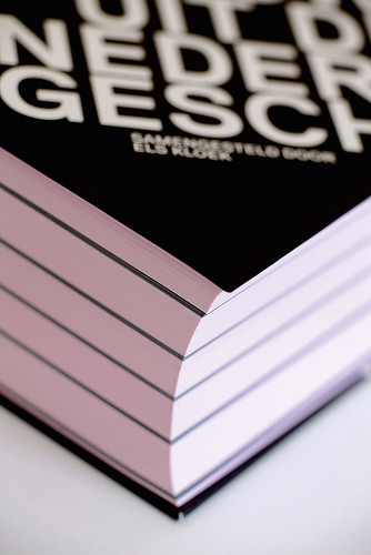
The book is an exercise in contrasts: fragile femininity shines through its thin pink paper, while a strong black hardcover ties it all together. By juxtaposing portraits of women from different ages on its glossy spreads, differences and similarities emerge.
Endnote
1. Massimo Vignelli died on 27 May 2014, after this interview took place.
Anne Miltenburg, writer, designer, The Hague
First published in Eye no. 88 vol. 22 2014
Eye is the world’s most beautiful and collectable graphic design journal, published quarterly for professional designers, students and anyone interested in critical, informed writing about graphic design and visual culture. It is available from all good design bookshops and online at the Eye shop, where you can buy subscriptions and single issues.