Winter 1999
Reputations: Jean Widmer
‘Signage reflects both the complexity of space and the way a place is organised. And it is very satisfying’
Jean Widmer was born in 1929 at Frauenfeld in Switzerland. He studied at the Kunstgewerbeschule in Zürich, where he was influenced by the teachings of Johannes Itten. In 1952 he came to Paris to study lithography at the École des Beaux Arts. He worked in an advertising agency before becoming art director at the department store Galeries Lafayette in 1959. In 1961 he moved to the fashion magazine Jardin des Modes, where he stayed for eight years. His page layouts took the form of scenarios which integrated photographic images and typography in a playful way.
His work for the Centre de Création Industrielle (CCI), which opened in 1968, marked a radical change in his style and the projects he undertook. He turned to simple designs, basic forms and minimalism. This desire for simplicity can be seen in his posters for the CCI, as well as in his pictograms for tourism signposts in the 1970s, and his analytical work for French motorways signs (1978). At a time when painted posters dominated the Gallic graphic design tradition, Widmer’s rationalist approach was innovative. Together with Adrian Frutiger (see Eye no. 31 vol. 8) he was part of the first generation of Swiss graphic designers in Paris.
In 1970 Widmer established (with his wife Nicole) the studio that subsequently became the design agency Visuel Design. Since the beginning of that decade he has worked on public realm projects such as the aforementioned road system, and on visual identity and signage for cultural institutions that include the Centre Georges Pompidou, the Musée d’Orsay, the Institut du Monde Arabe, the Conservatoire national supérieur de musique et de dance in Paris, the Cité de la Musique, the Jeu de Paume and the Bibliothèque Nationale de France.
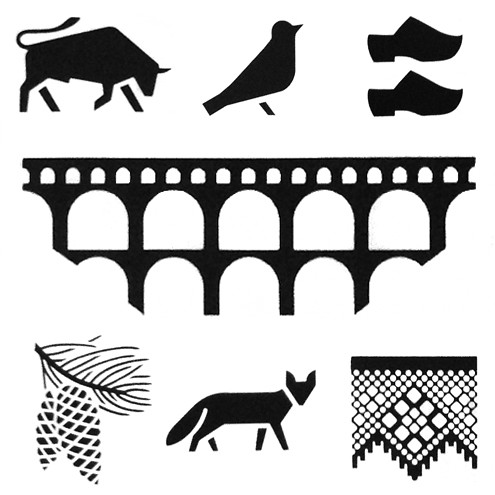
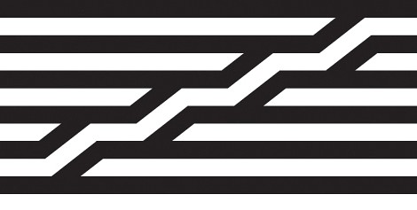
Roadside pictograms for tourist amenities, 1970s.
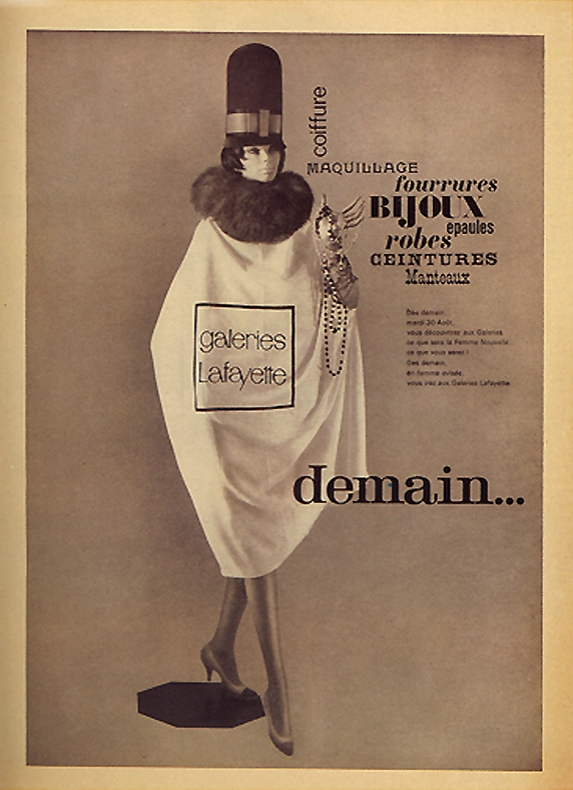
Top: Magazine advertisement for Galeries Lafayette, 1960. Photograph: Beni Trutmann.
Ursula Heid: What made you decide to join Galeries Lafayette?
Jean Widmer: I saw the shop as a place for the general public. I’d just returned from a trip to New York, where department stores entertained people. I felt something completely different there and wanted to introduce it into France, where the big shops at the time were still printing catalogues of their products.
So for each advertisement, I created a sort of story which related to the event or exhibition. I saw things photographically. A design based purely on type would not have conveyed such a sense of joy. I tried to avoid banal ides. Even today they still always show couples in ads, whether it’s for a mobile phone or an insurance policy.
Unfortunately they always rejected my best work. So left to join Jardin des Modes.
UH: Did they give you more freedom there?
JW: They went along with all my ideas, except one or two when I went a bit too far – or perhaps I was just ahead of my time. I drew on the bodies of girls wearing bathing costumes. The editor was a bit conservative and rejected the idea.
I worked closely with the photographers, and we had a lot of fun. Once, at a party – I had just got back from Japan and had brushes and ink with me – I started drawing abstract signs with some friends. We watched how they evolved in the most fantastic way as we consumed more and more alcohol. Later on, when I did my page layouts, I superimposed the drawings on the photos.
UH: Were you in contact with other magazines or artistic directors?
JW: There was a kind of competition with the other artistic directors. Peter Knapp was at Elle, Henry Wolf at Harper’s Bazaar, Otto Storch at McCall’s. It was very stimulating. You knew all the others were doing interesting things so you really had to prove yourself. My only problem was with our format. At the time, Jardin des Modes was much smaller than the others. It was only later that it moved to a larger format.
UH: You gradually developed a more rational and minimalist approach to graphic design.
JW: It began in 1968 with the page layout for a collection of clothes. I didn’t use a set. I asked the photographer just to use coloured squares, and I thought it worked out very well.
In France at that time people were just starting to talk about design. François Barré and François Mathey appeared on the scene, organising seminars on design, which I published in Jardin des Modes, and then founding the Centre de Création Industrielle. We were asking how design could help industry in France. I had been interested in design for some time and always read the magazine published by the Ulm School of Design.
UH: So you gave up the world of fashion and started to create a series of posters for the CCI.
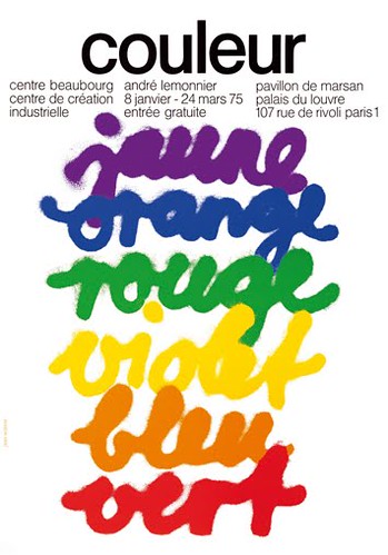
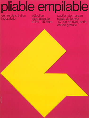
JW: I stopped thinking photographically and turned towards design, basic forms, visual identity. The CCI was originally set up at the Musée des Arts Décoratifs, before later moving to the Centre Georges Pompidou, and my idea was to create a contrast with the ‘decorative’ aspect of the collections. I refused simply to reproduce an object or the details of an object. I wanted it to be about the essence of design. The bottom part of the poster, where the picture was to go, was divided into nine squares. Abstract forms evoked the themes of the different exhibitions: the sun, for ‘En plein air’; a folding form for ‘Pliable empilable’, floors and walls for ‘Sol et mur’. And because we had a limited budget, at the printing stage I re-used the forms, rotating them to get new shapes. Everything was modular. The poster became a creation in its own right. In the end, for the exhibition on colour, the concept even extended to words written in spray paint.
UH: You had been teaching at the École des Arts Décoratifs since the 1960s.
JW: At that time, teaching methods were still very traditional. Jacques Adnet, the director, asked me to run an experimental course. I developed a form of teaching that was slightly in the style of the Bauhaus. I had always been interested in basic and fundamental design, and the relationship between two- and three-dimensional design. I was also influenced by Max Bill, his simplicity and reflection of all that was pretentious. I tried to give the students some basic tools: a good knowledge of typography; an eye for proportions and contrasts; and a conceptual way of looking at things, so that they did not take the subjects simply at face value.
Poster for the exhibition ‘Couleur’, 1975, Centre de Création Industrielle.
UH: How did you get into signage?
JW: My first job in this field was for tourism and cultural signposting on the motorways. The architect Henri Nardin got in touch with me because he had seen my posters for the CCI. Nardin wanted to inform people about the region they were travelling through. But his programme was very complicated; he approached the problem as an architect. For example, he showed little exhibitions at the motorway service areas, but they did not work very well. They were too busy. I said I thought that the pictograms would be a good idea. Because most people would be seeing them at 130 km per hour or more, the signs had to be very simple. At first I tried combining three pictograms with a caption, but you cannot really use the two at the same time. So I separated the elements. The picture asked a question, and 300 metres further on the text gave the reply. Both the management and the public reacted very favourably.
UH: You then moved on to a study of conventional motorway signs. You were part of a small multi-disciplinary team which included the semiologist Henri-Pierre Jeudy.
JW: Jeudy helped us formulate our criticisms. It was an enriching experience. It was important to convince management in a ‘scientific’ manner. With the help of visual demonstrations, we explained to the decision-makers that there were objective optical factors that played a role in how easy it was to read the signs. Letters with open forms are legible for longer than those with closed forms, when they are seen at a distance or from an angle. If they are well spaced, the letters remain distinct, but if they are set close together, the words start to blur. And in the 1960s the fashion was for too close-spaced type. Then there has always been a battle between capitals and lowercase letters. I think lowercase letters. I think lowercase letters are more legible, because they give an individual rhythm to the words.
We also questioned the idea of having a border to a road sign. Was it really necessary? We decided that it was important at night because it defined the edge of the signs and so gave important information as to its position with respect to the side of the road. It was with this study that I really learnt about signage.
UH: You analysed and compared roadsigns from all over Europe.
JW: When we compared the different systems we found a real mess. Everyone had different codes and colours. In some countries the signs for motorways were blue and those for other main roads green. In other countries it was exactly the opposite! And it is still the case today. Or take the signs above motorway lanes which indicate that you should continue straight on. In Italy and Germany the arrows point upwards. In the Netherlands, Britain and Switzerland they point downwards. Which is right? The exit arrow is even worse. It is at an angle sloping more or less towards the top or the bottom. In France it pointed down towards the grass verge rather than to the exit sliproad. Sometimes the use of arrows on roadsigns can even become dangerous. In France at this time the message was framed by two arrows, which could be very confusing for the driver; an arrow represents a direction of travel, and here it no longer corresponded to the path the car would actually take. The fact that there were no lines on the road made the situation even more dangerous.
There was one particular stretch of road where there were frequent accidents. I spent a lot of time there to observe what was happening. Over quite a short distance there were two bridges and two exits. The bridges made it difficult to see the various signs, and people unfamiliar with the road could not figure out where the exits were.
So I suggested they signal the two exits in advance, at a distance of 2 kilometres and again at 1.5 kilometres. And I designed the signs in lower case rather than the usual capitals. Given the problem, people did not really notice the fact they were in lowercase, but the signs created a precedent and after that I was able to use lowercase everywhere.
The main problem we faced was in the application of our proposals. When I went to view the signs on site I could see that they had been made by people who were not professionals. They did not position the type accurately, they pain no attention the spacing. I even saw letters that were the wrong way round! They paid us a lot of money to come up with the ideas and then made no effort in their implementation, despite the fact that we gave them precise instructions. It was very disappointing.
UH: France seems to have fallen behind. Other countries involve graphic designers in this area.
JW: I think graphic design was a little behind the times in France. There were type foundries and poster designers. There was Cassandre. As regards typography, there was a little apart from the classic typefaces, and while they were very elegant, they were not designed for signage. On the motorways they used a bastardised form of lettering supplied by a manufacturer in the States, and they applied by engineers. The term ‘graphic designer’ did not exist. There were only ‘poster artists’ and ‘commercial artists’. Logos were just entangled monograms, there was no sense of simplicity or stylisation. Minimalism did not develop easily in France. When Frutiger came to Paris in the 1950s he immediately had his work cut out! It was at that time that things started changing.
Foldable poster for the exhibition ‘Pliable empilable’ (Foldable stackable), Centre de Création Culturelle, 1970.
UH: Do you think that signage design is linked to fashion? Do road signs need to be brought up to date after a while?
JW: I do not think the typography falls into that category. The types we chose and used for the motorway signs were made to be easy to read. We used Roissy, the font made for signs at the Paris airport. (which was redrawn for filmsetting became Frutiger). However, I think that for tourist signs you could, if you wanted, redo the message or express it differently after twenty years or so.
UH: You said that in the 1960s there was a tendency to use tightly spaced type. Was that a fashion?
JW: Yes, it was. Today we tend to space type more, and not only to make it more readable. Is there a fashion? I’ve always thought of France as a country of fashion. I’ve heard it said that the French are ‘multisensuels’. It is not a criticism, I think it is probably just a characteristic of the Latin temperament. The new trends from Switzerland, Holland and Poland were quickly adopted in France. Trends in typography were being discussed in the 1940s. There was the fashion for Helvetica, and then Baskerville for newspapers. Today there is a fashion for DIN. Is graphic design linked to the creative expression of a particular time? All forms of expression reflect their era. Art, music. I am aware of this. But I try to create things that last. That is my aim.
UH: You worked in the fashion world. Was this already your aim when you worked at Jardin des Modes?
JW: Many of the things I did at Jardin des Modes are still done today. It is the clothes that are no longer in fashion, or the objects in the photos which give away the period.
Logo for the Centre Georges Pompidou, 1974.
UH: Do you have a favourite project?
JW: It is probably the Centre Georges Pompidou. I was really in tune with that one. We had to go through three stages of competition to get that project. Then we were working on an entire system, signage, visual identity. But it was not always easy to get people to accept our ideas. For example, we made all the signs vertical, which was strongly criticised at the time. The first director accepted it, but a couple of years later the next one took them all down and put up horizontal signs.
UH: So relations with clients – these big cultural institutions – were not always easy?
JW: When I have an idea, I like to keep it intact. Sometimes clients insist on changes. You are never completely free, but you can generally impose your ideas. But if the clients give good reasons for a change, I will work on the idea again. It’s a dialogue, and it is not always easy to hit on an idea that makes both sides happy from the start. For example, my original logo for the Centre Georges Pompidou was made up of five horizontal lines with a kind of caterpillar crossing them diagonally. The clients said that one floor was missing, despite the fact that I’d said it was a sign and not an architectural drawing. Someone else said: ‘You’ll have to close the sides of the logo, or people will fall off.’ All these comments stem from the psychology of the people themselves. But at the end of the day, the public would not have noticed the difference between five or six floors in the sign, and there are enough clues to get the feeling of the diagonal escalator.
UH: There was even talk of abandoning the logo in favour of a purely typographic identity.
JW: Everyone knows and recognises the logo, so it was important to keep it. A logo, whether it is on the back of a book, the hard hat of a construction worker or a pencil, has a completely different impact to type on its own. A logo can convey much more than what is actually shown. For example, if you put a cross on a grace you know someone is buried underneath. For an institution like the Centre Georges Pompidou, which has many different departments, it is important to have a symbol that links them all. You cannot give an overall picture with names.
UH: How do you work with the architects on a signage project?
JW: With the Musée d’Orsay, a project we did in collaberation with Bruno Monguzzi, we worked closely with architect Gae Aulenti. In this sort of work, the graphic designer is more than just a graphic designer. The problem is that we come in at a late stage, and often the way the visitor will move through the exhibition has already been worked out. The architect is interested in the space in its own right, while the graphic designer is more interested in the flow of people, the way they visit the museum. Signage cannot correct a badly conceived itinerary. For aesthetic reasons, the architect had concealed a stairway. We refused to put up a huge sign with an arrow to draw attention to it, when it was more logical to make the stairway more visible.
UH: You once said that when you were a student Johannes Itten asked you to taste a lemon to experience the colour yellow. There seems to be something of that in your signage work – speaking directly to the senses.
JW: You really have to immerse yourself in the various routes to and through a building. Orientation doesn’t work with signboards; for example, a change of material on the floor can indicate a boundary, or a ‘path’ in a different texture can lead towards an entrance. Signs need not be placed on stands or walls; they can be incorporated into the concrete itself. We try to find a rapport with the material used in the building.
UH: What role does psychology play in signage?
JW: Everything depends on the psychology of the user. A museum would not have the same direction signs as a motorway, for example. It is a more relaxed situation, an outing, and the signs are part of that experience.
In two other projects I looked at the question of anxiety. The first was the multi-storey car park at the Gare de Lyon railway station in Paris. The bigger the parking area, the more anxious people are. The space was painted entirely in white. Each floor was indicated by a motif such as a rabbit or a plane. Most people’s memory is more visual than numeric. The second time was for a tunnel. People get worried when they are underground and like to know how much longer they will be there. We visualised the passage of time by putting numbers on the walls which showed exactly what distance was left to cover. Knowing exactly how far they had left to go made people relieved, and also helped to pass the time.
UH: Where do you think signage stops and architecture starts?
JW: Graphic art is important in signage, but we must think beyond that. We need to be practical and ask ourselves whether we can do things another way, or better. What can we improve on? For example, at the music conservatoire in Paris there was a wall of pinboards that was very ugly. The space was beautiful and so the cork boards they used were out of place. We had to do something. So we suggested a grid of large clips that couple hold A3 and A4 formats. It wasn’t a request from the client. This is the start of design.
UH: What attracts you about working in signage?
JW: There are a number of things that are interesting: working with different materials, with space, and choosing how to set up the signs. But signage projects require analysis on many different levels. The creative aspect only takes up about ten per cent of the time.
Signage is interesting when it is varied, when it answers a variety of functions. Signage reflects both the complexity of space and the way an institution is organised. It is the link between the two. And then the monumental and lasting aspect of the work is very satisfying. It must be awful in advertising because things change all the time.
Logo, 1987.
Translation by Glynis Crook
Ursula Held, graphic designer, Paris
First published in Eye no. 34 vol. 9, 1999
Eye is the world’s most beautiful and collectable graphic design journal, published quarterly for professional designers, students and anyone interested in critical, informed writing about graphic design and visual culture. It is available from all good design bookshops and online at the Eye shop, where you can buy subscriptions and single issues.