
Summer 2000
Reputations: Lorraine Wild
‘The space is configured to the work I want to do. Maybe it has to do with growing up in Detroit, where garages are the site of great creativity (both automotive and musical)’
In a Los Angeles neighbourhood, behind a typical 1920s “Spanoid” bungalow, is a one-car garage wired with four phone lines. It is in this “electronic cottage” that Lorraine Wild (and her associates) do something on par with inventing the future while constantly facing the veracities of everyday life. Charles Ray or the Museum of Modern Art one moment; a wild menage of two-year-olds the next. This place reflects what it means to Wild to have an interesting career shaped by a meaningful life and vice-versa. And it is from here, in the late hours of the day, that Lorraine, only a few blocks from Louise, emails her replies to this interview.
Wild is the designer of over 70 notable books and exhibition catalogues on architecture, art, photography and other cultural topics. After graduating from the Cranbrook Academy of Art with a BFA in Graphic Design in 1976, she moved to New York where she worked at Vignelli Associates. While in New York she became increasingly interested in American design between the wars. Her research eventually led her to graduate studies at Yale University where she received her MFA degree in Graphic Design in 1982.
Following Yale, Wild taught at the University of Houston, while continuing to write and beginning to design books. In 1985 she became Director of the Graphic Design Program at California Institute of the Arts (she stepped down from the position in 1992, but still teaches there). She was a founding partner of the Los Angeles design firm ReVerb (see Eye no. 14, vol. 4 Autumn 1994), who were recognised with a Chrysler Award for Innovation in Design in 1995, but left the following year to start her own practice. In 1998, she was the subject of an exhibition “Lorraine Wild: Selections for the Permanent Collection” at the San Francisco Museum of Modern Art. Her work has received numerous honours: many AIGA “50 Books” awards, citations from the American Association of Museums, the American Institute of Architecture; and she was in the first group of designers to be recognised in ID magazine’s “Top 40” list, in 1993.
Wild has continued to produce extensive writings and lectures that have been influential in shaping contemporary dialogues and debates concerning graphic design, writing for publications such as Emigre, Frieze and Eye. She has served on the national board of the AIGA and the STA (Society of Typographic Arts, now American Center for Design). Wild currently juggles teaching, writing, lecturing and running a thriving design studio with being a parent to her young daughter, Ana Xiao-Fei Wild Kaliski.
Louise Sandhaus: People know you as an educator, writer, historian and practitioner – probably in that order. Is that how you see yourself?
Lorraine Wild: I think of myself as a designer first, and I always have. I’m a designer who teaches and writes.
LS: Kathy McCoy once referred to you as Lorraine Wild Industries – it was a poke at your numerous involvements at any given moment. Yet you just work in the garage behind your house.
LW: There’s something very comfortable and productive about the garage. Being there has as much to do with adjusting myself to the realities of being the parent of a very young child as it does to the analysis of what is – and isn’t – necessary for the production of interesting work. It is somewhat of an anti-office in that it’s not about giving oneself over entirely to maintaining the overhead of the contemporary corporate standard of design production. The space is configured to the work that I want to do. Perhaps it has to do with my upbringing in Detroit, where garages are often the site of great creativity (both automotive and musical), or the influence of my teacher, Paul Rand, who worked out of his kitchen for years.
LS: Can you explain how you design?
LW: My design process has changed over time. I used to do more research and now I’m more intuitive. I’ve gotten better at understanding the materials that I am given to work with by writers, editors, curators, artists and architects, etc. I have always been conscientious about knowing the material, but now I’ve accumulated a library in my head which helps me read the larger context that surrounds the subject I’m about to work with. (I’m speaking very specifically about books here.) And I cannot underestimate the importance of my design associates and our exchanges of ideas as we produce the work.
Design is hard, but it does become a more comfortable activity with repetition. I don’t know if it is even visible to anyone else, but in my work I am often trying to make a very functional thing, but also to come up with a solution that possesses some sort of ineffable quality, or “soul.” This means devising a formal response to the content that comes out of a real appreciation for the subject, with some subtlety, I hope. While I try not to be too obviously “formal,” I am always trying to create an overt visual narrative to pull the reader toward the content. To me, building those narratives is both an editing and a design process.
LS: So the visual narrative is a level of interpretation you add, and one that allows for additional meaning or understandings of the book’s subject-matter: form and content in a pas de deux. This might explain why books in which you’ve had a hand seem greater than the sum of their parts – I guess it’s the quality you refer to as “soul.” Can you give an example of a project where this approach was particularly successful?
LW: A recent book is Height of Fashion. Lisa Eisner and Roman Alonso (my partners in publishing company Greybull Press) and I sent out letters to several hundred people asking them to submit a photograph of themselves at the point in their lives when they thought they looked fabulous. And that is all the book as made up of, with identifying captions and a few quotes.
Sequencing the images was the problem, and there were a hundred legitimate ways to solve it. But in the end I had to choose to tell a story with those pictures: in this case it’s a wobbly narrative between what is conventionally beautiful and what is strange. The push and pull between those two extremes drives the book forward: you need to keep turning the pages.
LS: What else differentiates your work from traditional book design?
LW: There are ways of designing perfectly competent, even beautiful books where the visual design relates to the subject only tenuously. That kind of book design is driven by the tradition of books. I was never that interested in (or even that knowledgeable about) the traditions or conventions of “fine printing” – my Modernist upbringing made me much more interested in extremes of both art and industry. I only design books that I think are worth the work, and I accept the restrictions of the marketplace so that the books can be accessible to the public. I’m always interested in good typography and good printing, but what constitutes good design is – to me – always in flux.
There are no two characteristics about the books I design that are the same (except for the paper), which is why I find most of the “authoritative” books on book design to be so curious. So many of them seem to centre on proportional voodoo or typographic formulae that are applicable in general, but which bypass the specific. And which subjects are best served by that? I’m almost only interested in the specific. On the other hand, I guess there is always a point in one’s career where a little proportional voodoo can’t hurt.
I’m completely conscious of how anachronistic “book design” sounds. As we say in LA, it is “so not” Web design. Yet – the challenge to old media by new media throws everything about print into high relief. One has to have really good reasons for producing more print: the functional and aesthetic issues are all the more critical and alive.
LS: You’ve done several projects with artists and architects that are more like collaborations than autonomous design experiences. For example, for twelve years you have been working closely with Tom Mayne of [architects] Morphosis, resulting in some exceptional books. How does the process work in these situations?
LW: In the artists’ or architects’ monographs, even though I’m the designer, my sympathies are with them. At the onset of these projects I try to make clear that my design agenda for the project cannot be that different from theirs: I’m there to translate their ideas into print, and however I do that has to feel as though it has come up through the work, (or through the collaborative process of designing the book) rather than seeming imposed from the outside.
The Charles Ray book is a good example. I looked at the books that had already been published about him, and it was clear that none of them adequately represented the very thing that he works with, which is scale. I brought this analysis to the curator, the artist, and the publication director at MOCA, [the Museum of Contemporary Art, Los Angeles] and they agreed with my initial idea that we should make a large-format book. I also proposed that the design of the page would be driven by the use of a badly proportioned text block – one that is too small for its page. Ray accepted that idea but we then spent a lot of time tinkering with how subtle that mis-fit would be, and I know that the book is better for all the back-and-forth that we went through, at his insistence, on that one aspect.
LS: Given that you are known as a book designer, do you feel cramped by that definition?
LW: Of course I’m capable of many other things, and it’s frustrating that we now work in a time when the notion of what kind of designer can handle what kind of projects is so incredibly rigid. The fact that my practice is small, in this business climate, means that I get cut out of a lot of interesting larger work. My strategy to keep involved in other types of projects is by working in partnership with other designers who have larger practices or who have niches that are different to my own. Last year, for instance, I collaborated with William Drenttel on an identity study for the Museum of Modern Art: I learnt so much from both him and the client in the course of that project. It’s my version of continuing education.
LS: Where do you see your practice going?
LW: I’m always trying to expand my involvement in the projects that I am commissioned to design at earlier stages. Through my association with Greybull Press I have a chance to initiate book titles, and that’s great. And then there are the temporary partnerships with other designers.
But in the long run, you cannot avoid the issue of how you want to shape your work in relation to the existing market, and in relation to one’s own ideals of aesthetic, intellectual, and/or financial independence. As exciting as the large office/overheated business climate/corporate design practice model is, it doesn’t work very well for women who are or would like to be mothers, or anyone who would like to have a life, for that matter. I have to build something that is much more flexible and collaborative, even familial. The associates in my office, the clients we work with, and the exchange of ideas that circulates among us is all the more critical to that ongoing practice.
LS: How does that compare to the direction in which you see graphic design going as a profession?
LW: Well, obviously, a lot of designers are happy to participate much more fully in the corporate model of practice – I’m a bit of a drop-out, comparatively. The only time I begin to feel “out of it” is when I think about how drastically the landscape of the graphic design has changed since I began to participate in it in the mid-1970s. Back then, all designers seemed to be middle-aged men, in New York, Chicago or the West Coast, who sort of all knew of each other and who generally supported an ideal of something called “good design” that was never fully articulated.
Now the number of people who practice graphic design (whether or not they call it that) has increased hugely. The field is geographically diverse, pluralistic, democratic . . . not so ingrown. We are told that the business world now realises that we are essential and that there is strength in numbers. But that has come at a price: a fracturing of the design community into sub-groups, like narrowly focused chat rooms, with little general dialogue or agreement on common goals or anything so antiquated as “good design.” It’s probably abstract to younger designers, but I find it a bit disorienting. Everybody’s doing it, but nobody’s home.
LS: Despite the demands of your practice, you still teach. As a graduate put the question: “With the obvious lack of financial incentive, what are the consistent rewards of teaching that allow you to maintain your enthusiasm?”
LW: My reasons are selfish, especially in the face of that de-centred, quasi-profession I describe. School creates a community of teachers and students who have agreed, at least during the hours that they share, to dig into the process of design much more deeply than can ever be accommodated within the world of practice. It is a very satisfying counterpoint to the rigours of everyday production. My colleagues are constantly challenging, and students expose me to things that I would never see otherwise. I would even call it a luxury, except that it requires too much work.
Implicitly, teaching design is somewhat political, in that we continuously insist that graphic design is a significant social and cultural activity, with a history and a future that goes beyond the current dictates. There are more than enough designers servicing that quotidian reality. I serve it as well, since school does provide a measure of “R&D”, but in a way (when it is done right), that not only serves the state of the art but also takes a longer view, becoming more experimental, analytical, predictive and more intelligent than the marketplace has necessarily bargained for.
LS: In an early article in the ACD Journal, you laid out significant principles of undergraduate design education as follows: “History has shown us that the best graphic design is synthetic – it is the work that makes imaginative connections between different disciplines or modes of thought that we always admire. If we expect a student to ‘make form a meaningful thing’ then the student has to understand, in the first place, the importance of meaning, and secondly, the means by which meaning is conveyed. Finally students must see themselves within the historical continuum of visual and verbal communicators.” Has anything changed in your thinking (or in the cultural conditions of practice) that would make you change or amend these ideals?
LW: That was written pre-digital and pre-new media. I think it is now all the more relevant and desperately necessary.
LS: As a historian in the 1980s you challenged the motivations behind contemporary visual form of the time. Your provocations opened the way for a revolution in graphic design – what became the strategies and visual languages associated with postmodernism, which then became “Cranbrook,” “CalArts” and “David Carson” styles. New stylistic conventions were not the objective, but where it seemed to end up. And now nobody seems to know what to do except run in the opposite direction: neo-Modernism. Where are we now?
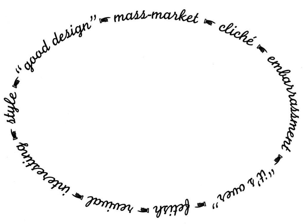
LW: First of all, let me pay my allegiance to form. I love form, sometimes for good reasons and sometimes for bad: if I didn’t, I couldn’t function as a designer. And one of the things I love about form is how once someone invents something that is visually interesting, other people pick it up and it becomes a style. It is chic for graphic designers to say that they abhor style, but that is one of the bigger shibboleths of design. Style – the invention of it, its proliferation to the point that it becomes cliché, its death and its inevitable revival – is a sign that design is alive over time. I have invented a chart called the “Great Wheel of Style” (or the “Life Cycle” or “Tao” of style) to try to describe this relentlessness: it’s amazing that designers think they can avoid it!
So it was no surprise to me that when younger designers started challenging some of the more ossified aspects of Modernist practice (aesthetic and pedagogical) in the 1980s, that we would also create a visual corollary to the new ideas. (The other obvious impetus behind that new visual style was the enthusiasm over new technology.) And of course the academic visual experiments of the late 1980s and early 1990s took the path (how could they not?) of moving first from the connection to that profound questioning of design, and then to being understood as a symbol of that questioning, and then to being accepted as an “alternative” style, and then finally to mass commercial usage, which of course has led to its stylistic demise. (This is shorthand for a much more nuanced story that some future historian will have fun unravelling.)
At CalArts in the mid-1990s we watched our students emulate the postmodern stylistic trajectory. It was then we knew it was time, not only to question the style, but to incorporate – in the teaching of typography, for instance – a reconsideration of the historical development of visuality as a vehicle for understanding design. You can only do that if, embracing postmodern relativity, you don’t really believe in the veracity of an any one style, but instead look for some flexible combination of form (ok, really interesting form, whatever that is) and structure driven by concept in order to assess whether or not a design has any power. And, now, that renewed commitment to visuality and communication in the teaching of design may ultimately be the most important thinking to have come out of the stylistic gyrations of the past fifteen years.
As to that neo-Modernism you refer to, I believe Time’s winged chariot is busily pursuing that one right now!
Actually, I have a completely different theory regarding the revival of tiny-Helvetica-on-a-grid.
It is the only style efficient enough to deal with the fact that designers have capitulated to the demands by clients that all design can be done in one day. Or, more darkly, it is the only style that is efficient enough to allow designers to work more profitably despite the pressure of competitive fees. So neo-Modernist style is the ultimate signifier of design as a pure service profession. Despite its intentions, the Swiss style of the 1950s was an elite aesthetic gesture: who could have predicted that by 2000 it would become practically Darwinian?
LS: How can we find an appropriate form for our times? (Or is this a Modernist question?)
LW: I was reading an interview with Martin Scorsese recently (“The Man Who Forgets Nothing” by Mark Singer, The New Yorker, 27 March 2000) where he states that he can never really assess whether or not his own work is good, he can only judge if it is right. And the interviewer asks him “Why isn’t ‘right’ synonymous with ‘good?’” and Scorsese goes on to define his ultimate criteria as “Will it communicate to other people? Will it communicate to other people when the culture’s changed? Will it speak to a different culture?” I was fascinated by this exchange because Scorsese, in my mind, is a great formalist, and yet his primary focus is the desire to engage an audience.
So, Kundun cannot be Casino, because they are different stories – and they have vastly different visual styles – but it is the intelligence behind his formal or structural choices and the way they convey narrative that is consistent, and not the forms themselves. And the artist part of Scorsese can’t really know if the formal choices are good for all time: but he certainly has both the eye and the experiential knowledge of both watching and making films to be able to judge what’s “right” for the moment. This is where I see an admittedly utopian parallel with design. (If only designers could produce work as interesting.)
LS: I marvel at your ability to write in much the same way that you design, with qualities of observation and points of view that are translated into lively narratives, including personal anecdote.
LW: Writing is torture for me, but I’ve forced myself to do it anyway. I felt that it was the best vehicle I had to try to record the experiences I have had as a designer during what I knew were remarkable times. And I knew from my design history research that some of the rarest documents are those of designers speaking in the first person. Alvin Lustig’s essays were models for me, in that you could sense him using writing as a way of reflecting on his experience and figuring out where he stood. I have been conscious all along of writing for some reader in the future who might be interested in hearing what it was like to be working during these strange years when everything changed. I’ve come to realise that it is not so much history that I’m so interested in, as it is a continuum of design practice – how it shifts around, yet how it stays exactly the same.
First published in Eye no. 36 vol. 9, 2000
Eye is the world’s most beautiful and collectable graphic design journal, published quarterly for professional designers, students and anyone interested in critical, informed writing about graphic design and visual culture. It is available from all good design bookshops and online at the Eye shop, where you can buy subscriptions and single issues.